
15 Free Excel Dashboard Templates You Can Download Today
Download 15 free Excel dashboard templates for executives, finance, sales, marketing, and operations. Ready-to-use .xlsx files with sample data, charts, and formulas.
Download the dashboards: Each of the 15 dashboards below has its own page with sample data, key-metric breakdown, and a free Excel download. Jump straight to the Free Templates Library or click any individual dashboard below.
Introduction
Excel is still the most widely used dashboard tool in business.
Not because it's the best — it isn't. But because everyone has it, everyone knows the basics, and you can build something useful in 30 minutes without asking IT for help.
After 15+ years of building dashboards for companies of every size, I've seen the same pattern: teams start with Excel, outgrow it, then migrate to a purpose-built tool. That's fine. Excel is a great starting point, and a well-built Excel dashboard beats a poorly configured BI tool every time.
In this guide, I'll share 15 Excel dashboard templates covering every major business function. Each one includes a free downloadable .xlsx file with sample data, charts, conditional formatting, and formulas you can customize. For each template, you'll also get the layout explanation, key metrics, and design tips.
See also: Google Sheets Dashboard Templates — 12 Google Sheets versions with QUERY + SPARKLINE formulas.
What Makes a Good Excel Dashboard?
Before jumping into templates, here are the five rules that separate useful Excel dashboards from the ones nobody opens after week one.
1. One Tab for the Dashboard, Separate Tabs for Data
Never mix raw data and your dashboard on the same sheet. Your dashboard tab should contain only charts, KPI cards, and summary numbers. All source data lives on hidden tabs behind it.
Structure:
Tab 1: DASHBOARD (visible, clean, charts only)
Tab 2: Data_Revenue (hidden, raw data)
Tab 3: Data_Sales (hidden, raw data)
Tab 4: Data_Marketing (hidden, raw data)
Tab 5: Calculations (hidden, formulas)
2. Use Named Ranges, Not Cell References
=SUM(Revenue_Monthly) is readable. =SUM(Sheet2!B4:B15) is not. Named ranges make your formulas self-documenting and your dashboard maintainable.
3. Keep to 5-7 KPIs Per Dashboard
Cognitive load applies to spreadsheets too. If you need to scroll to see your dashboard, it has too much on it. One screen, one story.
4. Add Context to Every Number
A number without context is meaningless. Every KPI needs at least one of: target comparison, period-over-period change, or a trend sparkline.
Bad:  Revenue: $1.2M
Good: Revenue: $1.2M | Target: $1.12M | 107% | +15% MoM
5. Use Conditional Formatting as Your Alert System
Green/yellow/red formatting turns a spreadsheet into a dashboard. Without it, you're just looking at numbers.
15 Excel Dashboard Templates
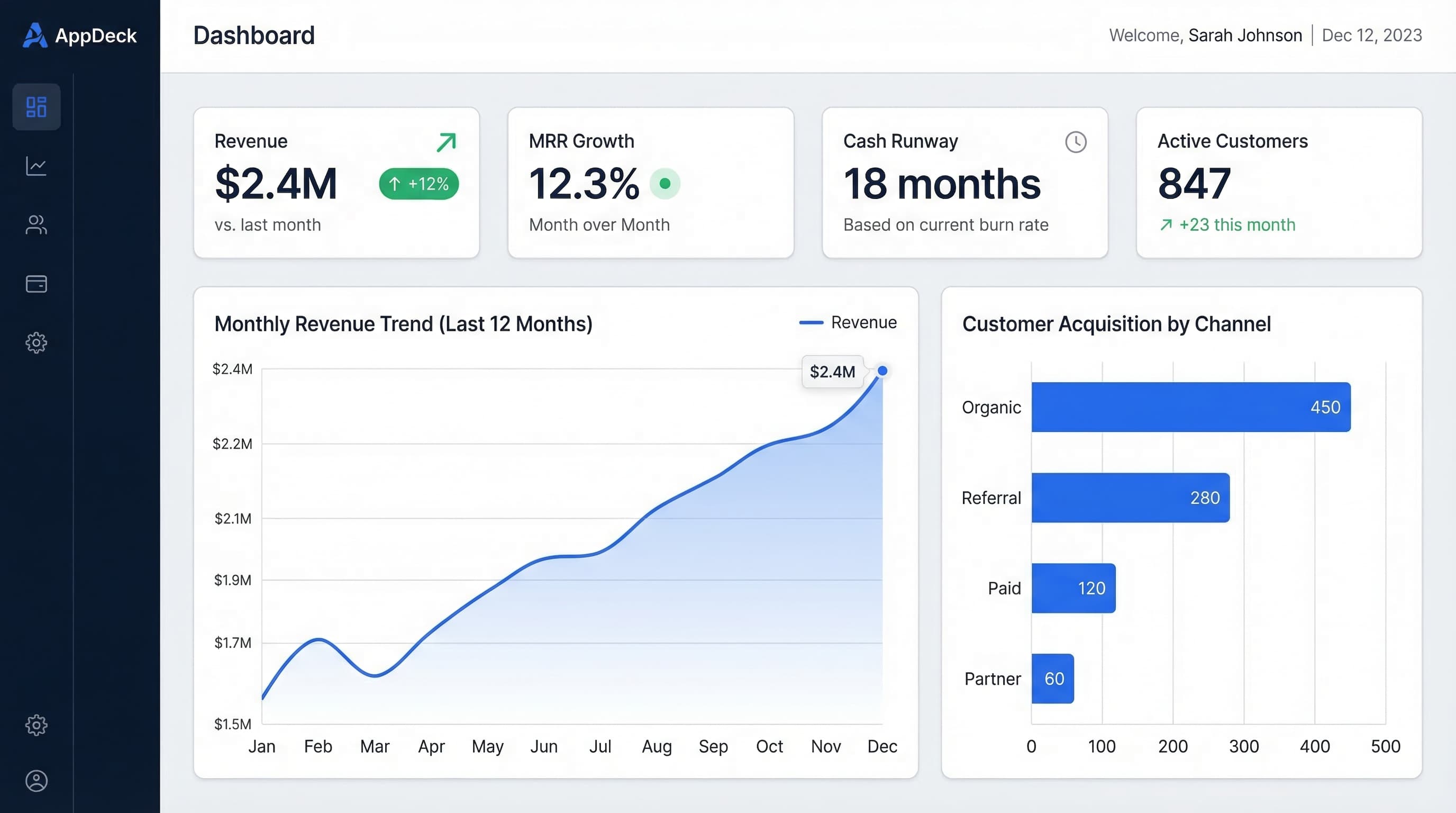
1. Executive Summary Dashboard
Get the Executive Summary Dashboard →
Best for: CEOs and founders who need company health at a glance
Layout:
━━━━━━━━━━━━━━━━━━━━━━━━━━━━━━━━━━━
EXECUTIVE SUMMARY DASHBOARD
━━━━━━━━━━━━━━━━━━━━━━━━━━━━━━━━━━━

[KPI Cards Row - 4 across]
Revenue     | Customers  | Cash       | NPS
$1.2M       | 187        | $1.65M     | 48
+15% MoM ✅ | +8% MoM ✅ | 8mo runway | +6 pts ✅

[Line Chart - Full Width]
Revenue vs. Target (12-month trend)

[Two Charts Side by Side]
Revenue by Source     | Expense Breakdown
(Stacked bar)         | (Pie chart)

[Table]
Top 5 Priorities This Week
Key formulas:
- MoM growth:
=(This_Month-Last_Month)/Last_Month - Runway:
=Cash_Balance/Monthly_Burn - Vs. target:
=Actual/Target
Conditional formatting rules:
- Green: >=100% of target
- Yellow: 80-99% of target
- Red: Below 80% of target
2. Financial KPI Dashboard
Best for: CFOs and finance teams tracking P&L, cash flow, and unit economics
Layout:
━━━━━━━━━━━━━━━━━━━━━━━━━━━━━━━━━━━
FINANCIAL DASHBOARD
━━━━━━━━━━━━━━━━━━━━━━━━━━━━━━━━━━━

[KPI Cards Row]
MRR         | Gross Margin | Burn Rate  | Runway
$450K       | 78%          | $201K/mo   | 8.2 mo
+12% MoM   | Target: 75%  | -3% MoM    | Target: >6

[Waterfall Chart]
MRR Movement: New + Expansion - Churn - Contraction

[Line Chart]
Actual vs. Budget (Monthly, YTD)

[Table - Budget vs. Actuals]
Category      | Budget  | Actual  | Variance
Personnel     | $142K   | $138K   | +$4K ✅
Marketing     | $45K    | $48K    | -$3K ⚠️
Infrastructure| $28K    | $27K    | +$1K ✅
Key formulas:
- Gross margin:
=(Revenue-COGS)/Revenue - Net MRR movement:
=New_MRR+Expansion_MRR-Churned_MRR-Contraction_MRR - Budget variance:
=Budget-Actual(positive = under budget) - Burn rate:
=-(Cash_End-Cash_Start)for the period
Pro tip: Use a waterfall chart (available in Excel 2016+) for MRR movement. It's the single most useful chart for SaaS finance dashboards.
3. Sales Pipeline Dashboard
Best for: Sales leaders tracking pipeline, quota attainment, and rep performance
Layout:
━━━━━━━━━━━━━━━━━━━━━━━━━━━━━━━━━━━
SALES PIPELINE DASHBOARD
━━━━━━━━━━━━━━━━━━━━━━━━━━━━━━━━━━━

[KPI Cards Row]
Quota Attain | Pipeline   | Win Rate   | Avg Deal
82%          | $6.2M      | 18%        | $42K
⚠️ 8 days   | 4.1x cover | Target: 20%| +$4K MoM

[Funnel Chart]
Pipeline by Stage: Discovery → Qualification → Proposal → Negotiation → Closed

[Horizontal Bar Chart]
Rep Performance: Actual vs. Quota (sorted by attainment %)

[Table]
Top 10 Deals: Company | Amount | Stage | Close Date | Probability
Key formulas:
- Pipeline coverage:
=Total_Pipeline/Remaining_Quota - Win rate:
=Deals_Won/(Deals_Won+Deals_Lost) - Weighted pipeline:
=SUMPRODUCT(Deal_Amounts,Stage_Probabilities) - Days to close:
=AVERAGEIF(Status,"Closed Won",Close_Date-Create_Date)
Conditional formatting:
- Rep quota attainment: Red below 80%, Yellow 80-100%, Green above 100%
- Deal close date: Red if overdue, Yellow if this week
4. Marketing Performance Dashboard
Best for: Marketing teams tracking lead generation, CAC, and channel ROI
Layout:
━━━━━━━━━━━━━━━━━━━━━━━━━━━━━━━━━━━
MARKETING DASHBOARD
━━━━━━━━━━━━━━━━━━━━━━━━━━━━━━━━━━━

[KPI Cards Row]
Leads       | MQLs       | CAC        | Marketing ROI
1,247       | 342        | $4,200     | 3.8:1
+22% MoM   | 27% conv   | -$300 MoM  | Target: >3:1

[Stacked Bar Chart]
Leads by Channel (12-month trend): Organic | Paid | Email | Referral

[Scatter Plot]
Channel Efficiency: CAC (x-axis) vs. Volume (y-axis) by channel

[Table]
Campaign Performance: Campaign | Spend | MQLs | CPL | SQLs | Pipeline
Key formulas:
- MQL conversion rate:
=MQLs/Total_Leads - CAC by channel:
=Channel_Spend/Channel_Customers - Marketing ROI:
=Marketing_Sourced_Revenue/Marketing_Spend - Cost per lead:
=Total_Spend/Total_Leads
5. KPI Scorecard Dashboard
Best for: Weekly leadership meetings where every function reports on 3-5 KPIs
Layout:
━━━━━━━━━━━━━━━━━━━━━━━━━━━━━━━━━━━
WEEKLY KPI SCORECARD
━━━━━━━━━━━━━━━━━━━━━━━━━━━━━━━━━━━

Function    | KPI              | Target | Actual | Status | Trend
━━━━━━━━━━━━━━━━━━━━━━━━━━━━━━━━━━━━━━━━━━━━━━━━━━━━━━━━━━━━━━━
Sales       | Quota attainment | 100%   | 82%    | ⚠️     | ↗️
Sales       | Pipeline cover   | 4.0x   | 4.1x   | ✅     | →
Marketing   | MQLs             | 300    | 342    | ✅     | ↗️
Marketing   | CAC              | <$5K   | $4,200 | ✅     | ↘️
Product     | Sprint velocity  | 220    | 187    | ⚠️     | ↘️
Product     | Uptime           | 99.9%  | 99.97% | ✅     | →
CS          | NPS              | >40    | 48     | ✅     | ↗️
CS          | Churn            | <5%    | 3.2%   | ✅     | →
Finance     | Burn rate        | <$210K | $201K  | ✅     | ↘️
Finance     | Runway           | >6 mo  | 8.2 mo | ✅     | →

[Sparklines column showing 8-week trend for each KPI]
Key formulas:
- Status:
=IF(Actual>=Target,"✅",IF(Actual>=Target*0.8,"⚠️","🚨")) - Trend (simplified):
=IF(This_Week>Last_Week,"↗️",IF(This_Week<Last_Week,"↘️","→"))
Pro tip: This is the most universally useful Excel dashboard. Every company I've worked with eventually builds some version of this for their leadership meetings. The sparklines column (Insert > Sparklines in Excel) adds trend context without taking up space.
6. Project Tracking Dashboard
Get the Project Status Dashboard →
Best for: Project managers and ops teams managing multiple workstreams
Layout:
━━━━━━━━━━━━━━━━━━━━━━━━━━━━━━━━━━━
PROJECT TRACKING DASHBOARD
━━━━━━━━━━━━━━━━━━━━━━━━━━━━━━━━━━━

[KPI Cards Row]
Active       | On Track   | At Risk    | Overdue
18 projects  | 14 (78%)   | 3 (17%)    | 1 (5%)

[Gantt-Style Horizontal Bars]
Project Timeline: Start → Today → Deadline (color by status)

[Stacked Bar]
Resource Allocation by Project (hours/week per team member)

[Table]
Project     | Owner   | Status | % Done | Deadline  | Risk
TechCorp    | Sarah   | ✅     | 85%    | Dec 15    | Low
GlobalBiz   | Marcus  | ⚠️     | 60%    | Dec 1     | Medium
StartupCo   | Alex    | 🚨     | 40%    | Nov 30    | High
Key formulas:
- % complete:
=Tasks_Done/Total_Tasks - Days remaining:
=Deadline-TODAY() - Status:
=IF(Pct_Done>=Expected_Pct,"✅",IF(Days_Remaining>7,"⚠️","🚨"))
7. HR & People Dashboard
Best for: HR leaders tracking headcount, hiring, and employee engagement
Layout:
━━━━━━━━━━━━━━━━━━━━━━━━━━━━━━━━━━━
PEOPLE DASHBOARD
━━━━━━━━━━━━━━━━━━━━━━━━━━━━━━━━━━━

[KPI Cards Row]
Headcount   | Open Roles | Turnover   | eNPS
47          | 8          | 12%        | 72
Plan: 55    | Avg fill:  | Target:    | +8 vs
            | 34 days    | <15%       | last Q

[Line Chart]
Headcount Plan vs. Actual (by month)

[Bar Chart]
Hiring Pipeline: Applied → Screened → Interviewed → Offered → Hired

[Table]
Department   | HC  | Plan | Open | Turnover | Avg Tenure
Engineering  | 18  | 22   | 4    | 8%       | 2.4 years
Sales        | 12  | 14   | 2    | 18%      | 1.8 years
Marketing    | 8   | 9    | 1    | 6%       | 3.1 years
CS           | 6   | 7    | 1    | 10%      | 2.0 years
Key formulas:
- Turnover rate:
=Departures_12mo/Avg_Headcount - Time to fill:
=AVERAGE(Fill_Date-Open_Date) - Headcount vs. plan:
=Actual_HC/Planned_HC
8. Customer Success Dashboard
Get the Customer Success Dashboard →
Best for: CS teams tracking retention, health scores, and expansion revenue
Layout:
━━━━━━━━━━━━━━━━━━━━━━━━━━━━━━━━━━━
CUSTOMER SUCCESS DASHBOARD
━━━━━━━━━━━━━━━━━━━━━━━━━━━━━━━━━━━

[KPI Cards Row]
Net Retention| Logo Churn | NPS        | CSAT
112%         | 3.2%       | 48         | 4.6/5.0
Target: >100%| Target: <5%| +6 QoQ     | Target: >4.5

[Donut Chart]
Customer Health: Healthy (68%) | At Risk (23%) | Churning (9%)

[Line Chart]
Churn Rate vs. Expansion Rate (12-month trend)

[Table - At Risk Accounts]
Account     | ARR    | Health | Risk       | Renewal  | Owner
TechCorp    | $95K   | 3/10   | Low usage  | 30 days  | Sarah
GlobalSys   | $68K   | 4/10   | Escalation | 60 days  | Marcus
Key formulas:
- Net revenue retention:
=(Start_MRR+Expansion-Churn-Contraction)/Start_MRR - Health score: Weighted average of usage, support tickets, NPS, and login frequency
- Days to renewal:
=Renewal_Date-TODAY()
9. E-commerce Dashboard
Best for: Online store owners tracking revenue, conversion, and product performance
Layout:
━━━━━━━━━━━━━━━━━━━━━━━━━━━━━━━━━━━
E-COMMERCE DASHBOARD
━━━━━━━━━━━━━━━━━━━━━━━━━━━━━━━━━━━

[KPI Cards Row]
Revenue     | Orders     | Conv Rate  | AOV
$487K       | 3,430      | 2.8%       | $142
+12% MoM   | +8% MoM    | +0.3pts    | +$14

[Line Chart]
Daily Revenue (with 7-day moving average)

[Bar Chart]
Revenue by Channel: Organic | Paid | Email | Social | Direct

[Table]
Top Products: Product | Units | Revenue | Margin | Return Rate
Key formulas:
- Conversion rate:
=Orders/Sessions - AOV:
=Total_Revenue/Total_Orders - Customer LTV:
=AOV*Purchase_Frequency*Avg_Lifespan - Return rate:
=Returns/Orders
10. Operations Dashboard
Get the Operations Dashboard →
Best for: Ops teams tracking efficiency, throughput, and SLAs
Layout:
━━━━━━━━━━━━━━━━━━━━━━━━━━━━━━━━━━━
OPERATIONS DASHBOARD
━━━━━━━━━━━━━━━━━━━━━━━━━━━━━━━━━━━

[KPI Cards Row]
Throughput  | On-Time %  | Error Rate | SLA Met
1,247 units | 94%        | 1.2%       | 97%
+8% MoM    | Target: 95%| Target: <2%| Target: 95%

[Control Chart]
Daily Throughput with Upper/Lower Control Limits

[Pareto Chart]
Top Defect Categories (80/20 analysis)

[Table]
Process      | Volume | Cycle Time | Error % | Trend
Order Entry  | 450    | 2.3 hrs    | 0.8%    | ↗️
Fulfillment  | 420    | 4.1 hrs    | 1.4%    | →
QA Review    | 415    | 1.2 hrs    | 2.1%    | ↘️
Shipping     | 410    | 3.8 hrs    | 0.9%    | →
Key formulas:
- On-time rate:
=On_Time_Deliveries/Total_Deliveries - Cycle time:
=AVERAGE(Complete_Date-Start_Date)*24(in hours) - SLA compliance:
=COUNTIF(Response_Times,"<="&SLA_Target)/Total_Tickets
11. Startup Metrics Dashboard
Get the Startup Metrics Dashboard →
Best for: Founders and early-stage teams tracking growth, runway, and product-market fit
Layout:
━━━━━━━━━━━━━━━━━━━━━━━━━━━━━━━━━━━
STARTUP DASHBOARD
━━━━━━━━━━━━━━━━━━━━━━━━━━━━━━━━━━━

[KPI Cards Row]
MRR         | Growth     | Runway     | DAU/MAU
$85K        | +22% MoM   | 7.3 mo     | 42%
ARR: $1.02M | Target: 20%| Burn: $58K | Sticky ✅

[Line Chart]
MRR Growth (with target line and projection)

[Cohort Table]
Month    | M0   | M1   | M2   | M3   | M6   | M12
Jan      | 100% | 82%  | 71%  | 65%  | 52%  | 38%
Feb      | 100% | 85%  | 74%  | 68%  | 55%  | --
Mar      | 100% | 88%  | 78%  | 72%  | --   | --

[Bar Chart]
Unit Economics: CAC vs. LTV (with payback period line)
Key formulas:
- MoM growth:
=(MRR_Current-MRR_Previous)/MRR_Previous - Runway:
=Cash_Balance/Monthly_Burn - LTV:CAC ratio:
=Customer_LTV/Customer_Acquisition_Cost - DAU/MAU ratio:
=Daily_Active_Users/Monthly_Active_Users
Pro tip: The cohort retention table is the most important chart for startups. If your retention curves flatten (stop declining), you have product-market fit. If they trend to zero, you don't. Build this in Excel by creating a matrix of signup cohorts (rows) vs. months since signup (columns).
12. Agency Utilization Dashboard
Get the Agency Utilization Dashboard →
Best for: Agencies and professional services firms tracking billable hours and project profitability
Layout:
━━━━━━━━━━━━━━━━━━━━━━━━━━━━━━━━━━━
AGENCY DASHBOARD
━━━━━━━━━━━━━━━━━━━━━━━━━━━━━━━━━━━

[KPI Cards Row]
Revenue     | Utilization| Avg Rate   | AR Days
$245K       | 86%        | $185/hr    | 34 days
+5% MoM    | Target: 80%| +$8/hr MoM | Target: <30

[Stacked Bar Chart]
Weekly Hours by Team Member: Billable | Non-billable | PTO

[Horizontal Bar]
Project Profitability: Planned Margin vs. Actual Margin per project

[Table]
Project     | Budget  | Spent   | Remaining | Margin | Status
TechCorp    | $85K    | $72K    | $13K      | 22%    | ✅
StartupCo   | $45K    | $41K    | $4K       | 8%     | ⚠️
GlobalBiz   | $32K    | $35K    | -$3K      | -9%    | 🚨
Key formulas:
- Utilization:
=Billable_Hours/Available_Hours - Effective rate:
=Project_Revenue/Hours_Worked - Project margin:
=(Revenue-Labor_Cost)/Revenue - AR days:
=Accounts_Receivable/(Annual_Revenue/365)
13. Inventory Management Dashboard
Best for: Supply chain and warehouse teams tracking stock levels and turnover
Layout:
━━━━━━━━━━━━━━━━━━━━━━━━━━━━━━━━━━━
INVENTORY DASHBOARD
━━━━━━━━━━━━━━━━━━━━━━━━━━━━━━━━━━━

[KPI Cards Row]
Total Value | Turnover   | Stockouts  | Days of Supply
$1.8M       | 6.2x/year  | 3 SKUs     | 42 days
-$120K MoM  | Target: 8x | Target: 0  | Target: 30-45

[Scatter Plot]
SKUs by Value (x) vs. Turnover Rate (y) — ABC analysis

[Line Chart]
Inventory Value Trend (with reorder points)

[Table - Action Items]
SKU         | On Hand | Reorder Pt | Days Left | Action
Widget-A    | 1,200   | 500        | 45 days   | ✅
Widget-B    | 180     | 200        | 8 days    | 🚨 Order
Widget-C    | 3,400   | 800        | 120 days  | ⚠️ Excess
Key formulas:
- Inventory turnover:
=COGS/Avg_Inventory - Days of supply:
=Current_Inventory/Daily_Usage - Reorder trigger:
=IF(On_Hand<=Reorder_Point,"🚨 ORDER","✅")
14. Support & Help Desk Dashboard
Best for: Support teams tracking ticket volume, resolution times, and customer satisfaction
Layout:
━━━━━━━━━━━━━━━━━━━━━━━━━━━━━━━━━━━
SUPPORT DASHBOARD
━━━━━━━━━━━━━━━━━━━━━━━━━━━━━━━━━━━

[KPI Cards Row]
Open Tickets| Avg Response| Resolution | CSAT
23          | 2.3 hrs     | 8.2 hrs    | 4.6/5.0
-12 vs last | Target: <4h | Target: <12h| Target: >4.5

[Line Chart]
Daily Ticket Volume: Created vs. Resolved (with backlog area)

[Pie Chart]
Tickets by Category: Bug | Feature Request | How-To | Account | Billing

[Table]
Agent       | Resolved | Avg Time | CSAT  | Status
Sarah       | 45       | 6.2 hrs  | 4.8   | ✅
Marcus      | 38       | 7.8 hrs  | 4.5   | ✅
Alex        | 32       | 12.1 hrs | 4.2   | ⚠️
Key formulas:
- First response time:
=AVERAGE(First_Response-Ticket_Created)*24 - Resolution time:
=AVERAGE(Resolved_Date-Ticket_Created)*24 - Backlog trend:
=CUMULATIVE(Created)-CUMULATIVE(Resolved)
15. Board Reporting Dashboard
Get the Board Reporting Dashboard →
Best for: Monthly or quarterly board packages that need to be clear, professional, and exportable
Layout:
━━━━━━━━━━━━━━━━━━━━━━━━━━━━━━━━━━━
BOARD REPORT — Q4 2025
━━━━━━━━━━━━━━━━━━━━━━━━━━━━━━━━━━━

[Header: Company logo, period, confidentiality notice]

[KPI Cards Row - 6 across]
ARR      | Growth  | Customers | NRR    | Runway  | Headcount
$5.4M    | +35%    | 187       | 112%   | 8.2 mo  | 47
YoY      | Target: | +28% YoY  | >100%  |         | Plan: 50
         | 30%     |           |        |         |

[Line Chart]
ARR Trajectory: Actual vs. Plan vs. Board-Approved Budget

[Two Charts Side by Side]
Revenue Waterfall        | Cash Bridge
(New, Expansion, Churn)  | (Start, In, Out, End)

[Table - Key Metrics]
Metric              | Q3 Actual | Q4 Target | Q4 Actual | YoY
ARR                 | $4.8M     | $5.2M     | $5.4M     | +35%
Gross Margin        | 76%       | 78%       | 78%       | +4pts
CAC Payback         | 16 mo     | 14 mo     | 14 mo     | -4 mo
Net Revenue Ret.    | 108%      | 110%      | 112%      | +8pts

[Section: Strategic Initiatives with status]
[Section: Key Risks and Mitigations]
[Section: Asks of the Board]
Pro tip: For board reporting, export your Excel dashboard as a PDF and include it in your board package. Keep the Excel version as the working file where you update numbers. If your board wants real-time access instead of static exports, consider a board portal where members can view live dashboards with role-based permissions.
Excel Dashboard Design Tips
Use These Chart Types
| Data Type | Best Chart | Why |
|---|---|---|
| Trend over time | Line chart | Shows direction clearly |
| Part of whole | Donut chart | Cleaner than pie charts |
| Comparison | Horizontal bar | Easy to read and rank |
| Distribution | Histogram | Shows spread at a glance |
| Two variables | Scatter plot | Reveals correlations |
| MRR movement | Waterfall | Shows adds and losses |
| Funnel stages | Funnel/stacked bar | Shows conversion drop-off |
Color Rules
- Use only 3-4 colors. Too many colors create visual noise.
- Green, yellow, red for status. Universal and immediately understood.
- Gray for secondary data. De-emphasizes context without removing it.
- Your brand color for primary metrics. One accent color, used sparingly.
Formatting Shortcuts
- Freeze panes on row 1 so headers stay visible when scrolling data tabs
- Data validation dropdowns for filters (select department, time period, etc.)
- SPARKLINE() for inline trend charts in table cells
- Conditional formatting icon sets for trend arrows (↑ → ↓)
- Custom number formats:
#,##0,Kdisplays 1,200,000 as 1,200K
Key Excel Formulas for Dashboards
These are the formulas you'll use in almost every dashboard:
Growth rate:     =(New-Old)/Old
Running total:   =SUM($B$2:B2)
YTD total:       =SUMIFS(Amount,Date,">="&DATE(YEAR(TODAY()),1,1))
Lookup:          =XLOOKUP(value, lookup_range, return_range)
Conditional avg: =AVERAGEIFS(Values,Criteria_Range,Criteria)
Sparklines:      Insert > Sparklines > Line (select data range)
Dynamic range:   =OFFSET(Start,0,0,COUNTA(Column),1)
When to Move Beyond Excel
Excel dashboards work well when you have:
- A small team (under 50 people)
- Data you can update manually or paste weekly
- Fewer than 5 data sources
- No need for real-time updates
Signs you've outgrown Excel:
-
You're spending 2+ hours per week updating data. That time compounds. At 2 hours/week, you're spending 100+ hours per year copying and pasting.
-
Multiple people edit the same file. Version control in Excel is a nightmare. "Dashboard_FINAL_v3_REAL_FINAL.xlsx" is a sign.
-
You need real-time data. If your team is making decisions on stale data because nobody updated the spreadsheet, it's time to upgrade.
-
You've hit the formula complexity wall. When your SUMPRODUCT/INDEX/MATCH formulas span 200 characters and nobody else can maintain them, the spreadsheet has become a liability.
-
Leadership wants a shared, always-current view. Excel files attached to emails are not dashboards. They're snapshots.
Where to go next:
For teams that need real-time, shared dashboards without the complexity of Tableau or Looker, AppDeck's executive dashboard connects directly to your tools and auto-updates. You get the simplicity of Excel with live data, role-based access, and a shareable link instead of an email attachment.
Try AppDeck Executive Dashboard →
Frequently Asked Questions
What is an Excel dashboard template?
An Excel dashboard template is a pre-built .xlsx file with sample data, charts, formulas, and formatting that you can download and customize for your own business. A good template separates raw data from the visualization layer using hidden data tabs, uses PivotTables or SUMIFS formulas to aggregate metrics, and applies conditional formatting (green/yellow/red) so status is immediately visible. The 15 templates in this guide cover CEO, finance, sales, marketing, operations, and HR functions — each with the formulas and chart structure already in place so you spend time on your data, not on building the spreadsheet.
Is Excel a good dashboard tool or should I use Google Sheets, Tableau, or Power BI?
Excel is the right tool when your data updates manually or weekly, you have one to three people maintaining the dashboard, and your team already lives in Microsoft 365. Google Sheets wins for real-time collaboration when multiple people edit at the same time. Tableau and Power BI win when you have multiple live data sources, more than 50 users viewing dashboards, or data volumes Excel can't handle (over a million rows). For most small businesses under 50 employees, Excel does 80% of what you need at zero additional cost — until the maintenance burden tips the math toward a purpose-built tool.
How long does it take to build a working Excel dashboard?
Starting from a template: 30-60 minutes to swap in your own metrics, customize colors, and connect to your data. Building from scratch: 4-12 hours for a single-page dashboard with 5-8 KPIs, charts, and conditional formatting. Add 2-4 hours per data source you're pulling in. Ongoing maintenance — refreshing data, fixing broken formulas when source files change, updating charts — typically runs 1-2 hours per week for a moderately complex dashboard. If your maintenance time exceeds 3 hours per week, the dashboard has outgrown Excel.
Who are Excel dashboards best for?
Excel dashboards work best for small business owners, finance teams, department managers, and analysts at companies under 100 employees who need to track 5-15 KPIs without involving IT or buying a BI tool. They're also a fast prototyping format — many companies build the first version of every dashboard in Excel to validate which metrics matter, then port the winning dashboards into Power BI or a SaaS tool once the metric set stabilizes. They're a poor fit for executive teams needing real-time data, multi-user editing, or board-level reporting where version control matters.
When should we stop using Excel for dashboards?
Move beyond Excel when you're spending 2+ hours per week updating data, multiple people need to edit the same file simultaneously, you've hit the formula complexity wall where nobody else can maintain your SUMPRODUCT/INDEX/MATCH chains, or leadership needs a shared always-current view that can't live as an email attachment. The transition usually happens around year three of dashboard maturity: years one and two are about figuring out what to measure, year three is about scaling the operating cadence. At that point, a tool with live data connections and role-based access (AppDeck, Looker Studio, Power BI) is worth the switch.
Conclusion
Excel dashboards are a great starting point. They're free, flexible, and familiar. The templates above give you a head start — pick the one closest to your function, customize the metrics, and you'll have a working dashboard in under an hour.
Quick start:
- Pick one template from this list
- Create your dashboard tab + hidden data tabs
- Add your actual metrics (start with 5-7 KPIs)
- Apply conditional formatting (green/yellow/red)
- Share with your team and iterate weekly
The best dashboard is the one your team actually uses. Start simple, add complexity only when you need it, and upgrade to a purpose-built tool when Excel starts holding you back.
Related reading:
- The Complete Guide to Executive Dashboards
- Executive Dashboard Templates: 12 Free Examples
- 20 KPI Dashboard Examples for Every Business Function
- CEO Dashboard Metrics: What to Track and Why

Founder & CEO, AppDeck
Serial entrepreneur with 20+ years building B2B software companies. Former executive managing 2,800+ employees across three continents. Vik reviews all AppDeck content for accuracy and practical relevance.
Share this article
Explore Related Solutions
Related Articles
Executive Dashboard Software: 8 Best Platforms Compared (2026)
Compare the best executive dashboard software for 2026. Features, pricing, and honest reviews of Tableau, Power BI, Looker, AppDeck, Geckoboard, Klipfolio, Databox, and Domo.
Executive Dashboard Templates: 12 Free Examples for CEOs, CFOs & CROs
Ready-to-use executive dashboard templates for tracking KPIs, financials, and team performance. Free examples with best practices from real companies.
Executive Summary Dashboard: What to Include, How to Build It, and Examples
Learn how to build an executive summary dashboard that drives decisions. Key metrics, layout best practices, real examples, and a step-by-step guide for CEOs, CFOs, and VPs.