
Free KPI Dashboard Template for Excel (Download + Setup Guide)
Download a free KPI dashboard template for Excel with traffic-light status, target vs. actual, and trend sparklines. Plus 6 function-specific variants and the formulas to customize them.
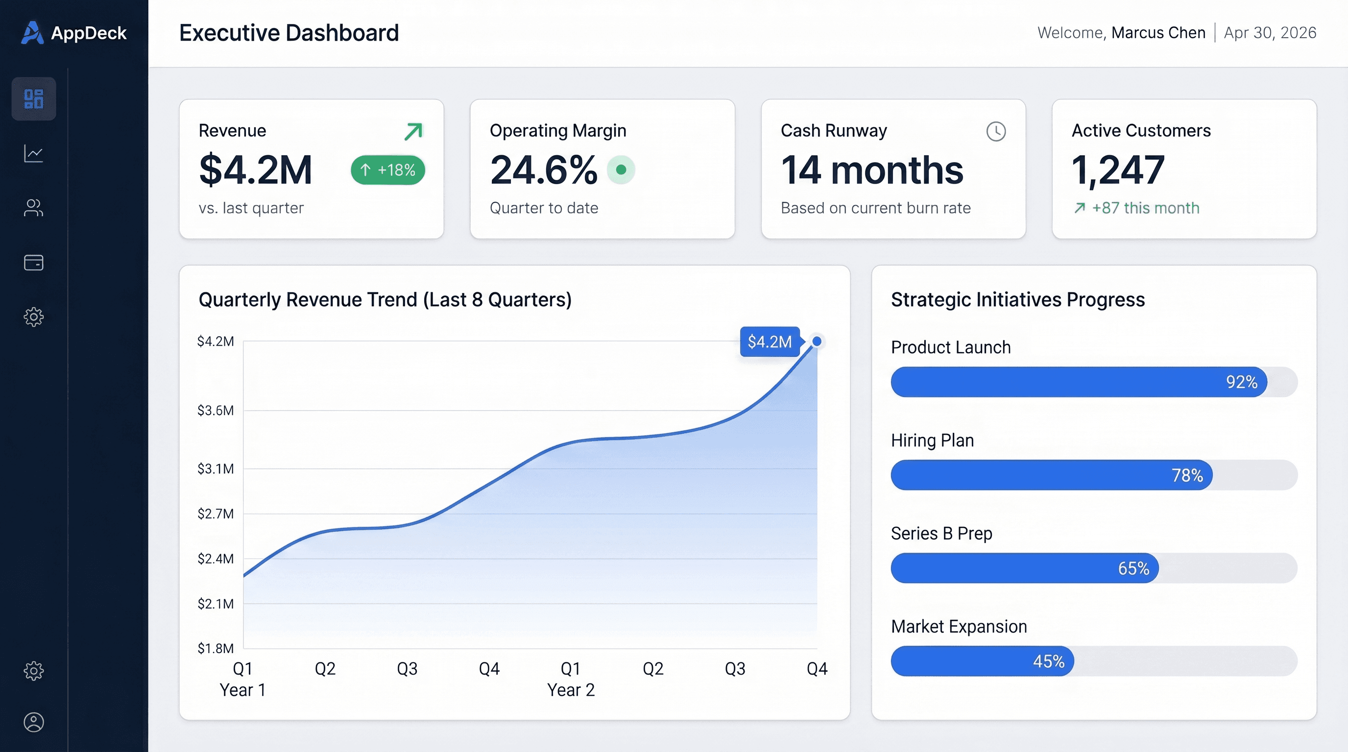
Download the template: Get the KPI Dashboard Template (.xlsx) — leading and lagging indicators, traffic-light status, target vs. actual, and 12-period trend sparklines. Free, no paywall.
TL;DR: A good KPI dashboard template for Excel tracks 5-7 KPIs per view, separates leading from lagging indicators, locks targets for the period, and flags every metric Red/Yellow/Green against target. Download the free .xlsx above, or grab one of the 6 function-specific variants below (financial, sales, marketing, operations, executive, startup).
Introduction
Almost every growing company eventually builds the same spreadsheet: a weekly KPI scorecard for the leadership meeting. Some version of "here are our numbers, here are the targets, here's what's red."
Most of them build it badly on the first try. Twenty metrics instead of seven. Targets that quietly move mid-quarter. Red statuses with no explanation attached. A dashboard that takes 45 minutes to discuss because nobody agreed in advance what any number means.
This post gives you the template so you can skip the bad first draft. The downloadable Excel file is the KPI scorecard structure I've rebuilt at every company — plus the formulas, the layout logic, and six function-specific variants if you need something more specialized than a company-wide scorecard.
What's in the KPI Dashboard Template
The free .xlsx download includes:
- Leading indicator block — predictive metrics (what will happen next quarter): pipeline created, demos booked, NPS
- Lagging indicator block — results metrics (what already happened): revenue, churn, profit
- Traffic-light status (Red/Yellow/Green) per KPI, calculated against target automatically
- Target column locked in for the period
- Variance-to-target column so the gap is a number, not a guess
- Trend sparkline for the last 12 periods on every KPI
- KPI owner column — every metric has exactly one name next to it
- Notes column — required context for every red KPI
- Source data on a separate tab, so the dashboard view stays clean
Sample data is included, so you can see how the formulas behave before you replace it with your own numbers.
The Layout
━━━━━━━━━━━━━━━━━━━━━━━━━━━━━━━━━━━━━━━━━━━━━━━━━━━━━━━━━━━━━━━
WEEKLY KPI SCORECARD                            Week of Jul 6
━━━━━━━━━━━━━━━━━━━━━━━━━━━━━━━━━━━━━━━━━━━━━━━━━━━━━━━━━━━━━━━

LEADING INDICATORS
Owner   | KPI               | Target | Actual | Var    | Status | Trend
──────────────────────────────────────────────────────────────────────
Sarah   | Pipeline created  | $1.2M  | $1.4M  | +$200K | ✅     | ↗️
Sarah   | Demos booked      | 40     | 33     | -7     | ⚠️     | ↘️
Marcus  | Trial signups     | 120    | 141    | +21    | ✅     | ↗️
Priya   | NPS               | >40    | 48     | +8     | ✅     | →

LAGGING INDICATORS
Owner   | KPI               | Target | Actual | Var    | Status | Trend
──────────────────────────────────────────────────────────────────────
Sarah   | New ARR           | $150K  | $118K  | -$32K  | 🚨     | ↘️
Priya   | Net churn         | <2%    | 1.4%   | +0.6pt | ✅     | →
David   | Burn rate         | <$210K | $201K  | +$9K   | ✅     | ↘️

NOTES (required for every red)
New ARR: two enterprise deals slipped to next month; both verbal,
closing week of Jul 13. No change to quarter forecast. — Sarah
Two things about this layout do most of the work.
The leading/lagging split. Most teams over-index on lagging indicators — revenue, churn, profit — and then wonder why they can't change the future. Lagging metrics tell you what happened; leading metrics tell you what's about to happen. Separating them on the dashboard forces both conversations every week.
The notes row. A red status without context is just bad news. The template treats a note as mandatory for every red KPI: what's driving it, what's being done, when it recovers. Red without a plan is procrastination.
How to Set It Up (15 Minutes)
1. Pick 5-7 KPIs, not 20
A KPI dashboard with 20 metrics is a data dump. Force the cut to the 5-7 that actually drive decisions at your level. If a metric never changes what anyone does on Monday, it's diagnostic data — keep it on a back tab, not the scorecard. The template includes a "metrics graveyard" tab for exactly this.
2. Tag every KPI as leading or lagging
Go down your list and ask: does this predict a future result, or measure a past one? Pipeline created, demos booked, qualified leads, NPS — leading. Revenue, churn, margin — lagging. A healthy scorecard has both blocks populated.
3. Set the target and lock it
Enter the target for the period — quarter, half, or year — and then don't touch it. Targets that get adjusted mid-period when teams start missing them make the dashboard meaningless. If a target genuinely must change, note it explicitly and date the change.
4. Assign one owner per KPI
Not a team. Not two people. One name. When the metric goes red, the note comes from that person. Shared ownership of a KPI is how metrics stay red for three quarters.
5. Put it on a weekly cadence
A KPI dashboard reviewed quarterly is decorative. Reviewed weekly with owners present, it changes behavior. Keep the review to 15-20 minutes: greens get skipped, yellows get one sentence, reds get discussed until there's an explicit action.
The Formulas That Power It
The template ships with these already wired up, but if you're building your own or customizing:
Traffic-light status:
=IF(Actual>=Target,"✅",IF(Actual>=Target*0.8,"⚠️","🚨"))
Adjust the 0.8 threshold per KPI — some metrics deserve a tighter yellow band than others. For "lower is better" metrics (churn, burn, CAC), flip the comparison.
Variance to target:
=Actual-Target
Format as a number, not a percentage, for anything money-related. "-$32K" lands harder than "-21%".
Trend arrow:
=IF(This_Period>Last_Period,"↗️",IF(This_Period<Last_Period,"↘️","→"))
Sparklines: select the trend column, then Insert → Sparklines → Line, and point at the last 12 periods on the data tab. Sparklines add trend context without taking up a chart's worth of space — they're the single highest-value Excel feature for dashboards.
Pulling from the data tab:
=SUMIFS(Data_Revenue[Amount], Data_Revenue[Week], $B$1)
Keep every formula on the dashboard tab pointed at structured table references on the data tabs. Never hand-type numbers into the scorecard — the moment someone pastes a value over a formula, the dashboard starts lying.
Need Something More Specific? 6 KPI Dashboard Variants
The scorecard above is function-agnostic — it works for a leadership team where every department reports 3-5 KPIs. If you need a deeper single-function dashboard, these variants are also free downloads:
| Template | Best for | Download |
|---|---|---|
| Executive Summary Dashboard | CEO one-pager: revenue, cash, pipeline, people | Get it → |
| Financial KPI Dashboard | CFOs: P&L, cash flow, runway, budget vs. actual | Get it → |
| Sales Dashboard | CROs: pipeline coverage, win rate, cycle, forecast | Get it → |
| Marketing Dashboard | CMOs: MQLs, CAC, channel performance, funnel | Get it → |
| Operations Dashboard | COOs: throughput, quality, on-time delivery | Get it → |
| Startup Metrics Dashboard | Founders: ARR, burn, runway, growth efficiency | Get it → |
All 15 dashboard templates (including e-commerce, HR, support, and board reporting) are in the full Excel dashboard roundup, and there are Google Sheets versions if your team lives in Workspace.
If you're deciding which KPIs belong on the dashboard in the first place, start with KPI Dashboard Examples — it walks through real KPI selections by role and function.
Excel vs. Google Sheets vs. BI Tools for KPI Dashboards
Excel wins when one person owns the dashboard, the data arrives as exports (CSV from your CRM, accounting system, ad platforms), and the review cadence is weekly. It's fast to build, everyone can open it, and the formulas above cover most of what a scorecard needs.
Google Sheets wins when multiple people update the same dashboard, or you want it permanently open in a browser tab. Functionally equivalent for scorecards; collaboration is the differentiator.
A BI tool wins when the maintenance cost exceeds the build cost — the usual signals:
- The owner spends 2+ hours a week copy-pasting exports
- Three or more data sources need consolidating every cycle
- Leadership asks "can this update live?" more than once
- Version confusion appears ("is this the latest file?")
That last mile is exactly what we built AppDeck's executive dashboards for — the same 5-7 KPI discipline, but connected to live data and shareable with your board or leadership team through a branded portal instead of an email attachment.
Frequently Asked Questions
What is a KPI dashboard template?
A KPI dashboard template is a pre-built spreadsheet structure for tracking key performance indicators against targets — typically with a status indicator (Red/Yellow/Green), a variance column, and a trend view. The template handles layout and formulas so you only supply KPIs, targets, and data.
How many KPIs should the dashboard track?
Five to seven per view at company level. Each function can run its own 5-7 on a separate view. Once a single view passes ten KPIs, it stops driving decisions and starts being a report — split it.
What's the difference between a KPI dashboard and a metrics dashboard?
A KPI is a metric that was chosen because it drives a decision. A KPI dashboard tracks 5-7 of those. A metrics dashboard might track dozens of diagnostic numbers. KPI = signal, metrics = data — the discipline of the cut is what makes it a KPI dashboard.
Does the template work in older versions of Excel?
Yes. The formulas use IF, SUMIFS, and sparklines — all supported since Excel 2010. It also opens cleanly in Google Sheets and LibreOffice; sparklines convert automatically in Sheets.
When should we move from Excel to a real dashboard tool?
When maintaining the file costs more than it returns: 2+ hours a week of manual updates, 3+ data sources to consolidate, or stakeholders asking for live numbers between updates. Until then, Excel is genuinely fine — a disciplined Excel scorecard beats a neglected BI deployment every time.
Conclusion
You don't need a BI project to get KPI discipline. You need 5-7 well-chosen KPIs, locked targets, one owner per metric, a weekly review — and a spreadsheet that makes status impossible to hide.
Download the free KPI dashboard template, replace the sample data with your numbers, and run your first weekly review this Monday. When you outgrow the spreadsheet, we can help with that too.
Related Reading

Founder & CEO, AppDeck
Serial entrepreneur with 20+ years building B2B software companies. Co-Founder of UnifyCX (formerly GlowTouch), which has 6,000+ employees. Vik reviews all AppDeck content for accuracy and practical relevance.
Share this article
Related Articles
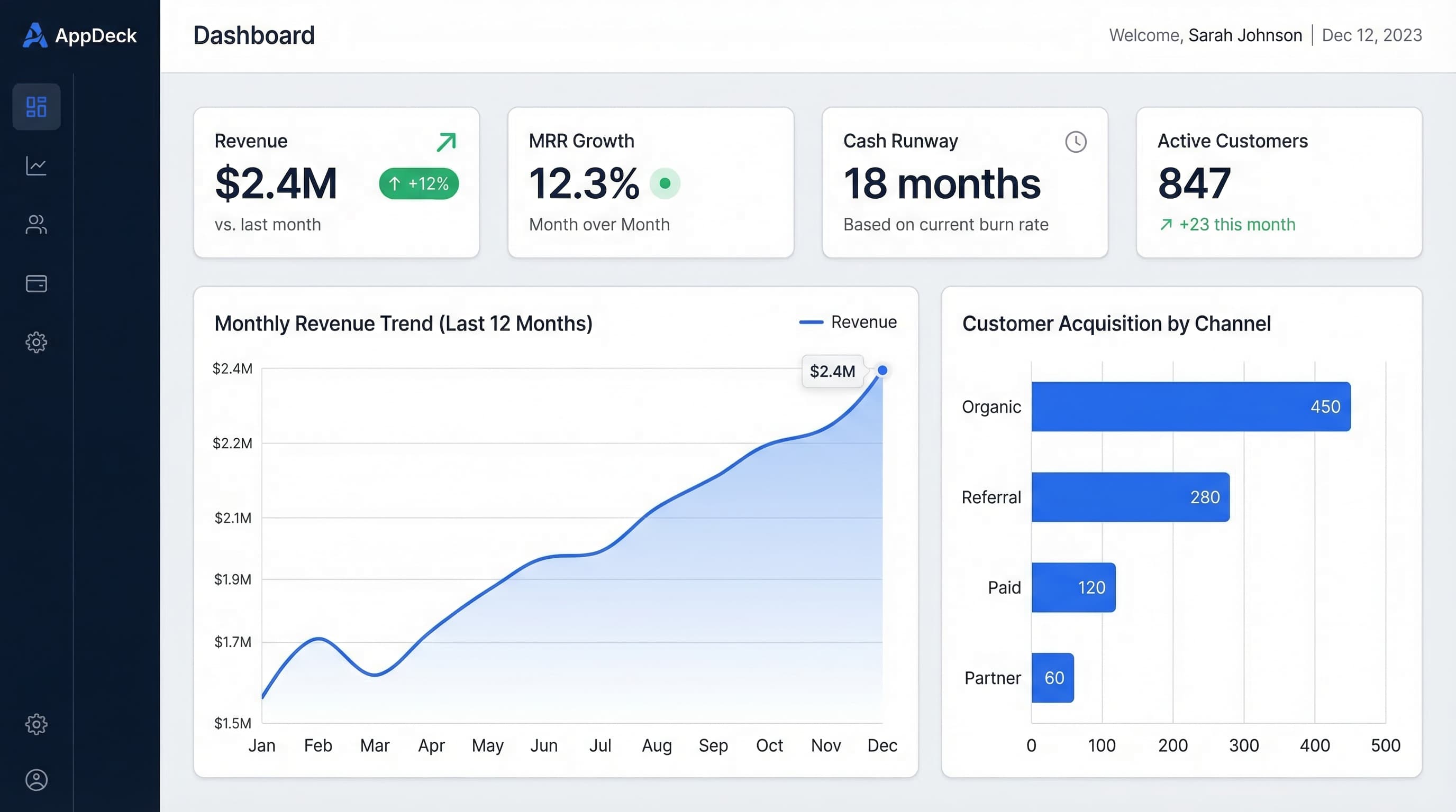
15 Free Excel Dashboard Templates (Dynamic .xlsx Files to Download)
Download 15 free Excel dashboard templates: dynamic .xlsx files for CEO, CFO, sales, marketing, HR, and operations teams, with sample data, charts, conditional formatting, and working formulas.
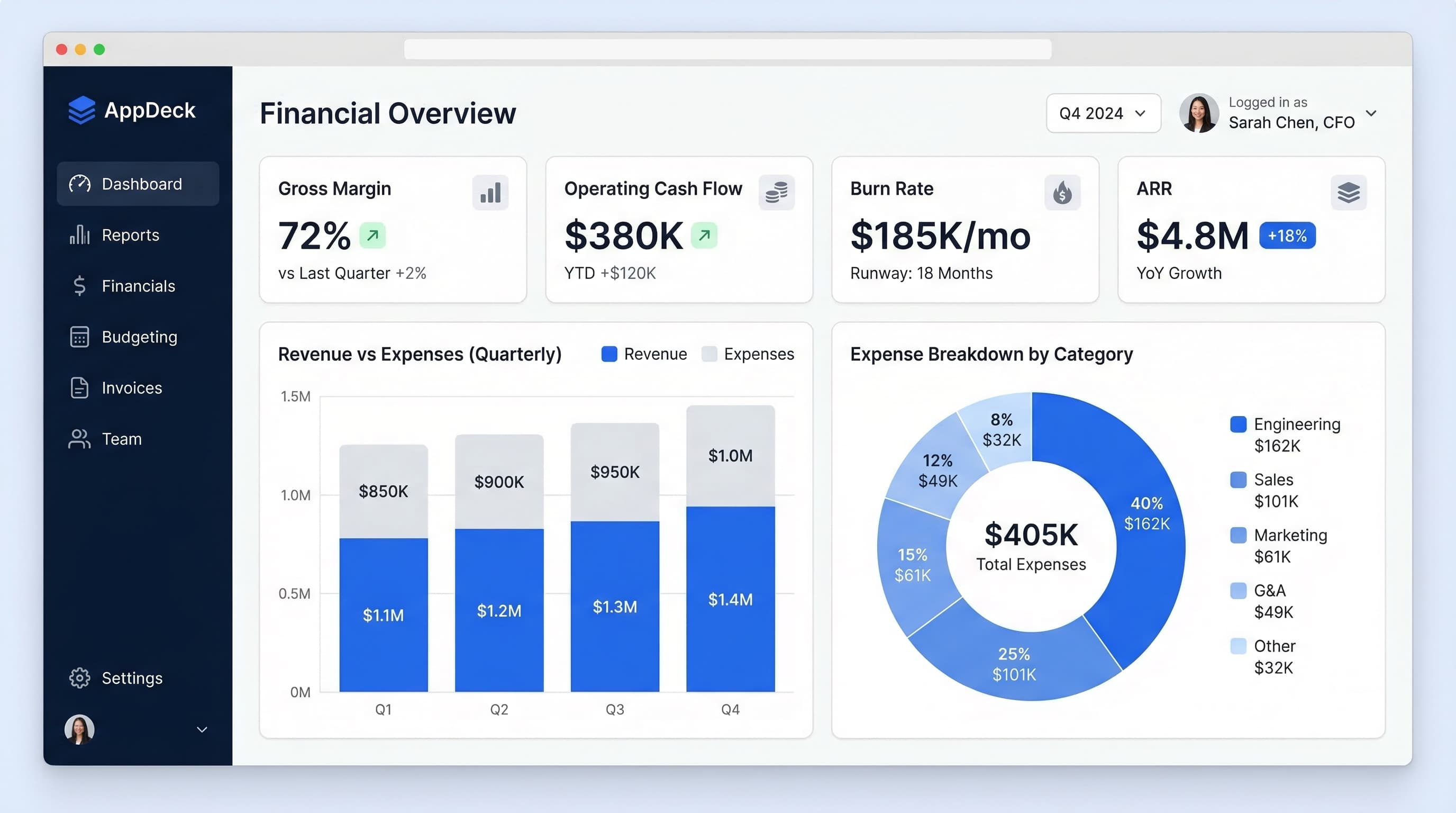
Free Power BI Dashboard Templates: Where to Get Them & How to Use Them
The best sources for free Power BI dashboard templates — official Microsoft samples, template apps, and community galleries — plus how to build your own from a free Excel data model.
Free Tableau Dashboard Templates: 7 Sources, 30 Layouts, and How to Use Them
Where to get free Tableau dashboard templates in 2026: 300+ official Accelerators, a 30-layout copy-paste workbook, 11 million Tableau Public vizzes, and the Excel data-model shortcut, plus step-by-step instructions for connecting your own data.