
Free Tableau Dashboard Templates: 7 Sources, 30 Layouts, and How to Use Them
Where to get free Tableau dashboard templates in 2026: 300+ official Accelerators, a 30-layout copy-paste workbook, 11 million Tableau Public vizzes, and the Excel data-model shortcut, plus step-by-step instructions for connecting your own data.
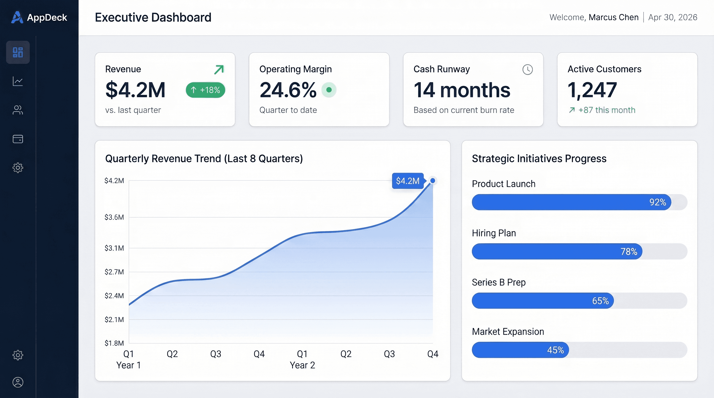
Shortcut: Tableau connects to Excel files natively. Every dashboard in our free Excel template library (financial, sales, KPI scorecard, operations, and more) works as a clean, pre-structured data source for your first Tableau dashboard. Free downloads, no paywall.
Key Takeaways
- Tableau has no "template gallery," but the Tableau Exchange hosts 300+ free Accelerators: pre-built dashboards with a data mapper that swaps in your data.
- One free Tableau Public workbook by Jeff Plattner holds 30 copy-and-paste dashboard layouts, the closest thing to a true layout template.
- Tableau Public has more than 11 million vizzes from 1.5 million authors, most downloadable as .twbx files (Tableau).
- For a first dashboard, connecting Tableau to a clean Excel data model is usually faster than adapting someone else's workbook.
- Tableau licensing starts at $15 per viewer and $75 per creator per month. For stakeholders who glance at seven numbers monthly, that math rarely works.
Introduction
Searching for "Tableau dashboard templates" is more confusing than it should be.
Excel has a File > New gallery. Power BI has .pbit files. Tableau has neither, so the search results are a mix of Tableau Public profiles, Pinterest boards, stock-image sites, and paid template stores. The good stuff exists. It is just not labeled "templates."
What Tableau does offer is better than a gallery once you know where to look: hundreds of officially maintained pre-built dashboards, a community layout workbook you can copy from in seconds, millions of downloadable workbooks to dissect, and sample data that ships inside the product.
This guide covers all seven free sources, what each one is actually good for, the step-by-step process for putting your own data into a downloaded workbook (the step where most people get stuck), the design rules that make the result usable, and when Tableau is the wrong delivery tool for the dashboard you are building.
What Counts as a Tableau Dashboard Template?
Three different things get called a Tableau template, and knowing which one you are downloading saves an afternoon.
1. Layout templates. A .twbx workbook with empty dashboard containers already arranged: header, KPI row, filter pane, chart grid, footer. No data model to speak of. You copy the dashboard into your workbook and drop your own worksheets into the placeholders. Fast, low-risk, and the closest thing to a "template" in the Excel sense.
2. Accelerators. Fully built dashboards with a sample data source, published by Tableau and its partners. Each one documents the fields it expects. You connect your data, map your columns to theirs, and the finished dashboard populates. More value, more setup.
3. Sample and community workbooks. Complete dashboards built around someone else's data: Tableau's Superstore samples, Tableau Public downloads, practitioner blog workbooks. Excellent for learning technique. Adapting one usually means rebuilding each worksheet against your own fields.
Two things people also search for are not templates at all. "Tableau dashboard background templates" are image files (PNG or SVG) placed as floating background objects for a branded look, which you can make in any design tool or Figma. "Tableau dashboard templates PPT" are PowerPoint mockups of dashboards for presentations, useful for pitching a design before you build it, but they contain no Tableau logic.
Where Can You Get Free Tableau Dashboard Templates? 7 Sources
1. Tableau Accelerators (the Official "Templates")
Accelerators are the starting point for anyone who means "template" the way Excel users mean it. Tableau (Salesforce) publishes them free on the Tableau Exchange, and the catalog now runs to well over 300 entries covering standard business scenarios and specific data sources.
A sample of what is there:
| Accelerator | Business area | Built for |
|---|---|---|
| Weighted Sales Pipeline | Sales | Salesforce Sales Cloud |
| Financial Statement | Finance | Any general ledger export |
| Budget Controlling | Finance | Budget vs. actual data |
| Email Performance by Campaign | Marketing | Marketo |
| Google Analytics | Marketing | Google Analytics |
| Call Center Agent Analytics | Customer service | Call center exports |
| Project Portfolio | Project management | Project tracker data |
| Workforce | HR | HRIS exports |
| Retail Sales, Sales and Margin | Retail and operations | Transaction data |
| Snowflake Account Usage | Cloud operations | Snowflake |
You can browse them three ways: on the Exchange website (filter by industry and data type, download the .twbx), from the More Accelerators link on the Tableau Desktop start page, or inside Tableau Cloud when creating a new workbook, where a smaller cloud-native set appears (Salesforce, ServiceNow, LinkedIn, Marketo, Oracle Eloqua).
Best for: exactly what most people mean by "template." Start here.
Watch out for: the field-mapping step. If your data lacks the columns the Accelerator expects, you will spend the afternoon reshaping data, not designing dashboards. Since Tableau 2023.1, many Accelerators include a Data Mapper that turns this into a drag-and-match exercise; the older ones still require the manual Replace Data Source workflow covered below.
2. Jeff Plattner's Dashboard Layout Templates (30 Free Layouts)
The number one Google result for this search is a single Tableau Public workbook, and it deserves the spot. Jeff Plattner's Tableau Dashboard Layout Templates contains 30 pre-built dashboard layouts, each a set of arranged containers with placeholder sheets for the logo, title, filters, KPI tiles, and charts (Tableau blog).
Using it takes about two minutes:
- Download the workbook from Tableau Public and open it in Tableau Desktop.
- Find the layout you want, right-click its dashboard tab, and choose Copy.
- In your own workbook, right-click any tab and choose Paste.
- Replace each placeholder sheet with your logo, title, filters, and worksheets.
Best for: teams that already have working worksheets and want a clean, consistent layout without fighting containers for an hour.
Watch out for: nothing serious. The layouts are sized for desktop; build a phone layout separately if you need one.
3. Tableau Public Business Dashboards
Tableau Public hosts more than 11 million visualizations from over 1.5 million authors, and more than a million new vizzes were published in 2024 alone (Tableau). Most authors allow downloads. Open any viz, click the download icon, choose Tableau Workbook, and you get the .twbx with data included.
Search for your function plus "dashboard" ("executive KPI dashboard," "sales pipeline dashboard") and sort by popularity. The Business Dashboards channel is curated, so start there before a general search.
Best for: design inspiration and learning technique. Want to see how someone built a KPI tile with a sparkline and a colored delta? Download one, open the worksheet, and read the calculated fields.
Watch out for: treating it as plug-and-play. Every public workbook is built around its author's columns and metric definitions. Reverse-engineer it; do not expect to swap data and ship.
4. Built-In Sample Workbooks
Tableau Desktop ships with sample workbooks, including the famous Superstore dataset, that demonstrate solid dashboard construction: fixed-size layouts, filter actions, a KPI row above trend charts. Unglamorous, maintained, and they open instantly from the start page. Copying their structure is a legitimate fast start for a first dashboard.
5. Tableau's Dashboard Examples Gallery
Tableau's own Dashboard Examples page ranks second for this search. It is a curated gallery of finished dashboards by industry and function, many of them Tableau Public vizzes you can download. Treat it as the editorial layer over source 3: fewer choices, higher average quality, and every example is a real working dashboard rather than a mockup.
6. Practitioner Blogs and GitHub
Tableau has one of the strongest practitioner communities in analytics. Consulting firms and Tableau Visionaries publish free workbooks with detailed build write-ups: finance dashboards, inventory dashboards, sales dashboards, each with the data model explained. Quality is often excellent; discoverability is poor, and many are two or three Tableau versions old.
Vet a download the same way you would vet any spreadsheet from the internet. Check the publish date, open every calculated field, and sanity-check the metric definitions against your own. A "win rate" formula written against someone else's stage names will silently produce nonsense on yours.
7. A Clean Excel Data Model (Often the Fastest Path)
Here is the practical reality for a first dashboard: the bottleneck is never Tableau's charts. It is clean, sensibly structured data. Tableau connects to Excel natively (Connect > Microsoft Excel), and a well-structured workbook becomes a working data source in seconds.
That is what our free Excel dashboard templates provide: realistic sample data in clean, single-header tables, one business function each, with the metric definitions already worked out.
| Excel starting point | Tableau dashboard it becomes | Free download |
|---|---|---|
| Executive Summary Dashboard | One-page C-suite overview | Download .xlsx |
| Financial KPI Dashboard | P&L, cash flow, budget vs. actual | Download .xlsx |
| Sales Dashboard | Pipeline, win rate, forecast | Download .xlsx |
| KPI Scorecard | Company KPI status board | Download .xlsx |
| Marketing Dashboard | Funnel and channel performance | Download .xlsx |
| Operations Dashboard | Throughput, quality, on-time delivery | Download .xlsx |
| HR Dashboard | Headcount, hiring funnel, turnover | Download .xlsx |
| Customer Success Dashboard | Retention, health scores, NPS | Download .xlsx |
The workflow: download the .xlsx, connect Tableau to it, rebuild the KPI cards and trend charts as Tableau worksheets, then repoint the data source at your real data. The build takes 30 to 60 minutes and teaches more than any template does. The full 15-template Excel roundup covers every function if yours is not above, and the Google Sheets versions work the same way through Tableau's Google Sheets connector.
A Note on Paid Tableau Templates
Paid template packs exist. Nudge BI, for example, sells 18 light and dark layout templates with an icon library for a one-time $249 (solo) or $399 (team). They are well made and are the right call for one specific buyer: a consultancy or internal BI team producing many dashboards that must look identical and on-brand. For a single dashboard, the free layout workbook in source 2 covers the same need.
How Do You Use a Tableau Dashboard Template With Your Own Data?
This is the step where most template downloads die. There are three paths depending on what you downloaded.
Path A: Accelerators With the Data Mapper
For Accelerators that support it (Tableau 2023.1 and later), the Data Mapper opens automatically or from Data > Open Data Mapper.
- Select Get Started.
- Connect to your data or pick an existing data source. Drag tables onto the canvas if the Accelerator expects more than one.
- Map each Accelerator field to your field. The mapper only offers columns of a matching data type, which prevents most mistakes.
- Select Replace Data. The sample data is removed and every worksheet repoints to yours.
The mapper saves your selections when closed (2023.2 and later), so you can map half the fields, fix your data, and come back.
Path B: Manual Replace Data Source
For older Accelerators, Tableau Public downloads, and blog workbooks, adaptation follows the same five steps every time:
- Study the data model first. Open the Data Source tab and look at the tables and relationships before touching any visual. Every worksheet depends on this structure.
- Connect your data as a new source. Data > New Data Source. Do not delete the sample source yet.
- Replace the data source. Go to any worksheet, then Data > Replace Data Source. Tableau swaps every worksheet's fields from the sample to yours where field names match.
- Fix the broken pills. Fields that did not match show a red exclamation mark. Right-click > Replace References and choose your equivalent column. This is most of the work; budget accordingly.
- Sanity-check every calculation. Open each calculated field and confirm the formula matches your definition of the metric. Rename the sample fields to match yours before step 3 and most of step 4 disappears.
If step 4 balloons (dozens of unmatched fields, calculations referencing columns you do not have), that is the signal to start clean from your own data instead. It is not a failure; it is usually faster.
Path C: Layout Templates
Copy the dashboard tab from the template workbook, paste it into yours, and swap the placeholder sheets for your own. No data mapping at all, because a layout template has no data. Build your worksheets first, then bring in the layout.
Tableau Dashboard Design: Rules That Survive Any Template
Whatever the source, the dashboards executives actually open follow the same rules. These are the ones that matter most in Tableau specifically. Our executive dashboard design guide covers the general principles in depth.
Fix the size. Set the dashboard to a fixed size (1200 × 800 works for most laptop screens) rather than Automatic. Automatic sizing reflows containers unpredictably and is the main reason dashboards that looked fine on the analyst's monitor look broken in the boardroom. Add a separate phone layout through Device Preview if people will open it on mobile.
One screen, no scrolling. Tableau makes vertical scroll containers easy. Resist them for executive views. If it does not fit on one screen, it is two dashboards or a drill-down action.
Five to seven KPIs across the top. Big number tiles with the current value, the delta versus target or prior period, and a color signal. Everything below the KPI row explains the KPI row.
Use containers, not floating objects. Tiled layout containers keep alignment consistent as content changes. Float only for logos and a background image.
Every number gets context. A value without a target, a prior period, or a sparkline is trivia. In Tableau this usually means a calculated field for the delta and a second one returning "▲" or "▼" for the indicator.
Color signals status, nothing else. Tableau's default palettes are attractive. Attractive is not the job. Two or three brand colors for structure, green and red reserved for on-target and off-target, gray for everything secondary.
Filters in one place. A single filter pane on the left or top, applied to all worksheets on the dashboard through Apply to Worksheets > All Using This Data Source. Scattered filters are the fastest way to confuse a director.
The honest answer to "how do I make my Tableau dashboard look nice?" is whitespace and restraint. Padding of 10 to 20 pixels between containers, one font family, and fewer charts than you think you need do more than any color scheme.
8 Tableau Dashboard Template Ideas by Business Function
If you are starting from a clean data model rather than a downloaded workbook, these are the blueprints that work. Each one maps to a free Excel data source above.
Executive summary. Four to six KPI tiles (revenue, customers, cash, a quality metric like NPS), a 12-month revenue-versus-target line, and one breakdown chart. A single parameter switches the period. This is the dashboard the CEO dashboard metrics guide describes in detail.
Financial KPI. MRR or revenue, gross margin, burn, and runway on top. A waterfall for revenue movement, a budget-versus-actual bar chart by category, and a variance table with conditional color. Finance teams should read the CFO dashboard metrics post before choosing the KPI row.
Sales pipeline. Quota attainment, pipeline coverage, win rate, and average deal size as KPIs. A funnel by stage, a horizontal bar of reps sorted by attainment, and a top-deals table with a close-date highlight. Weighted pipeline is a single calculated field: amount multiplied by stage probability.
Marketing performance. Leads, MQLs, CAC, and marketing ROI. A stacked bar of leads by channel over time and a scatter of channel cost against volume. Campaign table underneath.
Operations. Throughput, on-time percentage, error rate, and SLA compliance. A control chart with reference bands for upper and lower limits (Tableau's reference lines make this a two-minute build) and a Pareto of defect categories.
HR and people. Headcount versus plan, open roles, turnover, and eNPS. A hiring funnel, a headcount line by month, and a department table with tenure.
Customer success. Net revenue retention, logo churn, NPS, and CSAT. A donut of account health, a churn-versus-expansion line, and an at-risk accounts table sorted by renewal date. Our KPI dashboard examples post shows twenty more variations across functions.
Project status. Active, on-track, at-risk, and overdue counts. A Gantt built from a bar chart on a date axis, a stacked resource-allocation bar, and a project table with owner and risk flag.
Can AI Build a Tableau Dashboard for You?
Partly, and the honest answer matters because it is one of the most-asked questions on this topic.
General-purpose assistants like ChatGPT or Claude are good at three Tableau tasks: writing and debugging calculated fields (including LOD expressions that trip people up), explaining what a downloaded workbook's formulas do, and proposing a layout and KPI set for a given audience. They cannot reliably produce a working .twbx file; the workbook format is XML wrapped around a data extract, and hand-generated versions tend to fail on open.
Inside the product, Salesforce has been adding generative features under the Tableau+ bundle, including natural-language authoring help and Tableau Pulse for metric summaries. Those require the higher-priced Tableau+ edition, which is sold through a sales conversation rather than the public price list.
The practical workflow in 2026: use an AI assistant to design the KPI set and write the calculations, then build the worksheets yourself against a clean data model. Templates and AI both save time on the same step, which is deciding what to show. Neither replaces knowing your data.
When Is Tableau the Wrong Tool for the Dashboard?
Tableau is a superb analytics platform, and that is precisely why it is often the wrong dashboard delivery tool.
Cost scales with viewers. Tableau Cloud Standard is priced at $15 per Viewer, $42 per Explorer, and $75 per Creator per user per month, billed annually; the Enterprise edition runs $35, $70, and $115 (Tableau pricing, 2026). Every deployment needs at least one Creator. For a seven-person board that opens one dashboard a month, one Creator plus seven Viewers is $180 per month, or $2,160 a year, before the analyst's time.
It assumes an analyst owns it. Field mappings, extracts, refresh schedules, and version upgrades: someone has to maintain them. Without that person, the dashboard is stale within a quarter and the board stops opening it.
External sharing is clunky. Getting a dashboard in front of investors, clients, or board members who are not in your Tableau environment means buying them licenses, an embedding project, or screenshots pasted into a deck.
If the actual requirement is "our board and leadership see five to seven current KPIs in a professional, branded view," that is what AppDeck's executive dashboards do without the BI platform overhead. Stakeholders open a link to your branded portal with no per-viewer licensing, and the same portal can hold the board packet, the investor update, or the client report next to the numbers. Teams that need deep analytics run both: Tableau for the analysts who explore data, a portal for the stakeholders who glance at it. The executive dashboard software comparison walks through when each option fits.
Frequently Asked Questions
Does Tableau have built-in dashboard templates?
Not under that name. The equivalents are Accelerators (300+ free pre-built dashboards on the Tableau Exchange, also reachable from the Tableau Desktop start page), sample workbooks inside Tableau Desktop, and downloadable community workbooks on Tableau Public. Accelerators are the closest thing to a true template: pre-built, documented, and officially maintained, with a Data Mapper for connecting your own data in supported versions.
Are Tableau Accelerators free?
Yes. Accelerators are published free on the Tableau Exchange by Tableau and its partners. You need a Tableau Creator license to open them in Tableau Desktop and connect your own data, but the Accelerators themselves cost nothing. Salesforce-specific Accelerators additionally require API access to your Salesforce org.
Can I use Tableau dashboard templates without buying Tableau?
Partially. Tableau Desktop Public Edition is free and opens any .twbx, including Accelerators and layout templates, but it saves only to the public web, which is fine for learning and wrong for company data. Working privately with your own data requires a Creator license at $75 per user per month on Tableau Cloud Standard.
Can Tableau connect to an Excel dashboard template?
Natively. Choose Connect > Microsoft Excel and each sheet or named table becomes a usable data source. Clean, single-header tabular files such as our free dashboard templates work immediately. Files that use merged cells, multi-row headers, or formatting as structure need the Data Interpreter or a manual cleanup first.
What size should a Tableau dashboard be?
Use a fixed size rather than Automatic. 1200 × 800 pixels fits most laptop browsers without scrolling; 1366 × 768 matches many corporate displays. Fixed sizing keeps containers where you put them. Add a phone layout through Device Preview if the dashboard will be opened on mobile, since a desktop layout shrunk to a phone is unreadable.
Where can I find Tableau dashboard background templates?
Background templates are image files, not Tableau objects. Designers build them in Figma or PowerPoint at the dashboard's fixed pixel size, export as PNG, and place them as a floating image object at the back of the dashboard with worksheets tiled on top. Several free ones circulate on Tableau Public; searching "dashboard background" there is the fastest route.
Should I use Tableau or Excel for a KPI dashboard?
Excel for a weekly five-to-seven-KPI leadership scorecard that one person maintains; the KPI dashboard template for Excel gets that done in 15 minutes. Tableau when you need interactive exploration, live connections to databases, or data too large for a spreadsheet. Do not buy a BI platform to display seven numbers to people who will never click a filter.
Conclusion
Skip the paid template sites unless you are producing dashboards at volume. Tableau's free ecosystem covers everything a template store sells: Accelerators for pre-built dashboards with data mapping, Jeff Plattner's layout workbook for structure, Tableau Public and the official examples gallery for inspiration, and the sample workbooks for fundamentals.
Quick start:
- Pick an Accelerator or a layout from the 30-layout workbook.
- Connect a clean data source; a free Excel template if yours is not ready.
- Map or replace the data, then fix every red pill and check every calculation.
- Set a fixed size, five to seven KPIs on top, one filter pane, status colors only.
- Ask who the audience is. Analysts get Tableau; stakeholders get a link.
When the adaptation work outweighs the head start, connect Tableau to a clean Excel data model and build the five worksheets you actually need. And when the audience is stakeholders rather than analysts, deliver the dashboard through a portal instead and save the Tableau licenses for the people who explore data.
Related Reading

Founder & CEO, AppDeck
Serial entrepreneur with 20+ years building B2B software companies. Co-Founder of UnifyCX (formerly GlowTouch), which has 6,000+ employees. Vik reviews all AppDeck content for accuracy and practical relevance.
Share this article
Explore Related Solutions
Related Articles
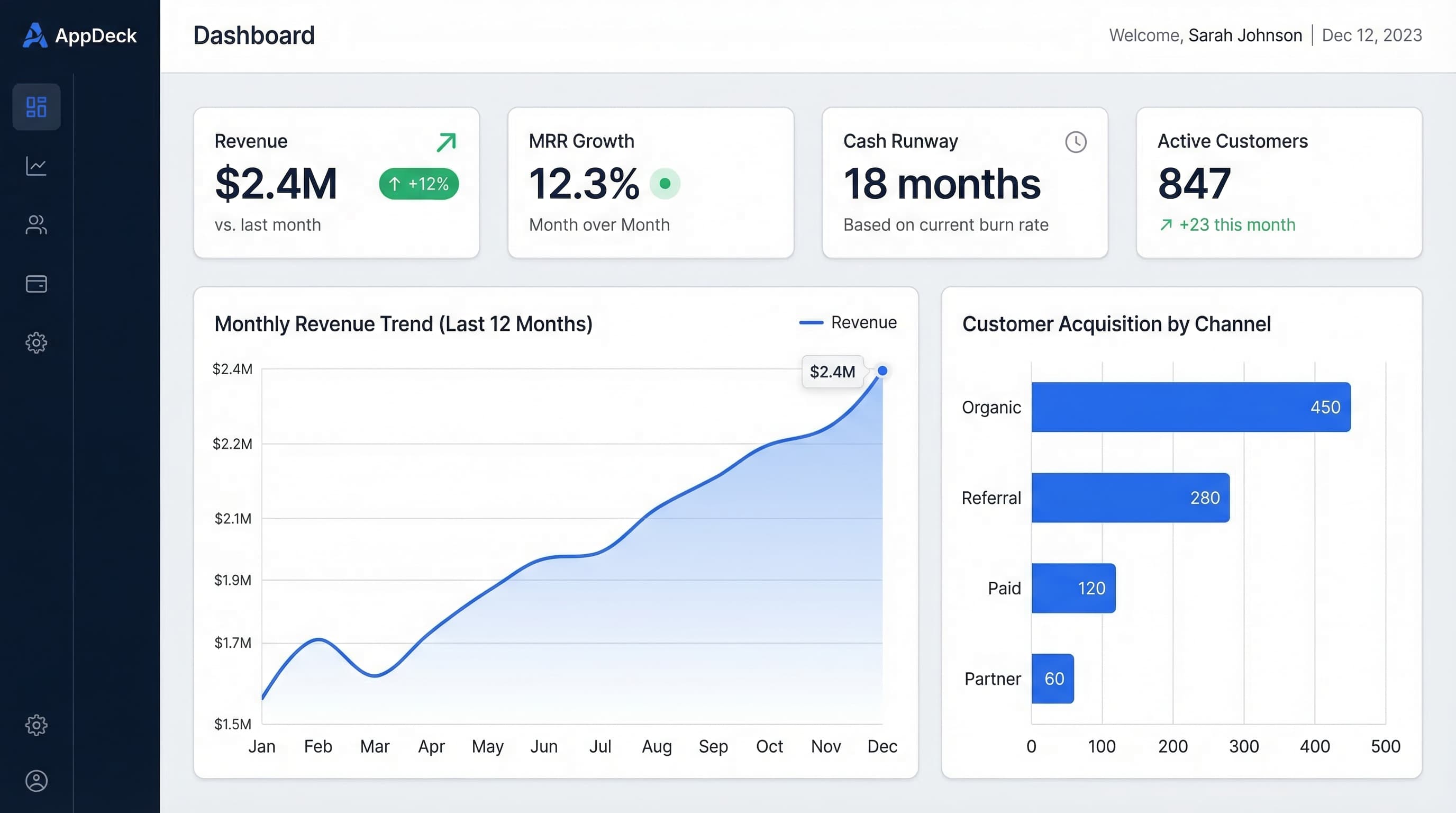
15 Free Excel Dashboard Templates (Dynamic .xlsx Files to Download)
Download 15 free Excel dashboard templates: dynamic .xlsx files for CEO, CFO, sales, marketing, HR, and operations teams, with sample data, charts, conditional formatting, and working formulas.
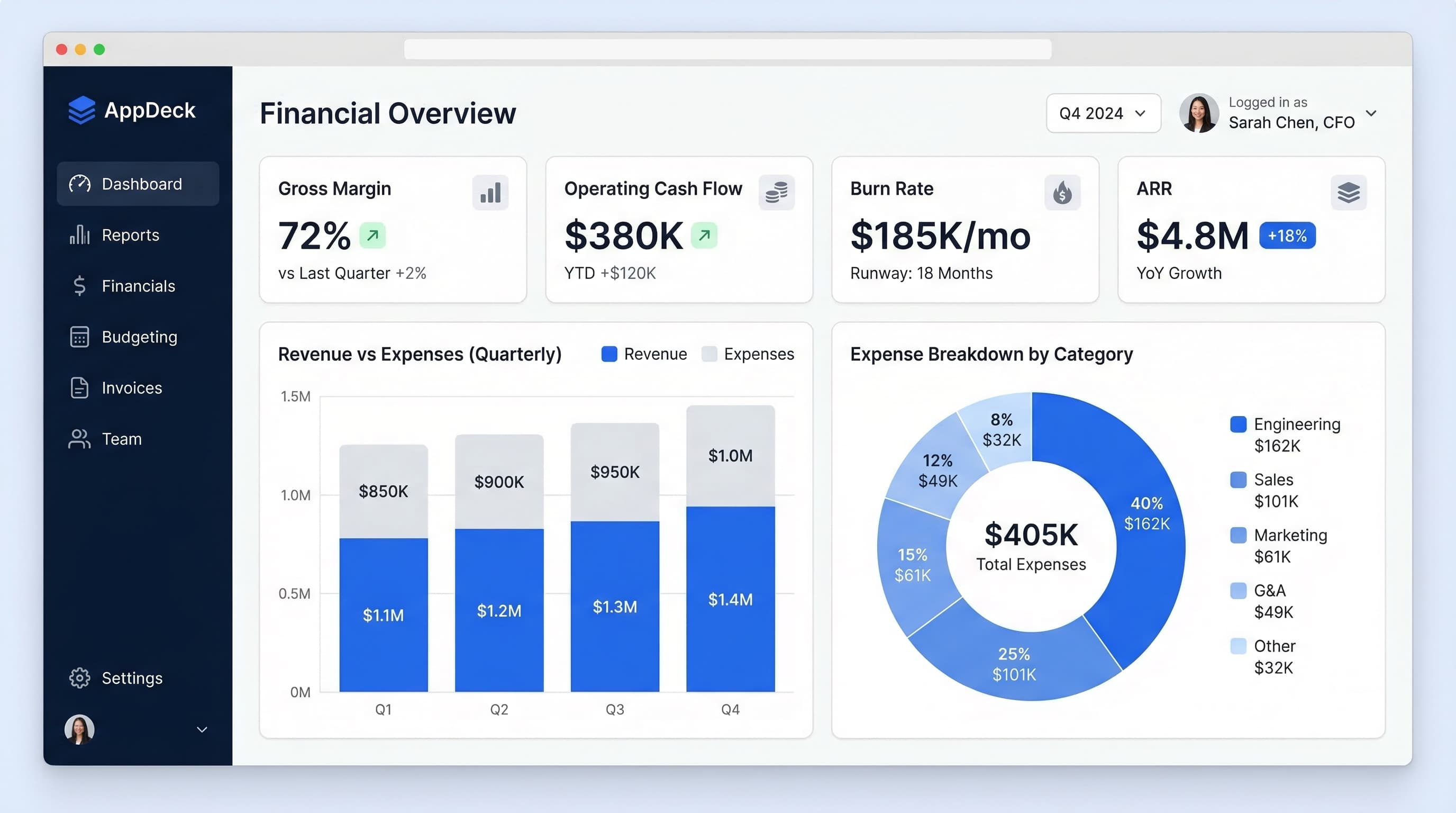
Executive Dashboard Design Best Practices: 10 Rules (With Real Examples)
How many KPIs? Which layout? 10 executive dashboard design best practices with real CEO and CFO examples, the 5-7 KPI rule, common mistakes, and a free Excel template.
Free Power BI Dashboard Templates: Where to Get Them & How to Use Them
The best sources for free Power BI dashboard templates — official Microsoft samples, template apps, and community galleries — plus how to build your own from a free Excel data model.