
Financial Dashboard Template
A financial dashboard template that summarizes the P&L, cash flow, balance sheet, and key ratios in one page — built for the monthly finance review, ready to drop into a board pack, and small enough that a non-finance executive can actually read it.
Download this template — free
Tell us where to send the link. We'll never share your email.
What's included
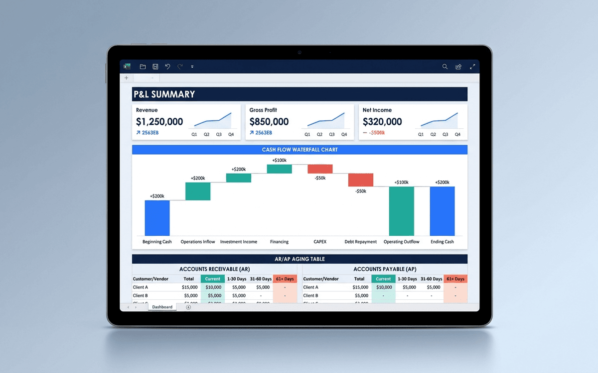
- P&L summary (revenue, COGS, gross margin, opex, EBITDA)
- Trend charts: revenue, gross margin %, operating cash flow
- Cash position and 12-month runway projection
- AR aging summary (current, 30, 60, 90+ days)
- AP aging summary
- Key ratios (gross margin, burn multiple, magic number, CAC payback)
- Variance to budget table
- Source data on a separate Data tab
How to use this template
1. Pull the data from your accounting system
Export the trial balance or P&L by month from QuickBooks (or whatever your accounting system is). Paste into the Data tab in the structure shown. The dashboard auto-aggregates by month and quarter.
2. Build the variance-to-budget column right away
The single most useful column on a financial dashboard is "actual vs. budget." Plug your budget into the budget column on the Data tab and the variance column fills in automatically. Anything more than 10% variance gets called out in the monthly review.
3. Show runway based on TRAILING burn, not projected burn
Founders systematically underestimate runway because they project optimistic future spending. The dashboard calculates runway based on trailing 3-month average burn — more conservative, more defensible, what investors model from.
4. Reconcile to the source every month
Dashboards drift. Build a fixed monthly close cadence: data refresh, ratio recalculation, then reconcile the headline numbers against the GL. Same day every month. Without this discipline, the dashboard becomes plausible-looking but wrong.
5. Pair this with a 13-week cash forecast
This dashboard is the look-back. The forward-looking equivalent is a 13-week cash forecast — short-horizon, bottom-up, owner by line. They complement each other; the dashboard is for the board and the forecast is for the operator. Build both.
Who it's for
- CFOs at SMBs running a monthly finance review
- Founders without a CFO who need a defensible financial view
- Controllers preparing the monthly board pack
- Operators getting ready for a fundraise
Frequently asked questions
- What metrics belong on a financial dashboard?
- Revenue, gross margin, EBITDA (or operating loss), cash on hand, runway, AR aging, AP aging, and 3–5 ratios relevant to the business (CAC payback, magic number, burn multiple, GMV, contribution margin). Variance to budget on the headline lines.
- What's the difference between a CFO dashboard and a financial dashboard?
- Practically: not much. "CFO dashboard" tends to lean operational (forecasts, hiring plan, cash forecast, departmental spend); "financial dashboard" leans historical (P&L, balance sheet, cash flow). The template here covers both — for SMBs the CFO and the finance dashboard are the same artifact.
- How often should we update the financial dashboard?
- Monthly, after the books close. Weekly is too noisy for financial metrics that lag billing and accounting. If you want weekly cash visibility, run a separate 13-week cash forecast.
- Should the financial dashboard go in the board pack?
- Yes — typically as one of the first pages, after the CEO update. Boards want to see the financial state first and then dig into operating details. Make sure the dashboard is readable on a single page printed letter-size before sending.
- When do we outgrow an Excel financial dashboard?
- Around $5M–$10M ARR or when finance becomes a multi-person function. At that point you want a real FP&A tool (Mosaic, Cube, Causal, or Anaplan for larger companies) that consolidates the dashboard, the budget, the forecast, and the actuals into a single living artifact.
More dashboards templates
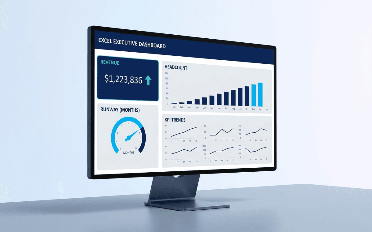
Executive Dashboard Template
An executive dashboard template gives leaders a one-page view of what actually matters — revenue, runway, headcount, and customer health — with the formulas and chart structure already built so you spend zero time formatting and all your time on the conversation.
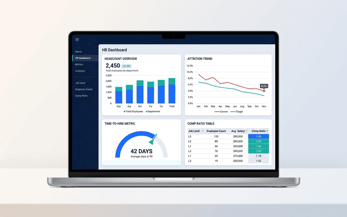
HR Dashboard Template
An HR dashboard template covering the metrics people leaders actually run their org against — headcount and attrition trends, time-to-hire, comp ratios, and DEI signals — laid out as a one-page monthly review the entire leadership team can read.
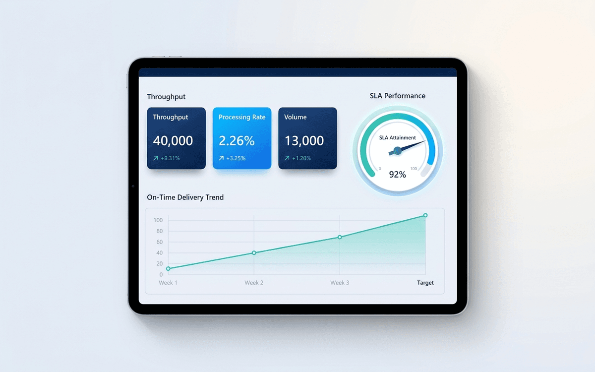
Operations Dashboard Template
An operations dashboard template that tracks the levers operators actually pull — throughput, SLA attainment, quality, capacity utilization, and on-time delivery — in a one-page weekly review format.
When the template isn't enough
AppDeck's dashboards portal turns this template into a live workspace — version control, permissions, signatures, and analytics built in.