
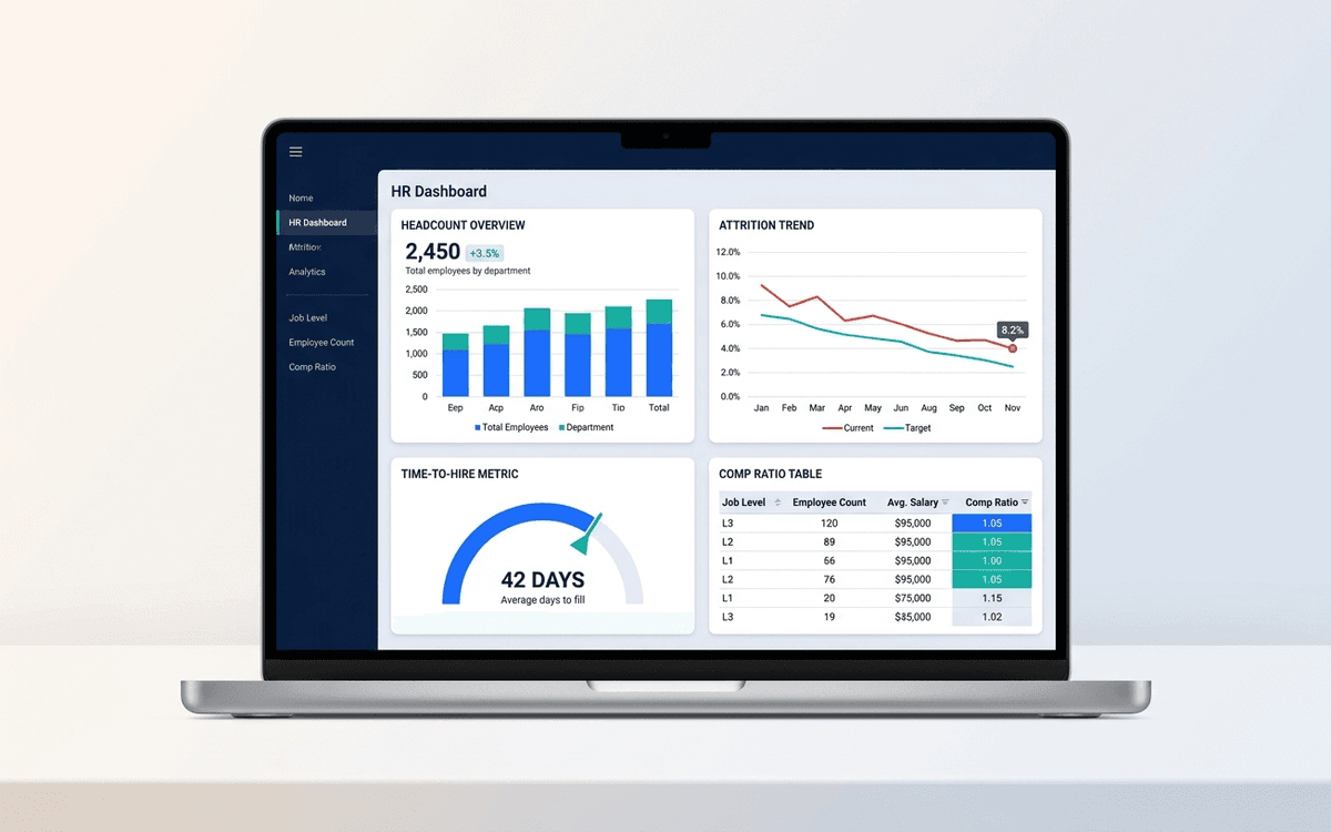
HR Dashboard Template
An HR dashboard template covering the metrics people leaders actually run their org against — headcount and attrition trends, time-to-hire, comp ratios, and DEI signals — laid out as a one-page monthly review the entire leadership team can read.
Download this template — free
Tell us where to send the link. We'll never share your email.
What's included
- Headcount by team, level, and location
- Trend chart: headcount by month, hires vs. exits
- 12-month rolling attrition (overall + regrettable)
- Open roles, days open, and source-of-hire breakdown
- Time-to-hire and time-to-fill metrics
- Comp ratio by level (midpoint comparison)
- DEI signals (gender, ethnicity at company level — anonymized for small teams)
- Engagement / eNPS trend (if you track it)
- Source data on a separate tab
How to use this template
1. Drop your HRIS export into the Data tab
Most HRISes (Rippling, Gusto, BambooHR, Workday) export headcount as a CSV. Paste it into the Data tab in the structure shown. The dashboard auto-aggregates by team and month.
2. Define "regrettable" attrition explicitly
Attrition is meaningless without separating regrettable (people you wanted to keep) from non-regrettable (performance-managed exits, role changes, structural). The dashboard has two attrition lines; tag each exit in the Data tab. Boards care about regrettable; the total is for context only.
3. Pair time-to-hire with source quality
Time-to-hire alone can be gamed by lowering the hiring bar. Pair it with 30/60/90-day quality-of-hire signals (passed probation, promoted within 18 months, regretted exit within 12 months) by source. That tells you which channels actually produce hires that stick.
4. Be cautious with DEI metrics on small teams
At under 50 employees, DEI category counts can identify individuals. The dashboard suppresses categories with under 5 people by default. Anonymization isn't optional — it's the law in many jurisdictions and the right call ethically.
5. Run it monthly with the leadership team
HR metrics that aren't reviewed in front of the leadership team don't change behavior. Put a 15-minute slot on the monthly leadership meeting for the HR dashboard. Cover: attrition trend, open roles, time-to-hire, anything red on comp ratios.
Who it's for
- Heads of People at companies under 200 employees
- Founders who do their own people-ops
- Talent leaders reporting to the executive team
- Boards asking for hiring + retention visibility
Frequently asked questions
- What metrics belong on an HR dashboard?
- Headcount + trend, attrition (overall + regrettable), open roles + time-to-fill, source-of-hire mix, comp ratio by level, engagement/eNPS if tracked, and DEI signals. Skip vanity metrics (training hours per employee, average tenure) that don't drive decisions.
- What's a good regrettable attrition rate?
- Industry-dependent. Tech: 8–12% annualized regrettable attrition is considered healthy. Below 5% and you may not be losing your lowest performers; above 15% and something is wrong with comp, management, or product-market fit for the role.
- How is time-to-hire different from time-to-fill?
- Time-to-hire is the candidate-side metric: days from a candidate entering your pipeline to accepting an offer. Time-to-fill is the company-side metric: days from opening a req to filling it. Both matter — time-to-hire reflects pipeline efficiency, time-to-fill reflects overall hiring throughput.
- Should we show DEI metrics on the dashboard?
- Yes, but with care. Anonymize categories under 5 people. Show progress against publicly stated goals if you have them. Don't show DEI metrics WITHOUT context (industry benchmarks, year-over-year trend) — out-of-context numbers create either complacency or false alarm.
- When do we need a real HR analytics tool instead of Excel?
- Around 100+ employees, or when you have 3+ people in the People function, or when leadership wants live data without waiting for monthly refresh. Visier, Lattice, Culture Amp, and the analytics modules in modern HRISes all replace the spreadsheet at scale.
More dashboards templates
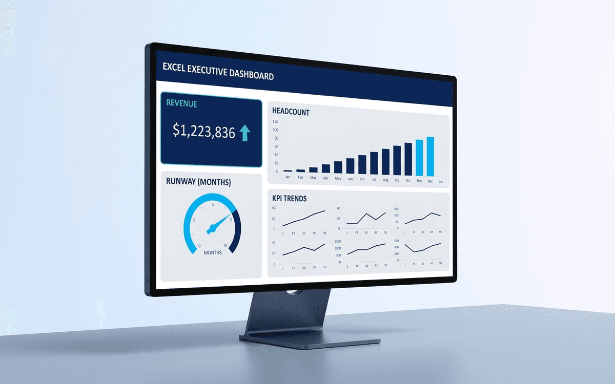
Executive Dashboard Template
An executive dashboard template gives leaders a one-page view of what actually matters — revenue, runway, headcount, and customer health — with the formulas and chart structure already built so you spend zero time formatting and all your time on the conversation.
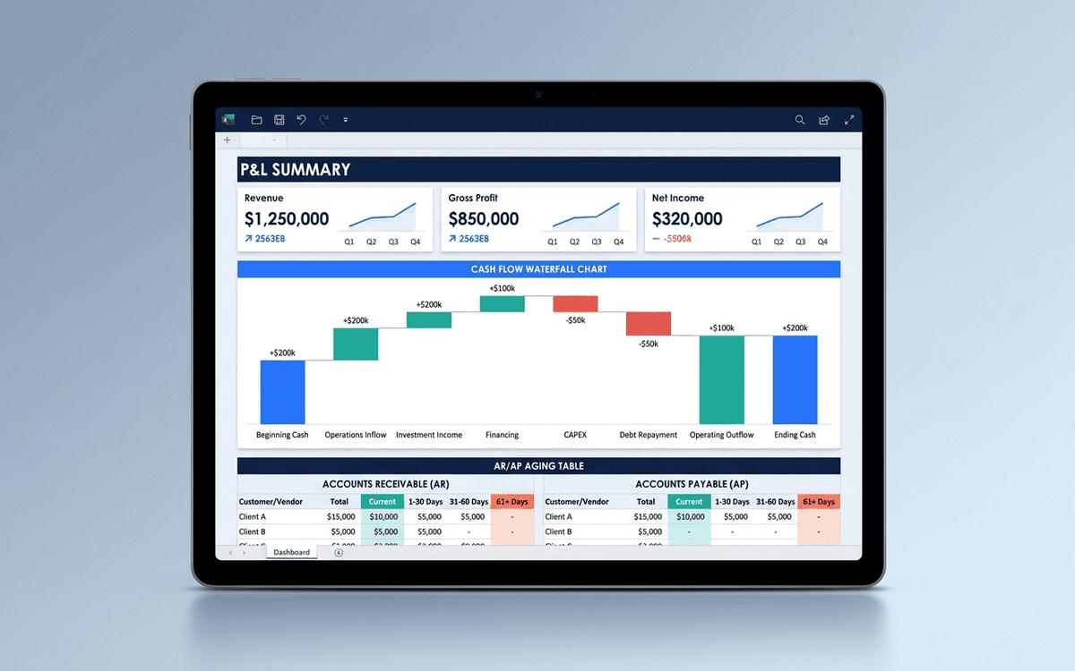
Financial Dashboard Template
A financial dashboard template that summarizes the P&L, cash flow, balance sheet, and key ratios in one page — built for the monthly finance review, ready to drop into a board pack, and small enough that a non-finance executive can actually read it.
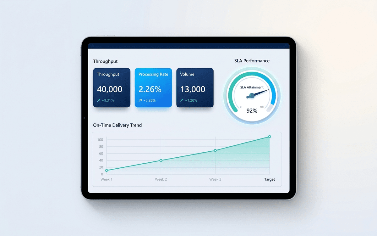
Operations Dashboard Template
An operations dashboard template that tracks the levers operators actually pull — throughput, SLA attainment, quality, capacity utilization, and on-time delivery — in a one-page weekly review format.
When the template isn't enough
AppDeck's dashboards portal turns this template into a live workspace — version control, permissions, signatures, and analytics built in.