
Operations Dashboard Template
An operations dashboard template that tracks the levers operators actually pull — throughput, SLA attainment, quality, capacity utilization, and on-time delivery — in a one-page weekly review format.
Download this template — free
Tell us where to send the link. We'll never share your email.
What's included
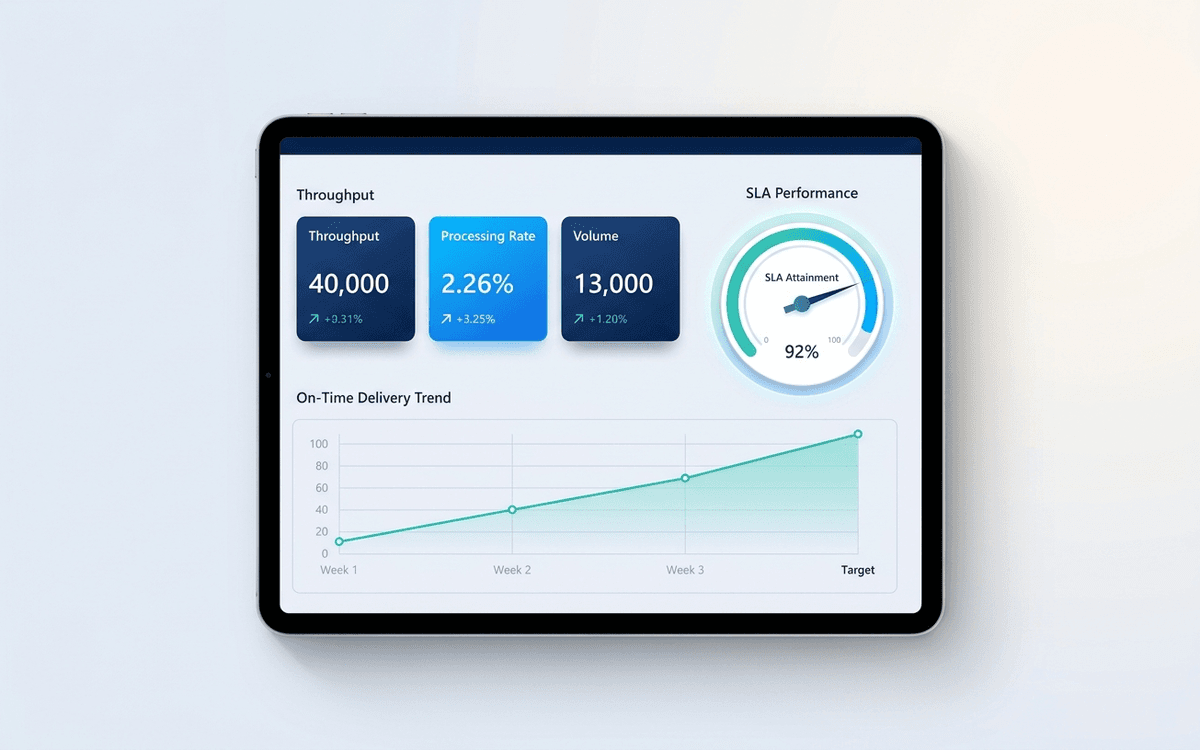
- Throughput tiles (units/day, units/week)
- SLA attainment by service tier
- On-time delivery percentage with trend
- Quality metrics (defect rate, first-time-right %)
- Capacity utilization by team or station
- Backlog and aging
- Incident / escalation log summary
- Cost-to-serve trend
How to use this template
1. Identify your operating cadence first
Operations dashboards run on tighter cadences than financial ones — typically weekly. Pick the cadence first (weekly Monday review, daily standup, etc.), then build the dashboard around that cadence. Daily dashboards need different aggregations than weekly ones.
2. Anchor everything to SLA, not throughput
Throughput is easy to optimize against and easy to misread — high throughput with poor quality is worse than moderate throughput with high quality. Anchor the dashboard to SLA attainment first; throughput becomes a supporting metric.
3. Show the trend, not just the snapshot
A single week of operations data is noise. Every tile pairs the current snapshot with a 4-week rolling average and a 12-week trend chart. Operations decisions get made on trends, not point-in-time numbers.
4. Track exceptions, not just averages
Averages hide the long tail. The dashboard surfaces the worst 5% of the queue (longest open items, most-escalated customers, lowest-quality stations) — operations improvement is almost always about removing the tail, not lifting the average.
5. Connect to the incident log
Operations dashboards become much more useful when paired with an incident log — every spike or red metric should have a linked incident entry explaining what happened. Six months of incidents tell the story of what to systematize next.
Who it's for
- COOs running weekly operations reviews
- Operations leaders at services businesses, agencies, or marketplaces
- Customer support leaders tracking SLA and queue health
- Logistics and supply chain managers
Frequently asked questions
- How does an operations dashboard differ from an executive dashboard?
- Cadence and depth. Executive dashboards are monthly and roll up to financial outcomes. Operations dashboards are weekly (or daily) and surface the leading indicators driving those outcomes. An executive dashboard says "revenue is below plan"; the operations dashboard explains why.
- What metrics belong on an operations dashboard?
- Throughput, SLA attainment, on-time delivery, quality (defect rate, first-time-right), capacity utilization, backlog age, and cost-to-serve. Skip metrics that don't map to a lever the operations team can pull this week.
- How often should we update the operations dashboard?
- Weekly is the most common cadence. Some businesses (high-volume support, logistics, e-commerce ops) need daily. Match the dashboard cadence to your decision cadence — if the team can only act on metrics weekly, daily updates create noise rather than insight.
- Should each team have its own operations dashboard?
- Yes — the dashboard in this template is the leadership-level rollup. Each team (support, ops, fulfillment, etc.) should have a more detailed functional dashboard that rolls up into it. Don't try to fit every team's metrics on one page.
- When do we outgrow an Excel operations dashboard?
- When you have multiple data sources (ticketing system + ERP + CRM + warehouse), when the team needs real-time visibility, or when the dashboard owner is spending more than 2 hours a week maintaining it. That's when Looker, Metabase, Tableau, or a purpose-built ops platform pays back.
More dashboards templates
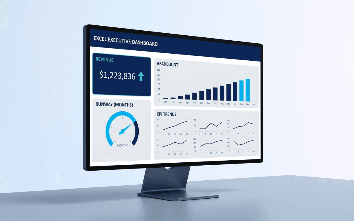
Executive Dashboard Template
An executive dashboard template gives leaders a one-page view of what actually matters — revenue, runway, headcount, and customer health — with the formulas and chart structure already built so you spend zero time formatting and all your time on the conversation.
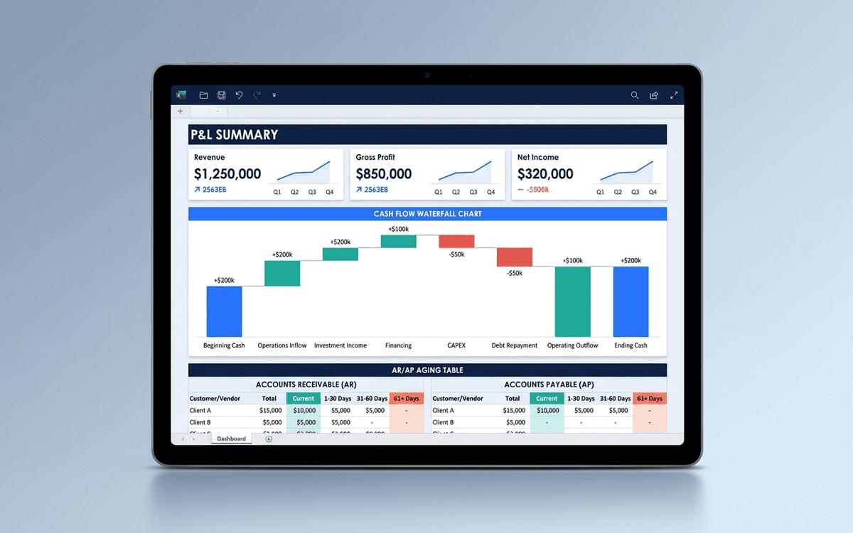
Financial Dashboard Template
A financial dashboard template that summarizes the P&L, cash flow, balance sheet, and key ratios in one page — built for the monthly finance review, ready to drop into a board pack, and small enough that a non-finance executive can actually read it.
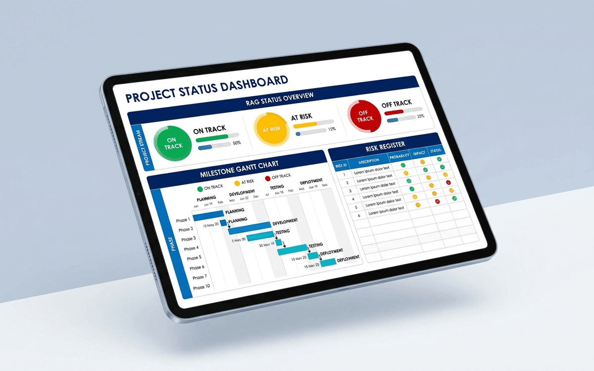
Project Status Dashboard Template
A project status dashboard template that surfaces what stakeholders actually want to know — milestone progress, RAG status, budget variance, and the top three risks — in a one-page weekly status report that doesn't take an hour to update.
When the template isn't enough
AppDeck's dashboards portal turns this template into a live workspace — version control, permissions, signatures, and analytics built in.