
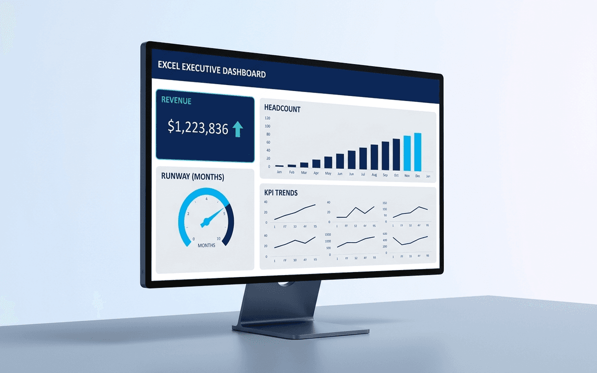
Executive Dashboard Template
An executive dashboard template gives leaders a one-page view of what actually matters — revenue, runway, headcount, and customer health — with the formulas and chart structure already built so you spend zero time formatting and all your time on the conversation.
Download this template — free
Tell us where to send the link. We'll never share your email.
What's included
- Headline tiles for revenue, MRR/ARR, gross margin, runway, headcount
- Trend charts: revenue growth, customer count, cash position
- Operating expense breakdown by department
- Customer cohort table (NRR, GRR, logo retention)
- Sample data populated for the last 12 months — replace with your own
- Source data on a separate tab so the dashboard stays clean
- Print-formatted for board distribution
How to use this template
1. Replace the sample data on the Data tab
The dashboard pulls from the Data tab — leave the Dashboard tab's layout alone and just overwrite the source values. Most cells you'll touch are in column B of the Data tab. The charts and formulas auto-update.
2. Pick 5–7 tiles that matter, hide the rest
Resist the urge to display everything. A good executive dashboard surfaces the 5–7 numbers that actually drive decisions. Hide the rest from the headline view and put them on a secondary tab. Dashboards that show 20 KPIs get scanned and forgotten; dashboards that show 5 get read and acted on.
3. Show the trend, not just the number
Every tile pairs a current value with a 12-month trend chart. The chart is what produces the conversation; the number alone produces nothing. Make sure each tile pairs a single big number with a small trend sparkline or chart.
4. Reconcile against your accounting system monthly
Executive dashboards drift away from the source of truth quickly. Build a monthly habit: reconcile the dashboard numbers against QuickBooks (or whatever your accounting system is) on the same day every month. The discipline matters more than the system.
5. Graduate to a live dashboard when your team grows
Excel dashboards work great through Series A. Once you have 3+ data sources and someone updating numbers weekly, you'll want a live BI tool (Looker, Metabase, or AppDeck's Executive Dashboard product) that connects directly to your data sources and updates in real time.
Who it's for
- CEOs who don't have a finance team to build the dashboard
- CFOs at SMBs assembling the first executive view
- Founders preparing the monthly investor update
- Boards asking for "just the highlights" each quarter
Frequently asked questions
- What goes on an executive dashboard?
- Five to seven core metrics — typically: revenue (or MRR/ARR), gross margin, cash position and runway, headcount, customer count or net retention, and one or two leading indicators specific to your business. Anything beyond seven dilutes attention.
- How often should the dashboard update?
- Monthly for an executive view. Weekly is too noisy for most strategic metrics (revenue, runway, headcount) and quarterly is too late to react. If you want a weekly cadence, build a separate operating dashboard with leading indicators (pipeline, NPS, support volume) — keep the executive dashboard at monthly.
- What's the difference between an executive dashboard and a KPI dashboard?
- An executive dashboard is anchored to a small set of strategic numbers a CEO/CFO/board cares about. A KPI dashboard is functional — sales, marketing, ops, support each have their own. Executive dashboards summarize and roll up; KPI dashboards drill down.
- Should the executive dashboard show targets or actuals only?
- Both. Every metric should show actual + target (or budget, or prior period) so the meaningful comparison is visible at a glance. A number without context is just a number; with context it becomes a decision input.
- When should we move off Excel to a live BI tool?
- When you have 3+ data sources, 2+ people maintaining the dashboard, or the dashboard is starting to drift away from the source of truth between updates. Looker, Metabase, Tableau, Domo, and purpose-built executive dashboards (like AppDeck's) all handle the multi-source live update problem.
More dashboards templates
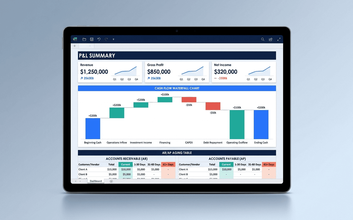
Financial Dashboard Template
A financial dashboard template that summarizes the P&L, cash flow, balance sheet, and key ratios in one page — built for the monthly finance review, ready to drop into a board pack, and small enough that a non-finance executive can actually read it.
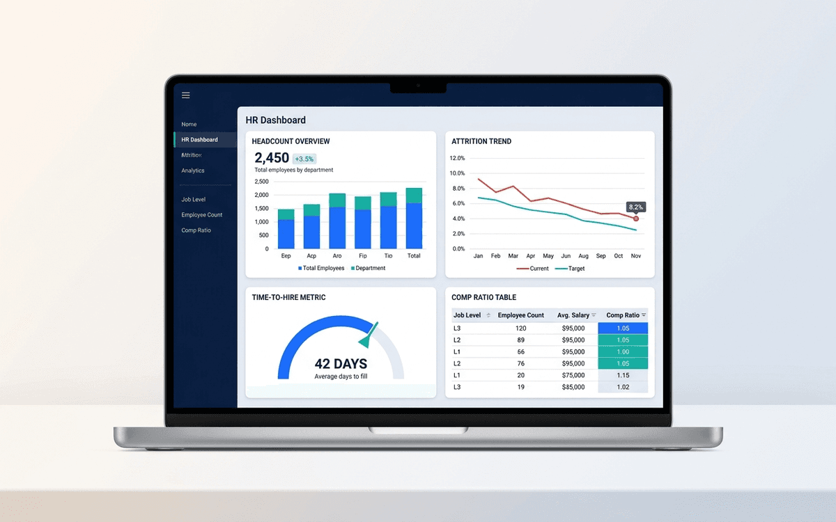
HR Dashboard Template
An HR dashboard template covering the metrics people leaders actually run their org against — headcount and attrition trends, time-to-hire, comp ratios, and DEI signals — laid out as a one-page monthly review the entire leadership team can read.
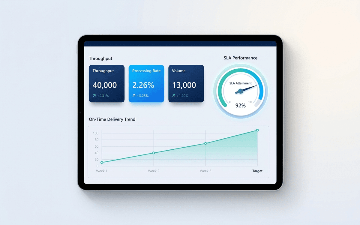
Operations Dashboard Template
An operations dashboard template that tracks the levers operators actually pull — throughput, SLA attainment, quality, capacity utilization, and on-time delivery — in a one-page weekly review format.
When the template isn't enough
AppDeck's dashboards portal turns this template into a live workspace — version control, permissions, signatures, and analytics built in.