
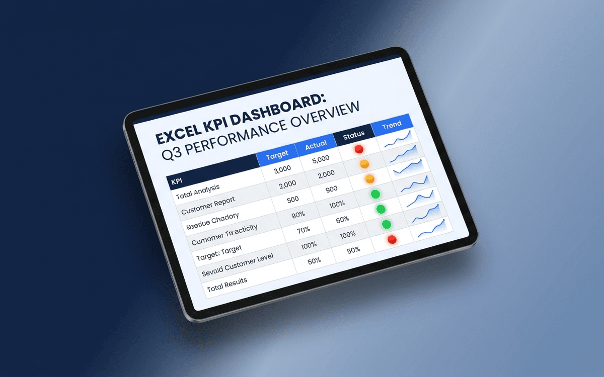
KPI Dashboard Template
A KPI dashboard template that separates leading from lagging indicators, shows status against target with traffic-light coloring, and surfaces trends — so the weekly business review answers "is this working?" in under 5 minutes.
Download this template — free
Tell us where to send the link. We'll never share your email.
What's included
- Leading indicator block (predictive — what will happen next quarter)
- Lagging indicator block (results — what already happened)
- Traffic-light status (Red/Yellow/Green) per KPI vs. target
- Target column locked in for the period
- Variance to target column
- Trend sparkline for the last 12 periods
- KPI owner column (accountability)
- Notes column for context on every red KPI
- Source data on a separate tab
How to use this template
1. Pick 5–7 KPIs per dashboard, not 20
A KPI dashboard with 20 metrics is a data dump, not a dashboard. Force yourself to pick the 5–7 that actually drive decisions. Add a "metrics graveyard" tab for things you stopped tracking — keeping it disciplined is the point.
2. Tag every KPI as leading or lagging
Leading indicators predict future results (pipeline created, demos booked, NPS); lagging indicators measure past results (revenue, churn, profit). A good dashboard has both, clearly separated. Most teams over-index on lagging and then wonder why they can't change the future.
3. Lock the target for the period
Targets get adjusted mid-period when teams start missing them — and the dashboard loses meaning. Lock targets at the start of the period (quarter, half, year). If targets need to change, note it explicitly and date the change. Don't let targets drift silently.
4. Make every red KPI come with a note
A red status without context is just bad news. Every Red KPI in this template requires a one-line note: what's driving it, what's being done, when it's expected to recover. Red without a plan is procrastination.
5. Review weekly with the owners present
A KPI dashboard reviewed quarterly is decorative. A KPI dashboard reviewed weekly with owners present changes behavior. Schedule the review, keep it tight (15–20 minutes), and exit with explicit actions on every Red metric.
Who it's for
- Founders and CEOs running a weekly leadership cadence
- Department heads tracking team KPIs
- COOs building the company operating system
- Boards wanting structured KPI visibility between meetings
Frequently asked questions
- What's the difference between a KPI dashboard and a metrics dashboard?
- In practice, often used interchangeably. The useful distinction: a KPI is a metric that's been chosen because it drives a decision — a KPI dashboard tracks 5–7 of those. A metrics dashboard might track dozens of metrics for diagnostic purposes. KPI = signal; metrics = data.
- How many KPIs should a leadership dashboard have?
- 5–7 at the company level. Each functional team can have 5–7 of their own. A consolidated leadership view of more than 10 KPIs becomes hard to act on — split it into multiple views if you need more.
- What's the right cadence for KPI dashboards?
- Weekly for operating dashboards, monthly for board-level, quarterly for strategic. Don't use one cadence for everything — different decisions need different frequencies.
- Should KPIs always have targets?
- Yes. A KPI without a target is just a metric. The target is what turns the number into a decision — "is this enough?" without a target there's no way to answer that. If you can't pick a target, you don't yet know the KPI well enough to track it as a KPI.
- When should we move from Excel to a real BI tool?
- When the dashboard owner spends more than 2 hours/week maintaining it, or when 3+ data sources need consolidating, or when leadership wants live updates instead of weekly snapshots. Looker, Metabase, Tableau, and purpose-built BI tools all replace Excel at that point.
More dashboards templates
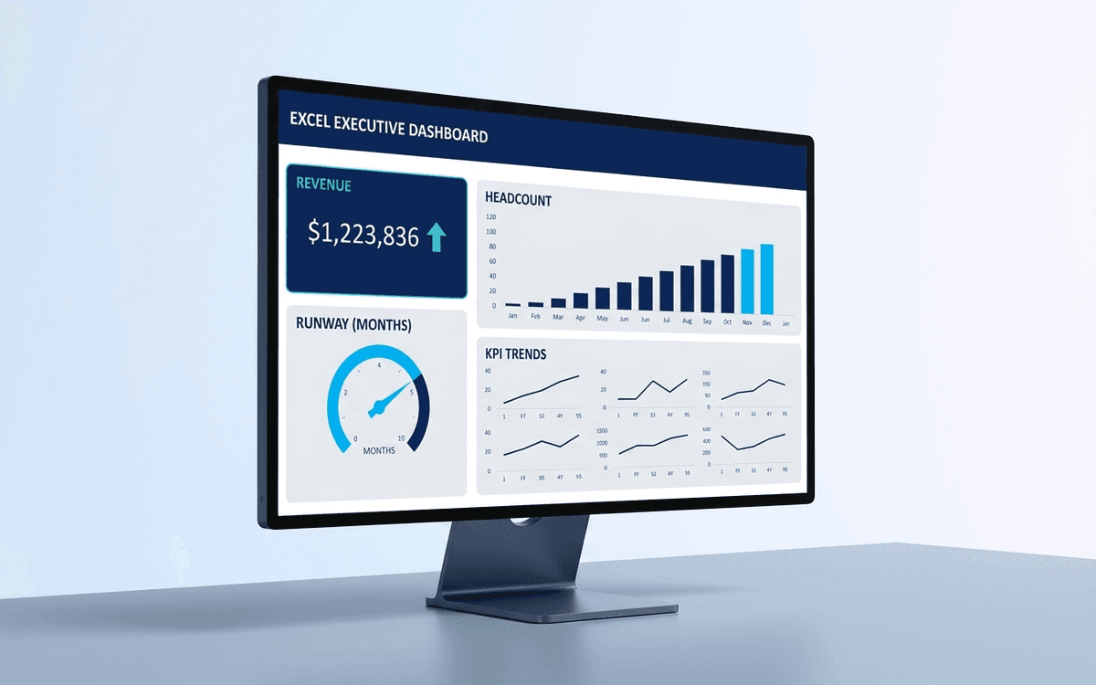
Executive Dashboard Template
An executive dashboard template gives leaders a one-page view of what actually matters — revenue, runway, headcount, and customer health — with the formulas and chart structure already built so you spend zero time formatting and all your time on the conversation.
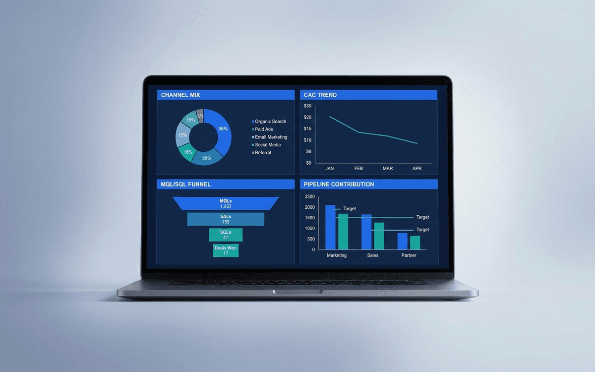
Marketing Dashboard Template
A marketing dashboard template covering the metrics CMOs actually defend — channel mix, blended CAC, MQL/SQL conversion, marketing-sourced pipeline, and ROI per program — in a one-page weekly review that ties spend to outcomes.
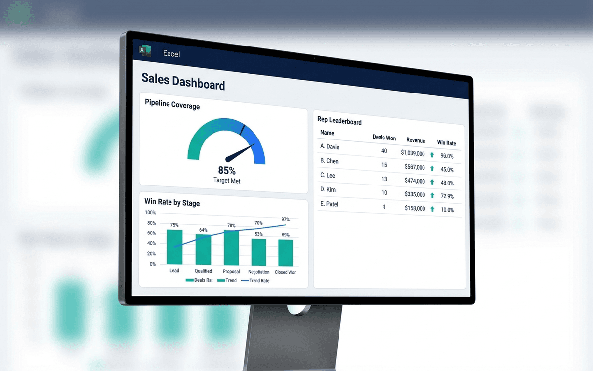
Sales Dashboard Template
A sales dashboard template covering what sales leaders actually run the team against — pipeline coverage, win rate by stage, sales cycle length, rep-level performance, and forecast accuracy — in a one-page weekly forecast call format.
When the template isn't enough
AppDeck's dashboards portal turns this template into a live workspace — version control, permissions, signatures, and analytics built in.