
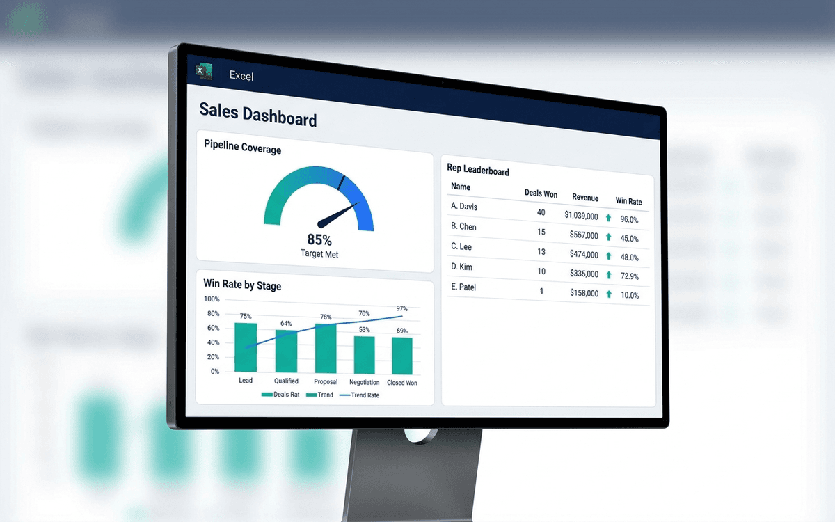
Sales Dashboard Template
A sales dashboard template covering what sales leaders actually run the team against — pipeline coverage, win rate by stage, sales cycle length, rep-level performance, and forecast accuracy — in a one-page weekly forecast call format.
Download this template — free
Tell us where to send the link. We'll never share your email.
What's included
- Pipeline coverage vs. quota (typically 3x is the rule of thumb)
- Stage-by-stage funnel with conversion rates
- Win rate by stage, by segment, by rep
- Average sales cycle length
- Rep-level performance leaderboard
- Forecast accuracy (committed vs. closed)
- Deal aging report — deals stuck in stage
- New logo vs. expansion split
- Source data on a separate tab
How to use this template
1. Define stages with exit criteria, not just names
Every stage in the dashboard has to have an exit criterion: a specific buyer behavior or vendor commitment that has to be true to advance. "Discovery" with no exit criteria is where deals go to die. Without exit criteria the conversion rates between stages are meaningless.
2. Track pipeline coverage at multiple points in the quarter
Pipeline coverage at quarter start should be 3x; mid-quarter it can drift toward 2x; entering the last month it should be 1.5x. The dashboard tracks coverage over time so you see drift early, not at the quarter-end forecast call.
3. Use win rate by stage, not blended win rate
Blended win rate (closed-won / all opportunities) is gameable — reps qualify everything as a deal to inflate volume. Stage-by-stage win rate (e.g., stage 3 → closed-won) is more diagnostic. The dashboard shows both; favor stage-by-stage when making decisions.
4. Calibrate forecast categories to reality
Most CRMs have "Commit / Best Case / Pipeline" categories — and most reps misuse them. The dashboard tracks historical accuracy of each category: what % of "Commit" actually closed last quarter? Use the trailing accuracy as a discount on this quarter's forecast.
5. Surface deal aging, not just deal count
Deals stuck in stage for >2x average cycle are usually dead — they just haven't been declared yet. The deal-aging section surfaces the stuck pile, forcing a forecast-call conversation on each one: advance, downgrade, or close-lost. Hope is not a sales motion.
Who it's for
- CROs and VPs of Sales running weekly forecast calls
- Sales leaders without a RevOps team
- Founders running founder-led sales
- Boards wanting sales visibility
Frequently asked questions
- What's a good pipeline coverage ratio?
- 3x quarterly quota at the start of the quarter is the typical benchmark for B2B SaaS. Higher (4–5x) for marketplaces or new sales motions; lower (2x) for very high-velocity, very high-win-rate businesses. Track the actual ratio you achieve consistently, not the textbook number.
- How do I calculate sales cycle?
- Average days from opportunity created to closed-won, segmented by deal size band. The single number is misleading for businesses with both SMB and Enterprise deals — segment by deal size or motion. Track cycle separately for new logo vs. expansion.
- Should we include closed-lost deals on the dashboard?
- Yes — in a separate section. Closed-lost analysis (reason codes, competitor data, deal value walked) is one of the most underused diagnostic tools in sales ops. The dashboard surfaces the top 5 closed-lost reasons so they show up in forecast calls.
- How often should sales leaders review the dashboard?
- Weekly, in the forecast call. Some metrics (rep-level coaching) are better as monthly reviews; some (deal-by-deal commit) are daily during the last 2 weeks of the quarter. Match cadence to decision: forecast = weekly, coaching = monthly, end-of-quarter = daily.
- When do we outgrow an Excel sales dashboard?
- When CRM data starts diverging from the dashboard (i.e., the spreadsheet becomes a parallel source of truth), when forecast calls are spent reconciling numbers instead of discussing deals, or when sales ops becomes a multi-person function. Salesforce reports, HubSpot dashboards, Looker, Gong Forecast, and Clari are common replacements.
More dashboards templates
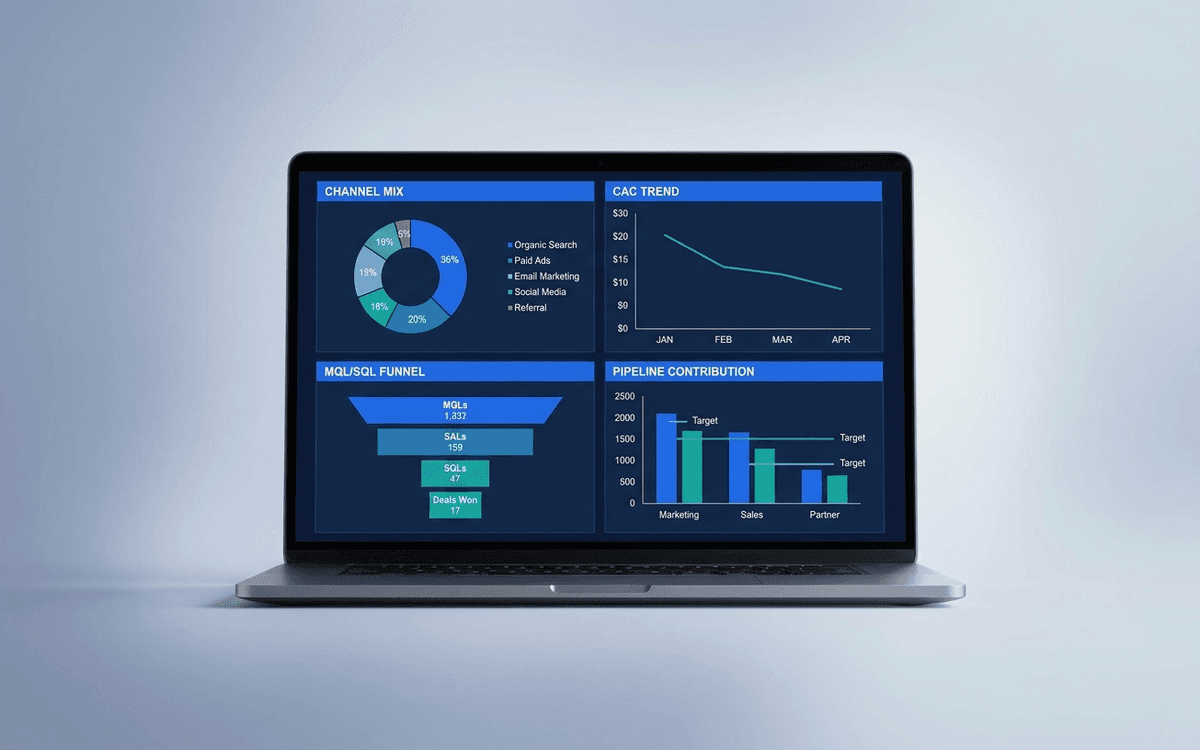
Marketing Dashboard Template
A marketing dashboard template covering the metrics CMOs actually defend — channel mix, blended CAC, MQL/SQL conversion, marketing-sourced pipeline, and ROI per program — in a one-page weekly review that ties spend to outcomes.
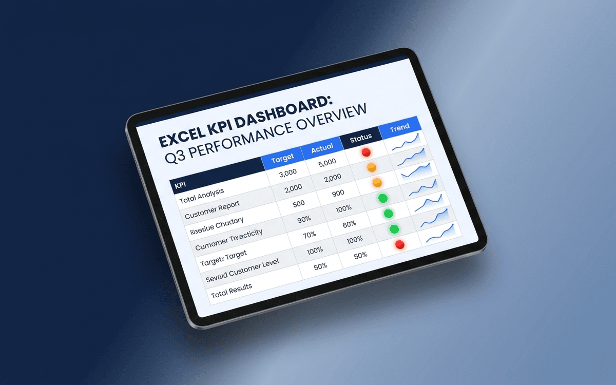
KPI Dashboard Template
A KPI dashboard template that separates leading from lagging indicators, shows status against target with traffic-light coloring, and surfaces trends — so the weekly business review answers "is this working?" in under 5 minutes.
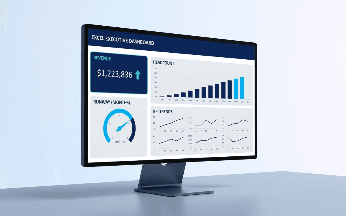
Executive Dashboard Template
An executive dashboard template gives leaders a one-page view of what actually matters — revenue, runway, headcount, and customer health — with the formulas and chart structure already built so you spend zero time formatting and all your time on the conversation.
When the template isn't enough
AppDeck's dashboards portal turns this template into a live workspace — version control, permissions, signatures, and analytics built in.