
Executive Dashboard Design: 10 Best Practices & Real Examples
Master executive dashboard design with 10 proven best practices. Layout principles, KPI selection, color usage, mobile optimization, and common mistakes that executives hate.
TL;DR: Master executive dashboard design with 10 proven best practices. Layout principles, KPI selection, color usage, mobile optimization, and common mistakes that executives hate.
Introduction
Most executive dashboards fail. Not because of bad data or broken integrations — they fail because someone treated the dashboard like a report, crammed 40 metrics onto the screen, and handed it to a CEO who glanced at it once and never opened it again.
I've built dashboards for C-suite executives, board members, and investors across SaaS, professional services, and e-commerce companies for over 15 years. The pattern is always the same. The data team spends weeks building something comprehensive. The executive asks one question the dashboard doesn't answer. Everyone goes back to spreadsheets and Slack messages.
The best executive dashboard answers the board's top 3 questions in 3 seconds.
That's the standard. Not 30 seconds. Not "after scrolling down." Three seconds, one screen, clear answers.
This guide covers 10 executive dashboard design best practices that separate the dashboards executives actually use from the ones they ignore. I'll walk through layout principles, KPI selection, color strategy, mobile optimization, and the common mistakes I see teams make repeatedly. If you're designing a dashboard for your leadership team, your board, or yourself — this is the framework I use every time.
What Is an Executive Dashboard?
An executive dashboard is a single-screen visual summary of the metrics that matter most to senior leadership. It's designed for people who make decisions but don't have time to analyze raw data.
Executive Dashboards vs. Operational Dashboards
This distinction matters because most dashboard design failures happen when teams build an operational dashboard and hand it to an executive.
| Executive Dashboard | Operational Dashboard | |
|---|---|---|
| Audience | CEO, CFO, CRO, CMO, board members | Managers, analysts, individual contributors |
| Metrics | 5-12 high-level KPIs | 20-50+ granular metrics |
| Update frequency | Real-time or daily | Real-time or hourly |
| Decision type | Strategic: "Should we invest more in this area?" | Tactical: "Which campaign needs adjustment today?" |
| Interaction | Glance, absorb, drill down if needed | Filter, slice, explore, export |
| Design goal | Immediate clarity | Comprehensive analysis |
The key difference: An executive dashboard is designed to be consumed passively. An operational dashboard is designed to be worked in actively. When you blur that line, you get a dashboard that's too complex for executives and too shallow for analysts.
Who Uses Executive Dashboards?
- CEOs — company health, revenue trajectory, team capacity, strategic progress
- CFOs — cash flow, burn rate, margins, budget vs. actual, runway
- CROs — pipeline, win rate, average deal size, revenue attainment
- CMOs — lead generation, CAC, marketing-sourced revenue, brand metrics
- Board members — quarterly KPIs, governance metrics, risk indicators
- Investors — growth rate, unit economics, market position
Each of these roles needs a different view of the business. That's why the best executive dashboard platforms support role-based views — one data source, multiple perspectives.
10 Executive Dashboard Design Best Practices
1. One Screen, No Scrolling
This is the single most important rule in executive dashboard design. If your dashboard requires scrolling, you've already lost.
Why it matters: Executives have 15-second attention spans for internal tools. The moment they need to scroll, they lose the gestalt — the ability to see the whole picture at once. Scrolling turns a dashboard into a report.
How to implement:
- Design for 1920x1080 resolution (standard laptop display)
- If targeting board members, also design for iPad landscape (2048x1536)
- Limit your dashboard to 6-12 metrics maximum
- If you can't fit everything, you have too many metrics — cut ruthlessly
The test: Display your dashboard on a 13-inch laptop. Can you read every number without scrolling or squinting? If not, simplify.
I've seen teams spend months building dashboards with 30+ charts spread across 4 scroll-lengths. The CEO used it once, then asked the CFO to send a weekly email summary instead. The email had 5 numbers in it. That's what the dashboard should have been from the start.
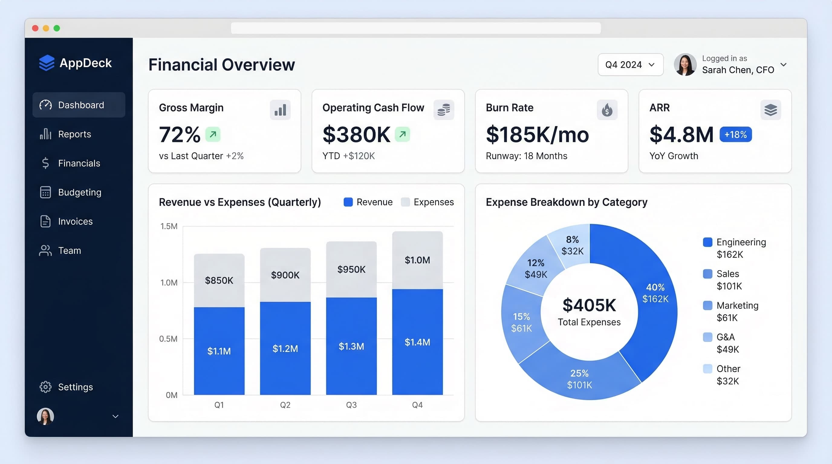
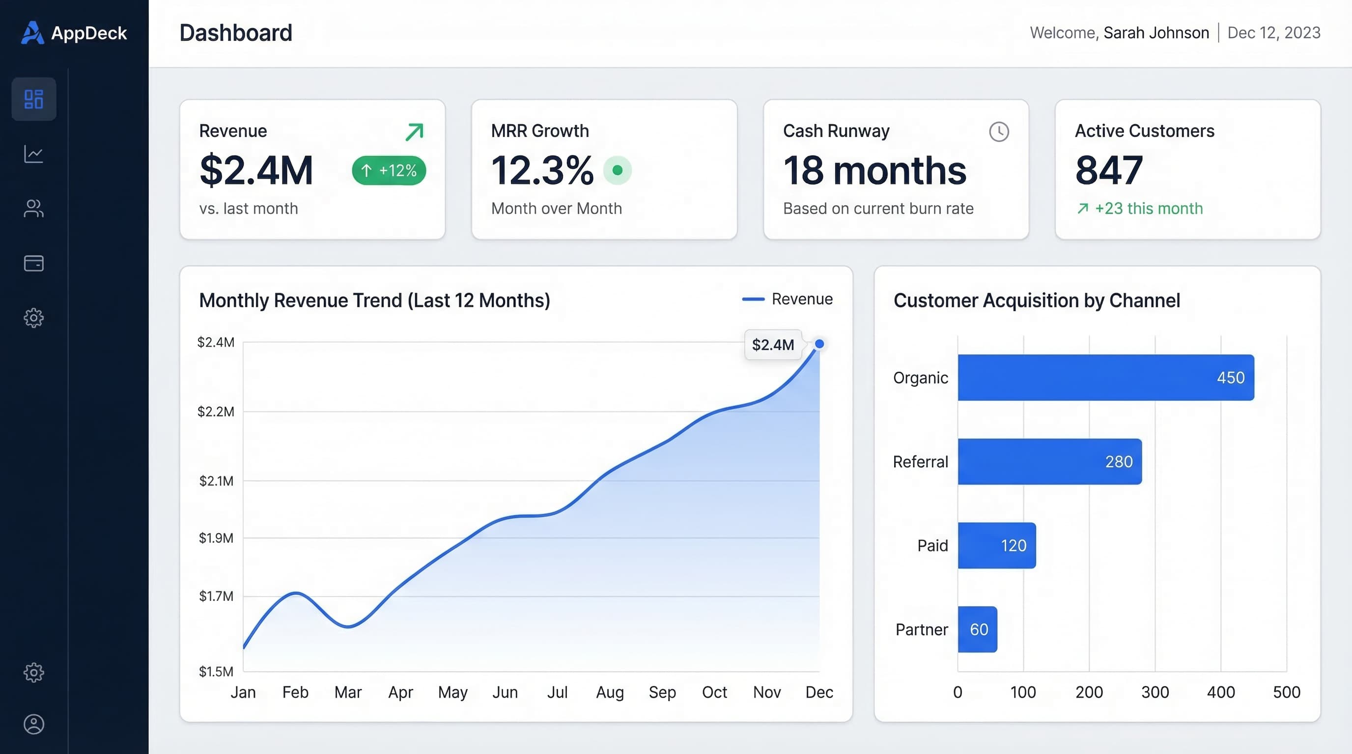
2. Lead with KPI Cards (The "Headlines")
The top of your dashboard should work like a newspaper front page. Big numbers. Clear status. Immediate answers.
The format for each KPI card:
Metric Name
$847K ↑12%
Target: $800K ✅
Every KPI card needs four elements:
- Metric name — what you're measuring
- Current value — the big number, large font
- Trend indicator — direction and percentage change
- Context — comparison to target, budget, or prior period
Top row layout: 4-6 KPI cards in a horizontal row across the full width of the screen. These are the "headlines" of your business.
Example for a CEO dashboard:
| MRR | Cash Runway | Net Revenue Retention | Employee NPS |
|---|---|---|---|
| $847K ↑12% | 14 months ✅ | 112% ↑3pts | 72 ⚠️ -5pts |
| Target: $800K | Target: >12mo | Target: >110% | Target: >75 |
When I design dashboards on AppDeck's executive dashboard, the KPI card row is always the first thing I build. If those 4-6 cards can't tell the story on their own, no amount of charts below them will fix it.
3. Use the Inverted Pyramid Layout
Borrow from journalism. The most important information goes at the top. Details live at the bottom — and only for people who want them.
The three tiers:
Top tier (20% of screen): KPI summary cards
- The "headline" metrics
- Glanceable in 3 seconds
- Tells you: "Are we on track?"
Middle tier (50% of screen): Trend charts and comparisons
- Line charts showing trajectory over time
- Bar charts comparing segments or periods
- Tells you: "Where are we heading?"
Bottom tier (30% of screen): Detail tables or secondary metrics
- Sortable tables with supporting data
- Lower-priority metrics
- Tells you: "What's behind the numbers?"
Why this works: Executives read top-down and stop when they have enough information. A CEO in a hurry reads the top row and moves on. A CFO preparing for a board meeting reads all three tiers. The same dashboard serves both needs because the layout respects how people actually consume information.
This is progressive disclosure applied to dashboard design. Show the summary first. Let users pull the detail when they need it.
4. Color Means Something (or It Means Nothing)
Color is the most abused element in dashboard design. I've seen dashboards that look like a bag of Skittles — every chart a different color, no two widgets matching, the whole thing an assault on visual processing.
The rules:
Use semantic color sparingly:
- 🟢 Green = on track, at or above target
- 🔴 Red = off track, below threshold, requires attention
- 🟡 Yellow/amber = warning, trending toward off-track
- Gray = neutral, context, no judgment
Use a neutral palette for data visualization:
- Charts and graphs should use brand-neutral colors (blues, grays, teals)
- Reserve green/red exclusively for status indicators
- If everything is colorful, nothing stands out
Avoid these mistakes:
- ❌ Rainbow charts where each bar is a different color for no reason
- ❌ Using red for a metric that's actually fine (e.g., red just because it's negative spending)
- ❌ Bright backgrounds on cards that compete with the data
- ❌ More than 4 colors in any single chart
The principle: Color should be a signal, not decoration. When a board member sees red on the dashboard, it should mean something is genuinely off track — not that the designer thought red looked nice.
5. Choose the Right Chart for the Question
Every chart on your dashboard should answer a specific question. If you can't articulate the question, the chart doesn't belong there.
The cheat sheet:
| Question | Best Chart Type | Example |
|---|---|---|
| How is this metric trending over time? | Line chart | MRR over last 12 months |
| How do these categories compare? | Horizontal bar chart | Revenue by product line |
| What's the breakdown of a whole? | Stacked bar or donut (≤5 segments) | Revenue by region |
| What's the current value vs. target? | KPI card with progress bar | Quota attainment: 87% |
| How are two metrics correlated? | Scatter plot | Deal size vs. close time |
| What changed this period? | Waterfall chart | MRR bridge (new + expansion - churn) |
Never use:
- ❌ 3D charts — they distort data and look like a 2003 PowerPoint
- ❌ Pie charts with 8+ slices — humans can't compare angles accurately beyond 4-5 segments
- ❌ Dual-axis charts — they imply a correlation that may not exist and confuse most readers
- ❌ Gauges/speedometers — they waste space; a KPI card communicates the same information in a fraction of the space
I covered specific chart examples for different executive roles in KPI Dashboard Examples. The principle is always the same: match the chart type to the question, not to what looks impressive.
6. Show Context, Not Just Numbers
A number without context is useless. This is the most common mistake I see in executive dashboard design, and it's the easiest to fix.
Every metric on your dashboard needs at least two of these:
- Comparison to target/budget
- Comparison to prior period (MoM, QoQ, YoY)
- Trend direction (up, down, flat)
- Status indicator (on track, at risk, off track)
The difference context makes:
❌ Without context:
   Revenue: $2.1M
   Churn: 4.2%
   Pipeline: $8.3M

✅ With context:
   Revenue: $2.1M (↑8% YoY, 105% of target) ✅
   Churn: 4.2% (↑0.8pts MoM, above 3.5% threshold) 🔴
   Pipeline: $8.3M (↓12% QoQ, 2.1x coverage) ⚠️
The first version tells you what happened. The second tells you whether you should be happy, worried, or calling an emergency meeting.
When I set up executive dashboards for clients, I enforce a rule: no metric ships without at least a target comparison and a trend indicator. It takes 10 minutes to add context. It saves hours of "wait, is this number good or bad?" conversations.
7. Design for Mobile First (Boards Use iPads)
Here's a statistic that should change how you design dashboards: the majority of board members review materials on tablets, not desktops. If your dashboard breaks on an iPad, you've lost a significant portion of your highest-stakes audience.
Mobile-first dashboard design principles:
- Stack KPI cards vertically on mobile instead of horizontal rows
- Use large touch targets — buttons and interactive elements need to be at least 44x44 pixels
- Make text readable without zooming — minimum 14px font for data labels, 24px+ for KPI values
- Simplify charts on small screens — a line chart with 12 data points works on mobile; one with 52 weekly points becomes unreadable
- Test on actual devices — iPad, iPhone, Android tablet
Responsive layout strategy:
Desktop (1920px):  [KPI] [KPI] [KPI] [KPI]
                   [Chart     ] [Chart     ]
                   [Table                   ]

Tablet (1024px):   [KPI] [KPI]
                   [KPI] [KPI]
                   [Chart          ]
                   [Chart          ]

Mobile (375px):    [KPI]
                   [KPI]
                   [KPI]
                   [KPI]
                   [Chart]
Board members reviewing materials before a meeting are often doing it on a flight, in a car, or between other meetings. They're not sitting at a desk with a 27-inch monitor. Design accordingly. If you're sharing dashboards through a board portal, make sure the portal itself is mobile-optimized — the best dashboard design in the world won't help if the delivery platform doesn't render properly on a tablet.
8. Update in Real-Time (Not Monthly)
A monthly dashboard isn't a dashboard — it's a report with charts. Real dashboards show what's happening now.
The timeliness spectrum:
| Update Frequency | Use Case | Example |
|---|---|---|
| Real-time | Revenue, active users, system health | SaaS company monitoring MRR |
| Daily | Pipeline, marketing leads, cash position | Sales team tracking quota |
| Weekly | Project status, team capacity, sprint velocity | Engineering dashboard |
| Monthly | Strategic KPIs with longer cycles | Brand awareness, NPS |
Why real-time matters for executives:
- Faster decisions: A CFO who sees cash position daily catches issues weeks before one who reviews monthly statements
- Better board meetings: Walk in with live data instead of 3-week-old slides
- Accountability: When metrics are visible in real-time, teams self-correct faster
Implementation tips:
- Connect directly to your source systems (CRM, accounting, analytics) via API
- Show a "last updated" timestamp prominently — executives need to trust the data
- Cache appropriately — real-time doesn't mean hitting your database every second
- Set up alerts for threshold breaches so the dashboard works even when nobody's watching
The executive dashboard templates I've shared before all assume real-time or daily data connections. If you're still copying numbers into a spreadsheet dashboard once a month, the design principles in this post won't help much until you solve the data pipeline first.
9. Add Drill-Down, Don't Add More Charts
When an executive sees a KPI that looks off, their instinct is to ask "why?" The wrong solution is to preemptively add 10 more charts to the summary screen. The right solution is drill-down.
How drill-down works in practice:
Level 1 — Summary KPI card:
Revenue: $2.1M (↑8% YoY) ✅
Level 2 — Click the card → detail view:
Revenue by Region:
  North America:  $1.2M (↑12%)
  Europe:         $540K (↑3%)
  APAC:           $360K (↓2%) ⚠️
Level 3 — Click APAC → granular detail:
APAC Revenue by Account:
  Acme Corp:     $120K (renewed)
  GlobalTech:    $95K (at risk — contract ends Q2)
  ...
The principle is progressive disclosure: Summary → Segment → Detail. Each level answers a more specific question. The executive chooses how deep to go.
Benefits of drill-down over more charts:
- Keeps the summary screen clean and scannable
- Doesn't overwhelm board members who just need the headlines
- Gives CFOs and analysts the depth they need without a separate tool
- Reduces dashboard maintenance — one view serves multiple audiences
This is a core design principle behind how we built AppDeck's executive dashboard. Every KPI card is clickable. The summary screen stays at 6-8 metrics. The detail is there when you need it, invisible when you don't.
10. Test with Your Worst User
This is the practice that separates good dashboards from great ones, and almost nobody does it.
The test: Find the least tech-savvy person who will use this dashboard. For most companies, that's a board member who's a retired industry executive. Put the dashboard in front of them. Ask one question: "How is the company doing?"
What you're measuring:
- ⏱️ Time to answer: Can they respond in 10 seconds? If it takes longer, simplify.
- ❓ Questions they ask: Every question reveals a gap in your design. "What does this number mean?" = missing labels. "Is this good or bad?" = missing context. "Where's the revenue number?" = bad hierarchy.
- 🤔 Confusion signals: Squinting, scrolling, clicking randomly — all signs that the design is failing.
Iterate based on what you learn:
- If they ask about a metric you didn't include, consider adding it
- If they ignore a section entirely, consider removing it
- If they ask "is this good or bad?" for any metric, add a status indicator
I've watched board members struggle with dashboards that the data team thought were "intuitive." The data team has context the board member doesn't. Testing with real users — especially the least technical ones — is the fastest way to close that gap.
Executive Dashboard Layout Templates
Here are three proven layouts I use repeatedly. Each one is optimized for a different audience and decision-making context.
The Financial Dashboard (CFO-Optimized)
Purpose: Cash management, profitability, and budget adherence
Layout:
┌─────────────┬─────────────┬─────────────┬─────────────┐
│  Cash        │ Gross Margin │  EBITDA     │  Burn Rate  │
│  $4.2M ✅    │  72% ✅      │  $380K ✅   │  $290K/mo   │
│  +$210K MoM  │  Target: 70% │  ↑8% QoQ   │  14mo runway│
├─────────────┴──────────────┴─────────────┴─────────────┤
│  Revenue vs Budget (line chart, 12 months)              │
│  Actual line + Budget line + Variance shading           │
├────────────────────────────┬────────────────────────────┤
│  Expense Breakdown         │  AR Aging Summary          │
│  (stacked bar by category) │  (horizontal bar chart)    │
├────────────────────────────┴────────────────────────────┤
│  Budget vs Actual by Department (table with RAG status) │
└─────────────────────────────────────────────────────────┘
I wrote a deeper dive on the specific metrics that belong on a CFO dashboard in CFO Executive Dashboard: Essential Metrics. The layout above is the structural framework — that post covers the content.
The Growth Dashboard (CEO/CRO-Optimized)
Purpose: Revenue trajectory, pipeline health, and customer acquisition
Layout:
┌─────────────┬─────────────┬─────────────┬─────────────┐
│  MRR         │  Pipeline   │  Win Rate   │  NRR        │
│  $847K ↑12%  │  $3.2M ✅   │  28% ⚠️     │  112% ✅    │
│  Target:$800K│  3.8x cover │  Target: 32%│  Target:110%│
├─────────────┴──────────────┴─────────────┴─────────────┤
│  MRR Trend (line chart, 12 months)                      │
│  With new + expansion + churn waterfall below           │
├────────────────────────────┬────────────────────────────┤
│  Pipeline by Stage         │  Revenue by Segment        │
│  (horizontal funnel)       │  (stacked bar chart)       │
├────────────────────────────┴────────────────────────────┤
│  Top 10 Deals in Pipeline (table, sortable)             │
└─────────────────────────────────────────────────────────┘
For a complete list of metrics to include in each section, see CEO Dashboard Metrics.
The Board Meeting Dashboard (Governance-Optimized)
Purpose: Quarterly business review and governance reporting
Layout:
┌─────────────┬─────────────┬─────────────┬─────────────┐
│  Revenue     │  Net Income  │  Headcount  │  Cash       │
│  $8.4M YTD   │  $1.1M ✅    │  142 (+8)  │  $4.2M      │
│  98% of plan │  112% margin │  Plan: 145  │  14mo runway│
├─────────────┴──────────────┴─────────────┴─────────────┤
│  Quarterly Revenue vs Plan (bar chart, 4 quarters)      │
│  With YoY growth rate overlay                           │
├────────────────────────────┬────────────────────────────┤
│  Strategic Initiative      │  Risk Register             │
│  Status (RAG cards)        │  (top 5, RAG status)       │
├────────────────────────────┴────────────────────────────┤
│  KPI Summary Table (10 metrics with QoQ and YoY)        │
└─────────────────────────────────────────────────────────┘
This layout is specifically designed for board meeting preparation. Share it through a secure board portal so directors can review ahead of the meeting and come prepared with questions rather than spending the first 30 minutes reading slides.
Common Executive Dashboard Design Mistakes
After reviewing hundreds of executive dashboards across different companies, these are the mistakes I see most frequently. Avoid all of them.
1. Too Many Metrics on One Screen
The symptom: More than 15 metrics visible without scrolling.
Why it happens: Every department head wants "their" metric on the executive dashboard. The CEO says yes to everyone. The dashboard becomes a committee-designed compromise that serves nobody.
The fix: Limit the summary view to 6-12 metrics maximum. Create role-specific views for department heads. Use drill-down for detail.
2. Using Dashboards as Reports
The symptom: The dashboard is a paginated document with charts — essentially a PDF rendered in a browser.
Why it happens: Teams rebuild their monthly board report in a dashboard tool and call it a "dashboard."
The fix: Reports and dashboards serve different purposes. Reports tell a narrative. Dashboards show current status. If your dashboard has paragraphs of text or page breaks, it's a report.
3. No Visual Hierarchy
The symptom: Every metric is the same size, same font weight, same prominence. Nothing stands out.
Why it happens: The designer treated the dashboard as a grid of equal-weight tiles.
The fix: Use the inverted pyramid. Make the top-line KPIs 2-3x larger than supporting metrics. Use whitespace to create visual grouping. The eye should know exactly where to look first.
4. Choosing Charts That Look Cool Over Charts That Communicate
The symptom: Radar charts, bubble charts, 3D pie charts, animated gauges — visually impressive, informationally useless.
Why it happens: Dashboard tools offer dozens of chart types. Designers pick the ones that look most "dashboardy."
The fix: Refer to the chart selection cheat sheet in Practice #5. If your board member can't understand the chart without explanation, replace it with something simpler.
5. Not Testing with Actual Executives
The symptom: The data team loves the dashboard. The executives don't use it.
Why it happens: Designers and analysts have different mental models than executives. What's obvious to someone who built the dashboard is opaque to someone seeing it for the first time.
The fix: Test with real users before launch. Iterate based on their questions and confusion. Revisit quarterly.
Tools for Executive Dashboard Design
Choosing the right tool depends on your technical resources, data infrastructure, and how you plan to share dashboards with stakeholders.
Power BI
Best for: Organizations already using Microsoft 365. Strong data modeling layer and good integration with Excel, Azure, and Dynamics. Handles complex data transformations well. Steeper learning curve for non-technical users.
Limitations: Dashboard sharing outside the organization requires Power BI Pro licenses for every viewer. Mobile experience is adequate but not exceptional.
Tableau
Best for: Data-heavy organizations with dedicated analysts. Best-in-class visualization capabilities and the most flexible chart customization. Strong community and template library.
Limitations: Expensive at scale. Requires significant expertise to build well-designed dashboards. Embedding in external-facing portals is complex.
Looker (Google)
Best for: Engineering-forward companies that want dashboards defined as code. Strong data governance and version control. Deep integration with Google Cloud.
Limitations: Requires LookML expertise. Not intuitive for non-technical dashboard builders. UI feels dated compared to newer tools.
Excel / Google Sheets
Best for: Quick prototyping and small teams. Zero learning curve. Everyone already has it.
Limitations: No real-time data connections (without workarounds). No drill-down. Not shareable in a professional portal experience. Breaks when someone accidentally edits a formula.
Purpose-Built Portal Platforms (AppDeck)
Best for: Companies that need to share executive dashboards with external stakeholders — board members, investors, clients — through a branded, secure portal. AppDeck's executive dashboard combines live data visualization with role-based access control, so your CFO sees financial detail while your board members see the governance summary.
Advantages over BI tools: No per-viewer licensing. Mobile-optimized by default. Embed dashboards alongside board documents, meeting agendas, and other materials in one portal. You can also embed live dashboards directly in your investor data room so investors always see current metrics without waiting for your quarterly update email.
The right tool depends on your use case. If your audience is internal analysts, Tableau or Power BI are strong choices. If your audience includes board members, investors, or clients who need a polished, secure experience — a purpose-built portal gives you better results with less configuration.
Frequently Asked Questions
How many metrics should an executive dashboard have?
Between 6 and 12 on the summary screen. Research on cognitive load consistently shows that humans can process 5-9 items at a glance (Miller's Law). My target is 6-8 top-line KPIs in the card row, supported by 2-4 charts in the middle tier. If you have more than 12 visible metrics, you're asking executives to do analysis rather than absorb a summary.
What's the difference between an executive dashboard and a KPI dashboard?
A KPI dashboard tracks key performance indicators for any audience — it could be designed for a marketing manager, a sales rep, or a CEO. An executive dashboard is a KPI dashboard specifically designed for senior leadership and board members, with emphasis on strategic metrics, minimal complexity, and high-level summary. See KPI Dashboard Examples for dashboards across multiple roles and levels.
How often should an executive dashboard be updated?
Daily at minimum for financial and operational metrics. Real-time for revenue, pipeline, and customer metrics if your systems support it. Monthly is not a dashboard — it's a report. Always display a "last updated" timestamp so users know the data is current.
Should I use a dark theme or light theme for executive dashboards?
Light theme for the vast majority of use cases. Dark themes look sleek in demos but cause readability issues in well-lit conference rooms and when printed or projected. Light backgrounds with dark text follow established readability research. Save dark themes for operations centers and NOC displays.
How do I get executives to actually use the dashboard?
Three strategies: (1) Make it the first thing they see — set it as the default tab in their portal or browser. (2) Design it around their questions, not your data model. (3) Keep it under 10 seconds to consume. If your dashboard answers the questions they're already asking in Slack and email, they'll use it because it's faster than the alternative.
What metrics should a CEO dashboard include vs. a CFO dashboard?
A CEO dashboard focuses on overall business health: revenue, growth rate, customer retention, team capacity, and strategic initiative progress. A CFO dashboard goes deeper on financial metrics: cash flow, margins, burn rate, AR/AP aging, budget variance, and runway. I've broken down both in detail: CEO Dashboard Metrics and CFO Executive Dashboard: Essential Metrics.
Can I use the same dashboard for internal team meetings and board meetings?
You can use the same underlying data, but the views should be different. Internal dashboards can be more detailed and assume more context. Board dashboards should be simpler, include more explanatory context (targets, benchmarks, status indicators), and focus on governance-level questions. A good executive dashboard platform lets you create multiple views from the same data source.
How do I handle sensitive financial data on dashboards?
Role-based access control is essential. Your CFO should see detailed financial data. Your board members might see summarized financials. Department heads should only see metrics relevant to their function. Never email dashboard screenshots — share through a secure portal with SSO, audit logging, and permission controls.
Design Your Executive Dashboard
The 10 practices in this guide come down to one core principle: respect your audience's time and cognitive load. Executives don't want more data. They want clearer answers.
Start with the inverted pyramid layout. Lead with 4-6 KPI cards that answer the top questions. Add trend charts for trajectory. Use color only for status. Test with your least technical stakeholder. Iterate.
If you're looking for inspiration, explore the executive dashboard templates I've published with specific metric recommendations for every C-suite role. For a deeper dive into building your complete dashboard strategy, the executive dashboard guide covers everything from metric selection to implementation.
Ready to build a dashboard your leadership team will actually use? AppDeck's executive dashboard gives you the framework — KPI cards, drill-down views, role-based access, and mobile optimization — without the six-month BI implementation project. Start with the metrics that matter most and expand from there.

Founder & CEO, AppDeck
Serial entrepreneur with 20+ years building B2B software companies. Former executive managing 2,800+ employees across three continents. Vik reviews all AppDeck content for accuracy and practical relevance.
Share this article
Explore Related Solutions
Related Articles
CEO Dashboard: 10 Metrics Every CEO Should Track in 2026
The 10 most important CEO dashboard metrics for 2026. Revenue, growth, customer health, team performance, and strategic KPIs with visualization tips and real-world examples.
15 Free Excel Dashboard Templates You Can Download Today
Download 15 free Excel dashboard templates for executives, finance, sales, marketing, and operations. Ready-to-use .xlsx files with sample data, charts, and formulas.
Executive Dashboard Software: 8 Best Platforms Compared (2026)
Compare the best executive dashboard software for 2026. Features, pricing, and honest reviews of Tableau, Power BI, Looker, AppDeck, Geckoboard, Klipfolio, Databox, and Domo.