
20 KPI Dashboard Examples for Every Business Function
KPI dashboard examples for executives, finance, sales, marketing, operations, and HR. Real-world layouts with key metrics and design tips.
Download the template: Get a working dashboard as a free Excel file — KPI Dashboard Template (.xlsx) — leading/lagging indicators, traffic-light status, target vs. actual, and trend sparklines. No paywall.
Introduction
KPI dashboards turn data into decisions. That's the promise, anyway.
The reality? Most dashboards fail. They're cluttered with 30+ metrics nobody reads. They're built to impress, not inform. They answer questions nobody asked. And they sit unused after the first week because the people who need them can't find anything actionable in the noise.
After building 200+ dashboards for companies ranging from seed-stage startups to Fortune 500 enterprises, I've learned one thing: the best dashboards aren't the prettiest or the most comprehensive. They're the ones that change behavior. They surface exactly the right information, at the right time, for the right person to make a better decision.
In this guide, I'll walk through 20 real-world KPI dashboard examples across six business functions: executive leadership, finance, sales, marketing, operations, and HR. For each example, you'll get the key metrics to include, the layout that works best, and the design rationale behind it. These aren't theoretical mockups. They're patterns drawn from dashboards that real teams use every day.
Whether you're building your first dashboard or rebuilding one that nobody uses, these examples will give you a concrete starting point.
See also: Operations Dashboard Template — 8 examples + key metrics for COOs and ops leaders.
What Makes a Great KPI Dashboard?
Before diving into examples, let's establish what separates dashboards that drive decisions from dashboards that collect dust. In 15+ years of building these, I've distilled it down to five principles.
1. Answer a Specific Question (Not "Show Everything")
Every effective dashboard starts with a question. "Are we on track to hit quarterly revenue targets?" is a dashboard. "Here's all our data" is a spreadsheet with colors.
Before building, ask: What decision will this dashboard help someone make? If you can't articulate the decision, you don't need a dashboard — you need a report.
2. Limit to 5-7 KPIs Maximum
Cognitive load is real. Research consistently shows that humans can hold 5-7 items in working memory. When you put 20 metrics on a dashboard, people see zero of them. When you put 6, they remember all of them.
The test: If you can't explain every metric on your dashboard in 30 seconds, you have too many.
3. Context Matters More Than Numbers
A number without context is meaningless. Revenue of $2.3M — is that good? Bad? You can't tell without context.
Every KPI needs at least one of these:
- Comparison to target (are we on track?)
- Comparison to last period (are we improving?)
- Trend direction (where are we heading?)
- Benchmark (how do we compare to industry?)
4. Include Only Actionable Metrics
If a metric goes red and nobody can do anything about it, it doesn't belong on a dashboard. Every KPI should have an owner and a lever.
Ask: If this number drops 20% tomorrow, who would I call and what would I ask them to do? If you don't have an answer, remove the metric.
5. Match the Audience and Frequency
A CEO checking weekly needs different metrics than a sales manager checking daily. A board reviewing quarterly needs different context than an ops team monitoring real-time.
Rule of thumb:
- Real-time dashboards: operational metrics (uptime, throughput, queue depth)
- Daily dashboards: tactical metrics (pipeline, support tickets, ad spend)
- Weekly dashboards: performance metrics (revenue, conversion rates, NPS)
- Monthly/quarterly dashboards: strategic metrics (ARR growth, market share, unit economics)
Executive / CEO Dashboards (Examples 1-4)
Executive dashboards serve the busiest people in the organization. They need to convey the health of the entire business in under 60 seconds. Every metric must earn its place.
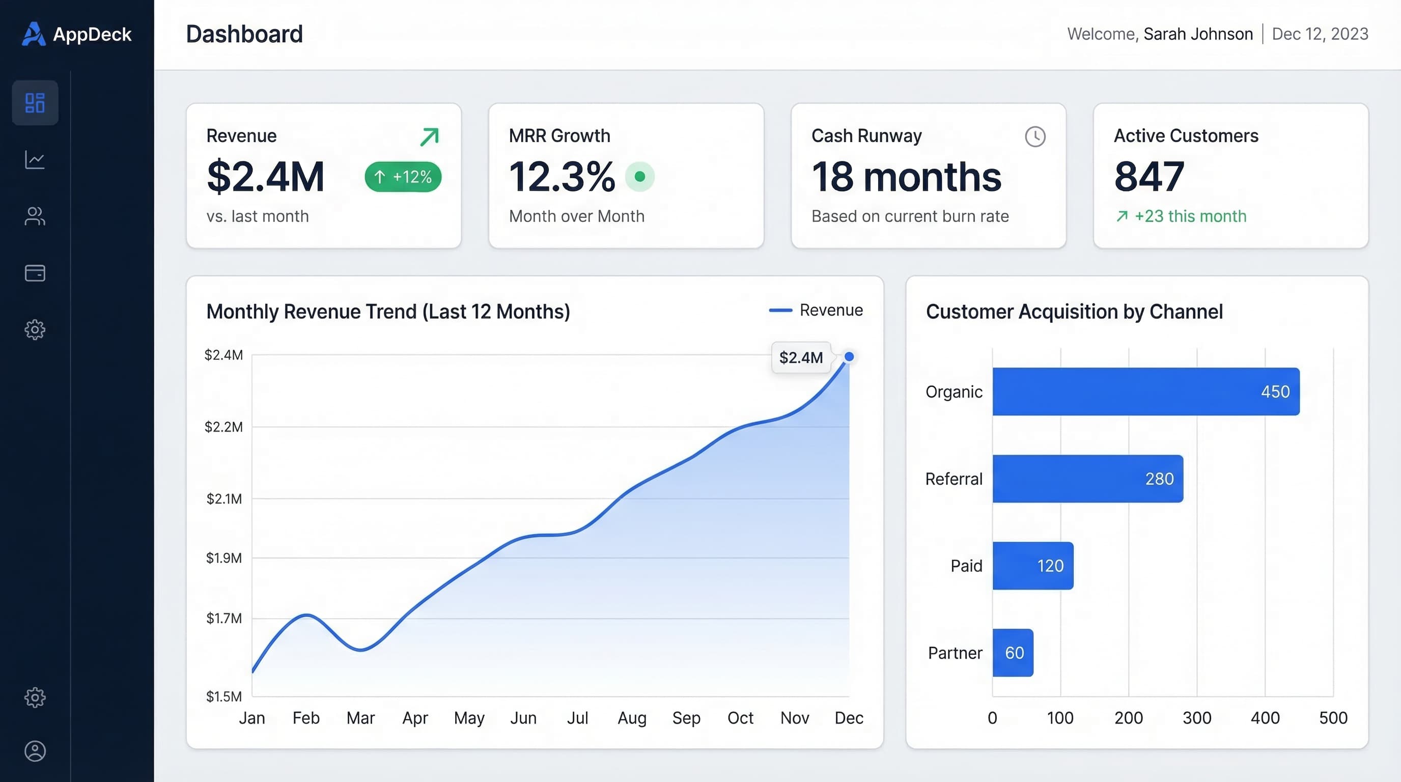
Example 1: CEO Weekly Overview
Question it answers: "Is the business healthy this week, and does anything need my attention?"
Key metrics (6):
- Revenue (MTD) — vs. monthly target, with daily run-rate projection
- MRR growth — month-over-month percentage change with 3-month trend
- Burn rate — monthly cash consumption with trend direction
- Runway — months of cash remaining at current burn
- NPS — latest score with quarterly trend
- Key hires — open critical roles and pipeline status
Layout:
The top row displays six large number cards, each showing the current value, comparison to target or last period, and a small sparkline trend. Think of these as the vital signs — a CEO should be able to glance at this row in 10 seconds and know if anything is off.
The middle section contains two trend charts side by side. On the left, a revenue chart showing daily actuals against the monthly target line, making it immediately clear whether you're tracking ahead or behind. On the right, a cash position chart showing burn rate trajectory and projected runway, which is the metric that keeps founders up at night.
The bottom section is an action items panel — a short list of 3-5 items that need the CEO's attention this week, pulled from department heads. Each item has an owner, a due date, and a status indicator. This transforms the dashboard from passive information display into an active decision-making tool.
Why this layout works: It follows the inverted pyramid. The most critical information (the six vital signs) is at the top where eyes go first. Supporting detail is in the middle. Action items are at the bottom, ready when the CEO decides to act on what they've seen.
Update frequency: Weekly, refreshed every Monday morning.
Example 2: Board Meeting Dashboard
Question it answers: "How did we perform this quarter, and are we executing against our plan?"
Key metrics (7):
- Revenue vs. plan — actual revenue against board-approved plan, with variance
- Gross margin — percentage with trend and comparison to prior quarter
- Cash position — current bank balance and 6-month forecast
- Customer growth — net new customers, with acquisition and churn breakdown
- Churn rate — monthly churn percentage with 4-quarter trend
- ARR — annual recurring revenue with growth rate
- Key milestone progress — status of 3-5 strategic initiatives
Layout:
This dashboard is designed for presentation on a large screen or shared via a secure board portal. It's formatted for horizontal viewing with clear section breaks.
The header section shows a single-line summary: "Q1 2026: Revenue $4.2M (103% of plan) | Cash $12.1M | ARR $16.8M (+34% YoY)." This gives the board the headline before any discussion begins.
Below the header, a two-column layout presents financial metrics on the left (revenue waterfall chart showing plan vs. actual, gross margin trend, and cash forecast) and growth metrics on the right (customer growth chart with stacked bars for new vs. churned, ARR progression, and churn trend).
The bottom third features a strategic initiatives table with five rows, each showing an initiative name, owner, target date, current status (green/yellow/red), and a brief update note. Board members can scan this in seconds and focus discussion on yellow and red items.
Why this layout works: Board members have limited time and need to assess company health quickly. The headline summary at the top lets them absorb the key message before diving into charts. The comparison-to-plan format is what boards expect and facilitates productive discussion.
Update frequency: Quarterly, prepared 3-5 days before board meetings.
Example 3: Startup Metrics Dashboard
Question it answers: "Are our unit economics healthy, and how long can we sustain current growth?"
Key metrics (6):
- MRR — monthly recurring revenue with month-over-month growth rate
- CAC — customer acquisition cost, blended and by channel
- LTV — customer lifetime value based on current retention
- LTV:CAC ratio — the fundamental unit economics indicator
- Burn rate — net monthly cash consumption
- Months of runway — cash remaining divided by burn rate
Layout:
The north star metric — MRR — dominates the top of the dashboard in a large format, showing the current value, growth rate, and a 12-month trend line. This is the number that defines the company's trajectory, and it deserves visual prominence.
Below the north star, four supporting metric cards sit in a single row: CAC, LTV, LTV:CAC ratio, and burn rate. Each card displays the current value, a small trend indicator (up/down arrow with percentage), and a color-coded status: green if healthy (LTV:CAC above 3x), yellow if concerning (2-3x), red if critical (below 2x).
The lower section splits into two panels. The left panel shows a CAC breakdown by channel (organic, paid, referral) as a horizontal bar chart, helping founders understand which acquisition channels are efficient. The right panel shows a cash runway projection — a declining line chart showing projected months of runway under current burn, with a dotted line showing runway if growth continues at current trajectory.
Why this layout works: Investors and startup executives think in terms of unit economics. This layout puts MRR front and center (the growth story), then immediately contextualizes it with efficiency metrics (are we growing sustainably?) and survival metrics (how long can we keep going?). The channel breakdown helps founders make immediate allocation decisions.
Update frequency: Weekly, with MRR updated daily.
Example 4: Executive Scorecard
Question it answers: "Are all departments executing against our company OKRs?"
Key metrics (5-7, depending on number of OKRs):
- Company OKR #1 status — progress percentage with red/yellow/green indicator
- Company OKR #2 status — same format
- Company OKR #3 status — same format
- Department health scores — one score per department (Engineering, Sales, Marketing, CS, etc.)
- At-risk items — count of OKRs or key results trending behind plan
- Team pulse — latest employee satisfaction or engagement score
Layout:
This dashboard uses a stoplight format optimized for executive team meetings. The top section displays 3-5 company-level OKRs in a vertical list, each showing the objective name, a progress bar (0-100%), a color indicator (green = on track, yellow = at risk, red = behind), and the accountable executive's name.
Below the OKRs, a department health grid presents each department as a card in a 2x3 or 3x3 grid. Each card shows the department name, a single health score (1-10 or percentage), the top key result that's driving the score, and whether the score improved or declined from last period. Color-coding matches the standard green/yellow/red convention.
The right sidebar (or bottom section on smaller screens) lists at-risk items — any key result that's trending below 70% of target. Each item shows the key result, the gap to target, the owner, and the recovery plan status. This is where executive meetings should focus their time.
Why this layout works: Executive teams don't need to see every metric. They need to see whether things are on track and where to focus attention. The stoplight format allows a room full of executives to align on priorities in the first 30 seconds of a meeting. The at-risk sidebar directs discussion to items that actually need leadership intervention.
Update frequency: Weekly, updated by department leads every Friday.
Finance / CFO Dashboards (Examples 5-8)
Finance dashboards must be precise. CFOs think in terms of cash, margins, forecasts, and compliance. These dashboards serve both strategic decision-making and operational financial management.
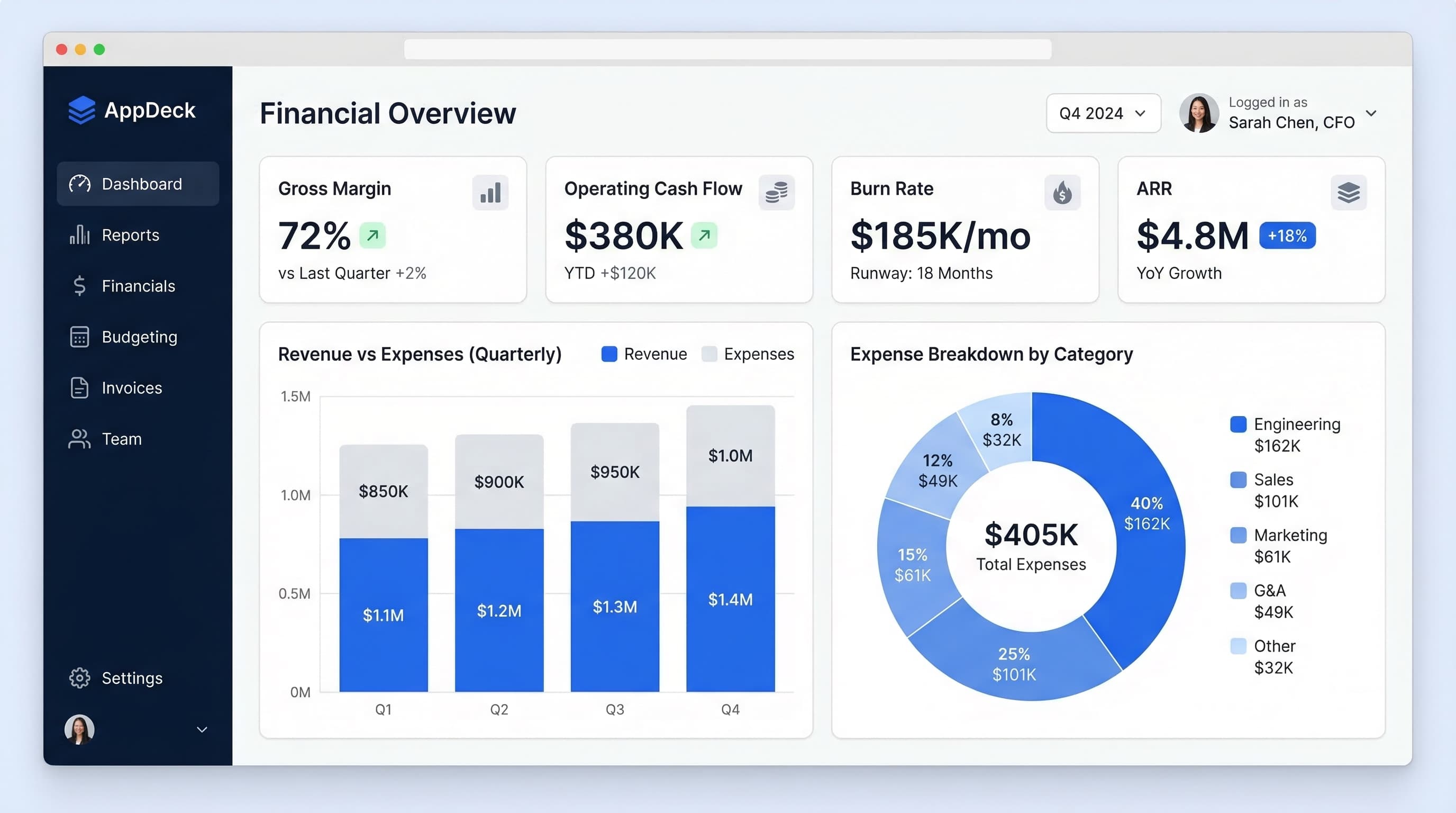
Example 5: Financial Overview
Question it answers: "What's our financial position right now, and how are we trending against plan?"
Key metrics (7):
- Revenue — MTD and YTD vs. plan
- COGS — cost of goods sold with margin impact
- Gross margin — percentage with trend
- Operating expenses — total and by category (people, software, facilities)
- EBITDA — actual vs. plan with margin percentage
- Cash flow from operations — monthly with trend
- Net cash position — bank balance with 90-day forecast
Layout:
The top section presents a condensed P&L summary in a single horizontal strip: Revenue -> COGS -> Gross Profit -> OpEx -> EBITDA. Each value shows actual, plan, and variance, color-coded green (favorable) or red (unfavorable). A CFO can read this strip left-to-right and understand the entire financial story in 15 seconds.
The center-left panel displays a revenue trend chart (12-month view) with actual vs. plan lines and a shaded variance band. Below it, a gross margin trend chart shows whether profitability is improving or degrading over time.
The center-right panel shows operating expense breakdown as a stacked bar chart by category. This makes it immediately visible which cost centers are growing and which are controlled. Below it, a cash flow chart displays operating cash flow by month.
The bottom strip shows three cash-related cards: current cash balance, AR balance (money owed to you), and AP balance (money you owe), with a simple visual showing net cash position and the 90-day forecast.
Why this layout works: CFOs process financial information in P&L order — revenue down to EBITDA. The horizontal P&L strip matches their mental model. The supporting charts provide the "why" behind each number. The cash strip at the bottom addresses the CFO's perennial concern: "Do we have enough cash?"
Update frequency: Daily cash position, weekly P&L, monthly full reconciliation.
Example 6: Cash Flow Dashboard
Question it answers: "Where is our cash going, and when will we need more?"
Key metrics (6):
- Operating cash flow — cash generated from business operations
- Free cash flow — operating cash flow minus capital expenditures
- Cash runway — months of cash remaining at current burn
- AR days (DSO) — average days to collect receivables
- AP days (DPO) — average days to pay suppliers
- Cash conversion cycle — DSO + inventory days - DPO
Layout:
The centerpiece of this dashboard is a waterfall chart showing cash movement for the current month. Starting with opening cash balance on the left, green bars show cash inflows (customer payments, investment income, financing) and red bars show cash outflows (payroll, vendors, rent, taxes, etc.), ending with the closing cash balance on the right. This single chart tells the complete cash story.
Above the waterfall, three key metric cards display operating cash flow, free cash flow, and cash runway — each with trend indicators and comparison to the prior month.
Below the waterfall, a two-panel layout addresses collections and payments. The left panel shows AR aging in a horizontal stacked bar: current (0-30 days), aging (31-60 days), overdue (61-90 days), and delinquent (90+ days). The DSO trend line overlays the chart. The right panel shows the AP aging in the same format with DPO trend, helping the CFO manage payment timing strategically.
A small projection chart at the bottom shows the 6-month cash forecast under three scenarios: best case, expected, and worst case, with the critical "need more cash" threshold clearly marked as a horizontal line.
Why this layout works: Cash is the lifeblood of any company, and this dashboard treats it that way. The waterfall chart is the single best visualization for cash movement — it shows both magnitude and direction at a glance. The AR/AP panels address the two biggest levers a CFO can pull to manage cash flow. The projection chart answers the most important forward-looking question.
Update frequency: Daily, with projections updated weekly.
Example 7: Budget vs. Actual
Question it answers: "Which departments are on budget and which need attention?"
Key metrics (varies by departments, typically 6-8 departments):
- Department budget vs. actual — for each major department
- Total variance — company-wide budget variance (dollar and percentage)
- Forecast — updated full-year projection based on current trends
- Largest variances — top 3-5 line items driving over/under-spend
- Headcount vs. plan — actual hires vs. budgeted headcount
- Discretionary spend — travel, software, and other controllable expenses
Layout:
The primary view is a comparison table — the workhorse of budget management. Each row represents a department (Engineering, Sales, Marketing, G&A, Customer Success, etc.). Columns show: budgeted amount, actual spend, variance (dollar), variance (percentage), and full-year forecast. Variance cells are conditionally formatted: green for under-budget, red for over-budget, with intensity proportional to the magnitude. A CFO can scan this table top-to-bottom and immediately identify problem areas.
Above the table, a summary bar shows total company budget vs. actual in a single horizontal progress bar, with a marker for current spend and the target line. This gives the high-level answer before drilling into departments.
Below the table, a variance analysis panel highlights the top 5 line items driving the largest variances. Each item shows the line item name, department, budgeted amount, actual amount, variance, and a brief explanation field (e.g., "Unplanned contractor hire for Q1 product launch"). This saves the CFO from having to hunt through spreadsheets to understand why a department is over budget.
A small headcount tracker in the corner shows planned vs. actual headcount by department, since people costs typically represent 60-80% of a company's budget.
Why this layout works: Budget vs. actual is inherently tabular data, and trying to make it "visual" with fancy charts often obscures the details CFOs need. The table format respects the data's nature while using conditional formatting to guide attention. The variance analysis panel adds the context that raw numbers lack.
Update frequency: Monthly, with forecast updated quarterly.
Example 8: Accounts Receivable Dashboard
Question it answers: "How much money is owed to us, and what's at risk of not being collected?"
Key metrics (5):
- Total AR balance — total outstanding receivables
- Aging buckets — current (0-30), 31-60, 61-90, and 90+ days
- DSO (Days Sales Outstanding) — average collection time
- Collection rate — percentage of AR collected within terms
- Bad debt reserve — estimated uncollectible amount
Layout:
The top section displays three large metric cards: Total AR balance (with month-over-month change), DSO (with trend and benchmark comparison), and collection rate (with target line). These three numbers give an instant health check on receivables.
The center panel features an aging distribution chart — a horizontal stacked bar showing the percentage of AR in each aging bucket. A healthy profile is heavily weighted toward the "current" bucket (green). As the bars shift toward 60+ and 90+ days (yellow and red), it signals collection problems. Below the distribution chart, a trend view shows how the aging profile has shifted over the past 6 months — is it getting better or worse?
The bottom section is an actionable table: the top 10 overdue accounts sorted by dollar amount. Each row shows customer name, invoice number, amount, days overdue, last contact date, and assigned collector. This is where the dashboard transitions from information to action — the collections team can work directly from this list.
A small sidebar tracks collection team performance: calls made, promises to pay received, and cash collected this week.
Why this layout works: AR dashboards must bridge finance and operations. The top-level metrics serve the CFO (are we collecting efficiently?). The aging chart serves the controller (where's the risk?). The overdue accounts table serves the collections team (who do I call next?). One dashboard serves three audiences by layering from strategic to operational top-to-bottom.
Update frequency: Daily, with the overdue accounts table refreshed in real-time.
Sales / CRO Dashboards (Examples 9-12)
Sales dashboards need to drive behavior. They're often displayed on large monitors in the sales area, and every metric should motivate action. The best sales dashboards create healthy urgency without creating anxiety.
Example 9: Sales Pipeline Dashboard
Question it answers: "Do we have enough pipeline to hit our number, and where are deals getting stuck?"
Key metrics (6):
- Total pipeline value — weighted and unweighted, by stage
- Pipeline coverage ratio — pipeline divided by quota (target: 3-4x)
- Win rate — percentage of opportunities that close, by stage
- Average deal size — with trend comparison
- Sales cycle length — average days from opportunity creation to close
- Stage conversion rates — percentage progressing from each stage to the next
Layout:
The top banner shows two critical numbers side by side: total weighted pipeline and pipeline coverage ratio. If coverage is below 3x, the number displays in red — a clear signal that more pipeline generation is needed immediately.
The main visualization is a funnel chart occupying the center of the dashboard. Each stage shows the number of deals, total value, and conversion rate to the next stage. The funnel widths are proportional to value (not deal count), making it immediately visible where revenue is concentrated. Stages with below-average conversion rates are highlighted with a warning indicator, showing where deals are getting stuck.
The right panel shows a deals table grouped by expected close date: this month, next month, and the month after. Each deal shows the company name, value, stage, days in stage, and probability. Deals that have been in the same stage for longer than the average are flagged — these are stalled opportunities that need intervention.
The bottom strip displays trend metrics: win rate (6-month trend), average deal size (6-month trend), and sales cycle length (6-month trend). These help the CRO identify whether the pipeline's overall quality is improving or degrading.
Why this layout works: Pipeline dashboards must answer two questions: "Do we have enough?" (coverage ratio) and "Will it convert?" (stage conversion rates). The funnel provides instant visual understanding of pipeline shape. The deals table makes it actionable — reps can work from it directly.
Update frequency: Real-time (synced with CRM).
Example 10: Sales Rep Performance Dashboard
Question it answers: "Who's performing, who needs help, and what activities are driving results?"
Key metrics (5):
- Quota attainment — per rep, percentage of target achieved
- Activities — calls, emails, and meetings completed per rep
- Pipeline generated — new pipeline created by each rep this period
- Win rate — per rep, compared to team average
- Average deal size — per rep, compared to team average
Layout:
This dashboard uses a leaderboard format — and that's intentional. Sales teams respond to competition and public accountability.
The primary view is a ranked table showing all reps sorted by quota attainment. Each row displays: rank, rep name (with photo if available), quota attainment percentage (with a progress bar), closed revenue, pipeline generated, activity count, and win rate. Reps above 100% of quota are highlighted in green, 80-100% in yellow, and below 80% in red. The visual effect is immediate — everyone can see where they stand.
Above the leaderboard, three summary cards show team-level metrics: total team quota attainment, total pipeline generated, and total activities completed. These provide context for individual performance.
Below the leaderboard, a scatter plot maps each rep on two axes: activity volume (x-axis) and quota attainment (y-axis). This reveals four quadrants that tell a coaching story. High activity, high attainment: top performers. High activity, low attainment: reps who need skill coaching (they're doing the work but not converting). Low activity, high attainment: efficient reps (or reps riding large deals). Low activity, low attainment: reps who need a serious conversation.
Why this layout works: Sales is one of the few functions where public performance comparison is culturally accepted and motivationally effective. The leaderboard creates accountability. The scatter plot gives sales managers a diagnostic tool for coaching. Together, they answer both "who" and "why."
Update frequency: Daily, often displayed on a TV screen in the sales area.
Example 11: Revenue Analytics Dashboard
Question it answers: "How is our recurring revenue evolving, and what's driving changes?"
Key metrics (5):
- MRR — total monthly recurring revenue
- Expansion revenue — upsells and cross-sells from existing customers
- Churn — lost revenue from cancellations and downgrades
- Contraction — revenue decrease from downgrades (not full churn)
- Net revenue retention — (starting MRR + expansion - churn - contraction) / starting MRR
Layout:
The hero visualization is an MRR waterfall chart occupying the top half of the dashboard. Starting with last month's MRR on the left, green bars add new MRR and expansion MRR, while red bars subtract churned MRR and contraction MRR, arriving at this month's ending MRR on the right. This is the single most important chart for any SaaS or subscription business — it tells the complete revenue story in one image.
Above the waterfall, a single large metric displays net revenue retention with a 12-month trend. NRR above 100% means existing customers are growing (displayed in green). Below 100% means the business is leaking revenue (displayed in red). This is the metric that investors care about most.
The bottom-left panel shows a cohort retention chart — a heatmap where each row represents a customer cohort (by signup month) and each column shows the percentage of revenue retained at month 1, 2, 3, and so on. This reveals whether retention is improving for newer cohorts or if there's a systemic problem.
The bottom-right panel breaks down churn by reason (price, product fit, competitor, budget cuts, etc.) in a horizontal bar chart. This transforms churn from a number into actionable intelligence — if 40% of churn is due to a missing feature, that's a product decision, not a sales problem.
Why this layout works: SaaS revenue is a story of additions and subtractions. The waterfall chart makes this story visual and intuitive. The cohort chart adds the time dimension that aggregate metrics miss. The churn reasons chart connects metrics to action.
Update frequency: Weekly MRR, monthly cohort analysis.
Example 12: Sales Forecast Dashboard
Question it answers: "Will we hit our number this quarter, and how confident should we be?"
Key metrics (5):
- Committed deals — deals with signed contracts or verbal commits
- Best case — committed plus high-probability pipeline
- Pipeline — total remaining pipeline for the quarter
- Forecast accuracy — how close previous forecasts were to actual results
- Gap to target — difference between current commit and quarterly target
Layout:
The top section shows a horizontal stacked bar for the current quarter. The bar is divided into segments: closed-won (dark green), committed (green), best case (yellow), and pipeline (light gray). A vertical target line marks the quarterly goal. At a glance, you can see how much is already closed, how much is committed, and how much needs to come from pipeline to hit the number. The gap between the committed segment and the target line is the "gap to close" — the number that should keep the CRO focused.
Below the stacked bar, a table shows the same breakdown by month (Month 1, Month 2, Month 3 of the quarter), allowing leaders to see whether the quarter is front-loaded or back-loaded.
The center panel displays a forecast accuracy chart — a 4-quarter history showing what was forecasted vs. what actually closed. This builds or erodes credibility. If the team consistently over-forecasts, everyone learns to discount the current forecast. If accuracy is high, the current forecast carries more weight.
The bottom section shows the top 10 deals expected to close this quarter, sorted by value. Each row includes company name, value, stage, probability, expected close date, rep name, and "days to close" countdown. Deals that have slipped from a previous expected close date are flagged. This is the operational layer that turns forecast discussion into deal-specific action planning.
Why this layout works: Forecasting is about confidence intervals, not precise numbers. The stacked bar with committed/best case/pipeline segments communicates uncertainty visually. The forecast accuracy history provides the context needed to interpret the current forecast. The deal table keeps the conversation grounded in specifics rather than abstractions.
Update frequency: Weekly, with deal-level updates daily.
Marketing / CMO Dashboards (Examples 13-16)
Marketing dashboards must connect activity to outcomes. The best ones trace the path from spend to revenue, making the marketing team's contribution to the business undeniable.
Example 13: Marketing Overview Dashboard
Question it answers: "Is our marketing engine generating enough qualified leads at an acceptable cost?"
Key metrics (6):
- MQLs (Marketing Qualified Leads) — volume with conversion rate from total leads
- SQLs (Sales Qualified Leads) — volume with conversion rate from MQLs
- MQL-to-customer conversion rate — the end-to-end funnel efficiency
- CAC (Customer Acquisition Cost) — blended and by channel
- Marketing spend — total and by channel, with percentage of revenue
- Marketing-sourced pipeline — dollar value of pipeline created by marketing
Layout:
The top section displays a horizontal funnel visualization flowing left-to-right: Website Visits -> Leads -> MQLs -> SQLs -> Opportunities -> Customers. Each stage shows the count and the conversion rate to the next stage. Stages with conversion rates below historical averages are highlighted in yellow. This funnel is the north star of marketing — it shows both volume and efficiency at every stage.
Below the funnel, a two-column layout provides depth. The left column shows a channel performance table: each row represents a marketing channel (organic search, paid search, social, email, events, referral), with columns for spend, leads generated, CAC, and ROI. This answers the perpetual question: "Where should we spend our next dollar?"
The right column shows two trend charts stacked vertically. The top chart tracks MQL volume over 12 months with the target line overlaid. The bottom chart tracks CAC over the same period. Together, they reveal whether marketing is scaling efficiently (MQLs up, CAC stable) or hitting diminishing returns (MQLs flat, CAC rising).
A bottom banner shows marketing spend as a percentage of revenue — a key efficiency metric that CMOs are increasingly held accountable for. Industry benchmarks are shown alongside for context (SaaS average: 20-30% of revenue for growth stage, 10-15% for mature companies).
Why this layout works: The funnel format matches how marketing teams think about their work — generating and qualifying demand. The channel table drives budget allocation decisions. The trend charts provide early warning if efficiency is degrading.
Update frequency: Weekly, with lead counts updated daily.
Example 14: Content Performance Dashboard
Question it answers: "Which content is driving traffic and conversions, and where should we invest?"
Key metrics (5):
- Organic traffic — total sessions from search with month-over-month growth
- Keyword rankings — number of keywords in top 3, top 10, and top 20
- Top pages by traffic — the 10 highest-traffic blog posts and pages
- Content conversion rate — percentage of blog visitors who become leads
- Content ROI — leads generated vs. content production cost
Layout:
The top row shows three metric cards: total organic traffic (with trend), total ranking keywords (with movement), and content conversion rate (with comparison to site average). These establish the content program's overall health.
The center section is a top pages table — the most actionable view for content teams. Each row shows a page URL (shortened for readability), title, monthly traffic, traffic trend (up/down with percentage), top ranking keyword, keyword position, and conversion rate. Pages are sorted by traffic, but conversion rate is highlighted when it's significantly above or below the average. A high-traffic page with zero conversions is a CRO opportunity. A low-traffic page with high conversion rate is an SEO opportunity.
Below the table, a keyword movement chart shows how many keywords moved up, stayed flat, or moved down in the past 30 days. This is a leading indicator — ranking improvements today become traffic gains in 30-60 days.
A small panel in the bottom corner shows the content calendar status: articles in production, scheduled publish dates, and target keywords. This connects performance data to the content pipeline, helping the team decide what to write next based on what's already working.
Why this layout works: Content marketing is a long game, and this dashboard balances lagging indicators (traffic, conversions) with leading indicators (keyword movement, content pipeline). The top pages table is the operational heart — it tells the team exactly where to focus optimization efforts.
Update frequency: Weekly, with rankings updated daily.
Example 15: Campaign Performance Dashboard
Question it answers: "Which campaigns are generating ROI and which should we pause or optimize?"
Key metrics (6):
- Total ad spend — across all platforms
- Impressions — total ad impressions
- Clicks — total clicks with CTR (click-through rate)
- CPA (Cost Per Acquisition) — cost to acquire a lead or customer
- ROAS (Return on Ad Spend) — revenue generated per dollar spent
- Conversions — leads, signups, or purchases from campaigns
Layout:
The top banner shows four summary cards: total spend, total conversions, blended CPA, and blended ROAS. These give the CMO the high-level efficiency picture before drilling into individual campaigns.
The primary view is a campaign comparison table. Each row represents a campaign (or campaign group), with columns for: campaign name, platform (Google, Meta, LinkedIn, etc.), spend, impressions, clicks, CTR, conversions, CPA, and ROAS. The table is sorted by ROAS in descending order, so the most efficient campaigns are at the top. CPA cells are color-coded: green if below target, yellow if at target, red if above target. The ROAS column uses a horizontal bar within each cell, making it easy to compare efficiency across campaigns visually.
Below the table, a spend allocation chart (pie or donut) shows how the budget is distributed across platforms. Next to it, a ROAS-by-platform bar chart reveals which platforms are delivering the best returns. If 50% of spend is on a platform delivering 20% of conversions, the misalignment is immediately obvious.
The bottom section shows a weekly trend chart for the two most important metrics: CPA and ROAS over time. This reveals whether campaign optimization efforts are working (CPA declining, ROAS increasing) or if performance is degrading (creative fatigue, audience saturation).
Why this layout works: Campaign management is fundamentally about allocation — putting more money where returns are highest. The comparison table enables direct apples-to-apples evaluation. The platform-level views reveal structural allocation issues. The trends show whether optimization is working.
Update frequency: Daily during active campaigns, weekly summary.
Example 16: SEO Dashboard
Question it answers: "Is our organic search presence growing, and what's driving changes?"
Key metrics (6):
- Organic traffic — sessions from search engines, with trend
- Keyword rankings — distribution across position ranges (top 3, 4-10, 11-20, 21-50)
- Domain authority / domain rating — site-wide authority metric with trend
- Backlinks — total referring domains, with new and lost this month
- Indexed pages — total pages indexed by Google
- Click-through rate — average CTR from search results
Layout:
The top section displays an organic traffic trend chart spanning 12 months, with a dotted line showing the prior year for year-over-year comparison. This is the ultimate scoreboard for SEO — are we growing organic visibility? Below the chart, a small annotation strip marks key events (algorithm updates, major content publishes, technical changes) that may explain traffic shifts.
The left panel shows keyword ranking distribution as a stacked area chart over time. The areas represent keyword counts in each position range: positions 1-3 (dark green), 4-10 (green), 11-20 (yellow), and 21-50 (light gray). A healthy SEO program shows the dark green and green areas growing over time, meaning more keywords are reaching page one.
The right panel displays a keyword movement table — the 20 keywords with the largest position changes (both up and down) in the past 30 days. Each row shows the keyword, current position, previous position, change, search volume, and the ranking URL. This table drives action: which pages need attention, and which wins should be amplified?
The bottom section shows backlink metrics: total referring domains (trend), new vs. lost domains this month, and a list of the 5 most valuable new backlinks acquired. For SEO, backlinks remain one of the strongest ranking factors, and tracking link acquisition is essential for understanding authority growth.
Why this layout works: SEO is a slow-burn channel where leading indicators (keyword movements, backlinks) precede lagging indicators (traffic) by weeks or months. This dashboard balances both, helping SEO managers understand not just where they are, but where they're heading.
Update frequency: Weekly rankings, monthly full review.
Operations & HR Dashboards (Examples 17-20)
Operations and HR dashboards focus on efficiency, quality, and people. These functions directly impact a company's ability to deliver on its promises and retain its team.
Example 17: Operations Dashboard
Question it answers: "Are we delivering on time, at quality, and at capacity?"
Key metrics (6):
- Throughput — units produced, orders fulfilled, or tasks completed per period
- Quality rate — percentage meeting quality standards (first-pass yield)
- On-time delivery — percentage of orders delivered by promised date
- Inventory turns — how quickly inventory is sold and replaced
- Capacity utilization — percentage of available capacity being used
- Cost per unit — production or fulfillment cost per unit with trend
Layout:
The top row presents four large metric gauges — semicircular dials showing throughput, quality rate, on-time delivery, and capacity utilization, each against their target. The gauge format works well for operations because teams think in terms of "are we in the green zone?" Green zone (above target), yellow zone (near target), and red zone (below target) are immediately intuitive.
The center panel shows a real-time production or fulfillment status board. For manufacturing, this might show each production line's status. For fulfillment, it shows orders in each stage: received, processing, packed, shipped. Color coding indicates whether each stage is moving at expected velocity or experiencing delays.
The bottom-left panel displays quality metrics: first-pass yield trend over 12 weeks, defect rate by category (Pareto chart showing which defect types account for 80% of issues), and cost of quality (rework, returns, warranty claims). The bottom-right panel shows delivery performance: on-time percentage trend, average delivery time, and a list of currently delayed orders requiring attention.
Why this layout works: Operations teams manage physical or process-oriented workflows where real-time status matters. The gauge format provides instant health checks. The status board connects the dashboard to the actual work being done. The quality and delivery panels address the two outcomes that matter most to customers.
Update frequency: Real-time for status board, daily for aggregate metrics.
Example 18: Customer Success Dashboard
Question it answers: "How healthy is our customer base, and who's at risk of churning?"
Key metrics (6):
- NPS (Net Promoter Score) — latest score with trend and segmentation
- CSAT (Customer Satisfaction Score) — average satisfaction rating
- Support ticket volume — total open and new tickets with trend
- First response time — average time to first response
- Resolution time — average time to fully resolve tickets
- Churn risk — number of accounts flagged as at-risk, with total revenue at risk
Layout:
The top section splits into two halves. The left half shows NPS as a large gauge with the score prominently displayed, alongside the breakdown of promoters (green), passives (yellow), and detractors (red) as a horizontal stacked bar. The NPS trend over 4 quarters is shown below. The right half shows CSAT as a similar gauge with the trend, plus a breakdown by interaction type (support, onboarding, QBR).
The middle section displays a customer health score distribution. Customers are categorized into health tiers: healthy (green), neutral (yellow), and at-risk (red). A bar chart shows the count and total ARR in each tier. Below it, a trend chart shows how the distribution has shifted over time — is the at-risk segment growing or shrinking?
The bottom section contains two panels. The left panel shows support metrics: a ticket volume trend chart (new tickets per week), with overlaid lines for first response time and resolution time. When ticket volume spikes and response times lag, it's a warning sign. The right panel is the churn risk watchlist — a table of the 10 highest-risk accounts sorted by revenue. Each row shows the account name, ARR, health score, primary risk factor (low engagement, support issues, contract renewal approaching), and the assigned CSM. This is the most actionable section — CSMs should be working this list daily.
Why this layout works: Customer success is about proactive intervention. The NPS and CSAT metrics measure sentiment. The health score distribution quantifies risk. The churn watchlist drives action. The dashboard moves from "how do customers feel?" to "who needs help right now?"
Update frequency: NPS/CSAT weekly, health scores and churn risk daily.
Example 19: HR / People Dashboard
Question it answers: "Are we attracting, hiring, and retaining the right people?"
Key metrics (6):
- Headcount — total employees with growth trend
- Open roles — number of active job postings by department
- Time-to-hire — average days from job posting to accepted offer
- Offer acceptance rate — percentage of offers accepted
- Attrition rate — voluntary and involuntary turnover percentage
- Employee engagement score — latest pulse survey result
Layout:
The top row displays a compact org growth chart — a line chart showing total headcount over 12 months with annotations for significant hires (VP-level and above). Next to it, a plan vs. actual headcount bar chart compares budgeted headcount against actual for each department, quickly revealing which teams are behind on hiring.
The center-left panel shows the hiring funnel as a vertical flow diagram: applications received -> phone screens -> interviews -> offers -> acceptances. Each stage shows the count and conversion rate to the next stage. Bottlenecks are immediately visible — if 200 applications yield only 2 phone screens, the sourcing strategy needs attention. If 10 offers yield only 4 acceptances, the compensation or employer brand may be the issue.
The center-right panel tracks attrition. A 12-month trend chart shows monthly attrition rate with a benchmark line (industry average). Below it, a breakdown by department shows which teams are experiencing the highest turnover. A small chart categorizes departures by reason (compensation, career growth, management, relocation, etc.), providing actionable insight for retention efforts.
The bottom section shows engagement metrics from the latest pulse survey: overall engagement score (with trend), top 3 strengths (what employees value most), and top 3 concerns (what needs improvement). This connects the quantitative hiring and retention metrics to the qualitative employee experience.
Why this layout works: HR dashboards must serve both tactical needs (are we hiring fast enough?) and strategic needs (are we retaining our best people?). The hiring funnel addresses the tactical. The attrition and engagement sections address the strategic. Together, they tell the complete people story.
Update frequency: Weekly hiring metrics, monthly attrition and engagement.
Example 20: Project Portfolio Dashboard
Question it answers: "Are our projects on track, on budget, and properly resourced?"
Key metrics (6):
- Active projects — total number of in-progress projects
- On-time percentage — projects currently tracking to deadline
- Budget utilization — percentage of total project budget spent vs. planned
- Resource allocation — team utilization rate (billable hours / available hours)
- At-risk projects — projects flagged yellow or red
- Completed this quarter — projects delivered with success metrics
Layout:
The top section shows four summary cards: active projects, on-time percentage, budget utilization, and resource utilization. Each card includes a comparison to the previous quarter, providing context on whether portfolio management is improving.
The primary view is a project status grid — a table where each row represents an active project. Columns include: project name, owner, start date, target completion, current phase, status (RAG: red/amber/green), budget spent (as a progress bar against total budget), and a brief status note. The RAG indicators are prominent — large colored circles that make it possible to scan 20+ projects in seconds and immediately spot trouble. Projects are sorted with red items at the top, then amber, then green.
Below the grid, a resource allocation heatmap shows team members across the top and projects down the side, with cell colors indicating allocation level: green (properly allocated), yellow (over-allocated), red (critically over-allocated), gray (unallocated). This reveals bottlenecks where a single person is spread across too many projects, which is the number one predictor of project delays.
The bottom panel shows a timeline view (Gantt-style, simplified) of all active projects, with milestones marked. Projects that have slipped from their original timeline show both the original and current projected dates, making schedule risk visible across the portfolio.
Why this layout works: Project portfolio management requires balancing scope, time, budget, and resources across many simultaneous initiatives. The status grid provides the executive summary. The resource heatmap reveals the constraints. The timeline view shows the interdependencies. A PMO director can walk into a steering committee meeting with this dashboard and answer any question about the portfolio.
Update frequency: Weekly, updated by project managers every Friday.
KPI Dashboard Design Best Practices
After building 200+ dashboards, these are the design principles that separate effective dashboards from decorative ones.
1. Start with the Question, Not the Data
The most common mistake is starting with available data and building a dashboard around it. Start with the decision. "What question does this dashboard answer?" If you can't state the question in one sentence, the dashboard will lack focus.
Bad approach: "We have data on revenue, support tickets, website traffic, and employee satisfaction. Let's put it all on one dashboard."
Better approach: "The CEO needs to know if the business is on track to hit quarterly targets. What metrics answer that question?"
2. Use the Inverted Pyramid
The most important information goes at the top. Supporting detail goes in the middle. Drill-down and action items go at the bottom. This matches how people read dashboards — they scan from top to bottom, and most people never scroll.
3. Group Related Metrics Together
Revenue and costs belong together. Lead volume and conversion rate belong together. Headcount and attrition belong together. Grouping related metrics creates natural "stories" that are easier to interpret than scattered individual numbers.
4. Use Consistent Color Coding
Establish a color convention and never deviate:
- Green: On target, healthy, favorable variance
- Yellow/Amber: At risk, approaching threshold, monitor
- Red: Below target, unhealthy, needs action
- Gray: Informational, no judgment implied
When every dashboard in the organization uses the same color language, people develop intuition that works across any dashboard they encounter.
5. Show Context for Every Number
A standalone number is almost useless. For every metric, include at least one form of context:
- vs. target: Are we on track?
- vs. last period: Are we improving?
- Trend direction: Where are we heading?
- Benchmark: How do we compare?
The most effective dashboards include two forms of context — typically target comparison and trend direction.
6. Make It Scannable
Executives spend 30 seconds on a dashboard. Sales reps spend 10 seconds. If your dashboard requires reading, it fails. Use visual hierarchy: large numbers for headline metrics, medium-sized charts for trends, small text for details. A person should be able to determine the dashboard's message from across the room.
7. Limit to One Screen
If your dashboard requires scrolling, it's not a dashboard — it's a report. Dashboards should fit on a single screen at a reasonable resolution. This constraint forces prioritization, which is exactly what makes dashboards effective.
8. Use the Right Chart Type
Each data type has an ideal visualization:
- Single number with context: KPI card with trend
- Trend over time: Line chart
- Comparison across categories: Bar chart (horizontal for many categories)
- Part of a whole: Stacked bar or donut chart (never 3D pie charts)
- Distribution: Histogram or box plot
- Correlation: Scatter plot
- Flow or progression: Funnel or waterfall chart
- Status: RAG indicators or gauges
Using the wrong chart type forces people to work harder to extract meaning.
9. Match Update Frequency to Decision Frequency
Don't update a dashboard hourly if the audience checks it weekly. Don't update it monthly if decisions happen daily. The update frequency should match how often the audience needs to make decisions based on the data.
10. Include a "So What"
The most advanced dashboards include interpretation, not just data. A brief text annotation that says "Revenue is 8% below target due to delayed enterprise deal (expected to close next week)" is more valuable than a red number alone. This turns dashboards from data displays into decision support tools.
How to Build KPI Dashboards with AppDeck
Building effective KPI dashboards doesn't require a data engineering team or months of implementation. Modern dashboard platforms make it possible to go from data to dashboard in hours.
Connect Your Data Sources
AppDeck integrates with the tools your business already uses:
- Financial data: QuickBooks, Xero, NetSuite, Stripe
- CRM data: Salesforce, HubSpot, Pipedrive
- Marketing data: Google Analytics, Google Ads, Meta Ads
- Project data: Jira, Asana, Monday.com
- Custom data: CSV uploads, API connections, database queries
Choose from Pre-Built Templates
Rather than starting from scratch, AppDeck offers dashboard templates based on the examples in this guide. Select a template for your function (executive, finance, sales, marketing, ops, HR), connect your data sources, and customize the metrics and layout to match your needs.
Customize for Your Audience
The same data can serve different audiences with different views:
- CEO view: High-level summary with 5-7 headline metrics
- CFO view: Financial detail with P&L structure and cash position
- CRO view: Pipeline and quota attainment focus
- Board view: Quarterly comparisons with strategic context
Share via Secure Portals
Dashboards are only valuable if the right people see them. AppDeck lets you share dashboards through secure, white-labeled portals:
- Board members access board meeting dashboards without needing login credentials to your internal tools
- Investors see real-time metrics through secure data rooms
- Department heads get their function-specific view
- Executives get the unified overview they need
Real-Time Access, Anywhere
Board members, investors, and executives can access their dashboards from any device — desktop, tablet, or mobile. No more emailing static PDF reports that are outdated by the time they're received.
Frequently Asked Questions
What is a KPI dashboard and what should it include?
A KPI dashboard is a focused visual display of 5 to 7 metrics that answer a specific business question and drive decisions. It includes the headline numbers (with target comparison and trend direction), supporting trend charts, and an action items section showing what needs attention. The best KPI dashboards follow the inverted pyramid: most important information at top, supporting detail in the middle, drill-down and actions at the bottom. Effective dashboards limit themselves to one screen, use consistent color coding (green/yellow/red), and include context for every number—a target, a trend, or a benchmark.
How is a KPI dashboard different from a report?
A dashboard is a decision tool; a report is a historical record. Dashboards limit to 5 to 7 metrics on one screen, update frequently (real-time to weekly depending on use), and prompt immediate action. Reports can run 10 to 50 pages, update monthly or quarterly, and document what happened for compliance, audit, or analysis purposes. If you can't articulate the decision your dashboard helps someone make, you don't need a dashboard—you need a report. The most common mistake is building a "dashboard" that's actually a multi-page report with charts, which neither serves quick decisions nor satisfies thorough analysis.
How many metrics should a KPI dashboard include?
5 to 7 metrics per dashboard, maximum. Cognitive research consistently shows humans hold 5 to 7 items in working memory; beyond that, people stop processing the data. When dashboards have 20+ metrics, viewers see zero of them effectively—the brain treats it as visual noise. Build separate dashboards for separate audiences and questions rather than trying to combine everything into one view. Executive dashboards focus on 5 to 7 KPIs. Operational dashboards can carry 10 to 15 metrics because operators look for specific anomalies. Analyst dashboards can go deeper because the audience expects exploration, but those are tools, not dashboards.
Who should each KPI dashboard be built for?
Match the dashboard to the audience and decision frequency. CEO weekly overview: 5 to 7 company vital signs, refreshed weekly. CFO financial dashboard: P&L, cash, and budget, refreshed daily for cash and weekly for the rest. CRO pipeline dashboard: real-time from CRM, focused on coverage, win rate, and deal velocity. CMO marketing dashboard: weekly outcome metrics (pipeline, ROI, CAC). Operations dashboard: real-time status and quality, often on a TV display. HR people dashboard: weekly for hiring, monthly for engagement and attrition. Board meeting dashboard: quarterly with deeper context. Avoid building one dashboard for "everyone"—it serves no one.
When should you redesign or retire a KPI dashboard?
Redesign when fewer than half the intended audience checks it weekly, when the team consistently asks questions the dashboard doesn't answer, after major strategy or organizational changes, or annually as a hygiene check. Retire dashboards that have lower than 10 percent weekly usage despite reminders—they're not solving a real problem. Replace metrics that stopped predicting outcomes (lead velocity rate that no longer correlates to pipeline, NPS that doesn't move regardless of CSAT changes). The best dashboards evolve every 12 to 18 months as the business grows; rigid dashboards become decorative.
Conclusion
KPI dashboards are not data decoration. They're decision-making tools. The 20 examples in this guide share a common thread: each one answers a specific question, limits cognitive load, provides context, and drives action.
The difference between a dashboard that transforms decision-making and one that gets ignored comes down to discipline: the discipline to focus on 5-7 metrics instead of 50, the discipline to design for your audience instead of yourself, and the discipline to include context that turns numbers into narratives.
Start with one dashboard. Pick the example from this guide that matches your most urgent need. Define the question it answers. Connect your data. Share it with your team. Iterate based on how they use it (or don't). A good dashboard built in a day beats a perfect dashboard planned for six months.
If you're ready to build dashboards that drive decisions, explore AppDeck's Executive Dashboard for real-time KPI dashboards, or set up a Board Portal to share financial and operational metrics with your board.
Related resources:
- The Complete Guide to Executive Dashboards
- Executive Dashboard Software: 8 Platforms Compared
- Executive Dashboard Templates — pre-built layouts for common use cases
- 15 Free Excel Dashboard Templates — downloadable .xlsx files for every business function
- CFO Executive Dashboard: Essential Metrics — deep dive into financial dashboard design

Founder & CEO, AppDeck
Serial entrepreneur with 20+ years building B2B software companies. Former executive managing 2,800+ employees across three continents. Vik reviews all AppDeck content for accuracy and practical relevance.
Share this article
Explore Related Solutions
Related Articles
CEO Dashboard: 10 Metrics Every CEO Should Track in 2026
The 10 most important CEO dashboard metrics for 2026. Revenue, growth, customer health, team performance, and strategic KPIs with visualization tips and real-world examples.
20 Power BI Dashboard Examples for Executives & Business Leaders
Explore 20 real-world Power BI dashboard examples for executives, CFOs, CROs, and CMOs. KPI layouts, design best practices, and when to consider alternatives to Power BI.
Executive Dashboard Design: 10 Best Practices & Real Examples
Master executive dashboard design with 10 proven best practices. Layout principles, KPI selection, color usage, mobile optimization, and common mistakes that executives hate.