
20 Power BI Dashboard Examples for Executives & Business Leaders
Explore 20 real-world Power BI dashboard examples for executives, CFOs, CROs, and CMOs. KPI layouts, design best practices, and when to consider alternatives to Power BI.
TL;DR: Explore 20 real-world Power BI dashboard examples for executives, CFOs, CROs, and CMOs. KPI layouts, design best practices, and when to consider alternatives to Power BI.
Introduction
Power BI is one of the most widely deployed business intelligence tools in the world, with over 350,000 organizations using it as of 2025. If your company runs on Microsoft 365, there's a good chance someone has already built a Power BI dashboard somewhere in your org.
But here's what I've seen over and over after 20 years of building B2B software: executives rarely use the dashboards their data teams build. The dashboards are too detailed, too slow, or too disconnected from the decisions that actually matter.
The problem isn't Power BI itself. It's a powerful tool. The problem is that most Power BI executive dashboards are built by analysts who think in data models, not by leaders who think in decisions.
In this guide, I'll walk through 20 Power BI dashboard examples organized by executive role — CEO, CFO, CRO, CMO, and Operations — with specific KPIs, layout recommendations, and the common mistakes that make each one fail. I'll also cover when Power BI is the right tool for the job and when you should consider purpose-built executive dashboard platforms instead.
What Makes a Great Executive Dashboard
Before diving into examples, let's establish the five principles that separate dashboards executives actually use from the ones that collect dust.
1. Single-Screen Rule
If your dashboard requires scrolling, it's not a dashboard — it's a report. Executives should be able to glance at one screen and know the state of the business in under 10 seconds. That means 6-10 metrics maximum, not 40.
2. Real-Time (or Close to It)
A dashboard that shows last month's data is a rearview mirror. The best executive dashboards pull data at least daily, and ideally refresh every few hours. Power BI supports scheduled refresh up to 8 times per day on Pro licenses (48 on Premium), which is adequate for most executive use cases.
3. Role-Specific
A CEO doesn't need to see individual sales rep conversion rates. A CMO doesn't need to see accounts receivable aging. The biggest mistake I see is building one "executive dashboard" and sharing it with the entire leadership team. Build one per role.
4. Actionable, Not Just Informational
Every metric on the dashboard should trigger a question or a decision. "Revenue is $4.2M" is information. "Revenue is $4.2M, which is 12% below plan" is actionable. Always show actuals against targets, benchmarks, or prior periods.
5. Drill-Down Capable
The dashboard is the starting point, not the destination. Executives should be able to click into any metric to understand the "why" behind the number. Power BI handles this well with drill-through pages and tooltip visuals.
CEO Dashboards (4 Examples)
The CEO's dashboard is the 30,000-foot view. It should answer one question: Is the business on track? For a deeper look at CEO-specific metrics, see my guide on the 10 metrics every CEO should track.
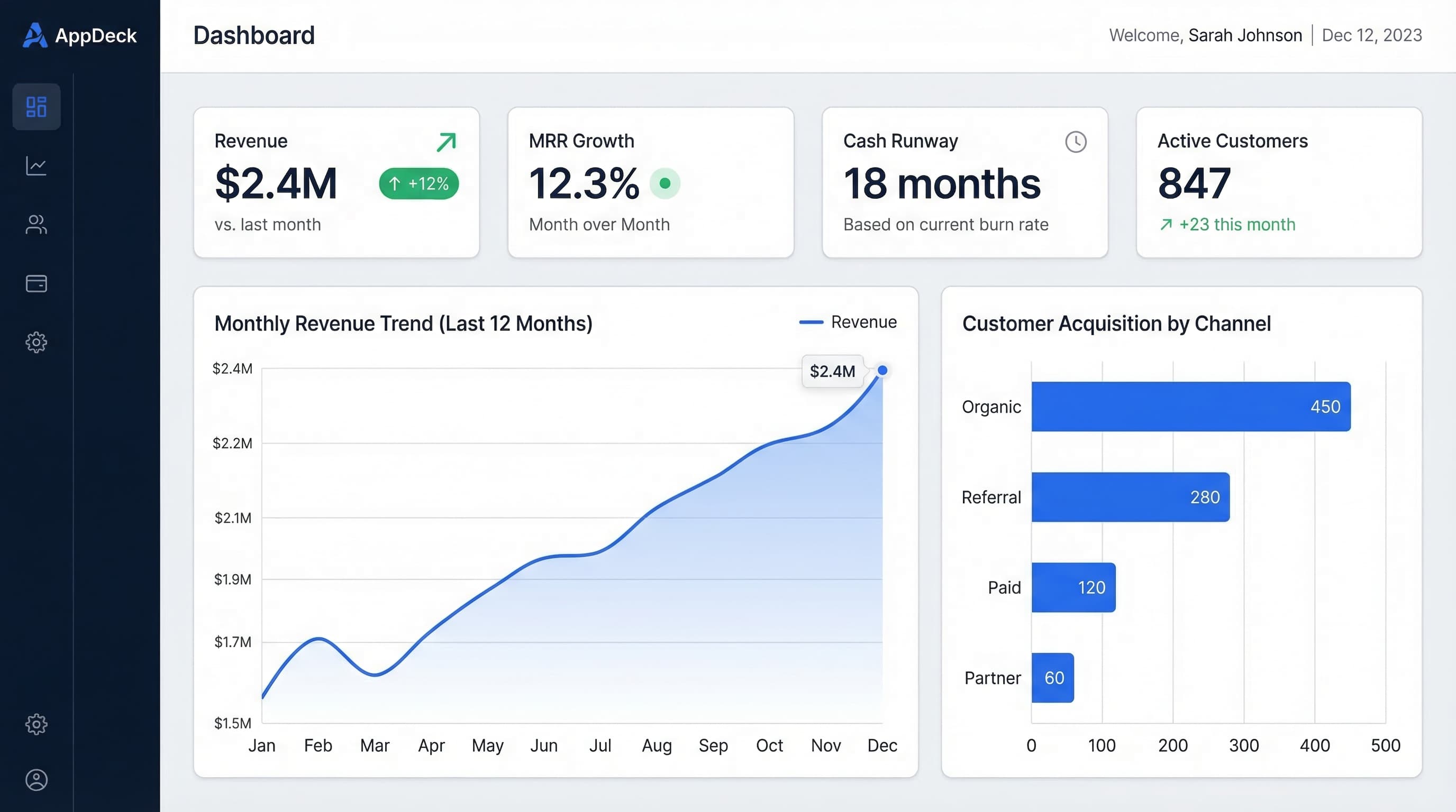
1. Company Health Overview Dashboard
Layout: Three rows. Top row has four large KPI cards showing the numbers that matter most. Middle row has two time-series charts. Bottom row has two summary tables.
KPIs Displayed:
- Monthly Recurring Revenue (MRR) with month-over-month change
- Net Revenue Retention (NRR) as a percentage
- Cash runway in months
- Employee headcount with open roles count
- Revenue trend line (trailing 12 months)
- Net Promoter Score (NPS) trend
- Churn rate vs. target
- Top 5 accounts by ARR with health status (green/yellow/red)
Why It Works: This dashboard connects financial performance (MRR, NRR), operational health (headcount, cash), and customer sentiment (NPS, churn) into a single view. A CEO can glance at this for 10 seconds before a Monday morning meeting and know exactly which area needs attention.
Common Mistake: Including too many financial details that belong on the CFO dashboard. The CEO doesn't need to see individual expense categories or cash flow breakdowns — just the headline numbers and trends.
2. Strategic OKR Tracker Dashboard
Layout: Left column shows company-level objectives with progress bars. Right panel shows a breakdown of key results with red/yellow/green status indicators. A bottom strip shows quarterly timeline with milestones.
KPIs Displayed:
- 3-5 company OKRs with percentage completion
- Key result progress (actual vs. target) for each OKR
- Owner name and last update date per key result
- Days remaining in the quarter
- Overall confidence score (on track / at risk / off track)
- Quarter-over-quarter OKR completion rate
Why It Works: OKRs only work if leadership reviews them regularly. Embedding them in the CEO's daily dashboard — rather than burying them in a Google Sheet reviewed once a quarter — creates accountability. The confidence score is the single most important element: it forces teams to self-assess honestly.
Common Mistake: Tracking too many OKRs. If your Power BI dashboard shows 15 objectives, nobody is focused. Three to five company-level OKRs is the ceiling.
3. Board Meeting Summary Dashboard
Layout: Designed to be presented on screen or exported as a PDF. Single page with a left-side summary panel (5 headline metrics with sparklines) and a right-side section with three mini charts: revenue waterfall, headcount plan vs. actual, and cash bridge.
KPIs Displayed:
- ARR or revenue vs. plan
- Gross margin percentage
- Customer count and logo churn
- Cash position and runway
- Key hiring progress (filled vs. open roles)
- Revenue per employee
- EBITDA or burn rate trend
- Top 3 strategic updates (text cards)
Why It Works: Board members have 30 minutes of attention for your financials. This dashboard gives them the five numbers they care about immediately, with supporting charts that tell the story. The text cards for strategic updates are underused in Power BI — they provide context that numbers alone can't.
If you're presenting to a board, you'll also want a secure way to share materials before and after the meeting. A board portal keeps everything — dashboards, documents, minutes, and resolutions — in one place that board members can access without a Power BI license.
Common Mistake: Building the board dashboard like an internal operating dashboard. Board members don't need drill-through capability. They need narrative and clarity.
4. Market & Competitive Intelligence Dashboard
Layout: Two-column layout. Left column shows internal metrics (market share estimate, win/loss ratios by competitor). Right column shows external signals (industry growth rates, competitor funding rounds, share of voice in key categories).
KPIs Displayed:
- Win rate by competitor (bar chart)
- Reasons for competitive losses (stacked bar)
- Market share estimate with trend
- Industry growth rate benchmarks
- Share of voice in analyst reports or review sites
- Competitive feature parity score
- New market entrants (recent 6 months)
Why It Works: Most CEOs rely on gut feel for competitive positioning. This dashboard forces rigor by tracking win/loss data and external signals in one place. The win-rate-by-competitor chart alone is worth the effort — it immediately shows where you're losing and why.
Common Mistake: Relying on stale data. Competitive intelligence is only useful if updated monthly at minimum. Set a recurring task for your strategy or product team to refresh the underlying data.
CFO Dashboards (5 Examples)
The CFO cares about financial performance, risk, and compliance. These dashboards need to be precise, auditable, and connected to the general ledger. For a deep dive, see essential CFO dashboard metrics and our CFO solutions page.
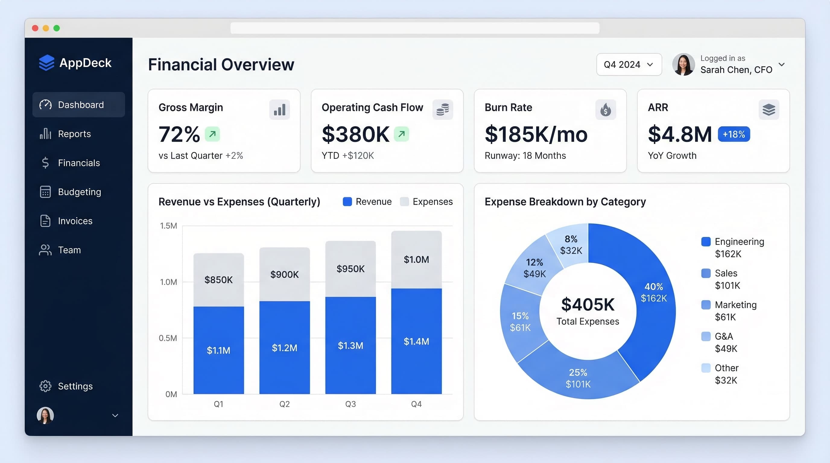
5. Financial Performance Dashboard (P&L, Cash Flow, Runway)
Layout: Top banner shows three headline numbers: total revenue, total expenses, and net income (or EBITDA) with month-over-month and year-over-year comparisons. Below that, a two-column layout: left column has a P&L waterfall chart, right column has a cash flow waterfall chart. Bottom strip shows 12-month runway projection.
KPIs Displayed:
- Total revenue (vs. plan and vs. prior year)
- Total COGS and gross margin %
- Total operating expenses by category
- Net income / EBITDA
- Operating cash flow
- Free cash flow
- Cash balance
- Runway in months (at current burn)
Why It Works: Waterfall charts are the single best visualization for P&L and cash flow because they show both the individual components and how they add up to the total. The runway projection at the bottom gives the CFO the forward-looking context that backward-looking P&L statements lack.
Common Mistake: Using pie charts for expense breakdowns. Pie charts are terrible for comparing categories. Use horizontal bar charts or waterfall charts instead.
6. Budget vs. Actual Variance Dashboard
Layout: Full-width table at the top showing every budget line item with columns for budget, actual, variance (dollar and percentage), and a conditional formatting color scale (green for under budget, red for over). Below the table, a bar chart showing the top 10 variance items ranked by dollar impact.
KPIs Displayed:
- Total budget vs. actual (company level)
- Variance by department
- Variance by expense category
- Top 10 over-budget line items
- Top 10 under-budget line items
- Year-to-date cumulative variance
- Forecast vs. budget for remaining quarters
- Variance trend (is it getting better or worse month over month?)
Why It Works: The CFO's primary job during budget cycles is identifying where the plan is diverging from reality. Ranking variances by dollar impact — not percentage — ensures the CFO focuses on what actually moves the needle. A 200% variance on a $5K line item is noise. A 15% variance on a $2M line item is a fire.
Common Mistake: Showing only current-month variance. Cumulative year-to-date variance and the trend line are essential for understanding whether a variance is a one-time event or a systemic issue.
7. Accounts Receivable Aging Dashboard
Layout: Left panel shows AR summary: total outstanding, current, 30-day, 60-day, 90-day+, and DSO (days sales outstanding). Right panel shows a horizontal stacked bar chart with aging buckets by customer or segment. Bottom section lists the top 20 overdue invoices with customer name, amount, days overdue, and last contact date.
KPIs Displayed:
- Total AR outstanding
- AR aging breakdown (current, 1-30, 31-60, 61-90, 90+ days)
- Days Sales Outstanding (DSO) with trend
- DSO vs. industry benchmark
- Bad debt reserve as percentage of AR
- Top 20 overdue invoices
- Collections rate (percentage of overdue AR collected per month)
- Concentration risk (percentage of AR from top 5 customers)
Why It Works: Cash is the lifeblood of any business. This dashboard gives the CFO an instant read on whether cash is flowing in on schedule or piling up in overdue buckets. The concentration risk metric is often overlooked — if 40% of your AR is sitting with two customers, that's a strategic risk worth flagging.
Common Mistake: Not including the "last contact date" on overdue invoices. It's the difference between knowing you have a problem and knowing whether anyone is doing something about it.
8. Revenue Recognition Dashboard
Layout: Top section shows total recognized revenue, deferred revenue, and unbilled revenue as three large KPI cards with month-over-month trends. Middle section has a stacked area chart showing the revenue recognition schedule over the next 12 months. Bottom section shows a table of contracts with recognition schedules, remaining performance obligations, and compliance flags.
KPIs Displayed:
- Recognized revenue (current month and YTD)
- Deferred revenue balance with trend
- Unbilled revenue
- Remaining performance obligations (RPO)
- Revenue recognition by contract type (subscription, services, one-time)
- ASC 606 compliance flags
- Contract modification impacts
- Monthly recognition forecast (next 12 months)
Why It Works: For SaaS and subscription businesses, the gap between bookings and recognized revenue can be enormous. This dashboard prevents surprises during close by giving the CFO real-time visibility into what's been recognized, what's deferred, and what's coming. The 12-month forward view is critical for planning.
Common Mistake: Building this dashboard disconnected from the billing system. Revenue recognition data needs to flow directly from your ERP or billing platform — manual updates introduce errors and audit risk.
9. Investor & Board Financial Metrics Dashboard
Layout: Designed for sharing with investors or board members. Clean, minimal layout with six large KPI cards across the top (ARR, growth rate, gross margin, NRR, CAC payback, Rule of 40 score). Below, two charts: ARR growth trend (trailing 8 quarters) and a cohort analysis showing NRR by customer vintage.
KPIs Displayed:
- Annual Recurring Revenue (ARR)
- ARR growth rate (quarter-over-quarter and year-over-year)
- Gross margin percentage
- Net Revenue Retention (NRR)
- CAC Payback period in months
- Rule of 40 score (growth rate + profit margin)
- LTV:CAC ratio
- Burn multiple (net burn / net new ARR)
Why It Works: Investors and board members evaluate your business using a specific set of SaaS metrics. This dashboard speaks their language. The Rule of 40 and burn multiple are increasingly the metrics that define whether a company is "efficient growth" or "burning cash." Showing them proactively builds trust.
This is a prime example of a dashboard that's hard to share via Power BI alone — your board members and investors likely don't have Power BI licenses. An executive dashboard platform designed for external stakeholders solves this by letting you share live dashboards through a secure portal without requiring recipients to install anything.
Common Mistake: Showing quarterly data without trailing trend lines. A single quarter's metrics are meaningless without context. Always show at least 4-8 quarters of history.
CRO / Sales Dashboards (4 Examples)
Sales dashboards need to be forward-looking. Historical data matters for analysis, but the CRO's primary question is: Will we hit the number this quarter? For more sales-specific layouts, check out sales dashboard examples for CROs.
10. Pipeline & Forecast Dashboard
Layout: Top banner shows three numbers: quota, committed forecast, and best-case forecast with gap-to-quota highlighted in red or green. Below, a funnel chart shows pipeline by stage with conversion rates between stages. Right panel shows weighted pipeline by close date (this month, next month, next quarter).
KPIs Displayed:
- Quarterly quota vs. committed forecast
- Gap to quota (dollar amount)
- Pipeline coverage ratio (pipeline / quota)
- Pipeline by stage with conversion rates
- Weighted pipeline by expected close date
- Average deal size
- Average sales cycle length
- Pipeline created this month vs. target
Why It Works: Pipeline coverage ratio is the single most predictive metric for whether you'll hit the number. If your historical close rate is 25% and you need $1M in bookings, you need $4M in pipeline. This dashboard makes that math visible and impossible to ignore.
Common Mistake: Showing unweighted pipeline totals. A $500K deal at the proposal stage is not the same as a $500K deal at the discovery stage. Always weight by stage probability or use committed vs. best-case categories.
11. Sales Rep Performance Dashboard
Layout: Leaderboard table at the top showing each rep with columns for quota, closed-won, attainment percentage, pipeline, and activity metrics. Below, a scatter plot showing each rep as a dot with activity volume on the x-axis and close rate on the y-axis — immediately revealing who's efficient, who's busy but ineffective, and who needs coaching.
KPIs Displayed:
- Individual quota attainment (percentage and dollar)
- Closed-won revenue per rep
- Win rate per rep
- Average deal size per rep
- Sales cycle length per rep
- Activity volume (calls, emails, meetings)
- Pipeline generated per rep
- Ramp status for new hires (months since start vs. ramp target)
Why It Works: The scatter plot is the key visual here. It creates four quadrants: high activity + high close rate (your stars), high activity + low close rate (need training), low activity + high close rate (could do more), and low activity + low close rate (performance issue). One chart tells the CRO exactly where to focus coaching time.
Common Mistake: Only tracking lagging indicators (revenue closed). By the time you see a rep's revenue drop, it's too late. Lead indicators — activity volume, pipeline created, meetings booked — give you 60-90 days of early warning.
12. Revenue by Segment & Product Dashboard
Layout: Two-column layout. Left column shows revenue broken down by customer segment (enterprise, mid-market, SMB) with stacked bar charts showing monthly trends. Right column shows revenue by product line or SKU. Bottom section shows a matrix: segments as rows, products as columns, revenue in cells — immediately revealing which products sell to which segments.
KPIs Displayed:
- Revenue by customer segment (enterprise, mid-market, SMB)
- Revenue by product line
- Segment-product matrix (cross-tabulation)
- Average contract value by segment
- Growth rate by segment
- New vs. expansion revenue split
- Segment concentration risk (percentage from top 10 accounts)
- Product attach rate (for multi-product companies)
Why It Works: Most CROs know their total number but can't quickly answer "Where is growth coming from?" This dashboard answers that question by segment and product simultaneously. The segment-product matrix is particularly powerful for companies with multiple products — it reveals white space (segments where a product isn't selling) and concentration risk.
Common Mistake: Mixing new business and expansion revenue in the same charts. They have completely different drivers and need separate trend lines to be actionable.
13. Customer Acquisition Cost & LTV Dashboard
Layout: Top row shows four KPI cards: CAC, LTV, LTV:CAC ratio, and CAC payback period. Middle section has two charts side by side: CAC trend by channel (line chart) and LTV by customer segment (horizontal bar chart). Bottom section shows a cohort analysis table with monthly cohorts as rows and cumulative revenue per customer at 3, 6, 12, and 24 months as columns.
KPIs Displayed:
- Blended Customer Acquisition Cost (CAC)
- CAC by channel (paid, organic, outbound, partner)
- Customer Lifetime Value (LTV)
- LTV by segment
- LTV:CAC ratio (blended and by channel)
- CAC payback period in months
- Cohort revenue curves (3, 6, 12, 24 months)
- Marketing spend as percentage of new ARR
Why It Works: The LTV:CAC ratio is arguably the most important metric in any recurring revenue business. A ratio below 3:1 means you're spending too much to acquire customers who don't stick around long enough. The cohort analysis is what makes this dashboard exceptional — it shows whether recent cohorts are retaining and expanding as well as older ones, or whether the business is degrading.
Common Mistake: Calculating CAC using only marketing spend. True CAC includes sales salaries, sales tooling, and any other costs directly attributable to customer acquisition. Underreporting CAC is the most common financial delusion in SaaS.
CMO / Marketing Dashboards (4 Examples)
Marketing dashboards need to connect spend to pipeline to revenue. The CMO's primary question is: Is marketing generating enough qualified pipeline to hit the revenue target? See also: marketing dashboard examples.
14. Campaign Performance Dashboard
Layout: Top section shows total marketing spend, total leads generated, and cost per lead as three KPI cards. Below, a table lists every active campaign with columns for spend, impressions, clicks, CTR, leads, MQLs, cost per MQL, and pipeline generated. A bar chart below the table ranks campaigns by pipeline generated (not by leads — that's the key insight).
KPIs Displayed:
- Total marketing spend (month and quarter)
- Leads generated by campaign
- MQLs generated by campaign
- Cost per lead and cost per MQL
- Pipeline generated by campaign (dollar value)
- Pipeline-to-spend ratio by campaign
- Click-through rate by campaign
- Campaign ROI (pipeline generated / spend)
Why It Works: Ranking campaigns by pipeline generated instead of by lead volume changes the entire conversation. A webinar that generated 50 leads and $800K in pipeline is more valuable than a paid campaign that generated 500 leads and $200K in pipeline. This dashboard forces the CMO to think in revenue terms.
Common Mistake: Only tracking top-of-funnel metrics (impressions, clicks, leads). If the dashboard doesn't show pipeline and revenue attribution, the CMO can't defend the marketing budget when the CFO comes asking.
15. Marketing Funnel Dashboard (MQL to SQL to Won)
Layout: A horizontal funnel visualization spans the full width, showing volume at each stage: visitor, lead, MQL, SQL, opportunity, closed-won. Below the funnel, a table shows conversion rates between each stage, with month-over-month comparison. A bottom section shows funnel velocity — average days between each stage.
KPIs Displayed:
- Volume at each funnel stage (visitor through closed-won)
- Conversion rate between each stage
- Month-over-month conversion rate changes
- Funnel velocity (days between stages)
- MQL-to-SQL acceptance rate
- SQL-to-opportunity conversion rate
- Marketing-sourced pipeline percentage
- Funnel leakage points (where are prospects dropping off?)
Why It Works: The funnel dashboard reveals bottlenecks that aggregate metrics hide. If MQL volume is up but SQL conversion is down, the problem is lead quality — not lead quantity. If SQL-to-opportunity conversion drops, it might be a sales process issue, not a marketing issue. This dashboard is the foundation for productive marketing-sales alignment conversations.
Common Mistake: Not tracking funnel velocity. A 90-day sales cycle hidden inside your funnel means the pipeline you're building today won't close for three months. Velocity metrics prevent unrealistic short-term expectations.
16. Content Performance Dashboard
Layout: Left column shows a ranked table of content pieces by organic traffic with columns for page views, average time on page, bounce rate, and conversions (lead captures). Right column shows content performance by category or topic cluster. Bottom section shows a trend chart of organic traffic growth and a content production tracker (published vs. target).
KPIs Displayed:
- Top 20 content pieces by organic traffic
- Traffic by content category
- Average time on page by content piece
- Bounce rate by content piece
- Conversions (leads) attributed to content
- Content conversion rate (leads / visitors)
- Organic traffic trend (trailing 12 months)
- Content production pace (published vs. target per month)
Why It Works: Most content teams measure output (articles published) instead of outcomes (traffic and conversions generated). This dashboard flips the focus. When you can see that 5 out of 100 blog posts drive 60% of organic conversions, it changes your content strategy entirely — double down on what works.
Common Mistake: Treating all traffic equally. A blog post that gets 10,000 visits from informational queries and zero conversions is less valuable than a comparison page that gets 500 visits and 50 demo requests. Always include conversion metrics alongside traffic.
17. Brand Health Metrics Dashboard
Layout: Top section shows three large gauges: brand awareness score, NPS, and share of voice. Middle section has trend lines for branded search volume, social media mentions, and review site ratings (G2, Capterra, Trustpilot). Bottom section shows sentiment analysis — positive, neutral, negative mentions over time.
KPIs Displayed:
- Branded search volume trend
- Share of voice vs. competitors
- Net Promoter Score (NPS) with trend
- Social media mention volume and sentiment
- Review site average rating (G2, Capterra, etc.)
- Number of new reviews per month
- Press/media mention count
- Brand recall survey results (if available)
Why It Works: Brand health is the one area most CMOs track poorly because it's harder to measure than campaign performance. But brand is the compounding asset that makes every other marketing channel more efficient over time. This dashboard forces regular attention on metrics that compound.
Common Mistake: Measuring brand health only quarterly or annually. Branded search volume and social mentions should be tracked monthly at minimum — they're leading indicators of demand generation performance.
Operations Dashboards (3 Examples)
Operations dashboards serve COOs, VPs of operations, and department heads who need to keep the business running smoothly. For a broader set of templates, see KPI dashboard examples and executive dashboard templates.
18. Supply Chain & Vendor Performance Dashboard
Layout: Top section shows three KPI cards: on-time delivery rate, average lead time, and total procurement spend. Middle section has a scorecard table listing top vendors with columns for on-time delivery, quality score, cost variance, and overall rating. Bottom section shows a trend chart of lead times and a geographic map of vendor locations (if applicable).
KPIs Displayed:
- On-time delivery rate (overall and by vendor)
- Average lead time with trend
- Total procurement spend vs. budget
- Vendor quality score (defect rate or return rate)
- Cost variance by vendor (actual vs. contracted)
- Vendor concentration risk (percentage of spend with top 3 vendors)
- Open purchase orders and expected delivery dates
- Inventory turnover rate
Why It Works: Vendor relationships are only as good as the data behind them. When you can show a vendor their on-time delivery rate dropped from 95% to 82% over three months, it changes the negotiation. The concentration risk metric is critical — if one vendor handles 60% of your supply, that's a single point of failure.
Common Mistake: Building this dashboard without vendor-level drill-down. The aggregate numbers are useful for the executive view, but operations teams need to click into individual vendor scorecards to take action.
19. Customer Support & NPS Dashboard
Layout: Top section shows four KPI cards: total open tickets, average resolution time, CSAT score, and NPS. Middle section has two charts: ticket volume trend (with a breakdown by category) and resolution time trend. Bottom section shows a table of the top 10 unresolved tickets by age, along with a text card summarizing the top 3 customer complaints this month.
KPIs Displayed:
- Total open tickets with aging breakdown
- Average first response time
- Average resolution time
- Customer Satisfaction Score (CSAT)
- Net Promoter Score (NPS)
- Ticket volume by category
- Tickets per customer (identifying noisy accounts)
- Escalation rate (percentage of tickets escalated)
Why It Works: Support metrics are a leading indicator of churn. When resolution times creep up and NPS drops, churn follows 60-90 days later. This dashboard gives operations leaders early warning. The "tickets per customer" metric is especially valuable — it identifies accounts that may be at risk of churning due to ongoing product issues.
Common Mistake: Tracking averages without distributions. An "average resolution time of 4 hours" sounds fine until you discover that 10% of tickets take over 48 hours. Add a distribution chart or percentile metrics (P50, P90, P95).
20. Employee Engagement & HR Metrics Dashboard
Layout: Top section shows headcount, open roles, and voluntary attrition rate as three large KPI cards. Middle section has two charts: headcount trend by department and attrition trend (voluntary vs. involuntary). Bottom section shows engagement survey scores by department and a time-to-fill chart for open roles.
KPIs Displayed:
- Total headcount with department breakdown
- Open roles and time-to-fill
- Voluntary attrition rate with trend
- Involuntary attrition rate
- Engagement survey score (overall and by department)
- Offer acceptance rate
- Average tenure
- Diversity metrics (if tracked)
Why It Works: People are the largest expense for most companies, yet HR metrics are rarely on the executive dashboard. This dashboard connects the dots: if attrition is rising in engineering while time-to-fill is 90 days, you have a capacity crisis brewing that will hit product delivery in two quarters. Making this visible to the COO and CEO drives investment in retention.
Common Mistake: Only showing lagging attrition data. Engagement survey scores and trending data predict attrition 3-6 months in advance. If you're not running pulse surveys, you're flying blind.
Power BI Dashboard Design Best Practices
Building the right dashboard is half the battle. Designing it so executives actually use it is the other half.
Layout Principles
Use the Z-pattern. Executives scan dashboards the same way they read a page: top-left to top-right, then diagonally down to bottom-left, then across to bottom-right. Put your most important KPIs in the top-left. Put supporting detail in the bottom-right.
Group related metrics. Don't scatter financial metrics across the dashboard. Revenue, expenses, and margin should be in one visual group. Pipeline, conversion, and close rate should be in another. Use borders, background shading, or whitespace to create visual groupings.
Limit to 6-8 visuals per page. Every chart competes for attention. If you have 15 visuals on a page, none of them get the attention they deserve.
Color Usage
Use color intentionally, not decoratively. The best executive dashboards use two or three colors maximum. Reserve red and green for performance indicators (above/below target). Use your brand's neutral colors for everything else.
Don't rely on color alone. Red-green colorblindness affects roughly 8% of men. Always pair color with a secondary indicator — an up/down arrow, a plus/minus sign, or a text label.
Avoid gradients and 3D effects. They look flashy in demos and are unreadable in practice.
Avoiding Clutter
Remove chart junk. Gridlines, unnecessary legends, decorative borders, and background images all reduce readability. Edward Tufte's data-ink ratio principle applies: maximize the ink used for data, minimize the ink used for everything else.
Don't show what didn't change. If a metric has been flat for six months, consider removing it from the daily dashboard and adding it to a monthly review instead. Dashboard real estate is premium — use it for what's moving.
Mobile Optimization
Power BI supports phone-layout views, and you should create them for every executive dashboard. The phone layout isn't just a smaller version of the desktop layout — it should be a simplified version with only the top 4-5 KPIs that an executive would check on their phone while waiting for a meeting to start.
Limitations of Power BI for Executive Dashboards
I use Power BI with clients and respect what it does well. But I'd be doing you a disservice if I didn't flag the areas where it falls short for executive use cases.
Requires a Data Team
Power BI is a tool for data professionals. Building a well-designed executive dashboard requires DAX knowledge, understanding of data models, and familiarity with Power Query. Most executives can't build or modify their own dashboards — they're dependent on their data team for every change. That creates a bottleneck.
Complex Setup and Maintenance
Connecting Power BI to your data sources — CRM, ERP, billing system, HR platform — requires significant upfront work. Data pipelines break. Refresh schedules fail silently. Someone needs to monitor and maintain the infrastructure, and that someone is usually an overworked data analyst.
Not Designed for External Sharing
This is Power BI's biggest limitation for executive use cases. If you want to share a dashboard with board members, investors, or clients, everyone needs a Power BI license. "Publish to web" exists but provides zero security — it creates a public URL that anyone can access.
Power BI Embedded solves this technically but adds complexity and cost. For most companies under $50M in revenue, it's overkill.
No Stakeholder Portal
Power BI is a BI tool, not a stakeholder communication tool. It doesn't have document sharing, comment threads, meeting scheduling, or approval workflows. An executive dashboard is often just one component of what a board member or investor needs — they also need board decks, financial reports, and a secure place to access everything. Power BI doesn't provide that.
Licensing Costs Add Up
Power BI Pro costs $10/user/month, which sounds cheap until you realize that every person who views a shared dashboard needs a Pro license. For a 10-person board, that's $100/month just for view access. Power BI Premium (capacity-based pricing starting at $4,995/month) removes the per-viewer requirement but is expensive for most mid-market companies.
When to Consider Alternatives to Power BI
Power BI is excellent for internal data analysis and ad hoc reporting. But there are specific scenarios where a purpose-built executive dashboard platform is the better choice.
Sharing with External Stakeholders
If your dashboards need to be viewed by board members, investors, advisors, or clients — people outside your organization who don't have Power BI licenses — you need a platform designed for external sharing with proper access controls, no software installation requirements, and a professional presentation layer.
Simplicity Over Flexibility
If your executive team wants dashboards that "just work" without needing a data team to build and maintain them, a purpose-built platform with pre-built templates and simple data connectors will get you to value faster. Not every company needs the full power (and full complexity) of a BI tool.
Combining Dashboards with Document Sharing
Board members need dashboards and board decks and minutes and resolutions. Investors need dashboards and financial models and cap tables. Clients need dashboards and project status reports and deliverables. When the dashboard is part of a larger communication workflow, a portal platform that combines dashboards with document management is more practical than stitching together Power BI + SharePoint + email.
When Speed to Value Matters
If you need a professional executive dashboard live in days, not months, a purpose-built tool with templates and guided setup will outperform a Power BI project that requires data modeling, DAX development, and iterative design with stakeholders. For a practical starting point, see our guide to executive dashboards.
Frequently Asked Questions
What is the best Power BI dashboard for a CEO?
The Company Health Overview dashboard (Example 1 above) is the best starting point for most CEOs. It combines revenue, cash, customer health, and team metrics into a single view. The key is keeping it to 6-8 metrics — CEOs who try to track everything end up tracking nothing effectively.
How many KPIs should an executive dashboard show?
Between 6 and 10. Research on cognitive load consistently shows that people can hold 7 plus or minus 2 items in working memory. An executive dashboard with more than 10 KPIs creates analysis paralysis. If you need more detail, use drill-through pages in Power BI to create a secondary layer.
Can I share Power BI dashboards with board members who don't have licenses?
Not easily. Power BI requires each viewer to have a Pro license ($10/month) or you need Premium capacity ($4,995+/month). "Publish to web" creates an unsecured public link, which is inappropriate for sensitive financial data. For external sharing with proper security, consider an executive dashboard platform built for stakeholder access.
What's the difference between a Power BI dashboard and a Power BI report?
In Power BI terminology, a dashboard is a single-page canvas of pinned visuals from one or more reports. A report is a multi-page collection of visuals built on a single dataset. For executive use, you want a dashboard — one screen that answers the key question. Reports are for the analysts who build the underlying data.
How often should executive dashboards refresh?
Daily at minimum for financial and operational metrics. Real-time for sales pipeline and support ticket dashboards. Power BI Pro supports up to 8 scheduled refreshes per day; Premium supports up to 48. For most executive dashboards, a morning refresh before the leadership team's first meeting is sufficient.
Is Power BI better than Tableau for executive dashboards?
Both are capable BI tools. Power BI has the edge if your organization is already in the Microsoft ecosystem (Azure, SQL Server, Dynamics, Office 365). Tableau has the edge in advanced visualization capabilities and handles very large datasets more gracefully. For executive dashboards specifically, the differences are marginal — the bigger question is whether either BI tool is the right choice versus a purpose-built executive dashboard platform.
What data sources can Power BI connect to?
Power BI connects to over 150 data sources, including SQL Server, Azure, Salesforce, Google Analytics, Excel, SharePoint, Oracle, SAP, and most REST APIs. The challenge isn't connectivity — it's data modeling. Getting data from five different sources into a clean, consistent data model that produces accurate executive metrics is where most projects stall.
How much does Power BI cost for an executive team?
Power BI Pro is $10/user/month for anyone who creates or views shared content. Power BI Premium starts at $20/user/month (Per User) or $4,995/month (capacity-based). For a 10-person executive team with a few dashboard builders, budget $200-400/month on Pro licenses. The hidden cost is the data team's time to build and maintain the dashboards — that typically runs 40-80 hours for initial build and 5-10 hours per month for maintenance.
Start Building Better Executive Dashboards
The 20 examples above should give you a concrete starting point for whatever role you're building for. The most important takeaway isn't any specific layout or KPI — it's this: the best dashboard is the one your executives actually open every day.
That means keeping it simple, keeping it relevant to the viewer's role, and making sure the data is fresh and trustworthy.
If you're building dashboards for internal use and your team has Power BI skills, Power BI is a solid choice. If you need to share dashboards with board members, investors, or clients — people outside your Power BI environment — take a look at AppDeck's executive dashboard platform. It's designed for exactly that use case: professional, secure dashboards that external stakeholders can access without installing software or managing licenses.
Related Reading
- Executive Dashboard Templates: 12 Free Examples
- 15 Free Excel Dashboard Templates (Download .xlsx)
- KPI Dashboard Examples for Every Department
- Essential CFO Dashboard Metrics
- CEO Dashboard: 10 Metrics Every CEO Should Track
- Sales Dashboard Examples for CROs
- Marketing Dashboard Examples
- The Complete Guide to Executive Dashboards

Founder & CEO, AppDeck
Serial entrepreneur with 20+ years building B2B software companies. Former executive managing 2,800+ employees across three continents. Vik reviews all AppDeck content for accuracy and practical relevance.
Share this article
Explore Related Solutions
Related Articles
CEO Dashboard: 10 Metrics Every CEO Should Track in 2026
The 10 most important CEO dashboard metrics for 2026. Revenue, growth, customer health, team performance, and strategic KPIs with visualization tips and real-world examples.
20 KPI Dashboard Examples for Every Business Function
KPI dashboard examples for executives, finance, sales, marketing, operations, and HR. Real-world layouts with key metrics and design tips.
Executive Dashboard Design: 10 Best Practices & Real Examples
Master executive dashboard design with 10 proven best practices. Layout principles, KPI selection, color usage, mobile optimization, and common mistakes that executives hate.