
Marketing Dashboard Examples: 12 Layouts for CMOs & Marketing Teams
12 marketing dashboard examples for CMOs and marketing teams. Covers SEO, paid ads, content, email, social media, and executive marketing dashboards with key metrics and layouts.
Download the template: Get a working dashboard as a free Excel file — Marketing Dashboard Template (.xlsx) — channel mix, CAC, MQL/SQL funnel, marketing-sourced pipeline, and ROI by program. No paywall.
Introduction
Marketing generates more data than any other business function. Google Analytics, ad platforms, email tools, social media accounts, CRM systems, attribution software — a typical marketing team touches 15-20 data sources daily. That's both the opportunity and the problem.
Most marketing dashboards try to solve this by cramming everything into one view. The result is a wall of metrics that nobody reads and nobody trusts. The SEO manager doesn't care about email open rates. The CMO doesn't need to see individual keyword rankings. And nobody benefits from a dashboard that takes ten minutes to interpret.
The fix is straightforward: build purpose-specific dashboards. One dashboard per function, designed for a specific audience, answering a specific question. After building marketing dashboards for over 80 companies, I've found that teams using focused, function-specific dashboards make faster decisions and waste less time in status meetings. The marketing teams that get the most value from their data aren't the ones with the most sophisticated tools. They're the ones with the clearest dashboards.
Here's what I mean: a mid-market SaaS company I worked with had a single marketing dashboard with 47 metrics on it. Nobody looked at it. We replaced it with four focused dashboards — one for the CMO, one for the demand gen team, one for content, and one for paid media. Within three weeks, the marketing team cut their weekly reporting meeting from 90 minutes to 20 minutes, because everyone walked in already knowing where things stood.
This guide covers 12 marketing dashboard examples organized by function. For each one, you'll get the key metrics, a detailed layout description, the question it answers, and the right update frequency. These are drawn from real dashboards that real marketing teams use every day — not theoretical mockups.
Whether you're a CMO building your executive view or a channel manager tracking campaign performance, you'll find a starting point here. If you're looking for dashboard examples across other business functions beyond marketing, see our companion guide on KPI dashboard examples for every business function.
What Makes a Great Marketing Dashboard?
Marketing dashboards have unique challenges compared to finance or operations dashboards. The data is noisier, the metrics are less standardized, and the temptation to track vanity metrics is constant. Here's what separates dashboards that drive marketing decisions from dashboards that just look busy.
Lead with Outcomes, Not Activity
Page views, impressions, and clicks are activity metrics. They tell you what happened, not whether it mattered. Great marketing dashboards lead with outcomes — leads generated, pipeline created, revenue influenced, customers acquired — and then provide the activity metrics as supporting context.
The test: If every metric on your dashboard turned green, would the CEO care? If not, you're tracking the wrong things.
Connect Marketing to Revenue
The fastest way to build executive trust in marketing is to show how marketing activity connects to revenue. Every marketing dashboard should include at least one metric that ties directly to the business's bottom line — whether that's marketing-sourced pipeline, customer acquisition cost, or revenue per channel.
Set Benchmarks Ruthlessly
A 2.5% email click rate means nothing without context. Is that good for your industry? Better than last quarter? Above or below your target? Every metric needs a benchmark — internal (last period, target) or external (industry average) — to be meaningful.
Every marketing metric should show at least one comparison:
- Current period vs. target (are we on track?)
- Current period vs. prior period (are we improving?)
- Current value vs. industry benchmark (how do we compare?)
- Current trend direction (where are we heading?)
Without at least one of these reference points, a metric is just a number floating in space. It occupies dashboard real estate without informing decisions.
Separate Strategic from Tactical
A CMO reviewing marketing performance weekly needs a different dashboard than a paid media specialist optimizing campaigns daily. Build separate views for strategic oversight (monthly/weekly, outcome-focused) and tactical execution (daily/real-time, activity-focused).
Rule of thumb for marketing dashboard frequency:
- Real-time: Ad spend monitoring during campaign launches, website uptime
- Daily: Paid media performance, lead counts, website traffic
- Weekly: SEO rankings, email campaign results, content performance, lead quality
- Monthly: Channel ROI, CAC trends, brand awareness, pipeline contribution
- Quarterly: Marketing strategy review, budget allocation, competitive positioning
Design for the Five-Second Test
When someone opens your marketing dashboard, they should understand the headline message within five seconds. If the dashboard requires scrolling, clicking, or interpretation to answer its core question, it's too complex. The five-second test is simple: show the dashboard to someone unfamiliar with it. After five seconds, ask them what it's telling them. If they can't articulate the main takeaway, redesign.
Use Consistent Color Coding
Across all your marketing dashboards, use the same color conventions:
- Green: On track, above target, positive trend
- Yellow/amber: At risk, approaching threshold, flat trend
- Red: Below target, declining, needs immediate attention
- Blue or gray: Neutral information, no judgment implied
When colors mean different things on different dashboards, people waste cognitive energy decoding instead of deciding. Consistency across dashboards also makes it easier for executives who review multiple dashboards — they can scan colors without re-learning the legend each time.
Build for Mobile
Over 40% of dashboard views now happen on mobile devices, especially for executives checking metrics during commutes, between meetings, or on weekends. Design your most important dashboards (particularly the CMO Executive Dashboard) to be readable on a phone screen. This means prioritizing headline metrics, using vertically stacked layouts, and keeping charts simple enough to render on smaller screens.
SEO Dashboard (Example 1)
Question it answers: "Is our organic search presence growing, and are we capturing the right traffic?"
Key metrics (6):
- Organic sessions — monthly total with month-over-month and year-over-year change
- Keyword rankings — count of keywords in positions 1-3, 4-10, and 11-20
- Organic conversions — form fills, sign-ups, or purchases from organic traffic
- Domain authority / domain rating — current score with trend
- Referring domains — total count with new vs. lost this month
- Page-level organic traffic — top 10 landing pages by organic sessions
Layout:
The top row displays three large metric cards: organic sessions (with YoY comparison), organic conversions (with conversion rate), and domain rating (with trend arrow). These are the three numbers an SEO manager checks first every morning.
The middle section splits into two panels. The left panel shows a keyword ranking distribution chart — a stacked area chart tracking how many keywords sit in each position bucket (1-3, 4-10, 11-20, 21-50, 50+) over the past 12 months. This reveals whether SEO efforts are moving the needle across the full keyword portfolio, not just a handful of trophy terms. The right panel shows a referring domains trend — a line chart with separate lines for new domains gained and domains lost, with the net change highlighted. This is the leading indicator that predicts future ranking improvements.
The bottom section features a top pages table listing the 10 highest-traffic organic landing pages. Each row shows the page URL, organic sessions, primary keyword, current rank, and month-over-month change. Pages with declining traffic are flagged in red so the team can prioritize content refreshes.
Why this layout works: SEO is a lagging-indicator game. Rankings and traffic follow effort by weeks or months. This dashboard balances the leading indicators (referring domains, ranking distribution movement) with the outcomes that matter (sessions, conversions). The top pages table makes it actionable — the team always knows which pages need attention.
Pro tip: Add a "content gap" section to your SEO dashboard showing high-volume keywords where competitors rank but you don't. This turns the dashboard from a performance tracker into a strategy tool. Prioritize gaps where you already have topically relevant content that could be expanded or optimized.
Update frequency: Weekly, with keyword rankings refreshed daily.
PPC / Paid Ads Dashboard (Example 2)
Question it answers: "Are we spending efficiently, and are our paid campaigns generating profitable returns?"
Key metrics (7):
- Total ad spend — MTD across all platforms with budget remaining
- Cost per acquisition (CPA) — blended and by platform (Google, Meta, LinkedIn)
- Return on ad spend (ROAS) — revenue generated per dollar spent
- Click-through rate (CTR) — blended and by campaign type
- Conversion rate — landing page conversion rate by campaign
- Impressions and reach — total audience exposure
- Quality score / relevance score — platform-specific ad quality indicators
Layout:
The top strip shows four headline cards: total spend vs. budget (with a progress bar showing pacing), blended CPA (with target comparison), ROAS (with trend arrow), and total conversions (with cost per conversion). A media buyer can glance at this strip and immediately know whether campaigns are pacing correctly and delivering efficient results.
The center section uses a two-column layout. The left column contains a platform comparison table showing spend, CPA, ROAS, CTR, and conversion rate for each advertising platform (Google Search, Google Display, Meta, LinkedIn, etc.). This side-by-side comparison makes budget reallocation decisions obvious — if Google Search delivers a 4x ROAS while LinkedIn delivers 1.2x, the next dollar should go to Google. The right column displays a spend pacing chart — a line showing daily cumulative spend against the monthly budget line. When the spend line runs above the budget line, the team is overspending. Below it, a CPA trend chart shows whether acquisition costs are rising or falling over the past 90 days.
The bottom section features a campaign-level performance table showing the top 10 campaigns sorted by spend. Each row includes campaign name, platform, spend, conversions, CPA, ROAS, and a status indicator (green = profitable, yellow = marginal, red = unprofitable). This table drives the daily optimization conversation.
Why this layout works: Paid media teams think in terms of efficiency ratios (CPA, ROAS) and pacing (are we on budget?). This dashboard puts both front and center. The platform comparison enables cross-channel budget decisions, while the campaign table enables within-channel optimization. The pacing chart prevents month-end budget surprises.
Pro tip: Include a day-of-week and time-of-day heatmap showing when conversions peak. Paid media teams that align bid adjustments to conversion patterns can often improve ROAS by 15-25% without increasing budget.
Update frequency: Daily, with real-time spend monitoring during high-budget campaigns.
Content Marketing Dashboard (Example 3)
Question it answers: "Is our content attracting the right audience and converting them into leads?"
Key metrics (6):
- Total content traffic — sessions to blog and resource pages with source breakdown
- Content-attributed leads — form fills and sign-ups that originated from content
- Average time on page — across all content pages with top and bottom performers
- Content pieces published — this month vs. target, with content calendar adherence
- Top-performing pages — ranked by a composite score of traffic, engagement, and conversions
- Content conversion rate — percentage of content visitors who take a desired action
Layout:
The dashboard opens with a content performance summary row showing three cards: total content traffic (with organic vs. paid vs. social breakdown), content-attributed leads (with month-over-month trend), and content conversion rate (with comparison to site-wide conversion rate). This immediately contextualizes whether content is pulling its weight as an acquisition channel.
The main section contains two panels. The left panel displays a content performance scatter plot with time-on-page on the Y-axis and sessions on the X-axis, with each dot representing a content piece. The upper-right quadrant (high traffic, high engagement) identifies your best content. The lower-right (high traffic, low engagement) reveals pieces that attract visitors but fail to hold them — candidates for content optimization. The lower-left (low traffic, low engagement) highlights content that may need to be retired or heavily revised. This single chart drives more content strategy decisions than any other visualization.
The right panel shows a publishing velocity chart — a bar chart of content pieces published per week over the past 12 weeks, with a target line. Below it, a content pipeline table shows upcoming pieces with their target publish dates, assigned authors, and current status (drafting, editing, design, scheduled).
The bottom section lists the top 10 and bottom 5 content pieces by performance score. The top performers get highlighted as models to replicate. The bottom performers get flagged for refresh or consolidation.
Why this layout works: Content marketing suffers from a measurement gap. Teams publish regularly but rarely connect content to business outcomes. This dashboard forces that connection by leading with leads and conversion rate, then providing the engagement context that explains why some content converts and others don't. The scatter plot is the centerpiece — it turns abstract performance data into a visual strategy tool.
Pro tip: Track content decay — pages that have lost more than 20% of their organic traffic compared to their peak. Content decay is one of the biggest hidden problems in content marketing. Pages that were once top performers quietly lose rankings, and without a dashboard flagging the decline, nobody notices until the traffic is gone.
Update frequency: Weekly, with monthly deep-dive reviews.
Email Marketing Dashboard (Example 4)
Question it answers: "Are our emails reaching the right people, engaging them, and driving action?"
Key metrics (6):
- List size — total subscribers with net growth (new subscribers minus unsubscribes)
- Open rate — average across campaigns with trend (noting Apple MPP impact)
- Click-through rate (CTR) — average with comparison to industry benchmark
- Conversion rate — email-attributed conversions (sign-ups, purchases, bookings)
- Revenue per email — total email-attributed revenue divided by emails sent
- Deliverability rate — percentage of emails successfully delivered (not bounced or spam-filtered)
Layout:
The top section displays a health check strip with four indicators: deliverability rate, list growth rate, average open rate, and average CTR. Each shows the current value, a trend arrow, and a color-coded status against industry benchmarks. This strip answers the fundamental question: "Is our email infrastructure healthy?" If deliverability drops below 95%, nothing else on the dashboard matters.
The center section is divided into two views. The left view shows a campaign performance table listing the last 10 email campaigns with send date, subject line, recipients, open rate, CTR, conversions, and revenue. Sorting by any column lets the email manager quickly identify which campaigns outperformed and which underperformed. The right view displays a subscriber growth chart — a line chart showing total list size over 12 months with annotations for major list-building campaigns or events. Below it, a small bar chart shows the unsubscribe rate per campaign, which often reveals content-fit problems before they escalate.
The bottom section shows a segmentation performance comparison. A horizontal bar chart compares open rates and CTRs across different audience segments (new subscribers, active customers, lapsed customers, etc.). This is where the most valuable email optimization insights live — segmentation performance determines where to focus future campaigns.
Why this layout works: Email marketing is a channel where deliverability and list health are prerequisites for everything else. This dashboard checks infrastructure health first (deliverability strip), then shows campaign-level performance (what's working), then reveals segment-level insights (who responds best). The progression matches how email marketers diagnose and optimize.
Pro tip: With Apple Mail Privacy Protection inflating open rates since 2021, consider adding a "reliable open rate" metric that excludes Apple Mail users, or shift your primary engagement metric from opens to clicks. Many email marketers are still reporting inflated open rates without acknowledging the MPP impact, which erodes credibility with leadership.
Update frequency: Updated after each campaign send, with a weekly summary view.
Social Media Dashboard (Example 5)
Question it answers: "Is our social media presence growing, engaging our audience, and driving traffic to our properties?"
Key metrics (6):
- Follower count — by platform with net growth rate
- Engagement rate — average across platforms (likes, comments, shares divided by reach)
- Social traffic — sessions driven to website from social channels
- Share of voice — brand mentions compared to competitors
- Top-performing posts — ranked by engagement for content replication
- Social conversions — leads or sign-ups attributed to social channels
Layout:
The top row presents a platform overview strip with one card per active social platform (LinkedIn, X, Instagram, Facebook, YouTube, etc.). Each card shows follower count, engagement rate, and posting frequency for the current month. Color coding highlights which platforms are growing (green), flat (yellow), or declining (red). This strip eliminates the need to log into five different platforms every morning.
The center-left section displays an engagement trend chart — a multi-line chart with one line per platform showing engagement rate over the past 12 weeks. This reveals which platforms are gaining momentum and which are losing steam. Below the trend chart, a posting frequency vs. engagement scatter plot helps the team understand whether posting more actually drives better engagement (often it doesn't).
The center-right section features a top posts table showing the 10 highest-engagement posts across all platforms. Each entry shows the platform, post date, a preview snippet, engagement count, reach, and the engagement rate. The social media manager uses this table to identify content themes, formats, and posting times that resonate with the audience.
The bottom section shows social referral traffic — a bar chart of website sessions by social platform, with conversion rates for each. This ties social media effort back to the metric that matters most: did social activity bring people to our site and convert them?
Why this layout works: Social media teams can easily drown in platform-specific vanity metrics. This dashboard cuts through by starting with a cross-platform overview (which platforms deserve our time?), showing engagement trends (is effort translating to results?), highlighting top content (what should we do more of?), and ending with website impact (is social driving business outcomes?). The progression from activity to impact keeps the team focused on value, not volume.
Pro tip: Track engagement rate by content format (video, carousel, static image, text-only, link post) in addition to topic. Most social teams optimize for topic but ignore format, even though format often has a larger impact on engagement. A simple format performance table can reveal that your audience engages 3x more with carousels than static images, regardless of topic.
Update frequency: Weekly, with monthly trend analysis.
Marketing Automation Dashboard (Example 6)
Question it answers: "Are our automated workflows nurturing leads effectively and moving them through the funnel?"
Key metrics (6):
- Active workflows — number of automation sequences running with total contacts enrolled
- Workflow completion rate — percentage of contacts who finish each sequence vs. dropping off
- Lead scoring distribution — breakdown of leads by score bucket (cold, warm, hot, sales-ready)
- MQL to SQL conversion rate — percentage of marketing-qualified leads accepted by sales
- Nurture email performance — open rate and CTR for automated emails (vs. manual campaigns)
- Time to MQL — average days from first touch to marketing-qualified status
Layout:
The top section shows a funnel visualization — a horizontal funnel displaying the total contacts at each stage: new leads, engaged leads, MQLs, SQLs, and opportunities. Each stage shows the count and the conversion rate to the next stage. Drop-off percentages between stages are highlighted, making funnel bottlenecks immediately visible.
The center section splits into two panels. The left panel lists active automation workflows in a performance table. Each row shows the workflow name, trigger type, contacts enrolled, completion rate, and the average lead score increase produced by the workflow. Workflows with low completion rates get flagged for review — they typically have content that's not relevant or a cadence that's too aggressive. The right panel shows a lead scoring distribution chart — a bar chart showing how many leads sit in each score bucket. The ideal shape is a funnel (many at low scores, fewer at high scores). If the distribution is flat or inverted, something is wrong with either lead generation quality or scoring criteria.
The bottom section focuses on the handoff to sales. A line chart shows MQL to SQL conversion rate over time, with annotations marking changes to scoring criteria or workflow adjustments. Below it, a table shows recent MQLs passed to sales with their score, source, and whether sales accepted or rejected them. Rejection patterns reveal scoring model problems faster than any audit.
Why this layout works: Marketing automation is the bridge between marketing activity and sales pipeline. This dashboard treats it that way — starting with the full funnel (the big picture), drilling into workflow performance (are automations working?), and ending with the sales handoff (is marketing delivering quality leads?). The rejection tracking is critical because it creates a feedback loop between marketing and sales.
Pro tip: Add a "sales feedback loop" metric that tracks why sales rejects MQLs. Common rejection reasons (wrong industry, too small, not decision-maker) should be categorized and displayed as a small bar chart. Over time, this feedback data is more valuable than any lead scoring model refinement — it tells you exactly where marketing's perception of a qualified lead diverges from sales' reality.
Update frequency: Weekly, with monthly funnel analysis reviews.
Lead Generation Dashboard (Example 7)
Question it answers: "Are we generating enough high-quality leads to fuel the sales pipeline?"
Key metrics (7):
- Total leads generated — MTD with comparison to target and prior month
- Leads by source — organic, paid, referral, events, partnerships
- Cost per lead (CPL) — blended and by source
- Lead-to-MQL rate — percentage of raw leads that meet qualification criteria
- MQL volume — marketing-qualified leads delivered to sales this month
- Lead velocity rate (LVR) — month-over-month growth in qualified leads
- Pipeline contribution — dollar value of pipeline sourced from marketing leads
Layout:
The dashboard header features two dominant metric cards side by side: total leads generated (with a gauge showing progress toward monthly target) and pipeline contribution (with a dollar value showing marketing's direct revenue impact). These two numbers frame every conversation about lead generation effectiveness — volume on the left, value on the right.
The center section uses a three-panel layout. The left panel shows a leads-by-source breakdown as a horizontal bar chart, with CPL annotated next to each bar. This immediately reveals which sources are volume drivers and which are cost-efficient — the two rarely overlap, and budget allocation depends on understanding the trade-off. The center panel displays a conversion funnel specific to lead generation: total leads, qualified leads (MQLs), sales-accepted leads (SALs), and opportunities created. Conversion rates between each stage are prominently displayed. The right panel shows lead velocity rate as a line chart over 6 months. LVR is one of the most underused and most predictive metrics in marketing — it measures the growth rate of qualified leads, which directly forecasts future pipeline growth.
The bottom section contains a source performance table with deeper detail: each lead source gets a row showing total leads, MQLs, CPL, lead-to-MQL rate, and pipeline value generated. This table is where the marketing team makes channel investment decisions during monthly planning sessions.
Why this layout works: Lead generation dashboards often focus exclusively on volume. This one balances volume (are we generating enough?) with quality (are leads converting?) and value (what's the pipeline impact?). The LVR chart is the hidden gem — it gives the CMO a forward-looking indicator that predicts whether next quarter's pipeline will be healthy, long before the revenue numbers arrive.
Pro tip: The lead velocity rate (LVR) deserves special attention. Unlike lagging metrics like revenue or even pipeline, LVR measures the growth rate of your lead engine in real-time. If LVR is positive and consistent, pipeline will follow. If LVR stalls or turns negative, pipeline problems are coming in 60-90 days — long before they show up in the revenue numbers. SaaS executives who track LVR catch pipeline problems a full quarter earlier than those who wait for revenue signals.
Update frequency: Daily lead counts, weekly quality analysis, monthly source performance review.
Website Analytics Dashboard (Example 8)
Question it answers: "Is our website attracting the right visitors and converting them effectively?"
Key metrics (6):
- Total sessions — with source/medium breakdown and month-over-month trend
- Bounce rate — site-wide and by top landing pages
- Pages per session — average depth of engagement
- Conversion rate — site-wide and by key conversion points (demo request, sign-up, contact)
- Page load speed — average load time with Core Web Vitals status
- Top landing pages — ranked by sessions with conversion rate for each
Layout:
The top section presents a traffic summary strip: total sessions, unique visitors, pages per session, average session duration, and bounce rate. Each metric shows the current period value, comparison to the prior period, and a small trend sparkline. This strip gives the website owner a 10-second health check.
The center-left panel shows a traffic sources pie chart (or better, a horizontal bar chart) breaking sessions into organic search, paid search, direct, referral, social, and email. Below it, a traffic trend chart displays daily sessions over the past 30 days with the prior 30 days as a comparison line. This overlay format makes seasonal patterns and growth trends immediately visible.
The center-right panel focuses on conversions. A conversion funnel shows the path from landing page view to key conversion action (e.g., visited site -> viewed pricing -> started trial -> completed sign-up), with drop-off rates at each stage. Below the funnel, a conversion rate trend chart shows the site-wide conversion rate over 12 weeks. This trend matters more than the absolute number — a declining conversion rate, even with growing traffic, signals a problem that needs immediate attention.
The bottom section lists the top 10 landing pages in a table with sessions, bounce rate, average time on page, and conversion rate. Pages with high traffic but low conversion rates are highlighted as optimization priorities. Pages with high conversion rates but low traffic are highlighted as promotion opportunities.
Why this layout works: Website analytics dashboards are the most common — and the most commonly cluttered. This layout resists the temptation to show everything Google Analytics offers. Instead, it focuses on the three questions that matter: Are we getting traffic? Is it the right traffic? Is it converting? The landing page table at the bottom turns analysis into action by identifying specific pages to fix or promote.
Pro tip: Include a "new vs. returning visitor" breakdown in your traffic analysis. Many marketing teams celebrate traffic growth without realizing it's entirely driven by returning visitors (existing customers using the site as a product resource) rather than new visitors (actual prospects). The ratio between new and returning visitors tells you whether marketing is expanding the audience or just serving the existing one.
Update frequency: Daily for traffic monitoring, weekly for conversion analysis.
Campaign ROI Dashboard (Example 9)
Question it answers: "Which marketing campaigns are generating positive ROI, and where should we allocate budget next?"
Key metrics (6):
- Total marketing spend — MTD and YTD with budget variance
- Marketing-sourced revenue — revenue directly attributed to marketing campaigns
- Marketing ROI — (revenue - cost) / cost, expressed as a percentage
- Customer acquisition cost (CAC) — total marketing spend divided by new customers acquired
- CAC payback period — months to recover acquisition cost from customer revenue
- Channel ROI breakdown — ROI calculated per marketing channel
Layout:
The header section displays the executive summary in three large cards: total marketing spend (YTD), marketing-sourced revenue (YTD), and overall marketing ROI (percentage with trend). A CMO presenting to the CEO needs exactly these three numbers. They answer the question every CFO asks: "What are we getting for our marketing investment?"
The center section features a channel ROI comparison chart — a bar chart showing ROI by channel (organic search, paid search, paid social, email, content, events, partnerships). Each bar is color-coded: green for channels with ROI above target, yellow for channels near breakeven, red for channels with negative ROI. This is the single most important visualization for budget allocation decisions. Below the bar chart, a time-series view shows how each channel's ROI has trended over the past four quarters, revealing whether channel performance is improving or degrading.
The right panel displays a CAC analysis section. A waterfall chart shows how CAC breaks down by component: ad spend, content production, tool subscriptions, team allocation, and agency fees. Below it, a CAC trend chart shows monthly CAC over 12 months with the LTV:CAC ratio annotated. When CAC rises faster than LTV, the business model is under pressure.
The bottom section contains a campaign-level ROI table listing the top 15 campaigns by spend. Each row shows campaign name, channel, spend, leads generated, customers acquired, revenue attributed, and ROI percentage. This table is where budget reallocation decisions get made during quarterly planning.
Why this layout works: Marketing ROI is the metric that determines whether marketing gets more budget or less. This dashboard puts ROI front and center at three levels — total (are we profitable?), channel (where should we invest?), and campaign (which specific bets paid off?). The CAC waterfall adds cost transparency, which builds trust with the finance team.
Pro tip: Marketing ROI attribution is contentious. Sales will argue that marketing is taking credit for deals that would have closed anyway. Finance will question the attribution methodology. Get ahead of these objections by including a footnote on the dashboard explaining the attribution model used (first-touch, last-touch, multi-touch, or time-decay) and its known limitations. Transparency about methodology builds more credibility than any perfect ROI number ever will.
One more consideration: track CAC by customer segment, not just as a blended average. Your CAC for enterprise customers might be $5,000 while your SMB CAC is $200. Blending them into a single $1,500 number hides the true economics of each segment and leads to poor budget allocation.
Update frequency: Monthly, with quarterly deep-dive reviews aligned to budget planning cycles.
Brand Awareness Dashboard (Example 10)
Question it answers: "Is our brand becoming more recognized and trusted in our target market?"
Key metrics (6):
- Brand search volume — Google search volume for brand name and branded terms
- Share of voice (SOV) — brand mentions as a percentage of total category mentions
- Media mentions — count of press mentions, podcast appearances, and earned media
- Direct traffic — website visits from direct/bookmark sources (a proxy for brand recognition)
- Social brand mentions — mentions, tags, and conversation volume across social platforms
- Brand sentiment — positive, neutral, and negative mention ratio
Layout:
The top section shows the brand health scorecard: four cards displaying brand search volume (with YoY growth), share of voice (with competitive comparison), brand sentiment score, and direct traffic trend. These are the four vital signs of brand health. Growth in all four signals a brand that's gaining market presence.
The center-left panel displays a share of voice comparison chart — a stacked bar chart showing your brand's mention volume versus 2-3 key competitors over the past 6 months. Tracking SOV over time reveals whether your brand is gaining or losing ground in category conversations. Below it, a brand search volume trend chart shows monthly branded search queries from Google Trends or a keyword research tool, with annotations for major marketing campaigns, product launches, or PR events. The correlation between campaigns and search volume spikes validates which activities actually build brand awareness.
The center-right panel focuses on earned media. A media mentions timeline shows mentions plotted on a calendar view, with dot size indicating reach or publication authority. Below it, a sentiment analysis breakdown shows the ratio of positive, neutral, and negative mentions, with trend arrows indicating whether sentiment is improving or declining. A sudden shift toward negative sentiment requires immediate attention — it often signals a PR issue before it escalates.
The bottom section contains a competitive comparison table showing your brand versus competitors across all tracked metrics: search volume, SOV, sentiment, social mentions, and media coverage. This table provides the context that makes your own numbers meaningful — brand awareness is always relative.
Why this layout works: Brand awareness is the hardest marketing function to measure, which is why many teams ignore it. This dashboard makes brand health tangible by combining search data (intent signals), social data (conversation signals), and media data (authority signals). The competitive comparison at the bottom prevents the team from celebrating growth that's actually slower than the market.
Pro tip: Brand awareness metrics are inherently noisy. A single viral social post or a one-time press mention can spike your numbers without indicating any sustainable brand growth. Smooth the noise by using 3-month rolling averages for brand search volume and share of voice. This reveals the true trend beneath the week-to-week fluctuations and prevents the team from overreacting to anomalies.
Update frequency: Monthly, with quarterly competitive deep-dives.
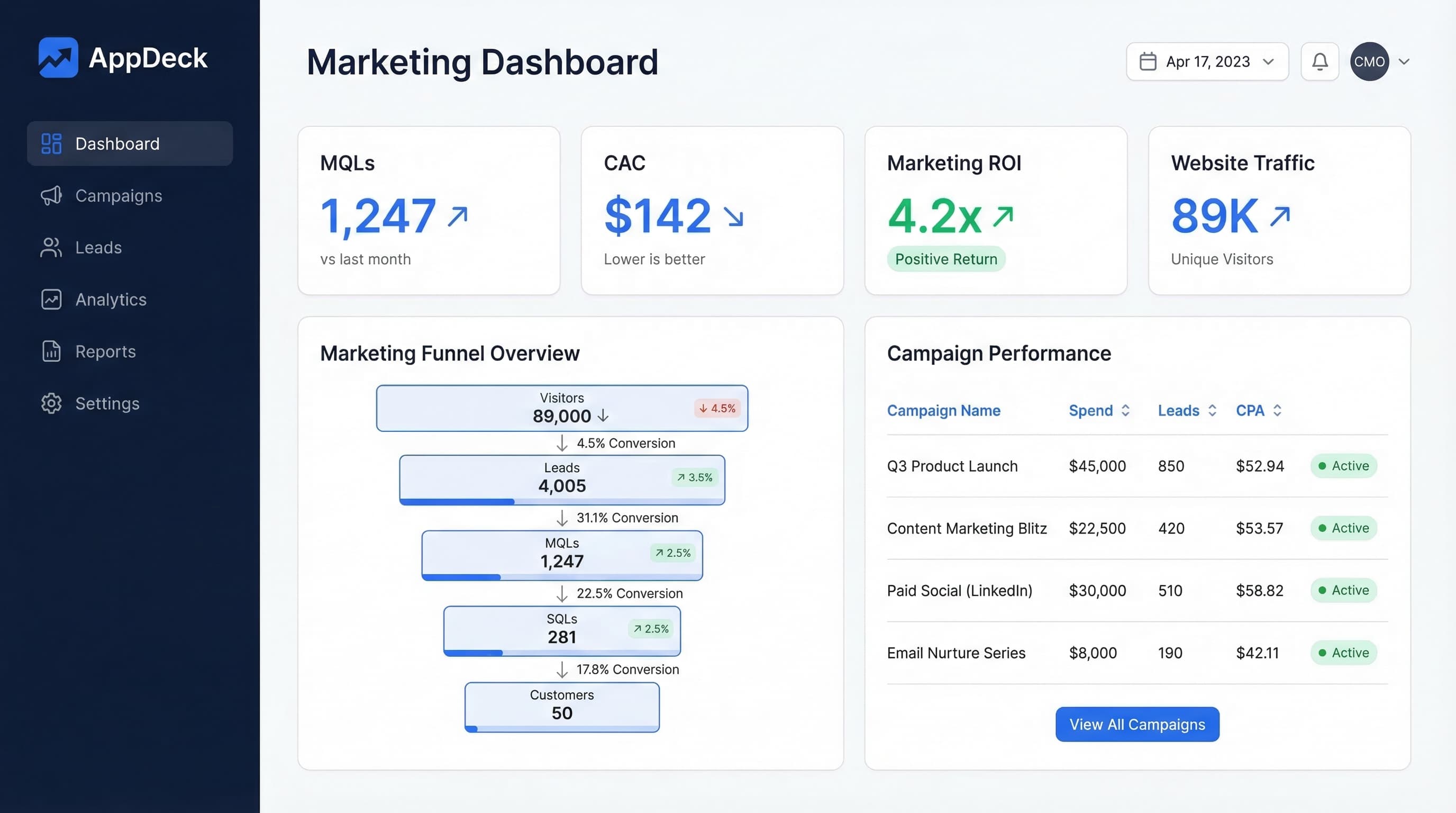
CMO Executive Dashboard (Example 11)
Question it answers: "Is marketing driving business growth, and are we executing against our plan?"
Key metrics (7):
- Marketing-sourced pipeline — total pipeline value generated from marketing leads
- Marketing-influenced revenue — closed-won revenue where marketing touched the buyer journey
- CAC — customer acquisition cost with trend and comparison to target
- MQL volume and velocity — qualified leads delivered to sales, with growth rate
- Channel mix performance — spend and return summary across all marketing channels
- Marketing budget utilization — spend vs. approved budget, with forecast to end of quarter
- Brand health score — composite metric combining search volume, SOV, and sentiment
Layout:
The dashboard header presents the CMO's headline narrative in two oversized metric cards: marketing-sourced pipeline (YTD vs. target) and marketing-influenced revenue (YTD vs. target). These are the two numbers the CMO brings to every executive team meeting. Together, they answer the CEO's question: "Is marketing contributing to growth?"
Below the header, a performance-vs-plan section shows five horizontal progress bars: pipeline target, MQL target, CAC target, budget utilization, and brand health score. Each bar shows the current value against the annual or quarterly target, color-coded green (ahead), yellow (on track), or red (behind). A CMO can scan these five bars in five seconds and know exactly where the team stands.
The center section uses a two-column layout. The left column shows a channel mix performance table — a compact table with one row per marketing channel showing spend, pipeline generated, ROI, and trend direction. This is the strategic planning view that drives quarterly budget allocation. The right column displays two trend charts stacked vertically: MQL volume over 12 months (showing whether the lead engine is accelerating or stalling) and CAC over 12 months (showing whether growth is becoming more or less efficient).
The bottom section features a marketing team scorecard — a summary of each marketing sub-function's performance against their key metric: SEO (organic traffic growth), paid media (ROAS), content (content-attributed leads), email (revenue per email), and social (engagement rate). Each sub-function shows a status indicator and its owner. This section transforms the CMO dashboard from a personal reporting tool into a team management tool.
Why this layout works: CMOs operate at the intersection of strategy and execution. This dashboard serves both: the pipeline and revenue metrics satisfy the board and CEO (strategy), while the channel mix and team scorecard enable the CMO to manage their team effectively (execution). The performance-vs-plan bars are the connective tissue — they show whether strategy is translating into results. This is the dashboard a CMO should share through a secure executive dashboard portal so leadership has real-time visibility.
Pro tip: The CMO Executive Dashboard should be the only marketing dashboard the CEO sees regularly. If the CEO is asking for SEO rankings or email open rates, it means the CMO dashboard isn't answering the right questions at the right level of abstraction. The CMO dashboard should give the CEO confidence that marketing is running well without requiring them to understand channel-level mechanics.
Update frequency: Weekly refresh, with monthly strategic review.
Marketing Team Scorecard (Example 12)
Question it answers: "How is each member and function of the marketing team performing against their individual targets?"
Key metrics (5-7, depending on team size):
- Individual KPIs by function — each team member's primary metric vs. target
- Project completion rate — percentage of planned deliverables shipped on time
- Sprint/milestone progress — status of current marketing sprint or quarterly milestones
- Cross-functional collaboration score — completion rate of tasks that depend on other teams
- Learning and development — certifications, training, or skill-building progress
- Team satisfaction pulse — anonymous team engagement score (monthly)
Layout:
The top section shows the team-level summary: overall project completion rate (with trend), percentage of individual KPIs on track (a single number that summarizes team health), and the latest team pulse score. These three numbers tell the CMO whether the team is productive, effective, and engaged.
The main section is a team member grid — a card-based layout with one card per team member or functional lead. Each card shows the person's name, role, primary KPI with current value and target, a progress indicator (ahead/on-track/behind), and their top project with its status. For larger teams, group cards by function (SEO, paid media, content, email, social). This layout replaces the weekly round-robin status meeting. Instead of asking each person "how are things going?" the CMO can review the grid in advance and focus meeting time on items that need discussion.
The center-bottom section displays a project timeline — a Gantt-style view showing active marketing projects, their deadlines, current status, and the responsible team member. Overdue projects are highlighted in red. Projects at risk (approaching deadline without sufficient progress) show in yellow. This view prevents surprises by making deadline risks visible weeks before they arrive.
The very bottom section features a quarterly milestone tracker showing 4-6 major marketing milestones for the quarter, each with a progress bar, owner, and status note. This connects the team's daily work to the quarterly objectives, ensuring individual efforts ladder up to strategic goals.
Why this layout works: Most marketing dashboards track channels and campaigns, not people and projects. This dashboard fills the management gap. It gives the CMO a single place to monitor team performance, identify who needs support, and ensure projects ship on time. The team pulse score prevents the common mistake of driving performance metrics while ignoring team health. Teams that burn out don't sustain results.
Pro tip: Add an "energy allocation" view to the team scorecard showing where each person is spending their time by category (strategic projects, ongoing campaigns, ad hoc requests, internal meetings). Marketing teams often discover that 40-50% of their time goes to unplanned ad hoc requests from other departments, leaving too little time for the strategic work that drives growth. Making time allocation visible is the first step toward fixing it.
Update frequency: Weekly, refreshed every Monday morning. Pulse survey collected monthly.
How to Choose the Right Marketing Dashboard
With 12 dashboard examples to choose from, the temptation is to build all of them. Don't. Start with one or two and expand based on proven value.
Start with Your Biggest Blind Spot
Ask yourself: "What marketing question do I get asked most often that I can't answer quickly?" If the CEO regularly asks about marketing ROI and you scramble to pull numbers from five different tools, start with the Campaign ROI Dashboard (Example 9) or the CMO Executive Dashboard (Example 11). If your paid media team is spending six figures monthly without a clear view of channel performance, start with the PPC Dashboard (Example 2).
Match the Dashboard to the Decision Maker
Different roles need different dashboards. Here's a quick mapping:
- CMO / VP Marketing: CMO Executive Dashboard (Example 11), Campaign ROI Dashboard (Example 9)
- Demand Gen Manager: Lead Generation Dashboard (Example 7), Marketing Automation Dashboard (Example 6)
- Content Marketing Manager: Content Marketing Dashboard (Example 3), SEO Dashboard (Example 1)
- Paid Media Specialist: PPC Dashboard (Example 2), Campaign ROI Dashboard (Example 9)
- Email Marketing Manager: Email Marketing Dashboard (Example 4)
- Social Media Manager: Social Media Dashboard (Example 5)
- Marketing Ops / Analytics: Website Analytics Dashboard (Example 8), Marketing Team Scorecard (Example 12)
Build in Layers
Start with the CMO Executive Dashboard as your top-level view. Then build the function-specific dashboards that feed into it. This layered approach means the CMO can start at the summary level and drill into any function that needs attention. It also means each function has its own operational dashboard without cluttering the executive view.
Validate Before You Scale
Before building all 12 dashboards, validate that the first one changes behavior. Is the team checking it regularly? Are decisions being made faster? Are reporting meetings shorter? If the answer is yes, build the next one. If not, the dashboard needs redesign before you invest in expanding.
Consider Your Data Maturity
Not every company is ready for all 12 dashboards. If your marketing attribution is unreliable, a Campaign ROI Dashboard will show inaccurate numbers that undermine trust. If you don't have a formal lead scoring model, the Marketing Automation Dashboard will have gaps. Be honest about your data maturity:
- Early stage (basic analytics only): Start with Website Analytics (Example 8) and one channel dashboard (SEO, PPC, or Email)
- Growth stage (CRM and marketing automation in place): Add Lead Generation (Example 7), Marketing Automation (Example 6), and CMO Executive (Example 11)
- Mature stage (multi-touch attribution, full marketing stack): Build Campaign ROI (Example 9), Brand Awareness (Example 10), and Marketing Team Scorecard (Example 12)
Building dashboards that outpace your data maturity creates false precision — numbers that look authoritative but aren't. This is worse than having no dashboard at all, because it drives decisions based on unreliable data.
Common Marketing Dashboard Mistakes
After building dashboards for 80+ marketing teams, I see the same mistakes repeated. Avoiding these will put your dashboard ahead of 90% of what's out there.
1. Tracking Vanity Metrics
Page views, follower counts, and impressions feel good but rarely drive decisions. Every metric on your dashboard should connect to a business outcome — either directly (revenue, leads) or as a leading indicator with a proven correlation.
2. Combining Strategic and Tactical Views
A CMO and a paid media specialist need different dashboards. When you combine both audiences into one view, neither gets what they need. Build separate dashboards for strategic oversight and tactical execution.
3. Ignoring Attribution Limitations
Multi-touch attribution is imperfect. Every marketing dashboard should acknowledge its attribution model's limitations and avoid presenting influenced revenue as sourced revenue. Overstating marketing's impact erodes trust with sales and finance faster than anything else.
4. Missing Competitive Context
Your marketing metrics only have meaning relative to your market. A 3% conversion rate might be excellent in enterprise SaaS and terrible in e-commerce. Include industry benchmarks or competitive comparisons wherever possible.
5. No Refresh Discipline
A dashboard that shows last month's data on the 15th of this month is worse than no dashboard at all. Assign ownership for each dashboard, define update schedules, and automate data refreshes wherever possible.
6. Building Dashboards Nobody Asked For
This one is subtle but common. A marketing ops person gets excited about a new tool, builds a beautiful dashboard, and shares it with the team. Nobody uses it because nobody asked the question it answers. Always start with the audience and their question before building. Ask: "Who will look at this, how often, and what decision will it help them make?" If you can't answer all three, don't build it yet.
7. Over-Designing at the Expense of Clarity
Gradient backgrounds, 3D charts, decorative icons, and custom color palettes might look impressive in a screenshot, but they reduce readability. The best marketing dashboards use clean layouts, consistent color coding (green/yellow/red for status, a single accent color for highlights), and standard chart types. Design should serve comprehension, not aesthetics.
8. No Single Owner
Every dashboard needs a single owner responsible for keeping it accurate, relevant, and maintained. Without ownership, dashboards decay. Data sources disconnect, metrics become stale, and gradually the team stops trusting the numbers. Assign one person per dashboard whose job includes verifying data accuracy, updating benchmarks quarterly, and soliciting user feedback on what's working and what isn't.
Marketing Dashboard Metrics Quick Reference
Here's a summary of the most important metrics across all 12 dashboards, organized by what they measure:
Growth metrics: Organic sessions, total leads, MQL volume, lead velocity rate, follower growth, list size, brand search volume
Efficiency metrics: CPA, ROAS, CAC, CPL, conversion rates (site, email, landing page), cost per MQL
Quality metrics: Lead-to-MQL rate, MQL-to-SQL rate, engagement rate, time on page, bounce rate, email CTR, content conversion rate
Revenue metrics: Marketing-sourced pipeline, marketing-influenced revenue, revenue per email, channel ROI, marketing ROI
Health metrics: Deliverability rate, domain rating, brand sentiment, team satisfaction pulse, workflow completion rate
When building your dashboards, select 5-7 metrics from the categories most relevant to your function. Every dashboard should include at least one metric from the revenue or efficiency categories — these are what connect marketing activity to business outcomes.
How to Build Marketing Dashboards with AppDeck
Building effective marketing dashboards doesn't require a data engineering team or custom development. Modern platforms make it possible to connect your data sources and build functional dashboards in hours.
Connect Your Marketing Stack
The biggest barrier to good marketing dashboards is fragmented data. When metrics live in ten different tools, nobody has a unified view. AppDeck solves this by connecting directly to the tools marketing teams already use:
- Analytics: Google Analytics, Adobe Analytics, Mixpanel
- Advertising: Google Ads, Meta Ads, LinkedIn Ads, Microsoft Ads
- Email: HubSpot, Mailchimp, Klaviyo, ActiveCampaign
- SEO: Google Search Console, Ahrefs, SEMrush
- Social: LinkedIn, X, Instagram, Facebook, YouTube
- CRM: Salesforce, HubSpot CRM, Pipedrive
Start with Templates
Starting from a blank canvas is intimidating and slow. AppDeck offers pre-built dashboard templates based on the examples in this guide. Select a marketing dashboard template (SEO, paid ads, content, email, CMO executive), connect your data sources, and customize the metrics and layout to match your needs. Templates give you a working dashboard in hours instead of weeks — you can always refine the design once you see real data flowing through it.
Customize for Your Audience
One of the core principles in this guide is that different audiences need different dashboards. AppDeck makes this easy by letting you build different views from the same underlying data:
- CMO view: Pipeline, revenue influence, channel mix, and budget
- Channel manager view: Channel-specific metrics with daily granularity
- Team view: Individual KPIs, project status, and milestone tracking
- Executive view: Marketing ROI, CAC, and revenue contribution
Share Through Secure Portals
Marketing dashboards often need to be shared beyond the marketing team. AppDeck lets you share dashboards through secure, branded portals:
- CMOs share marketing performance with the executive dashboard portal for CEO and board visibility
- Channel managers share campaign results with agency partners
- Marketing leaders share pipeline metrics with sales leadership
- Agencies share client-facing marketing reports through white-labeled portals
Iterate Based on Usage
The first version of any dashboard is a hypothesis. Watch how people actually use it:
- Which metrics do they look at first?
- What questions do they ask that the dashboard doesn't answer?
- Which sections do they skip entirely?
- Do they check it at the expected frequency?
Use these observations to refine the dashboard over 2-3 iterations. Remove metrics nobody looks at. Add the metrics people keep asking about. Adjust the layout based on actual usage patterns, not theoretical best practices.
Frequently Asked Questions
What is a marketing dashboard and what should it include?
A marketing dashboard is a focused view of metrics that answer one specific question for one specific audience—not a wall of every available marketing number. Effective marketing dashboards lead with outcomes (leads, pipeline, revenue, CAC) rather than activity (impressions, clicks, page views), include benchmarks and trends for context, and use consistent color coding. The right metrics depend on the audience: a CMO needs marketing-sourced pipeline and channel ROI, a paid media specialist needs CPA and ROAS by campaign, a content marketer needs traffic and content-attributed leads. Each audience deserves its own dashboard built around its decisions.
How is a CMO executive dashboard different from a channel-specific marketing dashboard?
A CMO executive dashboard focuses on strategic outcomes that the CEO and board care about: marketing-sourced pipeline, marketing-influenced revenue, CAC, MQL volume and velocity, channel mix performance, and brand health. It refreshes weekly to monthly and serves leadership conversations. A channel-specific dashboard (SEO, PPC, content, email, social) focuses on tactical optimization metrics for the channel manager: rankings, CTR, conversion rate, campaign-level CPA, content engagement. It refreshes daily and serves the operator running the channel. Combining both into one dashboard fails both audiences—keep them separate and link them through the funnel and budget data.
How much do marketing dashboard tools cost?
Free options: Google Looker Studio (basic), Google Analytics dashboards, and HubSpot built-in reports. Mid-tier dashboard platforms run $99 to $500 per month (AppDeck, Whatagraph, AgencyAnalytics, DashThis). Enterprise marketing analytics platforms like Tableau, Looker Enterprise, or attribution-specific tools (Bizible, Marketo Measure) run $20,000 to $100,000+ per year. Most marketing teams below $50M revenue land in the $100 to $1,000 monthly range across all dashboard tools. The largest hidden cost is integration—if your data lives in 10+ tools, expect ETL or data warehouse spend that often exceeds the dashboard tool itself.
Who should own and maintain marketing dashboards?
Marketing operations or analytics owns the technical layer—data connections, metric definitions, and refresh schedules. The CMO owns the executive dashboard and reviews its KPIs in leadership meetings. Channel managers own their function-specific dashboards (SEO manager owns the SEO dashboard, paid media specialist owns the PPC dashboard). Demand gen owns lead generation and marketing automation dashboards. Avoid having a single agency or contractor own dashboards critical to your business—when they leave, the dashboards break. Assign internal ownership even if the dashboard was originally built by an agency.
When should you build new marketing dashboards versus optimize what you have?
Build a new dashboard when leadership asks the same question repeatedly that current dashboards can't answer, when you launch a new channel or strategic initiative (events, partnerships, ABM) without existing measurement, or when team structure changes (new VP of marketing, new growth function). Optimize existing dashboards when usage is high but specific sections are ignored, when the team trusts the data but the layout is unclear, or when metric definitions need updating (e.g., new attribution model). Don't build new dashboards while existing ones go unused—dashboard sprawl is worse than dashboard gaps. Most marketing teams should have 3 to 5 active dashboards, not 15.
Conclusion
Marketing dashboards fail when they try to show everything. They succeed when they answer specific questions for specific people. If there's one takeaway from this guide, it's this: constraint is a feature, not a limitation.
The 12 examples in this guide share a common thread: each one leads with outcomes (not activity), limits metrics to what's actionable, and connects marketing effort to business results. Whether you're building an SEO dashboard for your content team or a CMO executive dashboard for the leadership team, the principle is the same — start with the decision the dashboard should inform, then work backward to the metrics that support that decision.
Start with one dashboard. Pick the example that matches your most urgent need. If you're a CMO, start with Example 11 (CMO Executive Dashboard) and build the function-specific dashboards later as your team needs them. If you're a channel specialist, start with the dashboard for your function and prove the value before expanding.
Remember: the goal isn't to track everything. It's to surface the right metrics for the right people at the right time so they can make better decisions, faster. Marketing teams that embrace this mindset spend less time reporting and more time optimizing — which is where the actual value lives.
The best marketing dashboard is the one your team actually uses. A focused dashboard built in a day beats a comprehensive one planned for three months. And a dashboard that changes one decision per week delivers more value than a dashboard suite that took six months to build and nobody opens.
If you're ready to build marketing dashboards that drive decisions, explore AppDeck's Executive Dashboard for real-time marketing performance visibility, browse our executive dashboard templates for ready-to-use layouts, or check out the complete guide to executive dashboards for deeper design principles.
Related resources:
- KPI Dashboard Examples for Every Business Function — 20 examples across executive, finance, sales, marketing, ops, and HR
- Sales Dashboard Examples for CROs — dashboard layouts designed for sales leadership
- The Complete Guide to Executive Dashboards — principles and best practices for building executive-level dashboards
- AppDeck Executive Dashboard — build and share real-time dashboards with your leadership team

Founder & CEO, AppDeck
Serial entrepreneur with 20+ years building B2B software companies. Former executive managing 2,800+ employees across three continents. Vik reviews all AppDeck content for accuracy and practical relevance.
Share this article
Explore Related Solutions
Related Articles
CEO Dashboard: 10 Metrics Every CEO Should Track in 2026
The 10 most important CEO dashboard metrics for 2026. Revenue, growth, customer health, team performance, and strategic KPIs with visualization tips and real-world examples.
20 KPI Dashboard Examples for Every Business Function
KPI dashboard examples for executives, finance, sales, marketing, operations, and HR. Real-world layouts with key metrics and design tips.
20 Power BI Dashboard Examples for Executives & Business Leaders
Explore 20 real-world Power BI dashboard examples for executives, CFOs, CROs, and CMOs. KPI layouts, design best practices, and when to consider alternatives to Power BI.