
Sales Dashboard Examples: 10 Metrics Every CRO Should Track in 2026
Proven sales dashboard templates for CROs and revenue leaders. Learn which metrics to track, how to visualize them, and real examples from high-performing sales teams.
Download the template: Get a working dashboard as a free Excel file — Sales Dashboard Template (.xlsx) — pipeline coverage, win rate by stage, sales cycle, rep leaderboard, and forecast accuracy. No paywall.
Introduction
As CRO, your board asks the same question every quarter: "How's the pipeline looking?"
A great sales dashboard answers that question in 3 seconds—and gives you the insights to hit your number. A bad one wastes hours with vanity metrics that don't drive decisions.
After building sales dashboards for 5 different companies (from $2M to $50M ARR), I've learned what metrics actually matter. Here are the 10 metrics every CRO dashboard should track.
Why CROs Need Real-Time Sales Dashboards
The Spreadsheet Problem
Common scenario:
- Board meeting in 2 days
- You spend 6 hours pulling data from Salesforce
- Creating charts in Excel
- By the time you present, data is already outdated
- Board asks a follow-up question you can't answer without another data pull
The Dashboard Solution
With a real-time sales dashboard:
- ✅ Data updates automatically from Salesforce/HubSpot
- ✅ Board can check metrics anytime (not just meetings)
- ✅ You spot pipeline issues 3 weeks earlier
- ✅ Reps see their performance in real-time
- ✅ CFO gets revenue forecast without asking
Result: Less time in Excel, more time coaching reps and closing deals.
The 10 Essential CRO Metrics
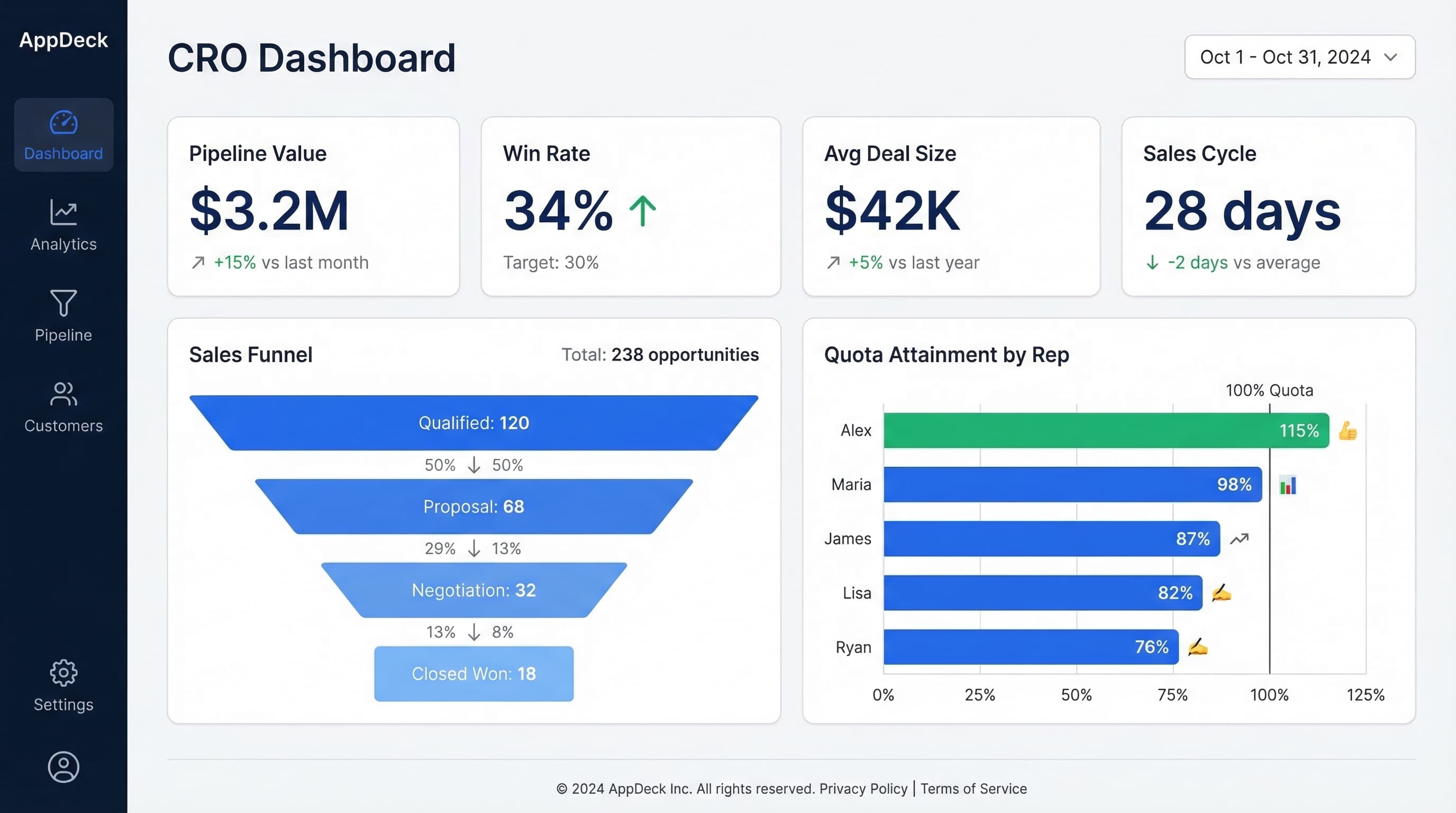
1. Pipeline Coverage Ratio
What it is: Pipeline value ÷ Quota for the period
Why it matters: Tells you if you have enough pipeline to hit your number.
Target benchmark:
- Early-stage sales: 3-4x coverage
- Enterprise sales: 5-6x coverage
Example visualization:
Q4 2024 Pipeline Coverage: 3.2x

Pipeline: $4.8M
Quota: $1.5M

━━━━━━━━━━━━━ 3.2x ━━━━━━
            ⚠️ Below target (4x)
How to use it:
- Below 3x? Increase top-of-funnel activities
- Above 5x? Your qualification might be too loose
- Track trend: Is coverage growing or shrinking?
Red flags:
- Coverage dropping month-over-month
- Coverage strong but conversion rates low (quality issue)
- Heavy dependence on deals in late stages
2. Win Rate by Stage
What it is: % of deals advancing from each pipeline stage
Why it matters: Shows where deals get stuck or fall out.
Example dashboard:
Win Rates by Stage (Q4 2024)

Discovery → Qualification:     78%  ✅
Qualification → Proposal:      65%  ✅
Proposal → Negotiation:        45%  ⚠️
Negotiation → Closed Won:      72%  ✅

Overall Win Rate:              18%
How to use it:
- Identify bottleneck stages (above: Proposal → Negotiation)
- Coach reps on weak stages
- Update sales process for stages with <50% advancement
What great CROs do:
- Track win rate by rep (find who's best at each stage)
- Compare win rate by deal size
- Monitor trend: Is win rate improving or declining?
3. Sales Cycle Length
What it is: Average days from first contact to closed-won
Why it matters: Longer cycles = longer cash conversion, harder forecasting.
Example visualization:
Average Sales Cycle: 67 days

By Segment:
SMB:        23 days  ✅
Mid-Market: 54 days  ✅
Enterprise: 127 days ⚠️

Trend: ↗️ +12 days vs. last quarter
How to use it:
- Set expectations with board on revenue timing
- Identify deals stalling longer than average
- Find reps with faster cycles (what are they doing differently?)
Red flags:
- Cycle length increasing quarter-over-quarter
- Huge variance between reps (training opportunity)
- Deals sitting in same stage >30 days
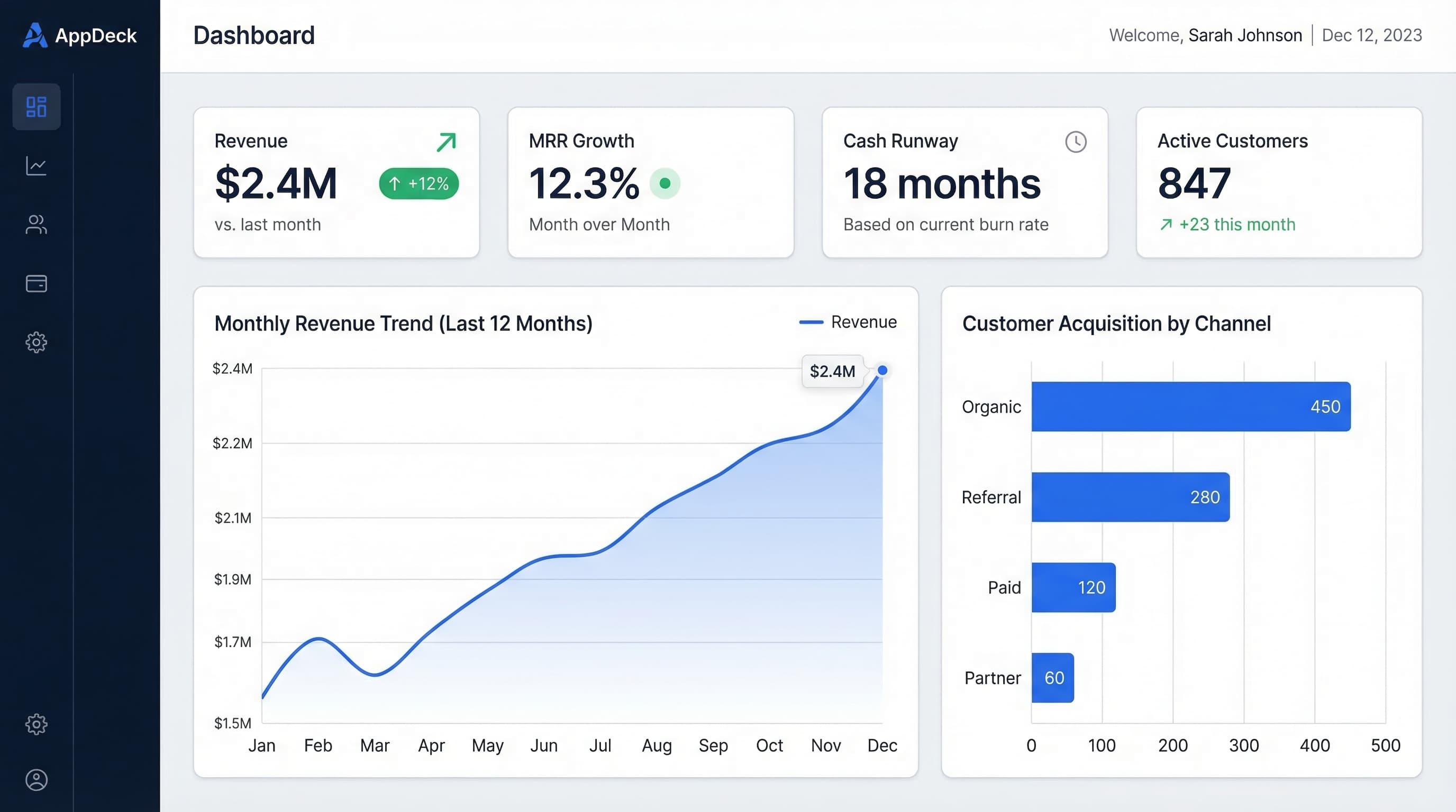
4. Monthly Recurring Revenue (MRR) & Growth Rate
What it is: Predictable monthly revenue from subscriptions
Why it matters: The metric that drives your company valuation.
Example dashboard:
MRR: $2.4M
MRR Growth Rate: +12% MoM

Breakdown:
New MRR:        +$180K  (from new customers)
Expansion MRR:  +$95K   (from upsells)
Churn MRR:      -$45K   (lost customers)
Contraction:    -$18K   (downgrades)

Net New MRR:    +$212K
How to use it:
- Share with board monthly (they care more about this than anything)
- Track components: Is growth from new business or expansion?
- Set targets by segment
What great CROs do:
- Forecast MRR 3-6 months out
- Track leading indicators (pipeline → MRR in 60-90 days)
- Identify expansion MRR opportunities
5. Customer Acquisition Cost (CAC) Payback Period
What it is: Months to recover the cost of acquiring a customer
Why it matters: Tells you if your unit economics are healthy.
Formula:
CAC Payback = (Sales & Marketing Costs / New Customers) ÷ (Avg MRR per Customer × Gross Margin %)
Example:
CAC Payback Period: 14 months

Sales & Marketing Cost: $420K
New Customers: 35
Avg MRR per Customer: $1,800
Gross Margin: 78%

Target: <12 months ⚠️
Benchmarks:
- World-class: <6 months
- Good: 6-12 months
- Acceptable: 12-18 months
- Problem: >18 months
How to improve it:
- Increase average deal size
- Improve win rate (lower acquisition cost)
- Reduce sales cycle (faster payback)
- Decrease CAC (more efficient marketing/sales)
6. Pipeline Velocity
What it is: How much revenue your pipeline generates per day
Why it matters: Combines all pipeline metrics into one number.
Formula:
Pipeline Velocity = (# of Opportunities × Average Deal Size × Win Rate) ÷ Sales Cycle Length
Example:
Pipeline Velocity: $28,500/day

Opportunities:      245
Avg Deal Size:      $42K
Win Rate:          18%
Sales Cycle:        67 days

Monthly Revenue Projection: $855K
How to use it:
- Track trend: Is velocity increasing or decreasing?
- Test impact of changes (new sales process, pricing, etc.)
- Forecast revenue more accurately
What moves the needle:
- Add more qualified opps (+20% opps = +20% velocity)
- Increase deal size (+10% deal size = +10% velocity)
- Improve win rate (+5% win rate = +5% velocity)
- Shorten cycle (-10% cycle = +10% velocity)
7. Rep Performance Leaderboard
What it is: Individual rep metrics vs. quota
Why it matters: Identifies top performers and those needing coaching.
Example dashboard:
Q4 2024 Rep Performance (Target: $250K/quarter)

Top Performers:
🥇 Sarah Chen       $412K  (165% to quota)  ✅
🥈 Marcus Kim       $378K  (151% to quota)  ✅
🥉 Alex Rivera      $325K  (130% to quota)  ✅

Needs Coaching:
   Jamie Foster     $187K  (75% to quota)   ⚠️
   Taylor Brooks    $145K  (58% to quota)   🚨
   Jordan Lee       $89K   (36% to quota)   🚨
Metrics to track per rep:
- Revenue vs. quota
-
of deals closed
- Average deal size
- Win rate
- Sales cycle length
- Activity metrics (calls, meetings, demos)
How to use it:
- Weekly 1:1s with underperformers
- Shadow top performers (what are they doing differently?)
- Adjust territories if needed
- Make data-driven hiring/firing decisions
8. Forecast Accuracy
What it is: How close your forecast was to actual results
Why it matters: Your credibility with the board depends on it.
Example:
Forecast Accuracy: 92%

Q3 2024:
Forecasted:  $1.45M
Actual:      $1.33M
Variance:    -8.3%   ⚠️

Historical Accuracy:
Q1: 96% ✅
Q2: 94% ✅
Q3: 92% ⚠️
Q4: TBD
Target: ±10% variance or better
How to improve forecast accuracy:
- Track by rep (who sandbags? who's overoptimistic?)
- Use data, not gut feel (pipeline coverage, historical win rates)
- Multi-scenario forecasting (best case, likely, worst case)
- Review weekly, update as deals progress
Pro tip: Under-promise, over-deliver. Board loves positive surprises, hates negative ones.
9. Churn Rate & Revenue Retention
What it is:
- Logo Churn: % of customers lost
- Revenue Retention: % of revenue retained from existing customers
Why it matters: Acquiring customers is expensive. Keeping them is cheaper and more valuable.
Example dashboard:
Logo Churn Rate: 4.2% monthly
Revenue Retention: 108% (net)

Breakdown:
Gross Retention:    95%  (lost 5% to churn)
Expansion:          +13% (from upsells/cross-sells)
Net Retention:      108% ✅

Industry Benchmark (SaaS): 100-110%
Benchmarks:
- Logo churn: <5% monthly for SMB, <2% for enterprise
- Net revenue retention: >100% is excellent (expansion > churn)
How to use it:
- High churn? Customer success problem (or wrong customers)
- Low expansion? Upsell motion missing
- Share with board monthly
What great CROs do:
- Track churn reasons (pricing, product, service?)
- Identify expansion opportunities proactively
- Align sales and customer success on retention
10. Revenue by Source/Segment
What it is: Where your revenue comes from
Why it matters: Tells you where to invest and where to cut.
Example:
Q4 Revenue by Segment:

Enterprise (>$1M ARR):      $1.2M  (48%)  ✅
Mid-Market ($100K-1M):      $850K  (34%)  ✅
SMB (<$100K):               $450K  (18%)  ⚠️

Revenue by Source:

New Business:               $1.4M  (56%)
Expansion/Upsell:          $750K  (30%)
Renewals:                  $350K  (14%)
How to use it:
- Double down on best-performing segments
- Cut underperforming segments (if CAC doesn't work)
- Set quotas by segment
- Adjust team size by segment revenue
Questions to ask:
- Which segment has best CAC payback?
- Which has highest retention?
- Where should you hire next rep?
CRO Dashboard Template (Complete Example)
Here's a real dashboard I use for board meetings:
Executive Summary (Top of Dashboard)
Q4 2024 Performance Summary

📊 Revenue:        $2.1M  (105% of $2M quota)  ✅
📈 MRR Growth:     +12% MoM                    ✅
🎯 Pipeline:       $8.4M  (4.2x coverage)      ✅
⚠️ Win Rate:       16%    (-2% vs. Q3)         ⚠️
⏱️ Sales Cycle:    72 days (+9 vs. Q3)        ⚠️
💰 CAC Payback:    15 months                  ⚠️
Pipeline Health
- Pipeline by stage (funnel chart)
- Week-over-week pipeline change
- Top 10 deals at risk
- Pipeline coverage trend (last 6 months)
Revenue Performance
- Revenue vs. quota (monthly)
- Revenue by segment
- MRR growth chart
- Churn rate trend
Team Performance
- Rep leaderboard
- Reps at risk of missing quota
- Hiring plan vs. actual headcount
Leading Indicators
- Demo completion rate
- Qualified opps created this month
- Average deal size trend
- Win rate by competitor
How to Build Your CRO Dashboard
Step 1: Connect Your Data Sources
Essential integrations:
- Salesforce or HubSpot (pipeline data)
- Stripe or billing system (revenue data)
- Marketing automation (lead source data)
- Customer success platform (churn data)
Why real-time matters: Static Excel dashboards are outdated the moment you create them. Real-time dashboards update automatically.
Step 2: Start Simple, Add Over Time
Month 1: Core metrics only
- Revenue vs. quota
- Pipeline coverage
- Win rate
Month 2: Add team metrics
- Rep leaderboard
- Sales cycle length
Month 3: Add forecasting
- Pipeline velocity
- Forecast accuracy
Don't try to build everything at once. Start with 3-5 metrics, add more as needed.
Step 3: Share Widely
Who should see your dashboard:
- ✅ Board (monthly update)
- ✅ CEO (real-time access)
- ✅ CFO (for financial planning)
- ✅ Your sales team (transparency drives performance)
- ✅ Marketing (close the loop on lead quality)
Customize views:
- Board: Executive summary only
- Reps: Individual performance + team leaderboard
- CEO: Everything
Step 4: Review Weekly, Refine Monthly
Weekly review:
- Which metrics moved?
- Any red flags?
- What needs attention this week?
Monthly review:
- Are we tracking the right metrics?
- Any metrics we never look at? (Remove them)
- What questions came up this month? (Add metrics to answer them)
Common CRO Dashboard Mistakes
Mistake #1: Too Many Metrics
Problem: 47 metrics on one dashboard
Result: Analysis paralysis. Can't see the forest for the trees.
Solution: Start with 10 metrics max. Add only if you'll act on the data.
Mistake #2: Vanity Metrics
Problem: Tracking "Total Opportunities Created" without context
Result: Feels good but doesn't drive decisions.
Solution: Focus on metrics that inform action:
- Not: "Total opps created"
- Yes: "Qualified opps created per rep per month"
Mistake #3: No Comparisons
Problem: Showing metrics without context
Example:
❌ Win Rate: 18%
(Is that good? Bad? Improving?)

✅ Win Rate: 18% (-2% vs. Q3, Industry avg: 22%)
Solution: Always show:
- Target/benchmark
- Trend (vs. last period)
- Industry comparison (if available)
Mistake #4: Static PDFs
Problem: Creating dashboard in Excel, exporting to PDF for board
Result:
- Data outdated immediately
- Board can't drill into details
- You spend hours updating manually
Solution: Use real-time dashboard tools where board can access live data.
Mistake #5: Build It and Forget It
Problem: Set up dashboard, never review or update
Result: Metrics drift from reality, dashboard ignored
Solution:
- Review weekly with sales leadership
- Refine monthly (add/remove metrics)
- Get board feedback (what questions do they ask that dashboard doesn't answer?)
CRO Dashboard Tools Comparison
Option 1: AppDeck Executive Dashboard
Best for: CROs who want real-time dashboards without IT setup
Pricing: $199/month
Pros:
- Connects directly to Salesforce, HubSpot, Stripe
- Pre-built CRO dashboard templates
- Real-time updates (no manual data pulls)
- Share secure link with board
- 30-minute setup
Cons:
- Newer tool (less customization than building from scratch)
Try it: AppDeck Executive Dashboard
Option 2: Build in Salesforce Dashboards
Best for: Teams already deep in Salesforce
Pricing: Included with Salesforce
Pros:
- Already own the tool
- Direct connection to pipeline data
- Customizable
Cons:
- No cross-platform data (can't pull from Stripe, marketing tools easily)
- Salesforce dashboards are ugly
- Limited sharing options for board
Option 3: Custom BI Tools (Tableau, Looker, etc.)
Best for: Large enterprises with data teams
Pricing: $70-200/user/month + implementation
Pros:
- Unlimited customization
- Enterprise-grade features
- Beautiful visualizations
Cons:
- Requires data team to build and maintain
- Expensive
- Overkill for most growth-stage companies
Frequently Asked Questions
What metrics should every CRO dashboard include?
Every CRO dashboard needs five non-negotiable metrics: bookings vs. quota (the headline number), pipeline coverage (3-4x of next-quarter target), win rate by segment, sales cycle length, and net revenue retention. Add average deal size, rep productivity (quota attainment %), and CAC payback if your board cares about efficiency. Anything beyond 10 metrics dilutes attention. The best CRO dashboards put bookings and pipeline coverage at the top because those drive 80% of board conversations. Everything else is diagnostic.
Is a CRO dashboard different from a sales manager's dashboard?
Yes — different audiences, different time horizons. A sales manager's dashboard is operational: rep activity, deal stage progression, pipeline hygiene, this week's calls and demos. A CRO dashboard is strategic: quarterly bookings trajectory, pipeline coverage 2-3 quarters out, segment-level win rates, and CAC efficiency. The CRO needs to spot trends; the sales manager needs to spot deals. Mixing the two leads to dashboards no one trusts. Build separate views with shared underlying data.
How often should a CRO review their dashboard?
Daily glance, weekly review, monthly deep-dive. The daily check is 60 seconds — is the pipeline number moving in the right direction? Weekly is 30-45 minutes with the leadership team to review pipeline movement, slipped deals, and forecast accuracy. Monthly is 2-3 hours analyzing segment trends, win/loss patterns, and rep performance variance. Quarterly, run the full strategic review against the board plan. Daily and weekly cadence matters more than monthly because revenue decisions decay quickly when stale.
Which CROs benefit most from real-time dashboards vs. weekly reports?
Real-time dashboards matter most for high-velocity sales motions (SMB SaaS, transactional sales, ecommerce-adjacent models) where a week of lag means a quarter of damage. They matter less for long enterprise sales cycles where deals move in months, not days. The honest CRO test: if your pipeline can swing by 15% week over week, you need real-time. If quarter-end always looks roughly like quarter-start plus expected adds, weekly reports are fine. Most growth-stage SaaS sits somewhere in between and benefits from real-time pipeline with weekly-batched forecast updates.
When should you stop adding metrics to your CRO dashboard?
Stop when you hit 10 metrics, when the dashboard takes more than 30 seconds to scan, or when no one on your team can name the top three numbers without looking. Adding a metric should always force a conversation about which metric gets retired. The classic failure mode is the "all-knowing dashboard" with 40 widgets that no one actually reads. If a metric hasn't driven a decision in the last 90 days, it's noise. Cut it.
My Recommendation
For most CROs at growth-stage companies ($5M-50M ARR):
Use AppDeck Executive Dashboard
Why:
- Get up and running in 30 minutes (vs. weeks)
- Real-time data from Salesforce + Stripe (no manual updates)
- Share live link with board (vs. static PDFs)
- $199/mo (vs. $10K+ for BI tools)
I personally use this for my board dashboard and team performance tracking.
Conclusion
A great sales dashboard transforms how you run revenue operations.
Key takeaways:
- Track 10 core metrics (not 50 vanity metrics)
- Use real-time data (not static Excel)
- Share widely (board, CEO, team)
- Review weekly, refine monthly
- Focus on metrics that drive decisions
Next steps:
- Pick your top 5 metrics to start tracking
- Set up real-time dashboard (try AppDeck)
- Share with your team this week
- Review weekly in 1:1s and team meetings
- Add more metrics monthly as needed
Your board wants visibility. Your team wants transparency. Your dashboard should provide both.
Related reading:
- The Complete Guide to Executive Dashboards
- Executive Dashboard Templates: 12 Free Examples — Ready-to-use templates for CEOs, CFOs, and CROs
- KPI Dashboard Examples — 20 dashboard layouts across all business functions
- CFO Executive Dashboard Metrics — Essential metrics for finance and executive teams
- Revenue Operations Tools Stack — Build the right tech stack for your revenue team

Founder & CEO, AppDeck
Serial entrepreneur with 20+ years building B2B software companies. Former executive managing 2,800+ employees across three continents. Vik reviews all AppDeck content for accuracy and practical relevance.
Share this article
Explore Related Solutions
Related Articles
Revenue Operations Tools: The Complete Tech Stack for Modern CROs in 2026
Build a world-class RevOps tech stack. Complete guide to CRM, sales engagement, forecasting, and analytics tools that high-performing revenue teams actually use.
15 Free Excel Dashboard Templates You Can Download Today
Download 15 free Excel dashboard templates for executives, finance, sales, marketing, and operations. Ready-to-use .xlsx files with sample data, charts, and formulas.
Executive Dashboard Software: 8 Best Platforms Compared (2026)
Compare the best executive dashboard software for 2026. Features, pricing, and honest reviews of Tableau, Power BI, Looker, AppDeck, Geckoboard, Klipfolio, Databox, and Domo.