
12 Free Google Sheets Dashboard Templates (Ready to Use)
Build dashboards in Google Sheets with 12 free templates covering executive, financial, sales, marketing, HR, and more. Includes formulas, layouts, and implementation tips.
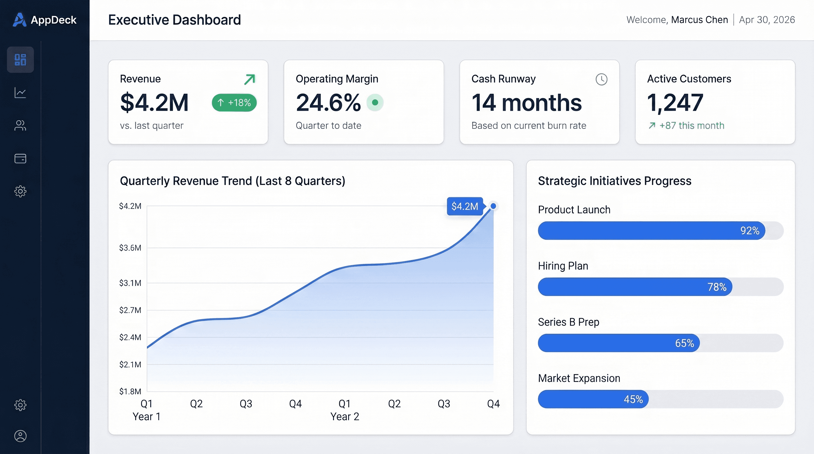
Download the files: Every dashboard in our free template library ships as an .xlsx that opens directly in Google Sheets (File → Import → Upload). Sparklines and conditional formatting convert automatically. Free, no paywall.
TL;DR
Google Sheets is the fastest way to build a shared dashboard that your entire team can edit simultaneously. Below are 12 ready-to-use templates covering every major business function. Each includes a layout diagram, key metrics, Google Sheets-specific formulas (QUERY, SPARKLINE, IMPORTRANGE), and implementation tips. Copy whichever one fits your role, plug in your data, and you'll have a working dashboard in under an hour.
If you've already outgrown spreadsheets, skip to the When to Move Beyond Google Sheets section.
Why Google Sheets for Dashboards?
Google Sheets isn't the most powerful dashboarding tool. But it has three advantages that matter more than power in the early stages:
- Real-time collaboration. Multiple people editing the same sheet simultaneously, with no "FINAL_v3_REAL_FINAL" file naming disasters.
- Zero cost. Every Google Workspace user already has it. No procurement, no licenses, no IT tickets.
- Built-in data connectivity. IMPORTRANGE pulls data from other spreadsheets. IMPORTDATA pulls from CSVs. Google Apps Script connects to APIs. You can wire up a surprising amount of automation without leaving the ecosystem.
The tradeoff is that Sheets has weaker charting than Excel, no pivot chart support, and performance degrades past about 50,000 rows. But for most teams, those limits don't matter until much later.
If you're coming from Excel, I also wrote a companion guide: 15 Free Excel Dashboard Templates You Can Download Today. And if you're evaluating BI tools instead, see the companion pieces on free Power BI dashboard templates and free Tableau dashboard templates.
What Makes a Good Google Sheets Dashboard?
Before the templates, here are the five rules that separate dashboards people actually use from ones that get bookmarked and forgotten.
1. Separate Dashboard Tab from Data Tabs
Your dashboard tab should contain only charts, KPI summaries, and SPARKLINE cells. All raw data lives on separate tabs — ideally named clearly (Data_Revenue, Data_Pipeline, etc.) and hidden from casual viewers.
Tab 1: DASHBOARD (visible, clean, charts and summaries only)
Tab 2: Data_Revenue (hidden)
Tab 3: Data_Sales (hidden)
Tab 4: Data_Marketing (hidden)
Tab 5: Calculations (hidden, intermediate formulas)
2. Use QUERY Instead of Complex Formula Chains
Google Sheets' QUERY function is its single biggest advantage over Excel. It lets you write SQL-like statements against your data:
=QUERY(Data_Revenue!A:E, "SELECT A, SUM(C) WHERE B = 'Q1' GROUP BY A LABEL SUM(C) 'Revenue'")
One QUERY formula replaces what would be a SUMIFS + INDEX/MATCH + helper column setup in Excel.
3. Keep to 5-7 KPIs Per View
Cognitive overload kills dashboards. If you need to scroll, you have too much. One screen, one story. Use tabs or dropdown filters if you need multiple views.
4. Use SPARKLINE for Inline Trends
Google Sheets' SPARKLINE function embeds a tiny chart inside a cell. It's the fastest way to add trend context without cluttering your layout:
=SPARKLINE(B2:M2, {"charttype","line";"linewidth",2;"color","#2196F3"})
5. Set Up Conditional Formatting as Your Alert System
Green/yellow/red formatting turns numbers into a dashboard. Without it, you're reading a spreadsheet.
12 Google Sheets Dashboard Templates
1. Executive Summary Dashboard
The executive summary is your company's vital signs on one screen. It answers the question every CEO asks on Monday morning: "Are we on track?"
Best for: CEOs, founders, and COOs who need company health at a glance
Key metrics:
| KPI | Formula | Target Example |
|---|---|---|
| Revenue (MTD) | =SUMIFS(Revenue, Date, ">="&EOMONTH(TODAY(),-1)+1) | $1.2M |
| Active Customers | =COUNTA(UNIQUE(Customers!A:A)) | 200+ |
| Cash Position | Direct entry or IMPORTRANGE | 6+ months runway |
| NPS Score | =AVERAGE(NPS_Responses) | >40 |
| MoM Revenue Growth | =(This_Month-Last_Month)/Last_Month | >10% |
Layout:
━━━━━━━━━━━━━━━━━━━━━━━━━━━━━━━━━━━
EXECUTIVE SUMMARY DASHBOARD
━━━━━━━━━━━━━━━━━━━━━━━━━━━━━━━━━━━

[KPI Cards Row - 4 across]
Revenue     | Customers  | Cash       | NPS
$1.2M       | 187        | $1.65M     | 48
+15% MoM    | +8% MoM    | 8mo runway | +6 pts

[SPARKLINE row under each KPI - 12 month trend]

[Line Chart - Full Width]
Revenue vs. Target (12-month trend)

[Two Charts Side by Side]
Revenue by Source     | Expense Breakdown
(Stacked bar)         | (Donut chart)

[Table]
Top 5 Priorities This Week — Status — Owner
Implementation tips:
- Use
IMPORTRANGEto pull revenue from your finance sheet, customers from your CRM export, and NPS from your survey sheet. This keeps one source of truth per metric. - Add a SPARKLINE row directly beneath each KPI card:
=SPARKLINE(Revenue_By_Month!B2:M2, {"charttype","line";"color","#4CAF50"}). - Use a named range
Today_Monthset to=EOMONTH(TODAY(),-1)+1so your date filters auto-update.
For a deeper dive on executive dashboard design, see Executive Dashboard Templates: 12 Free Examples and the Complete Guide to Executive Dashboards.
2. Financial / P&L Dashboard
Your finance dashboard should tell you three things instantly: are we making money, are we spending it wisely, and how long can we keep going?
Best for: CFOs, finance teams, and founders tracking P&L, cash flow, and budget variance
Key metrics:
| KPI | Formula | Target Example |
|---|---|---|
| Monthly Recurring Revenue | =SUMIFS(MRR, Date, Current_Month) | $450K |
| Gross Margin | =(Revenue-COGS)/Revenue | >75% |
| Burn Rate | =-(Cash_End-Cash_Start) | <$200K/mo |
| Runway | =Cash_Balance/Monthly_Burn | >6 months |
| Budget Variance | =Budget-Actual | Positive = good |
Layout:
━━━━━━━━━━━━━━━━━━━━━━━━━━━━━━━━━━━
FINANCIAL DASHBOARD
━━━━━━━━━━━━━━━━━━━━━━━━━━━━━━━━━━━

[KPI Cards Row]
MRR         | Gross Margin | Burn Rate  | Runway
$450K       | 78%          | $201K/mo   | 8.2 mo

[Stacked Bar Chart]
Revenue Breakdown: New + Expansion - Churn - Contraction

[Line Chart]
Actual vs. Budget (Monthly, YTD)

[Table - Budget vs. Actuals]
Category      | Budget  | Actual  | Variance | Trend
Personnel     | $142K   | $138K   | +$4K ✅  | →
Marketing     | $45K    | $48K    | -$3K ⚠️  | ↗️
Infrastructure| $28K    | $27K    | +$1K ✅  | →
Implementation tips:
- Use
QUERYfor the budget vs. actuals table:=QUERY(Budget_Data!A:F, "SELECT A, SUM(B), SUM(C), SUM(C)-SUM(B) GROUP BY A LABEL SUM(B) 'Budget', SUM(C) 'Actual', SUM(C)-SUM(B) 'Variance'"). - For the variance column, apply conditional formatting: green if positive (under budget), red if negative.
- SPARKLINE in the trend column:
=SPARKLINE(B2:G2, {"charttype","line";"linewidth",2}).
For more on financial dashboards, see Financial Dashboard Template: Metrics, Layout & Design Guide.
3. Sales Pipeline Dashboard
A pipeline dashboard needs to answer one question: will we hit quota this quarter? Everything else is context for that answer.
Best for: Sales leaders tracking pipeline health, quota attainment, and rep performance
Key metrics:
| KPI | Formula | Target Example |
|---|---|---|
| Quota Attainment | =Closed_Won/Quota | 100% |
| Pipeline Coverage | =Total_Pipeline/Remaining_Quota | >3x |
| Win Rate | =Won/(Won+Lost) | >20% |
| Avg Deal Size | =SUM(Deal_Values)/COUNTA(Deal_Values) | $40K+ |
| Sales Cycle | =AVERAGE(Close_Date-Create_Date) | <45 days |
Layout:
━━━━━━━━━━━━━━━━━━━━━━━━━━━━━━━━━━━
SALES PIPELINE DASHBOARD
━━━━━━━━━━━━━━━━━━━━━━━━━━━━━━━━━━━

[KPI Cards Row]
Quota Attain | Pipeline   | Win Rate   | Avg Deal
82%          | $6.2M      | 18%        | $42K
⚠️ 8 days   | 4.1x cover | Target: 20%| +$4K MoM

[Stacked Bar - Pipeline by Stage]
Discovery → Qualification → Proposal → Negotiation → Closed

[Horizontal Bar Chart]
Rep Performance: Actual vs. Quota (sorted by attainment %)

[Table - Top Deals]
Company | Amount | Stage | Close Date | Probability
Implementation tips:
- Build the pipeline stage summary with QUERY:
=QUERY(Pipeline!A:F, "SELECT C, COUNT(A), SUM(D) GROUP BY C ORDER BY SUM(D) DESC")where column C is stage and D is deal value. - Weighted pipeline uses
=SUMPRODUCT(Deal_Amount, Stage_Probability)where you maintain a lookup table mapping each stage to a probability percentage. - Use a data validation dropdown to let users filter by rep, quarter, or region without editing formulas.
4. Marketing Performance Dashboard
Marketing dashboards fail when they track vanity metrics. This template focuses on the metrics that connect marketing activity to revenue.
Best for: Marketing teams tracking lead generation, channel ROI, and campaign performance
Key metrics:
| KPI | Formula | Target Example |
|---|---|---|
| Total Leads | =COUNTA(Leads!A:A)-1 | 1,000+/mo |
| MQL Conversion | =MQLs/Total_Leads | >25% |
| Customer Acquisition Cost | =Marketing_Spend/New_Customers | <$5,000 |
| Marketing ROI | =Sourced_Revenue/Marketing_Spend | >3:1 |
| Cost Per Lead | =Total_Spend/Total_Leads | <$200 |
Layout:
━━━━━━━━━━━━━━━━━━━━━━━━━━━━━━━━━━━
MARKETING DASHBOARD
━━━━━━━━━━━━━━━━━━━━━━━━━━━━━━━━━━━

[KPI Cards Row]
Leads       | MQLs       | CAC        | ROI
1,247       | 342        | $4,200     | 3.8:1
+22% MoM   | 27% conv   | -$300 MoM  | Target: >3:1

[Stacked Bar Chart]
Leads by Channel (12-month trend): Organic | Paid | Email | Referral

[Table - Campaign Performance]
Campaign | Spend | Leads | CPL | MQLs | Pipeline Generated
Implementation tips:
- If your marketing data lives in another spreadsheet (or your team lead's sheet), use
IMPORTRANGE("spreadsheet_url", "Leads!A1:F500")to pull it in automatically. You only need to authorize it once. - Use
QUERYwithWHEREclauses to break down leads by channel:=QUERY(Leads!A:E, "SELECT B, COUNT(A) WHERE C = 'Organic' GROUP BY B"). - For the CPL column, use conditional formatting with a gradient scale — green for lowest cost, red for highest.
5. HR & People Dashboard
People metrics are often the last to get dashboarded and the first to cause problems when ignored. This template covers the basics every HR team should track.
Best for: HR leaders tracking headcount, hiring velocity, and retention
Key metrics:
| KPI | Formula | Target Example |
|---|---|---|
| Headcount | =COUNTA(Employees!A:A)-1 | Per plan |
| Open Roles | =COUNTIF(Roles!D:D, "Open") | Minimize |
| Turnover Rate | =Departures_12mo/Avg_Headcount | <15% |
| Time to Fill | =AVERAGE(Fill_Date-Open_Date) | <35 days |
| eNPS | =(Promoters-Detractors)/Total | >50 |
Layout:
━━━━━━━━━━━━━━━━━━━━━━━━━━━━━━━━━━━
PEOPLE DASHBOARD
━━━━━━━━━━━━━━━━━━━━━━━━━━━━━━━━━━━

[KPI Cards Row]
Headcount   | Open Roles | Turnover   | eNPS
47          | 8          | 12%        | 72
Plan: 55    | Avg fill:  | Target:    | +8 vs
            | 34 days    | <15%       | last Q

[Line Chart]
Headcount Plan vs. Actual (by month)

[Bar Chart]
Hiring Funnel: Applied → Screened → Interviewed → Offered → Hired

[Table]
Department   | HC  | Plan | Open | Turnover | Avg Tenure
Engineering  | 18  | 22   | 4    | 8%       | 2.4 years
Sales        | 12  | 14   | 2    | 18%      | 1.8 years
Marketing    | 8   | 9    | 1    | 6%       | 3.1 years
Implementation tips:
- Use
QUERYfor the department breakdown:=QUERY(Employees!A:G, "SELECT B, COUNT(A) GROUP BY B LABEL COUNT(A) 'Headcount'")where column B is department. - Turnover by department:
=COUNTIFS(Departures!B:B, "Engineering", Departures!C:C, ">="&DATE(YEAR(TODAY())-1, MONTH(TODAY()), DAY(TODAY())))/AVERAGEIFS(Employees!A:A, Employees!B:B, "Engineering"). - Google Forms integrates natively with Sheets — set up a quarterly eNPS survey (one question: "How likely are you to recommend this company as a place to work?") that dumps responses directly into a data tab.
6. Project Status Dashboard
Project dashboards work when they give you the "portfolio view" — not the detail of each task, but the health of each project at a glance.
Best for: Project managers and ops leaders managing multiple concurrent workstreams
Key metrics:
| KPI | Formula | Target Example |
|---|---|---|
| Active Projects | =COUNTIF(Status, "<>Complete") | Varies |
| On Track % | =COUNTIF(Status,"On Track")/Active | >80% |
| At Risk | =COUNTIF(Status,"At Risk") | 0 |
| Avg Completion | =AVERAGE(Pct_Complete) | Per plan |
| Overdue Tasks | =COUNTIFS(Due, "<"&TODAY(), Status, "<>Done") | 0 |
Layout:
━━━━━━━━━━━━━━━━━━━━━━━━━━━━━━━━━━━
PROJECT STATUS DASHBOARD
━━━━━━━━━━━━━━━━━━━━━━━━━━━━━━━━━━━

[KPI Cards Row]
Active       | On Track   | At Risk    | Overdue
18 projects  | 14 (78%)   | 3 (17%)    | 1 (5%)

[Horizontal Bar Chart - % Complete per Project]
Color-coded by status: Green = On Track, Yellow = At Risk, Red = Overdue

[Table]
Project     | Owner   | Status | % Done | Deadline  | Days Left
Account A   | Sarah   | ✅     | 85%    | Dec 15    | 12
Account C   | Marcus  | ⚠️     | 60%    | Dec 1     | -2
Account B   | Alex    | 🚨     | 40%    | Nov 30    | -3
Implementation tips:
- Use the
SPARKLINEbar chart type for the % complete column:=SPARKLINE(E2, {"charttype","bar";"max",1;"color1","#4CAF50";"color2","#E0E0E0"}). This creates a mini progress bar inside each cell. - For status auto-calculation:
=IF(Pct_Done >= Expected_Pct, "On Track", IF(Deadline - TODAY() > 7, "At Risk", "Overdue")). - Days left formula with color:
=DAYS(Deadline, TODAY())with conditional formatting — red if negative, yellow if under 7.
7. Customer Success Dashboard
Customer success dashboards are retention dashboards in disguise. The single most important number is net revenue retention — if it's above 100%, your existing customers are growing faster than they're leaving.
Best for: CS teams tracking retention, health scores, and expansion revenue
Key metrics:
| KPI | Formula | Target Example |
|---|---|---|
| Net Revenue Retention | =(Start_MRR+Expansion-Churn-Contraction)/Start_MRR | >100% |
| Logo Churn Rate | =Churned_Customers/Start_Customers | <5% annually |
| NPS | =AVERAGE(NPS_Data) | >40 |
| CSAT | =AVERAGE(CSAT_Scores) | >4.5/5.0 |
| Avg Health Score | Weighted composite | >7/10 |
Layout:
━━━━━━━━━━━━━━━━━━━━━━━━━━━━━━━━━━━
CUSTOMER SUCCESS DASHBOARD
━━━━━━━━━━━━━━━━━━━━━━━━━━━━━━━━━━━

[KPI Cards Row]
Net Retention| Logo Churn | NPS        | CSAT
112%         | 3.2%       | 48         | 4.6/5.0

[Donut Chart]
Customer Health: Healthy (68%) | At Risk (23%) | Churning (9%)

[Line Chart]
Churn Rate vs. Expansion Rate (12-month trend)

[Table - At Risk Accounts]
Account     | ARR    | Health | Risk       | Renewal  | Owner
Account A   | $95K   | 3/10   | Low usage  | 30 days  | Sarah
Account C   | $68K   | 4/10   | Escalation | 60 days  | Marcus
Implementation tips:
- Build the health score as a weighted average across usage, support tickets, NPS, and login frequency. Use a Calculations tab:
=0.4*Usage_Score + 0.3*Support_Score + 0.2*NPS_Score + 0.1*Login_Score. - For the at-risk table, use
QUERYwith aWHEREclause:=QUERY(Accounts!A:H, "SELECT A, B, C, D, E, F WHERE C < 5 ORDER BY B DESC"). - Days to renewal:
=DAYS(Renewal_Date, TODAY())with conditional formatting — red under 30 days, yellow under 60.
8. Operations & Supply Chain Dashboard
Operations dashboards should surface exceptions, not confirmations. The dashboard's job is to tell you what's broken and what's about to break.
Best for: Operations, logistics, and supply chain teams tracking throughput and SLA compliance
Key metrics:
| KPI | Formula | Target Example |
|---|---|---|
| Throughput | =COUNTIFS(Complete_Date, ">="&Start_Period) | Per baseline |
| On-Time Delivery % | =COUNTIF(On_Time,"Yes")/Total | >95% |
| Error Rate | =Errors/Total_Processed | <2% |
| SLA Compliance | =COUNTIF(Response,"<="&Target)/Total | >95% |
| Avg Cycle Time | =AVERAGE(Complete-Start)*24 | Per process |
Layout:
━━━━━━━━━━━━━━━━━━━━━━━━━━━━━━━━━━━
OPERATIONS DASHBOARD
━━━━━━━━━━━━━━━━━━━━━━━━━━━━━━━━━━━

[KPI Cards Row]
Throughput  | On-Time %  | Error Rate | SLA Met
1,247 units | 94%        | 1.2%       | 97%
+8% MoM    | Target: 95%| Target: <2%| Target: 95%

[Line Chart with Control Limits]
Daily Throughput — Upper/Lower bounds shown as dashed lines

[Bar Chart]
Error Categories (Pareto: top categories first)

[Table]
Process      | Volume | Cycle Time | Error % | Trend
Order Entry  | 450    | 2.3 hrs    | 0.8%    | ↗️
Fulfillment  | 420    | 4.1 hrs    | 1.4%    | →
QA Review    | 415    | 1.2 hrs    | 2.1%    | ↘️
Implementation tips:
- Control limits in the line chart: calculate the mean and standard deviation of your throughput data, then add two series to your chart for
=AVERAGE(Data)+2*STDEV(Data)and=AVERAGE(Data)-2*STDEV(Data). Points outside these bounds are process exceptions worth investigating. - Use
QUERYwithORDER BYandLIMITfor the Pareto analysis:=QUERY(Errors!A:B, "SELECT A, COUNT(A) GROUP BY A ORDER BY COUNT(A) DESC LIMIT 5"). - SPARKLINE in the trend column:
=SPARKLINE(Weekly_Data, {"charttype","line";"linewidth",2}).
9. IT / DevOps Dashboard
Engineering and DevOps dashboards should track reliability and velocity. If your site is down, nothing else matters. If your site is up, ship speed matters most.
Best for: Engineering managers and DevOps teams tracking uptime, deployment frequency, and incident response
Key metrics:
| KPI | Formula | Target Example |
|---|---|---|
| Uptime | =(Total_Minutes-Downtime_Minutes)/Total_Minutes | >99.9% |
| Deploy Frequency | =COUNTIFS(Deploys, ">="&Period_Start) | Daily+ |
| Mean Time to Recovery | =AVERAGE(Recovery_Time) | <1 hour |
| Open Incidents | =COUNTIF(Status, "Open") | 0 critical |
| Sprint Velocity | =SUM(Story_Points_Completed) | Stable trend |
Layout:
━━━━━━━━━━━━━━━━━━━━━━━━━━━━━━━━━━━
IT / DEVOPS DASHBOARD
━━━━━━━━━━━━━━━━━━━━━━━━━━━━━━━━━━━

[KPI Cards Row]
Uptime      | Deploys    | MTTR       | Open P1s
99.97%      | 12/week    | 42 min     | 0
Target:99.9%| +3 vs last | Target: <1h| ✅

[Line Chart]
Deploy Frequency & Incident Count (12-week trend, dual axis)

[Table - Recent Incidents]
Date     | Severity | Duration | Root Cause       | Status
Apr 2    | P2       | 23 min   | DB connection    | Resolved
Mar 28   | P1       | 1.2 hrs  | Config rollback  | Resolved
Implementation tips:
- Track the four DORA metrics (deploy frequency, lead time, MTTR, change failure rate) — they're the industry standard for engineering performance.
- Use
IMPORTDATAto pull from a CSV endpoint if your CI/CD tool can export deployment logs. - For uptime calculation:
=1-(SUMIFS(Downtime_Minutes, Date, ">="&Period_Start)/(DAYS(TODAY(), Period_Start)*24*60)). Format as percentage with two decimals. - Consider a Google Apps Script trigger that runs hourly to check an endpoint and log the result to a "Uptime_Log" tab. A simple
UrlFetchApp.fetch()call is all it takes.
10. SaaS Metrics Dashboard
If you're running a SaaS business, this is the dashboard your board and investors will ask about. It focuses on the unit economics and growth indicators that determine whether your business model works.
Best for: SaaS founders, finance teams, and investors tracking recurring revenue metrics
Key metrics:
| KPI | Formula | Target Example |
|---|---|---|
| MRR | =SUMIFS(MRR, Status, "Active") | Growth trend |
| MoM Growth | =(MRR_Current-MRR_Previous)/MRR_Previous | >10% early stage |
| LTV:CAC Ratio | =Customer_LTV/CAC | >3:1 |
| Payback Period | =CAC/Monthly_Revenue_Per_Customer | <12 months |
| Net Revenue Retention | =(Start+Expansion-Churn-Contraction)/Start | >100% |
Layout:
━━━━━━━━━━━━━━━━━━━━━━━━━━━━━━━━━━━
SAAS METRICS DASHBOARD
━━━━━━━━━━━━━━━━━━━━━━━━━━━━━━━━━━━

[KPI Cards Row]
MRR         | Growth     | LTV:CAC    | NRR
$85K        | +18% MoM   | 4.2:1      | 112%
ARR: $1.02M | Target: 15%| Target: >3 | Target: >100%

[Line Chart]
MRR Trend with New, Expansion, Churn, Contraction breakdown

[Cohort Retention Table]
Signup Mo | M0   | M1   | M2   | M3   | M6   | M12
Jan       | 100% | 82%  | 71%  | 65%  | 52%  | 38%
Feb       | 100% | 85%  | 74%  | 68%  | 55%  | --
Mar       | 100% | 88%  | 78%  | 72%  | --   | --

[Bar Chart]
CAC vs. LTV by Acquisition Channel
Implementation tips:
- The cohort table is the most important view for any SaaS business. Build it by creating a matrix: rows are signup months, columns are months since signup. Each cell is
=COUNTIFS(Signup_Month, Row_Month, Active_In_Month, Col_Month)/COUNTIF(Signup_Month, Row_Month). - Use conditional formatting with a color gradient on the cohort table — dark green for high retention, light red for low. The pattern of color immediately shows you whether retention is improving over time.
- MRR waterfall: track New MRR, Expansion MRR, Churned MRR, and Contraction MRR as separate columns each month. Net MRR movement =
=New+Expansion-Churned-Contraction. - Use
SPARKLINEbar charts in a "Quick Ratio" column:=SPARKLINE({Expansion+New, Churned+Contraction}, {"charttype","bar";"color1","#4CAF50";"color2","#F44336"}).
11. Budget Tracker Dashboard
A budget tracker isn't glamorous, but it's the dashboard most teams actually need. It answers one question: are we spending what we planned to spend?
Best for: Finance managers, department heads, and ops teams tracking spend against plan
Key metrics:
| KPI | Formula | Target Example |
|---|---|---|
| Total Spend (MTD) | =SUMIFS(Amount, Date, ">="&Month_Start) | Per budget |
| Budget Remaining | =Annual_Budget - YTD_Spend | Positive |
| Variance % | =(Budget-Actual)/Budget | Within +/- 5% |
| Forecast at Completion | =(YTD_Spend/Months_Elapsed)*12 | Under budget |
| Top Overspend Category | QUERY with ORDER BY Variance | Actionable |
Layout:
━━━━━━━━━━━━━━━━━━━━━━━━━━━━━━━━━━━
BUDGET TRACKER DASHBOARD
━━━━━━━━━━━━━━━━━━━━━━━━━━━━━━━━━━━

[KPI Cards Row]
YTD Spend   | Budget Left | Variance   | Forecast
$1.8M       | $2.4M       | +2.3%      | $4.1M
Budget: $4.2M| 57% remain | Under ✅   | Under ✅

[Stacked Bar Chart]
Monthly Spend by Category vs. Budget Line

[Table - Category Detail]
Category      | Annual Budget | YTD Spend | YTD Budget | Variance | Status
Personnel     | $1.7M        | $820K     | $850K      | +$30K ✅ | Under
Software      | $240K        | $135K     | $120K      | -$15K ⚠️| Over
Marketing     | $480K        | $220K     | $240K      | +$20K ✅ | Under
Travel        | $120K        | $72K      | $60K       | -$12K ⚠️| Over
Implementation tips:
- The YTD budget column should auto-calculate based on how far through the year you are:
=Annual_Budget*(MONTH(TODAY())/12). This gives you a proportional budget to compare against. - For the variance column, use
=YTD_Budget-YTD_Spendand apply conditional formatting: green if positive, red if negative, yellow if within 5% of zero. - Use
QUERYto aggregate from a detailed transaction log:=QUERY(Transactions!A:D, "SELECT B, SUM(D) GROUP BY B ORDER BY SUM(D) DESC LABEL SUM(D) 'YTD Spend'")where column B is category and D is amount. - Add a "Forecast" column that projects year-end spend:
=YTD_Spend/MONTH(TODAY())*12. This is a simple linear projection, but it catches overspending trends early.
12. OKR Tracker Dashboard
OKRs fail when teams set them and forget them. This dashboard keeps objectives visible and creates accountability through progress tracking.
Best for: Leadership teams running quarterly OKR cycles
Key metrics:
| KPI | Formula | Target Example |
|---|---|---|
| Overall OKR Score | =AVERAGE(All_KR_Scores) | 0.6-0.7 (stretch) |
| On Track KRs | =COUNTIF(Status, "On Track")/Total_KRs | >70% |
| At Risk KRs | =COUNTIF(Status, "At Risk") | <20% |
| Avg Confidence | =AVERAGE(Confidence_Scores) | >6/10 |
| Days Left in Quarter | =Quarter_End - TODAY() | Awareness |
Layout:
━━━━━━━━━━━━━━━━━━━━━━━━━━━━━━━━━━━
OKR TRACKER — Q2 2026
━━━━━━━━━━━━━━━━━━━━━━━━━━━━━━━━━━━

[Summary Row]
12 Key Results | 8 On Track | 3 At Risk | 1 Off Track
Overall Score: 0.62 | 47 days remaining

[Table - Objectives & Key Results]
Objective              | Key Result              | Target | Current | Score | Status
━━━━━━━━━━━━━━━━━━━━━━━━━━━━━━━━━━━━━━━━━━━━━━━━━━━━━━━━━━━━━━━━━━━━━
Grow Revenue           | Reach $150K MRR         | $150K  | $118K   | 0.79  | ✅
                       | Close 20 new accounts   | 20     | 11      | 0.55  | ⚠️
                       | Expand 5 enterprise accts| 5     | 3       | 0.60  | ✅
Improve Retention      | NRR > 110%              | 110%   | 108%    | 0.72  | ⚠️
                       | Reduce churn to < 3%    | 3%     | 3.8%    | 0.47  | 🚨
Ship V2 Platform       | Launch by May 15        | May 15 | On track| 0.80  | ✅
                       | 90% feature parity      | 90%    | 74%     | 0.82  | ✅

[SPARKLINE progress bars in Score column]
Implementation tips:
- OKR scoring:
=MIN(1, Current/Target)for increasing metrics (revenue, customers). For decreasing metrics (churn, costs):=MIN(1, Target/Current). Cap at 1.0. - Use SPARKLINE bar charts for visual progress:
=SPARKLINE(Score, {"charttype","bar";"max",1;"color1","#2196F3";"color2","#E0E0E0"}). - Status auto-calculation based on score and time elapsed:
=IF(Score >= (1-Days_Left/Total_Days)*0.7, "On Track", IF(Score >= (1-Days_Left/Total_Days)*0.4, "At Risk", "Off Track")). This adjusts expectations based on how far through the quarter you are. - Keep objectives grouped visually using merged cells or alternating row colors. The hierarchy (Objective > Key Result) should be immediately clear.
Google Sheets vs. Excel for Dashboards
If you're choosing between Sheets and Excel for your dashboard, here's the honest comparison.
| Capability | Google Sheets | Excel |
|---|---|---|
| Real-time collaboration | Native — multiple simultaneous editors | Requires OneDrive/SharePoint, often laggy |
| Sharing | Share a link, set permissions | Email attachment or shared drive |
| Charting | Basic — fewer chart types, less customization | Superior — waterfall, sunburst, funnel, treemap |
| Formula power | QUERY is excellent; some advanced functions missing | More functions, better pivot tables, Power Query |
| Data connections | IMPORTRANGE, IMPORTDATA, Apps Script | Power Query, ODBC, native SQL connections |
| Performance | Slows noticeably past 50K rows | Handles 1M+ rows comfortably |
| Automation | Apps Script (JavaScript-based) | VBA macros, Power Automate |
| Offline access | Limited offline mode | Full offline capability |
| Cost | Free with Google account | Requires Microsoft 365 license |
| Version control | Built-in version history | Manual save points |
Bottom line: Choose Google Sheets when collaboration and access matter more than chart polish. Choose Excel when you need advanced charting, large datasets, or offline work. For more Excel templates, see our Excel dashboard templates guide.
Key Google Sheets Formulas for Dashboards
These are the formulas you'll use in nearly every Sheets dashboard:
QUERY (SQL-like):     =QUERY(Data!A:E, "SELECT A, SUM(C) GROUP BY A")
SPARKLINE (inline):   =SPARKLINE(B2:M2, {"charttype","line";"color","#4CAF50"})
IMPORTRANGE (cross-sheet): =IMPORTRANGE("sheet_url", "Tab!A1:D100")
IMPORTDATA (CSV):     =IMPORTDATA("https://example.com/data.csv")
FILTER (dynamic):     =FILTER(A:C, B:B="Active", C:C>100)
UNIQUE (deduplicate): =UNIQUE(A2:A)
ARRAYFORMULA:         =ARRAYFORMULA(IF(A2:A<>"", A2:A*B2:B, ""))
Growth rate:          =(New-Old)/Old
Running total:        =ARRAYFORMULA(MMULT(SEQUENCE(ROWS(B2:B),ROWS(B2:B),1,0)>=SEQUENCE(1,ROWS(B2:B),1,1),B2:B))
Conditional count:    =COUNTIFS(Status,"Active",Date,">="&Start_Date)
Pro tip: ARRAYFORMULA is unique to Sheets and eliminates the need to drag formulas down. Wrap any row-level formula in ARRAYFORMULA and it applies to the entire column automatically. This is especially useful for dashboard data tabs where new rows get added over time.
When to Move Beyond Google Sheets
Google Sheets dashboards work well when you have:
- A small team that values collaboration over chart polish
- Data you can update via paste, IMPORTRANGE, or simple Apps Script
- Fewer than 50,000 rows of source data
- No need for sub-minute refresh rates
Signs you've outgrown Sheets:
-
Your sheet takes more than 5 seconds to load. Sheets slows down with large datasets and complex formulas. If your team avoids opening the dashboard because it's slow, it's no longer serving its purpose.
-
You're writing Apps Script to compensate for missing features. A little automation is fine. But if you have hundreds of lines of custom Apps Script just to make your dashboard functional, you've built a fragile app, not a spreadsheet.
-
You need data from more than 5 sources. IMPORTRANGE chains break. API connections via Apps Script need maintenance. At some point, you need a tool designed for data integration.
-
Stakeholders want role-based views. Google Sheets sharing is all-or-nothing per tab. You can't easily show the CEO a summary while giving the VP of Sales a detailed pipeline view from the same sheet.
-
You're spending more time maintaining the dashboard than using it. If weekly data updates take more than 30 minutes, the spreadsheet has become a burden.
Where to go next:
For teams that want the simplicity of a spreadsheet with live data, role-based access, and automatic updates, AppDeck's executive dashboard connects directly to your existing tools. No formulas to maintain, no data to paste, and a shareable link instead of a spreadsheet URL.
Try AppDeck Executive Dashboard →
Frequently Asked Questions
What makes Google Sheets a good choice for dashboards?
Google Sheets is the best free dashboard tool when real-time collaboration matters more than chart polish. Three things set it apart: multiple people can edit the same sheet simultaneously without version conflicts, every Google Workspace user already has access (no procurement), and built-in functions like IMPORTRANGE, QUERY, and Apps Script let you pull and transform data from many sources. The tradeoffs are weaker charting than Excel, no pivot chart support, and performance degradation past about 50,000 rows. For most teams under 50 people, those limits don't bite.
How is Google Sheets different from Excel for dashboards?
Google Sheets wins on collaboration, sharing, version history, and the QUERY function (SQL-like syntax against your data). Excel wins on chart variety (waterfall, sunburst, funnel, treemap), Power Query for ETL, large dataset handling (1M+ rows), and offline access. For finance teams already on Microsoft 365, Excel is usually faster. For startups, agencies, and cross-functional teams that share dashboards with non-technical stakeholders, Google Sheets is the better default. Both support conditional formatting, dropdown filters, and the core dashboard patterns covered in this guide.
How much time does it take to build a dashboard in Google Sheets?
A simple dashboard built from one of the templates in this guide takes 1 to 3 hours: copy the template, add IMPORTRANGE connections to your existing sheets, drop in SPARKLINE cells, and apply conditional formatting. A more complete dashboard with cohort analysis, custom QUERY formulas, and Apps Script automation takes 8 to 20 hours. Maintenance after that is typically 15 to 30 minutes per week assuming your data sources are stable. If you're spending more than an hour per week updating the dashboard, the source data needs a better pipeline.
Who should use Google Sheets dashboards versus a dedicated BI tool?
Use Google Sheets when your team is under 25 people, data lives in 3 or fewer sources, fewer than 5 stakeholders view the dashboard, and you don't need role-based access controls. Move to a dedicated tool (Looker, Mode, Tableau, or a portal product like AppDeck) when your data team exceeds 2 people, you need to combine 5+ data sources, the dashboard powers external-facing reporting (board, investors, clients), or when "the spreadsheet keeps breaking" becomes a recurring conversation. Most series B+ companies have outgrown Sheets for executive dashboards but still use it for departmental ones.
When should you stop using Google Sheets for dashboards?
Migrate off Sheets when the dashboard takes more than 5 seconds to load, you're writing hundreds of lines of Apps Script to compensate for missing features, you need data from more than 5 sources, stakeholders need role-based views (CEO sees summary, VP Sales sees pipeline detail), or weekly maintenance exceeds 30 minutes. Also migrate when your dashboard powers material decisions and a formula error could cause real financial damage—Sheets has weak audit trails. The clearest signal is when the team avoids opening the dashboard because they don't trust the data or the load time; at that point the spreadsheet is doing more harm than good.
Conclusion
Google Sheets is the best free option for building shared dashboards. The real-time collaboration alone makes it worth choosing over Excel for most small and mid-size teams. The templates above give you a head start — pick the one closest to your function, swap in your actual metrics, and you'll have something useful within an hour.
Quick start:
- Pick one template from this list
- Create your dashboard tab + hidden data tabs
- Use IMPORTRANGE to connect to existing data sheets
- Add SPARKLINE cells and conditional formatting
- Share the link with your team and iterate weekly
The best dashboard is the one your team actually opens. Start with Google Sheets, get the habit of reviewing metrics weekly, and upgrade to a purpose-built tool when the spreadsheet starts limiting what you can see.
Related reading:
- 15 Free Excel Dashboard Templates You Can Download Today
- Free KPI Dashboard Template for Excel
- Free Power BI Dashboard Templates
- Executive Dashboard Templates: 12 Free Examples
- 20 KPI Dashboard Examples for Every Business Function
- Financial Dashboard Template: Metrics, Layout & Design Guide
- The Complete Guide to Executive Dashboards

Founder & CEO, AppDeck
Serial entrepreneur with 20+ years building B2B software companies. Co-Founder of UnifyCX (formerly GlowTouch), which has 6,000+ employees. Vik reviews all AppDeck content for accuracy and practical relevance.
Share this article
Explore Related Solutions
Related Articles
Operations Dashboard Template: 8 Examples with Key Metrics and Layouts
Free operations dashboard templates for COO reporting, supply chain, manufacturing, quality control, warehouse logistics, and IT uptime. Layouts, key metrics, and design tips.
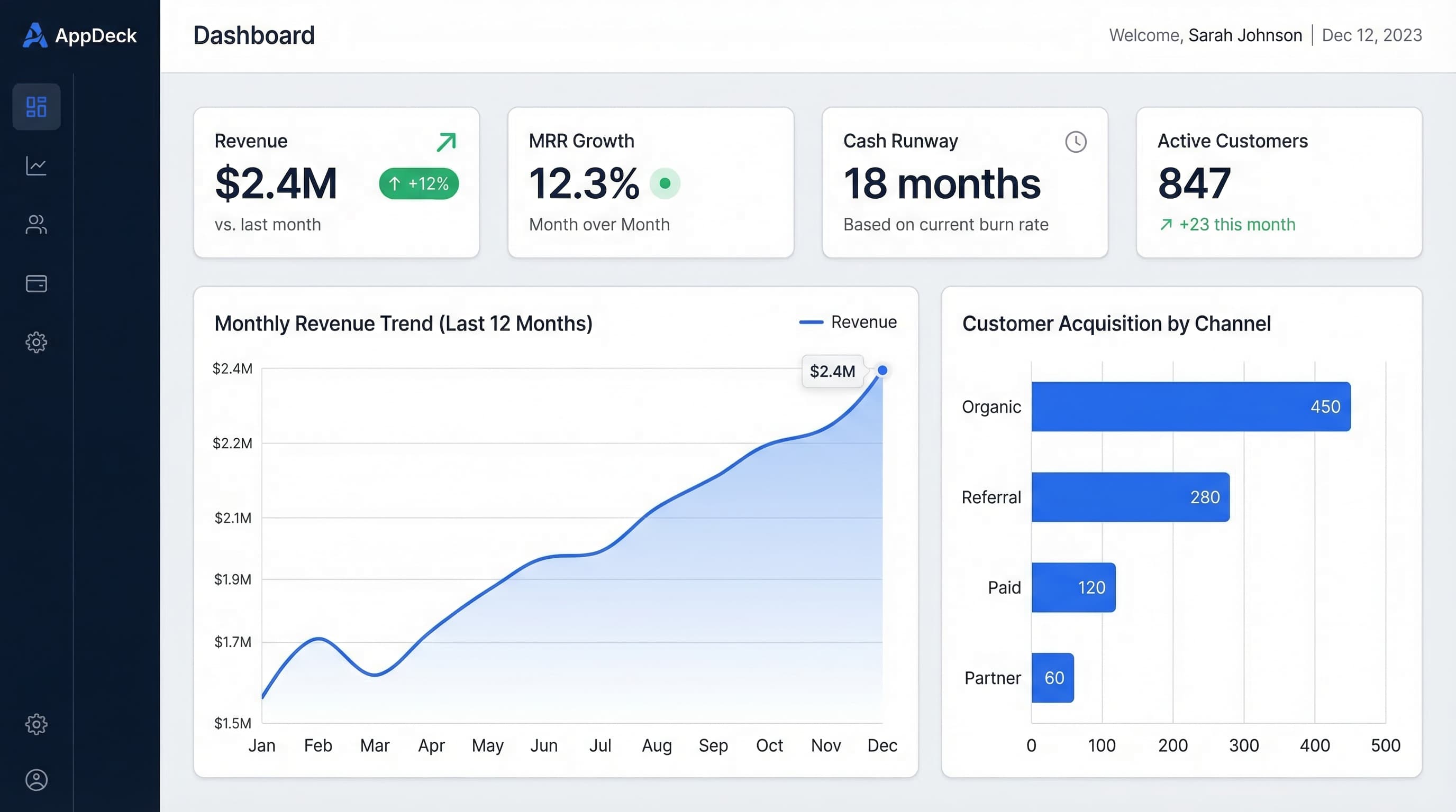
15 Free Excel Dashboard Templates (Dynamic .xlsx Files to Download)
Download 15 free Excel dashboard templates: dynamic .xlsx files for CEO, CFO, sales, marketing, HR, and operations teams, with sample data, charts, conditional formatting, and working formulas.
Executive Dashboard Software: 8 Best Platforms Compared (2026)
Compare the best executive dashboard software for 2026. Features, pricing, and honest reviews of Tableau, Power BI, Looker, AppDeck, Geckoboard, Klipfolio, Databox, and Domo.