
Operations Dashboard Template: 8 Examples with Key Metrics and Layouts
Free operations dashboard templates for COO reporting, supply chain, manufacturing, quality control, warehouse logistics, and IT uptime. Layouts, key metrics, and design tips.
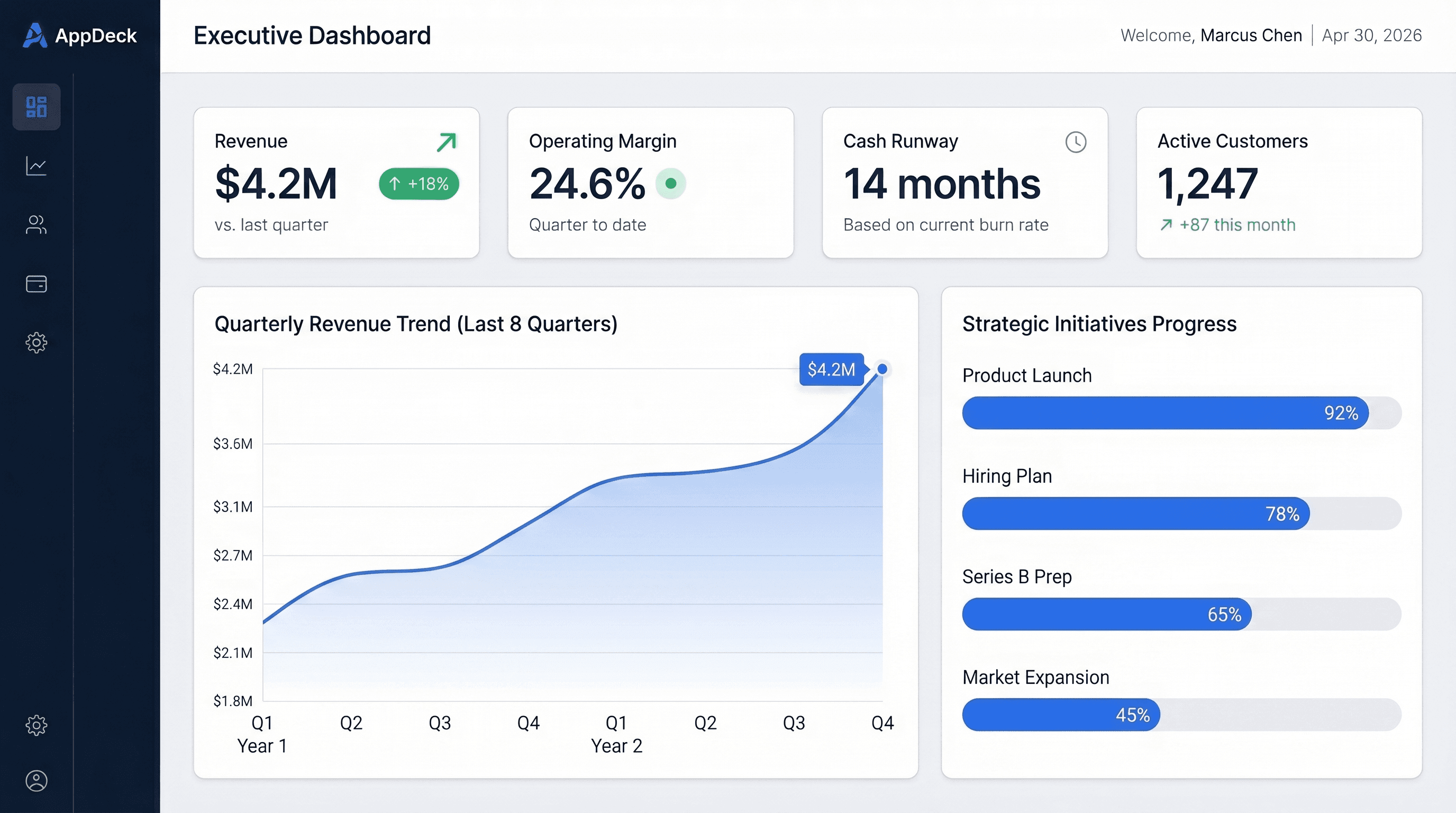
Download the template: Get the dashboard as a free Excel file — Operations Dashboard Template (.xlsx) — throughput, SLA attainment, on-time delivery, quality, and capacity utilization on sample data. No paywall.
TL;DR: Operations dashboards work best when each one answers a single question for a specific audience. This guide covers eight templates — from a COO executive overview down to field operations — with ASCII layouts, key metrics, and implementation tips you can adapt today. If you want to skip ahead, the COO Executive Overview is the most broadly useful starting point.
Introduction
Operations is where strategy meets reality. You can have the best product roadmap, the sharpest sales team, and the most ambitious growth targets — but if operations cannot deliver, none of it matters.
The challenge is that operations generates more data than any other function. Cycle times, defect rates, inventory levels, uptime percentages, fulfillment speeds, capacity utilization — the list is endless. And most of it lives in different systems that do not talk to each other.
An operations dashboard cuts through the noise. It takes the handful of metrics that actually matter for a given role or function and puts them on one screen, updated in real time, with enough context to drive decisions instead of just reporting history.
Over the past twenty years, I have built and reviewed operations dashboards across manufacturing, logistics, SaaS, and professional services. The templates below are distilled from what I have seen work. Each one includes a layout, the key metrics to track, and practical tips for implementation.
If you are looking for broader dashboard inspiration, start with our executive dashboard templates guide or the complete KPI dashboard examples collection.
What Makes an Effective Operations Dashboard
Before jumping into templates, here are four principles that separate operations dashboards people actually use from the ones that get ignored.
1. Real-Time or Near-Real-Time Data
Operations moves fast. A dashboard that updates once a day is a report, not a dashboard. The best operations dashboards pull live data from your ERP, WMS, MES, or monitoring tools so the team can spot problems while they are still fixable.
2. Threshold-Based Alerts
Operations teams do not have time to scan 30 metrics looking for anomalies. Use color-coded thresholds — green, yellow, red — so that problems are impossible to miss. If everything is green, you move on. If something is red, you know exactly where to look.
Good:  On-Time Delivery: 94.2%  ⚠️ vs 96% target
Bad:   On-Time Delivery: 94.2%  (no context)
3. One Dashboard Per Audience
A COO needs a different view than a warehouse manager. Resist the temptation to build one mega-dashboard that tries to serve everyone. It will serve no one. Each template below is designed for a specific role and a specific set of decisions.
4. Drill-Down from Summary to Detail
Every metric on an operations dashboard should be clickable. If your overall equipment effectiveness drops, you need to drill into which production lines, which shifts, and which machines are driving the decline. The summary is the starting point, not the destination.
8 Operations Dashboard Templates
1. COO Executive Overview Dashboard
The COO executive overview is the single-screen answer to the question: "How are operations performing right now?" This is the dashboard you pull up in your Monday morning leadership meeting. It covers the big four — delivery, quality, cost, and capacity — without getting into the weeds.
Best for: COOs, VP of Operations, General Managers, and anyone reporting operational performance to the C-suite or board
Key metrics:
- On-time delivery rate
- Overall quality rate (first-pass yield or defect rate)
- Operational cost vs budget
- Capacity utilization
- Order backlog
- Customer satisfaction (CSAT or NPS)
━━━━━━━━━━━━━━━━━━━━━━━━━━━━━━━━━━━━━━━━━━━━━━━━━━━━━━━━━━━━━━━
   COO EXECUTIVE OVERVIEW                       April 2026
━━━━━━━━━━━━━━━━━━━━━━━━━━━━━━━━━━━━━━━━━━━━━━━━━━━━━━━━━━━━━━━
  On-Time         Quality        OpEx vs Bud.   Capacity
  96.1%           99.2%          $1.82M/$1.85M  78%
  ✅ vs 95% tgt   ✅ vs 99% tgt  ✅ Under budg.  ✅ vs 85% max
━━━━━━━━━━━━━━━━━━━━━━━━━━━━━━━━━━━━━━━━━━━━━━━━━━━━━━━━━━━━━━━
   ORDER BACKLOG & THROUGHPUT (12 weeks)
   ┌─────────────────────────────────────────────────────────┐
   │  Backlog ████████████░░░░░░░░░░░░                       │
   │  Throughput ━━━━━━━━━━━━━━━━━━━━ (trend line)           │
   └─────────────────────────────────────────────────────────┘
━━━━━━━━━━━━━━━━━━━━━━━━━━━━━━━━━━━━━━━━━━━━━━━━━━━━━━━━━━━━━━━
   TOP 3 ISSUES THIS WEEK          CSAT TREND (6 months)
   ━━━━━━━━━━━━━━━━━━━━━━━         ━━━━━━━━━━━━━━━━━━━━━━━━
   1. Vendor delay (Line B)        Nov  4.1
   2. Hiring gap: 3 open roles     Dec  4.2
   3. Rework rate up in QC-7       Jan  4.3
   ━━━━━━━━━━━━━━━━━━━━━━━         Feb  4.2
                                   Mar  4.4
                                   Apr  4.3
                                   ━━━━━━━━━━━━━━━━━━━━━━━━
━━━━━━━━━━━━━━━━━━━━━━━━━━━━━━━━━━━━━━━━━━━━━━━━━━━━━━━━━━━━━━━
Layout zones: Top row is the four KPI scorecards with status indicators. Middle row shows backlog trend and throughput over 12 weeks. Bottom row splits between a manual issues list (updated weekly) and a rolling CSAT trend.
Implementation tips: Keep this dashboard to one screen — no scrolling. If you find yourself adding more metrics, you need a second dashboard, not a bigger one. The issues list should be manually curated by the COO or their chief of staff, not auto-generated. The human curation is what makes it valuable.
2. Supply Chain and Inventory Dashboard
Supply chain visibility is the difference between proactive management and firefighting. This dashboard tracks the flow of goods from suppliers through your warehouse to the customer, with early warning signals at each stage.
Best for: Supply chain directors, procurement managers, inventory planners
Key metrics:
- Supplier on-time rate
- Inventory turnover ratio
- Days of supply on hand
- Stockout rate
- Purchase order cycle time
- Freight cost per unit
━━━━━━━━━━━━━━━━━━━━━━━━━━━━━━━━━━━━━━━━━━━━━━━━━━━━━━━━━━━━━━━
   SUPPLY CHAIN & INVENTORY                    April 2026
━━━━━━━━━━━━━━━━━━━━━━━━━━━━━━━━━━━━━━━━━━━━━━━━━━━━━━━━━━━━━━━
  Supplier OTD     Inventory Turn   Days of Supply  Stockout %
  91.4%            6.2x             28 days         1.8%
  ⚠️ vs 95% tgt   ✅ vs 5x min     ✅ 20-35 range  ✅ vs 3% max
━━━━━━━━━━━━━━━━━━━━━━━━━━━━━━━━━━━━━━━━━━━━━━━━━━━━━━━━━━━━━━━
   SUPPLIER SCORECARD
   ━━━━━━━━━━━━━━━━━━━━━━━━━━━━━━━━━━━━━━━━━━━━━━━━━━━━
     Supplier        OTD      Quality    Lead Time
     Acme Parts      97%      99.5%      12 days    ✅
     GlobalComp      88%      98.2%      18 days    🚨
     FastShip Co     94%      99.8%      8 days     ⚠️
   ━━━━━━━━━━━━━━━━━━━━━━━━━━━━━━━━━━━━━━━━━━━━━━━━━━━━

   INVENTORY BY CATEGORY             PO CYCLE TIME TREND
   ━━━━━━━━━━━━━━━━━━━━━━━           ━━━━━━━━━━━━━━━━━━━━━━━
     Raw Materials  $1.2M             Jan  14 days
     WIP            $680K             Feb  13 days
     Finished       $2.1M             Mar  15 days
     Total          $3.98M            Apr  12 days   ✅
   ━━━━━━━━━━━━━━━━━━━━━━━           ━━━━━━━━━━━━━━━━━━━━━━━
━━━━━━━━━━━━━━━━━━━━━━━━━━━━━━━━━━━━━━━━━━━━━━━━━━━━━━━━━━━━━━━
Layout zones: Top row is four KPI cards. Middle zone is the supplier scorecard table with red/yellow/green status. Bottom row splits between inventory value by category and PO cycle time trend.
Implementation tips: The supplier scorecard is the most actionable section. Review it weekly and use it to drive vendor performance conversations. Set up automated alerts when any single supplier's on-time delivery drops below 90% — that is usually the point where it starts impacting your own delivery commitments.
3. Manufacturing and Production Dashboard
This dashboard lives on a big screen on the factory floor. It tells the production team whether they are hitting targets in real time, not after the shift is over.
Best for: Plant managers, production supervisors, manufacturing engineers
Key metrics:
- Overall Equipment Effectiveness (OEE)
- Units produced vs plan
- Cycle time
- Scrap/rework rate
- Downtime (planned vs unplanned)
- Changeover time
━━━━━━━━━━━━━━━━━━━━━━━━━━━━━━━━━━━━━━━━━━━━━━━━━━━━━━━━━━━━━━━
   PRODUCTION DASHBOARD                    Shift: Day — Apr 7
━━━━━━━━━━━━━━━━━━━━━━━━━━━━━━━━━━━━━━━━━━━━━━━━━━━━━━━━━━━━━━━
  OEE              Units Today    Cycle Time      Scrap Rate
  82.4%            1,247 / 1,500  4.2 min         2.1%
  ✅ vs 80% tgt    ⚠️ 83% plan    ✅ vs 4.5 std   ✅ vs 3% max
━━━━━━━━━━━━━━━━━━━━━━━━━━━━━━━━━━━━━━━━━━━━━━━━━━━━━━━━━━━━━━━
   LINE STATUS
   ━━━━━━━━━━━━━━━━━━━━━━━━━━━━━━━━━━━━━━━━━━━━━━━━━━━━━━━━
     Line A   ✅ Running    OEE: 87%    Units: 430 / 500
     Line B   🚨 DOWN       Reason: Motor fault — 42 min
     Line C   ✅ Running    OEE: 84%    Units: 395 / 480
     Line D   ⚠️ Changeover ETA: 18 min
   ━━━━━━━━━━━━━━━━━━━━━━━━━━━━━━━━━━━━━━━━━━━━━━━━━━━━━━━━

   DOWNTIME THIS SHIFT              OEE TREND (30 days)
   ━━━━━━━━━━━━━━━━━━━━━━           ━━━━━━━━━━━━━━━━━━━━━━━━
     Planned: 45 min                 Wk1  79%
     Unplanned: 42 min  🚨           Wk2  81%
     Changeover: 22 min              Wk3  83%
     Total: 109 min / 480 min        Wk4  82%
   ━━━━━━━━━━━━━━━━━━━━━━           ━━━━━━━━━━━━━━━━━━━━━━━━
━━━━━━━━━━━━━━━━━━━━━━━━━━━━━━━━━━━━━━━━━━━━━━━━━━━━━━━━━━━━━━━
Layout zones: Top row is four KPI scorecards. Middle section is a live status table for each production line. Bottom row splits between downtime breakdown and a 30-day OEE trend.
Implementation tips: This dashboard should refresh every 60 seconds or faster. OEE is the single most important metric — it combines availability, performance, and quality into one number. If your OEE is below 60%, focus on availability first (reducing unplanned downtime gives the biggest improvement). Between 60-85%, start optimizing cycle time and changeover. Above 85%, you are world-class and should focus on quality.
4. Quality Control Dashboard
Quality issues are expensive when caught at the factory. They are catastrophic when caught by the customer. This dashboard gives your quality team early visibility into trends before they become recalls.
Best for: Quality managers, QA engineers, compliance officers
Key metrics:
- First-pass yield
- Defect rate (PPM or percentage)
- Customer complaint rate
- CAPA (Corrective and Preventive Action) status
- Inspection pass rate
- Cost of quality (prevention + appraisal + failure)
━━━━━━━━━━━━━━━━━━━━━━━━━━━━━━━━━━━━━━━━━━━━━━━━━━━━━━━━━━━━━━━
   QUALITY CONTROL DASHBOARD                   April 2026
━━━━━━━━━━━━━━━━━━━━━━━━━━━━━━━━━━━━━━━━━━━━━━━━━━━━━━━━━━━━━━━
  First-Pass Yield  Defect Rate     Complaints     CAPA Open
  97.8%             1,420 PPM       0.3%           7
  ✅ vs 97% tgt     ⚠️ vs 1K tgt   ✅ vs 0.5%     ⚠️ 3 overdue
━━━━━━━━━━━━━━━━━━━━━━━━━━━━━━━━━━━━━━━━━━━━━━━━━━━━━━━━━━━━━━━
   DEFECT PARETO (Top 5 This Month)
   ━━━━━━━━━━━━━━━━━━━━━━━━━━━━━━━━━━━━━━━━━━━━━━━━━━━━
     Cosmetic scratch    ████████████████  38%
     Dimension OOS       █████████████     28%
     Seal failure        ████████          16%
     Color mismatch      █████             10%
     Label error         ███                8%
   ━━━━━━━━━━━━━━━━━━━━━━━━━━━━━━━━━━━━━━━━━━━━━━━━━━━━

   COST OF QUALITY                   DEFECT TREND (6 months)
   ━━━━━━━━━━━━━━━━━━━━━━           ━━━━━━━━━━━━━━━━━━━━━━━━
     Prevention   $42K               Nov  1,680 PPM
     Appraisal    $28K               Dec  1,520 PPM
     Int. Failure $18K               Jan  1,380 PPM
     Ext. Failure $9K                Feb  1,290 PPM
     Total        $97K               Mar  1,350 PPM
   ━━━━━━━━━━━━━━━━━━━━━━           Apr  1,420 PPM  ⚠️
                                     ━━━━━━━━━━━━━━━━━━━━━━━━
━━━━━━━━━━━━━━━━━━━━━━━━━━━━━━━━━━━━━━━━━━━━━━━━━━━━━━━━━━━━━━━
Layout zones: Top row is four KPI scorecards. Middle section is a Pareto chart of the top defect types. Bottom row splits between cost of quality breakdown and a six-month defect rate trend line.
Implementation tips: The Pareto chart is the single most actionable visual. It tells your team exactly where to focus improvement efforts. If the top two defect categories account for more than 60% of all defects, you have a clear starting point. Track the defect trend monthly — a reversal (like the uptick from March to April in this example) should trigger an immediate root-cause investigation, not a wait-and-see approach.
5. Warehouse and Logistics Dashboard
Warehouse operations run on speed and accuracy. This dashboard is designed for the distribution center manager who needs to know if orders are getting out the door on time, if the team is keeping up with inbound receipts, and if inventory accuracy is holding.
Best for: Warehouse managers, distribution center directors, logistics coordinators
Key metrics:
- Order fulfillment rate
- Pick accuracy
- Average order cycle time (receipt to ship)
- Inbound receipts processed
- Inventory accuracy
- Dock-to-stock time
━━━━━━━━━━━━━━━━━━━━━━━━━━━━━━━━━━━━━━━━━━━━━━━━━━━━━━━━━━━━━━━
   WAREHOUSE & LOGISTICS                       April 7, 2026
━━━━━━━━━━━━━━━━━━━━━━━━━━━━━━━━━━━━━━━━━━━━━━━━━━━━━━━━━━━━━━━
  Fulfillment      Pick Accuracy   Cycle Time      Inv. Accuracy
  98.4%            99.7%           2.1 hours       99.2%
  ✅ vs 97% tgt    ✅ vs 99.5%     ✅ vs 3 hr max  ✅ vs 99% tgt
━━━━━━━━━━━━━━━━━━━━━━━━━━━━━━━━━━━━━━━━━━━━━━━━━━━━━━━━━━━━━━━
   TODAY'S THROUGHPUT
   ━━━━━━━━━━━━━━━━━━━━━━━━━━━━━━━━━━━━━━━━━━━━━━━━━━━━
     Orders Received       842
     Orders Picked         810
     Orders Shipped        798
     Pending               44        ⚠️ (backlog)
   ━━━━━━━━━━━━━━━━━━━━━━━━━━━━━━━━━━━━━━━━━━━━━━━━━━━━

   INBOUND STATUS                    CYCLE TIME TREND (4 wks)
   ━━━━━━━━━━━━━━━━━━━━━━           ━━━━━━━━━━━━━━━━━━━━━━━━
     POs Due Today    12             Wk1  2.4 hrs
     Received         9              Wk2  2.2 hrs
     Dock-to-Stock    3.2 hrs        Wk3  2.0 hrs
     Late POs         3  🚨          Wk4  2.1 hrs
   ━━━━━━━━━━━━━━━━━━━━━━           ━━━━━━━━━━━━━━━━━━━━━━━━
━━━━━━━━━━━━━━━━━━━━━━━━━━━━━━━━━━━━━━━━━━━━━━━━━━━━━━━━━━━━━━━
Layout zones: Top row is four KPI scorecards. Middle section is the daily throughput funnel — orders received, picked, shipped, and pending. Bottom row splits between inbound receiving status and a four-week cycle time trend.
Implementation tips: The throughput funnel is the heartbeat of this dashboard. If the gap between orders received and orders shipped widens over consecutive days, you are building a backlog that will eventually blow up your delivery commitments. Set an alert threshold — for example, if pending orders exceed 10% of daily volume, escalate to the warehouse manager immediately.
6. Customer Operations Dashboard
Customer operations sits at the intersection of support, success, and fulfillment. This dashboard is for the leader who owns the post-sale experience and needs to see whether the operation is delivering on the promises the sales team made.
Best for: VP of Customer Operations, Head of Support, Customer Success leaders
Key metrics:
- Ticket volume and resolution time
- First contact resolution rate
- SLA compliance
- Customer effort score
- Escalation rate
- NPS by segment
━━━━━━━━━━━━━━━━━━━━━━━━━━━━━━━━━━━━━━━━━━━━━━━━━━━━━━━━━━━━━━━
   CUSTOMER OPERATIONS                         April 2026
━━━━━━━━━━━━━━━━━━━━━━━━━━━━━━━━━━━━━━━━━━━━━━━━━━━━━━━━━━━━━━━
  Tickets Open     Avg Resolution   FCR Rate       SLA Met
  127              4.2 hrs          78%            96.1%
  ⚠️ vs 100 avg   ✅ vs 6 hr tgt   ⚠️ vs 82% tgt  ✅ vs 95% tgt
━━━━━━━━━━━━━━━━━━━━━━━━━━━━━━━━━━━━━━━━━━━━━━━━━━━━━━━━━━━━━━━
   TICKET VOLUME BY CHANNEL
   ━━━━━━━━━━━━━━━━━━━━━━━━━━━━━━━━━━━━━━━━━━━━━━━━━━━━
     Email          ████████████████████████  48%
     Chat           ██████████████            28%
     Phone          ████████                  16%
     Self-Service   ████                       8%
   ━━━━━━━━━━━━━━━━━━━━━━━━━━━━━━━━━━━━━━━━━━━━━━━━━━━━

   ESCALATION TRACKER                NPS BY SEGMENT
   ━━━━━━━━━━━━━━━━━━━━━━           ━━━━━━━━━━━━━━━━━━━━━━━━
     Open Escalations    8           Enterprise   +52
     Avg Age             2.4 days    Mid-Market   +38
     Escalation Rate     3.1%        SMB          +21
     Resolution Target   48 hrs      Overall      +34
   ━━━━━━━━━━━━━━━━━━━━━━           ━━━━━━━━━━━━━━━━━━━━━━━━
━━━━━━━━━━━━━━━━━━━━━━━━━━━━━━━━━━━━━━━━━━━━━━━━━━━━━━━━━━━━━━━
Layout zones: Top row is four KPI scorecards. Middle section is a horizontal bar chart showing ticket volume by channel. Bottom row splits between escalation tracker and NPS by customer segment.
Implementation tips: The most underrated metric here is first contact resolution (FCR). Every ticket that requires a second touch adds to your cost to serve. If FCR is below 80%, dig into the reasons — it is usually either a knowledge gap (agents do not have the right information) or a process gap (the issue requires a handoff to another team). Both are fixable. Pair this dashboard with your project status dashboard to track improvement initiatives.
7. IT Operations and Uptime Dashboard
For companies that run a SaaS product or depend on internal systems, IT operations uptime is directly tied to revenue. This dashboard gives your IT ops or SRE team the real-time visibility they need to keep systems running.
Best for: IT directors, SRE teams, DevOps managers, CTOs
Key metrics:
- System uptime (monthly and trailing 12-month)
- Incident count and mean time to resolve (MTTR)
- Mean time between failures (MTBF)
- Change success rate
- Open incidents by severity
- Infrastructure cost per user
━━━━━━━━━━━━━━━━━━━━━━━━━━━━━━━━━━━━━━━━━━━━━━━━━━━━━━━━━━━━━━━
   IT OPERATIONS / UPTIME                      April 2026
━━━━━━━━━━━━━━━━━━━━━━━━━━━━━━━━━━━━━━━━━━━━━━━━━━━━━━━━━━━━━━━
  Uptime (MTD)     MTTR            Incidents       Change Succ.
  99.97%           18 min          3 (P1: 0)       94%
  ✅ vs 99.9% SLA  ✅ vs 30 min    ✅ no critical   ⚠️ vs 98% tgt
━━━━━━━━━━━━━━━━━━━━━━━━━━━━━━━━━━━━━━━━━━━━━━━━━━━━━━━━━━━━━━━
   SERVICE STATUS
   ━━━━━━━━━━━━━━━━━━━━━━━━━━━━━━━━━━━━━━━━━━━━━━━━━━━━━━━━
     Web App         ✅ Operational       Uptime: 99.99%
     API Gateway     ✅ Operational       Uptime: 99.98%
     Database        ✅ Operational       Uptime: 99.99%
     Auth Service    ⚠️ Degraded          Latency: 420ms (>200)
     CDN             ✅ Operational       Uptime: 100%
   ━━━━━━━━━━━━━━━━━━━━━━━━━━━━━━━━━━━━━━━━━━━━━━━━━━━━━━━━

   INCIDENTS (30 days)               INFRA COST TREND
   ━━━━━━━━━━━━━━━━━━━━━━           ━━━━━━━━━━━━━━━━━━━━━━━━
     P1 (Critical)   0               Jan  $48K
     P2 (Major)      2               Feb  $47K
     P3 (Minor)      8               Mar  $52K  ⚠️
     P4 (Low)        14              Apr  $49K
     Avg MTTR        18 min          Per User: $14.20
   ━━━━━━━━━━━━━━━━━━━━━━           ━━━━━━━━━━━━━━━━━━━━━━━━
━━━━━━━━━━━━━━━━━━━━━━━━━━━━━━━━━━━━━━━━━━━━━━━━━━━━━━━━━━━━━━━
Layout zones: Top row is four KPI scorecards. Middle section is a live service status table for each critical system. Bottom row splits between incident breakdown by severity and infrastructure cost trend.
Implementation tips: Uptime percentages can be deceiving. The difference between 99.9% and 99.99% sounds trivial but represents a 10x improvement in downtime (43 minutes per month vs 4 minutes). Make sure your team understands what your SLA actually requires. The change success rate is a leading indicator — if it drops below 95%, you are likely introducing instability faster than you are resolving it. This is one of the KPIs every executive should track.
8. Field Operations Dashboard
Field operations — whether it is a fleet of technicians, a construction crew, or a distributed sales and service team — has unique challenges. Your people are dispersed, visibility is limited, and every mile driven is money spent. This dashboard keeps headquarters connected to what is happening in the field.
Best for: Field operations managers, service dispatch leaders, fleet managers
Key metrics:
- Jobs completed vs scheduled
- First-time fix rate
- Average response time
- Technician utilization
- Travel time vs work time ratio
- Customer satisfaction (post-visit)
━━━━━━━━━━━━━━━━━━━━━━━━━━━━━━━━━━━━━━━━━━━━━━━━━━━━━━━━━━━━━━━
   FIELD OPERATIONS                            April 7, 2026
━━━━━━━━━━━━━━━━━━━━━━━━━━━━━━━━━━━━━━━━━━━━━━━━━━━━━━━━━━━━━━━
  Jobs Today       Fix Rate        Avg Response    Utilization
  84 / 92          88%             2.4 hrs         74%
  ⚠️ 91% sched.   ⚠️ vs 90% tgt  ✅ vs 4 hr SLA  ⚠️ vs 80% tgt
━━━━━━━━━━━━━━━━━━━━━━━━━━━━━━━━━━━━━━━━━━━━━━━━━━━━━━━━━━━━━━━
   TEAM PERFORMANCE
   ━━━━━━━━━━━━━━━━━━━━━━━━━━━━━━━━━━━━━━━━━━━━━━━━━━━━━━━━
     Tech       Jobs     Fix Rate   Travel%    CSAT
     A. Lopez    7/8      100%       22%        4.8   ✅
     B. Kim      6/7       86%       28%        4.5   ✅
     C. Davis    5/8       80%       35%        4.1   ⚠️
     D. Patel    8/8      100%       18%        4.9   ✅
     E. Tanaka   4/7       71%       41%        3.8   🚨
   ━━━━━━━━━━━━━━━━━━━━━━━━━━━━━━━━━━━━━━━━━━━━━━━━━━━━━━━━

   JOB BACKLOG (7 days)             TRAVEL vs WORK TIME
   ━━━━━━━━━━━━━━━━━━━━━━           ━━━━━━━━━━━━━━━━━━━━━━━━
     Mon   92 sched / 84 done       Travel  ████████  26%
     Tue   88 sched                 Work    ████████████████ 52%
     Wed   95 sched                 Admin   ██████  22%
     Thu   90 sched                 ━━━━━━━━━━━━━━━━━━━━━━━━
     Fri   78 sched
   ━━━━━━━━━━━━━━━━━━━━━━
━━━━━━━━━━━━━━━━━━━━━━━━━━━━━━━━━━━━━━━━━━━━━━━━━━━━━━━━━━━━━━━
Layout zones: Top row is four KPI scorecards. Middle section is a technician-level performance table. Bottom row splits between a weekly job backlog view and a time allocation breakdown.
Implementation tips: First-time fix rate is the metric that drives everything in field operations. A return visit costs you the truck roll, the technician's time, and the customer's patience. If your first-time fix rate is below 85%, investigate whether the issue is parts availability (techs arriving without the right components), diagnosis accuracy (misidentified problem on the first visit), or skill gaps (certain job types failing more often). Travel time percentage above 30% usually means your routing or territory design needs work.
Key Operations Metrics Reference
Here is a reference table for the metrics used across these eight templates. Use it as a starting point when building or customizing your own operations dashboards.
| Metric | Formula / Definition | Common rule-of-thumb target |
|---|---|---|
| OEE | Availability x Performance x Quality | 85%+ world-class |
| On-Time Delivery | Orders delivered on time / Total orders | 95%+ |
| First-Pass Yield | Units passing QC first time / Total units | 97%+ |
| Defect Rate (PPM) | Defective parts per million produced | Under 1,000 PPM |
| Inventory Turnover | COGS / Average inventory value | 5-10x depending on industry |
| Days of Supply | Average inventory / Daily usage | 15-30 days |
| Cycle Time | Time from order receipt to delivery | Lower is better |
| MTTR | Mean time to resolve an incident | Under 30 min for critical |
| MTBF | Average time between system failures | Higher is better |
| Uptime % | (Total time - Downtime) / Total time | 99.9%+ for SaaS |
| First-Time Fix Rate | Jobs resolved on first visit / Total jobs | 90%+ |
| Technician Utilization | Productive hours / Available hours | 75-85% |
| First Contact Resolution | Tickets resolved on first touch / Total | 80%+ |
| SLA Compliance | Tickets resolved within SLA / Total | 95%+ |
| Capacity Utilization | Actual output / Maximum output | 75-85% optimal |
| Cost of Quality | Prevention + Appraisal + Failure costs | Under 5% of revenue |
| Stockout Rate | Instances of zero stock / Total SKUs | Under 2% |
| Pick Accuracy | Correct picks / Total picks | 99.5%+ |
Tools for Building Operations Dashboards
Spreadsheets (Excel / Google Sheets)
The universal starting point. Spreadsheets are flexible, familiar, and free. The downside: they do not update in real time, version control is manual, and sharing a live dashboard with 15 stakeholders means someone is always looking at stale data.
Best for: Early-stage companies, one-off analyses, proof-of-concept before investing in a dedicated tool
AppDeck Executive Dashboards
If your operations team needs a central hub where leadership, board members, and cross-functional partners can access live dashboards without chasing email attachments, AppDeck Executive Dashboards let you build polished dashboards with role-based access controls. Embed charts from your existing BI tools, add context with commentary, and keep everything in one secure, branded portal. It is especially useful for COOs who need to share operational performance with the board or investors alongside financial and strategic metrics.
Best for: Executive reporting, board updates, cross-functional operational reviews
BI Platforms (Tableau, Power BI, Looker)
Enterprise BI tools connect directly to your data warehouse and offer powerful visualization and drill-down capabilities. They are the right choice when you have a dedicated analytics team and complex data models. The tradeoff is cost, complexity, and the time required to build and maintain dashboards.
Best for: Mid-market to enterprise companies with dedicated data teams
Operational Software (ERP, WMS, MES)
Your ERP (NetSuite, SAP), WMS (Manhattan, Blue Yonder), or MES (Plex, IQMS) likely has built-in dashboards. They have the advantage of real-time data access but are often rigid in layout and limited in customization. They work well as data sources feeding into a more flexible presentation layer.
Best for: Companies already invested in these platforms that want quick wins without additional tooling
How to Choose the Right Template
You do not need all eight dashboards on day one. Start with the ones that answer the questions your stakeholders are already asking.
Single-site operations: Start with the COO Executive Overview and Manufacturing/Production dashboards. Add Quality Control when defect rates become a strategic concern.
Distribution and e-commerce: Prioritize the Warehouse and Logistics dashboard, then add Supply Chain and Inventory. The Customer Operations dashboard becomes critical once order volume exceeds what a small team can manage manually.
SaaS and technology companies: The IT Operations dashboard is non-negotiable. Pair it with the Customer Operations dashboard and the COO Executive Overview for leadership reporting.
Field service businesses: The Field Operations dashboard is your foundation. Add the COO Executive Overview when you need to roll performance up for executive visibility.
For a deeper look at how these templates fit into a broader executive reporting strategy, see the complete guide to executive dashboards or explore how other leaders are building their executive dashboard software stack.
Frequently Asked Questions
What is an operations dashboard?
An operations dashboard is a real-time visualization of the metrics that govern how a business runs day-to-day — production output, service levels, on-time delivery, inventory, staffing, quality, and incident rates. Unlike an executive dashboard (which summarizes strategic performance for leadership) or a project dashboard (which tracks one initiative), an operations dashboard answers "is the machine running well right now?" It supports tactical decisions like reallocating staff, expediting orders, escalating incidents, or pausing production. Good ops dashboards are role-specific (warehouse manager, IT director, COO, field ops lead) and update at the cadence the role requires — hourly for floor managers, daily for directors.
How is an operations dashboard different from a KPI or executive dashboard?
An executive dashboard summarizes strategic health across the whole company — revenue, growth rate, runway, headcount, customer satisfaction — for a board or CEO. A KPI dashboard tracks a defined set of metrics tied to goals, often for a specific function (sales, marketing, finance). An operations dashboard focuses on the throughput and quality of the work itself — orders fulfilled, tickets resolved, calls answered, jobs completed. Ops dashboards run at higher refresh rates (often real-time) and trigger immediate action; executive dashboards run weekly or monthly and trigger strategic conversations. Most companies need all three; they serve different audiences and decision cadences.
How often should operations metrics be refreshed and reviewed?
Refresh frequency depends on the metric's volatility and the decision it drives. Production output, queue depth, and incident counts should refresh every 5-15 minutes for floor and shift managers. Daily summaries (orders shipped, tickets closed, fill rate) refresh at end of day or shift change. Weekly metrics (capacity utilization, schedule attainment) refresh Monday morning. Reviewed cadence should match: shift huddles for real-time metrics, daily standups for end-of-day metrics, weekly ops reviews for trend data. If a metric doesn't trigger a conversation or decision at its refresh cadence, you're refreshing too often.
Who should use operations dashboard templates?
Operations dashboard templates fit four primary roles: shift and warehouse managers tracking throughput in manufacturing or fulfillment, IT operations teams managing infrastructure and ticket queues, customer operations leaders watching CSAT and resolution times, and COOs reviewing cross-function performance. Smaller companies may not need a separate ops dashboard — Google Sheets with key numbers updated daily is enough. The threshold is roughly when no single person can hold the operational picture in their head anymore, which depends more on operational complexity than on headcount alone.
When should we build a custom dashboard instead of using a template?
Start with a template for the first 3-6 months — you'll learn what metrics actually drive decisions before you invest in custom infrastructure. Build custom when three signals appear: (1) the metrics your team actually uses don't match standard templates because your business has unique operational characteristics, (2) data integration across multiple source systems has become the bottleneck and you need a BI tool (Looker, Tableau, Metabase) with proper modeling, or (3) your operational data needs to be embedded in customer-facing products. Most ops dashboards never need to graduate beyond a configured template plus Looker Studio or a portal-based reporting layer.
Conclusion
An operations dashboard is not a nice-to-have. It is the nervous system of your business — the thing that tells you whether the organization is healthy, where it hurts, and what needs attention right now.
The best operations dashboards I have seen share three traits: they are built for a specific audience, they surface exceptions instead of burying them in data, and they are tied to a decision cadence — a weekly meeting, a daily standup, a shift change — where someone is accountable for acting on what the dashboard shows.
Start with one template from this guide. Get the data flowing. Get the team using it. Then expand. The goal is not to build the perfect dashboard — it is to build one that is good enough to change how your team makes decisions, and then iterate from there.
Related Reading

Founder & CEO, AppDeck
Serial entrepreneur with 20+ years building B2B software companies. Co-Founder of UnifyCX (formerly GlowTouch), which has 6,000+ employees. Vik reviews all AppDeck content for accuracy and practical relevance.
Share this article
Explore Related Solutions
Related Articles
12 Free Google Sheets Dashboard Templates (Ready to Use)
Build dashboards in Google Sheets with 12 free templates covering executive, financial, sales, marketing, HR, and more. Includes formulas, layouts, and implementation tips.
15 Free Excel Dashboard Templates (Dynamic .xlsx Files to Download)
Download 15 free Excel dashboard templates: dynamic .xlsx files for CEO, CFO, sales, marketing, HR, and operations teams, with sample data, charts, conditional formatting, and working formulas.
Executive Dashboard Software: 8 Best Platforms Compared (2026)
Compare the best executive dashboard software for 2026. Features, pricing, and honest reviews of Tableau, Power BI, Looker, AppDeck, Geckoboard, Klipfolio, Databox, and Domo.