
Executive Summary Dashboard: What to Include, How to Build It, and Examples
Learn how to build an executive summary dashboard that drives decisions. Key metrics, layout best practices, real examples, and a step-by-step guide for CEOs, CFOs, and VPs.
TL;DR: Learn how to build an executive summary dashboard that drives decisions. Key metrics, layout best practices, real examples, and a step-by-step guide for CEOs, CFOs, and VPs.
Introduction
An executive summary dashboard is the single page that answers the question every leader asks on Monday morning: How is the business doing?
Not a 40-slide deck. Not a spreadsheet with 12 tabs. One page. Five to seven metrics. Red, yellow, or green.
After 20+ years building B2B software companies, I have sat through hundreds of leadership meetings where the first 30 minutes were wasted just getting everyone on the same page. Revenue numbers from finance didn't match the numbers from sales. Marketing reported leads one way, demand gen reported them another. The CEO asked a simple question and got five different answers from five different tools.
An executive summary dashboard eliminates that problem. It's the single source of truth that every leader in the room can point to and say: This is where we stand.
In this guide, I'll walk through exactly what an executive summary dashboard is, what metrics belong on it, how to lay it out so it's scannable in seconds, and four real-world examples you can adapt for your own organization.
Executive Summary Dashboard vs. Operational Dashboard
Before we go further, let's clarify an important distinction. An executive summary dashboard and an operational dashboard serve fundamentally different purposes.
Executive Summary Dashboard
- Audience: CEO, CFO, VP-level, board members
- Refresh frequency: Daily or weekly
- Number of metrics: 5-7 KPIs
- Time horizon: Month-to-date, quarter-to-date, trailing 12 months
- Purpose: Answer "Are we on track?" and surface items that need attention
- Depth: Summary-level with the ability to drill down
Operational Dashboard
- Audience: Department managers, team leads, individual contributors
- Refresh frequency: Real-time or hourly
- Number of metrics: 15-30+ metrics
- Time horizon: Today, this week, last 7 days
- Purpose: Monitor daily workflows, identify bottlenecks, manage queues
- Depth: Granular, showing individual records and transactions
The key difference: An operational dashboard helps you do the work. An executive summary dashboard helps you evaluate the work.
Think of it this way. An air traffic controller needs a screen showing every aircraft, altitude, speed, and vector in real time. That's an operational dashboard. The airport director needs a screen showing on-time departure rate, passenger throughput, and terminal utilization. That's an executive summary dashboard.
If your "executive dashboard" has 30 metrics, it's an operational dashboard in disguise. And it's probably not helping anyone make decisions.
What to Include on an Executive Summary Dashboard
The best executive summary dashboards follow a simple rule: every metric on the screen should be something the leadership team can act on.
Here are the 5-7 metrics that belong on nearly every executive summary dashboard, regardless of industry.
1. Revenue (Actual vs. Target)
This is the top-line number. For SaaS companies, it's MRR or ARR. For services firms, it's monthly billings. For e-commerce, it's gross revenue.
Always show it against a target. A number without context is useless.
Revenue (MTD):     $1.42M of $1.50M target (95%)  ⚠️
Revenue (QTD):     $3.85M of $4.50M target (86%)  🚨
2. Gross Margin or Profitability
Revenue means nothing if you're burning cash to get it. Show gross margin percentage alongside revenue so leaders can see whether growth is healthy or expensive.
Gross Margin:      68.2% (target: 70%)  ⚠️
Operating Margin:  12.4% (target: 15%)  ⚠️
3. Cash Position and Runway
Especially critical for startups and growth-stage companies, but relevant for everyone. How much cash is in the bank, and how long does it last at the current burn rate?
Cash on Hand:      $4.2M
Monthly Burn:      $380K
Runway:            11 months  ✅
4. Pipeline or Sales Forecast
What does the next 30-90 days look like? This metric gives leaders a forward-looking view of revenue, not just a rearview mirror.
Pipeline (90-day):     $2.8M weighted
Win Rate (QTD):        28% (target: 30%)  ⚠️
Avg Deal Size:         $42K (up 8% QoQ)   ✅
5. Customer Health
Are customers staying? Are they expanding? For SaaS, this is churn and net revenue retention. For services, it's client retention rate.
Net Revenue Retention:   108% (target: 110%)  ⚠️
Logo Churn (monthly):    1.2% (target: 1.5%)  ✅
NPS Score:               62 (target: 50+)     ✅
6. Team Capacity and Headcount
Are you staffed to hit your goals? This is especially important during hiring surges or freezes.
Headcount:         142 of 150 plan (95%)
Open Roles:        12 (avg 38 days to fill)
Attrition (QTD):   4.2% annualized  ✅
7. Strategic Initiative Progress
Every company has 2-3 big bets each quarter. Show them with a simple status indicator so the leadership team stays aligned on what matters most.
Q1 Strategic Initiatives:
  Product v3.0 Launch        ✅ On Track (ship date: Mar 28)
  Enterprise Sales Motion    ⚠️ Behind (3 of 8 target logos)
  SOC 2 Certification        ✅ On Track (audit: Apr 15)
That's it. Seven metrics. One page. If your executive summary dashboard has more than this, you're diluting attention instead of focusing it.
Layout Best Practices
A dashboard with the right metrics but the wrong layout is still a bad dashboard. Here's how to structure an executive summary dashboard so it communicates instantly.
The Inverted Pyramid
Borrow from journalism. Put the most important information at the top, supporting details in the middle, and action items at the bottom.
+--------------------------------------------------+
|              TOP: KPI SUMMARY CARDS               |
|  Revenue | Margin | Cash | Pipeline | Retention   |
|  (big numbers, color-coded red/yellow/green)      |
+--------------------------------------------------+
|            MIDDLE: TREND CHARTS                   |
|  Revenue trend (12 mo)  |  Pipeline trend (6 mo)  |
|  Margin trend (12 mo)   |  Churn trend (6 mo)     |
+--------------------------------------------------+
|           BOTTOM: ACTION ITEMS                    |
|  - Revenue 14% behind Q target: review pricing    |
|  - Enterprise pipeline thin: add 2 AEs            |
|  - Attrition rising in engineering: schedule 1:1s  |
+--------------------------------------------------+
KPI Cards at the Top
The top row should be 4-6 KPI cards, each showing:
- Metric name (Revenue, Margin, Cash, etc.)
- Current value in large, bold text
- Comparison (vs. target, vs. last period)
- Status color (green, yellow, red)
This row is the "glanceable" layer. A leader who has 10 seconds between meetings should be able to look at this row and know whether the business is healthy.
Trend Charts in the Middle
Numbers without trends are snapshots. Trends tell the story. Show 6-12 months of trailing data for your key metrics so leaders can see direction, not just position.
Best chart types for executive summary dashboards:
- Line charts for revenue, MRR, margin trends
- Bar charts for pipeline, headcount, deal volume
- Sparklines for compact trend indicators inside KPI cards
Avoid pie charts. They look nice but communicate poorly. A bar chart always conveys the same information more clearly.
Action Items at the Bottom
This is the section most dashboards miss. After showing the numbers and the trends, explicitly call out the 2-3 items that need leadership attention this week.
Every action item should follow this format:
- What is off track
- Why it matters
- Who owns the resolution
- When is the next check-in
Color Coding
Keep it simple and consistent:
Green  = On track, no action needed
Yellow = Within 10% of target, monitor closely
Red    = More than 10% off target, needs immediate action
Gray   = No target set or data unavailable
4 Executive Summary Dashboard Examples
Example 1: CEO Dashboard Summary
The CEO executive summary dashboard focuses on company-wide health across all functions.
+-----------------------------------------------------------+
| CEO EXECUTIVE SUMMARY           Week of March 24, 2026    |
+-----------------------------------------------------------+
| Revenue    | Margin     | Cash       | NRR        | NPS   |
| $1.42M     | 68.2%      | $4.2M      | 108%       | 62    |
| 95% target | vs 70% tgt | 11mo runway| vs 110% tgt| +5 QoQ|
| ⚠️ YELLOW   | ⚠️ YELLOW   | ✅ GREEN    | ⚠️ YELLOW   | ✅ GRN |
+-----------------------------------------------------------+
|                                                           |
|  REVENUE TREND (12 MO)         PIPELINE (90-DAY)          |
|  $1.5M |          ___/         $3.0M |     ___             |
|  $1.2M |      ___/             $2.0M | ___/                |
|  $0.9M | ____/                 $1.0M |/                    |
|        +------------>               +------------>         |
|        Apr   Jul   Oct   Jan        Jan   Feb   Mar       |
|                                                           |
+-----------------------------------------------------------+
| ACTION ITEMS                                              |
| 1. Revenue 14% behind Q1 target. Sales review Wed 10am.  |
| 2. Margin dipping: COGS up 3%. CFO investigating.        |
| 3. Enterprise pipeline thin. Adding 2 AEs by Apr 1.      |
+-----------------------------------------------------------+
Example 2: CFO Dashboard Summary
The CFO executive summary dashboard focuses on financial health, cash management, and budget adherence.
+-----------------------------------------------------------+
| CFO EXECUTIVE SUMMARY           Month: March 2026         |
+-----------------------------------------------------------+
| Revenue    | EBITDA     | Cash       | Burn Rate  | AR    |
| $1.42M     | $178K      | $4.2M      | $380K/mo   | $620K |
| 95% plan   | 12.5% mrgn | vs $3.8M LM| vs $350K LM| 42 DSO|
| ⚠️ YELLOW   | ⚠️ YELLOW   | ✅ GREEN    | ⚠️ YELLOW   | ✅ GRN |
+-----------------------------------------------------------+
|                                                           |
|  BUDGET VS ACTUAL (QTD)          CASH FLOW FORECAST       |
|                                                           |
|  Revenue:   $3.85M vs $4.50M plan (-14%)  🚨             |
|  COGS:      $1.22M vs $1.20M plan (+2%)   ⚠️             |
|  OpEx:      $2.41M vs $2.50M plan (-4%)   ✅             |
|  Net Inc:   $220K  vs $800K  plan (-72%)  🚨             |
|                                                           |
|  Cash Forecast (next 6 months):                           |
|  Mar: $4.2M  Apr: $3.9M  May: $3.6M                      |
|  Jun: $3.8M  Jul: $4.1M  Aug: $4.3M                      |
|                                                           |
+-----------------------------------------------------------+
| ACTION ITEMS                                              |
| 1. Net income 72% behind plan. Revenue shortfall + COGS.  |
| 2. AR: 3 accounts over 60 days ($180K). Collections call. |
| 3. Reforecast Q2 by Apr 5 based on revised pipeline.      |
+-----------------------------------------------------------+
Example 3: Board Meeting Dashboard Summary
Board members have limited time and context. This dashboard executive summary is designed to be understood in 60 seconds by someone who sees it quarterly.
+-----------------------------------------------------------+
| BOARD EXECUTIVE SUMMARY              Q1 2026              |
+-----------------------------------------------------------+
| ARR        | Growth     | Cash       | NRR        | Runway|
| $8.16M     | 42% YoY    | $4.2M      | 108%       | 11 mo |
| vs $7.8M LQ| vs 38% LQ  | vs $4.8M LQ| vs 112% LQ |      |
| ✅ GREEN    | ✅ GREEN    | ⚠️ YELLOW   | ⚠️ YELLOW   | ✅ GRN|
+-----------------------------------------------------------+
|                                                           |
|  ARR PROGRESSION                LOGO COUNT                |
|  $10M |              ___        500 |           ___/       |
|  $8M  |          ___/ .--tgt    400 |       ___/           |
|  $6M  |      ___/              300 |   ___/               |
|  $4M  | ____/                  200 |__/                    |
|       +---------------->            +---------------->     |
|       Q1'25  Q2  Q3  Q4 Q1'26      Q1'25  Q2  Q3  Q4     |
|                                                           |
+-----------------------------------------------------------+
| STRATEGIC UPDATES                                         |
| 1. Enterprise: 12 logos added (target: 15). Pipeline OK.  |
| 2. Product v3.0 ships Mar 28. Beta NPS: 71.              |
| 3. SOC 2 Type II audit begins Apr 15.                    |
| 4. Cash: Burn increased $30K/mo due to 8 new hires.      |
+-----------------------------------------------------------+
| ASKS OF THE BOARD                                         |
| 1. Approve Q2 hiring plan (6 engineering, 2 sales).      |
| 2. Intro to Acme Corp (target enterprise account).       |
+-----------------------------------------------------------+
Example 4: Startup Executive Summary Dashboard
Early-stage companies need a dashboard that maps directly to what investors and the founding team care about: product-market fit, growth rate, and runway.
+-----------------------------------------------------------+
| STARTUP EXECUTIVE SUMMARY        Week of March 24, 2026   |
+-----------------------------------------------------------+
| MRR        | Growth     | Runway     | CAC Payback| DAU   |
| $82K       | +18% MoM   | 14 months  | 8 months   | 3,200 |
| vs $69K LM | vs +15% LM | vs 16mo LM | vs 9mo LM  | +22% |
| ✅ GREEN    | ✅ GREEN    | ⚠️ YELLOW   | ✅ GREEN    | ✅ GRN|
+-----------------------------------------------------------+
|                                                           |
|  MRR GROWTH (6 MO)              COHORT RETENTION          |
|  $100K|              /          100%|\_                    |
|  $75K |          ___/            80%|  \___               |
|  $50K |      ___/                60%|      \____          |
|  $25K | ____/                    40%|           \____     |
|       +------------>                +------------>        |
|       Oct  Nov  Dec  Jan  Feb  Mar  M0  M1  M2  M3  M4   |
|                                                           |
+-----------------------------------------------------------+
| KEY UPDATES                                               |
| 1. MRR crossed $80K. On pace for $100K by May.           |
| 2. Month-3 retention improved to 68% (was 61%).          |
| 3. Runway dropped 2 months: hired 2 engineers.           |
| 4. Top-of-funnel: 1,200 signups this month (+30%).       |
+-----------------------------------------------------------+
How to Build an Executive Summary Dashboard: Step by Step
Step 1: Define the 3 Questions Your Dashboard Must Answer
Before you pick metrics or tools, sit down with your leadership team and agree on the three most important questions the dashboard needs to answer every week.
Examples:
- "Are we going to hit our quarterly revenue target?"
- "Do we have enough cash to execute our plan?"
- "Are customers healthy or at risk of churning?"
Everything on your dashboard should connect back to one of these questions. If a metric doesn't help answer any of them, it doesn't belong.
Step 2: Identify the 5-7 Metrics
Map each question to 1-3 metrics. You'll end up with 5-7 total. Resist the urge to add more. Every additional metric dilutes attention from the ones that matter.
Write each metric down with its definition, data source, and target. This prevents the "my numbers don't match your numbers" problem.
Metric:      Net Revenue Retention
Definition:  (Starting MRR + Expansion - Contraction - Churn) / Starting MRR
Source:      Stripe billing data via Metabase
Target:      110% or higher
Owner:       VP of Customer Success
Step 3: Connect Your Data Sources
Most executive summary dashboards pull from 3-5 systems:
- CRM (Salesforce, HubSpot) for pipeline and deal data
- Billing system (Stripe, QuickBooks) for revenue and margins
- HRIS (Rippling, BambooHR) for headcount and attrition
- Product analytics (Amplitude, Mixpanel) for usage and retention
- Spreadsheets for strategic initiative tracking
The biggest bottleneck is always data integration. Choose a tool that connects to your existing systems natively, or plan for a manual update process.
Step 4: Design the Layout
Follow the inverted pyramid structure described in the layout section. Start with a wireframe on paper or a whiteboard before you touch any software.
Layout checklist:
- KPI cards at the top with status colors
- Trend charts in the middle (6-12 months of history)
- Action items at the bottom
- No scrolling required to see the full summary
- Print-friendly (board members still print things)
Step 5: Set a Review Cadence
A dashboard that nobody looks at is worse than no dashboard at all. Set a recurring review cadence:
- Weekly: Leadership team reviews the dashboard in the Monday standup
- Monthly: Deep dive on any yellow or red metrics, update targets if needed
- Quarterly: Review whether the right metrics are on the dashboard, swap out anything that's no longer relevant
The weekly review is the most important habit. It takes 5 minutes and keeps the entire leadership team aligned.
Tools for Building Executive Summary Dashboards
You don't need expensive software to build a great executive summary dashboard. Here are the most common options, from simple to sophisticated.
Spreadsheets (Excel / Google Sheets)
Best for: Teams with limited budgets or simple data sources. Excel and Google Sheets can handle basic KPI tracking with manual data entry. The downside is that someone has to update the numbers every week, and formatting is limited.
If you're going the spreadsheet route, check out our guide to free Excel dashboard templates for a head start.
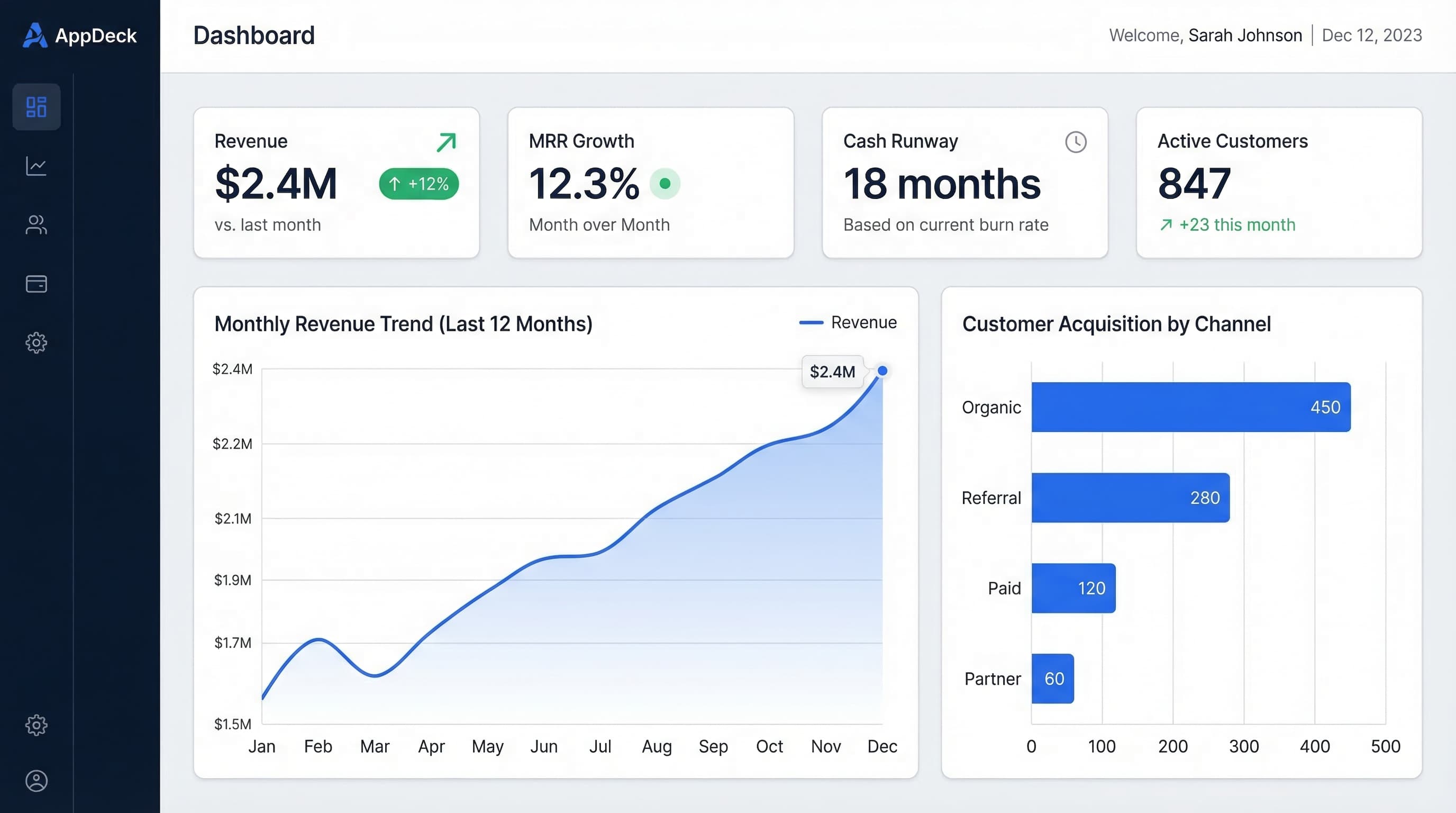
AppDeck
Best for: Teams that want a polished, always-up-to-date executive summary dashboard without building custom integrations. AppDeck's executive dashboard platform lets you build KPI dashboards that pull from your existing tools, share them with your leadership team through a secure portal, and control exactly who sees what.
I built AppDeck specifically because I was tired of stitching together dashboards from 5 different tools for my board meetings. If you need a dashboard that looks professional, updates automatically, and doesn't require a data engineer to maintain, it's worth a look.
Tableau
Best for: Data-heavy organizations with a dedicated analyst or BI team. Tableau is powerful but complex. It excels at visualization and can handle massive datasets, but the learning curve is steep and licensing costs add up.
Power BI
Best for: Microsoft-heavy organizations that already use the Office 365 ecosystem. Power BI integrates tightly with Excel, Azure, and Dynamics. It's more affordable than Tableau for organizations already paying for Microsoft licenses.
For ideas on what to build, see our Power BI dashboard examples for executives.
Common Mistakes
After helping dozens of leadership teams build executive summary dashboards, I see the same mistakes over and over. Here's what to avoid.
1. Too Many Metrics
This is the most common mistake by far. Someone on the leadership team says "can we also add..." and before you know it, the dashboard has 25 metrics and nobody reads it. Stick to 5-7. If a metric is important but not top-7, put it on a separate drill-down page.
2. Numbers Without Context
A revenue number by itself means nothing. Is $1.2M good or bad? You can't tell without a target, a trend, and a comparison to last period. Every metric on your executive summary dashboard needs at least two of these three: a target to compare against, a trend showing direction, and a period-over-period comparison.
3. No Status Indicators
If your dashboard requires the viewer to mentally calculate whether each number is good or bad, it's not doing its job. Use red, yellow, and green indicators so status is obvious at a glance.
4. Stale Data
A dashboard showing last month's numbers is a report, not a dashboard. If your data can't be updated at least weekly, reconsider your data sources or invest in automation.
5. No Action Items
The best executive summary dashboards don't just show you what's happening. They tell you what to do about it. Include a section at the bottom that calls out the 2-3 items requiring leadership attention, with owners and deadlines.
6. Designing for the Tool, Not the Audience
Don't start with "what can Tableau do?" Start with "what does my CEO need to see?" The tool should serve the audience, not the other way around. Some of the best executive summary dashboards I've seen were built in Google Sheets because the team prioritized clarity over aesthetics.
7. No Drill-Down Path
An executive summary dashboard should answer "how is the business doing?" in 10 seconds. But when something is red, the next question is always "why?" Make sure every metric links to a detail view where leaders can dig deeper without asking someone to pull a report.
Frequently Asked Questions
What is an executive summary dashboard?
An executive summary dashboard is a single-page view of the 5 to 7 metrics that answer the question every leader asks: how is the business doing? It's designed for CEOs, CFOs, VPs, and board members—not operators. It refreshes daily or weekly, includes targets and trends for every number, uses red/yellow/green status indicators, and surfaces action items at the bottom. The goal is alignment: every leader in the room can point to the dashboard and agree on where the business stands. If your dashboard has 30 metrics, it's an operational dashboard mislabeled as executive.
How is an executive summary dashboard different from an operational dashboard?
Executive summary dashboards are built for evaluation; operational dashboards are built for execution. Executive dashboards have 5 to 7 metrics, refresh daily or weekly, show month-to-date and quarter-to-date views, and target C-suite and board audiences. Operational dashboards have 15 to 30+ metrics, refresh in real time, show today or this week, and target managers and individual contributors. Think air traffic controller (operational—every flight) versus airport director (executive—on-time rate and passenger throughput). The same data sources can feed both, but the design intent is fundamentally different.
How much does it cost to build an executive summary dashboard?
Costs range from free (Google Sheets or Excel with manual updates) to $50,000+ for enterprise BI deployments with Tableau or Power BI. Most teams land in the middle: $100 to $500 per month for purpose-built dashboard tools like AppDeck, plus 10 to 20 hours of internal setup time. The hidden cost is data integration—if your CRM, billing, HRIS, and product analytics tools don't speak natively to your dashboard tool, you'll pay for ETL, custom development, or ongoing manual work. Budget for integrations as carefully as for the dashboard itself.
Who should be in the room when designing an executive summary dashboard?
The CEO, CFO, and heads of each major function (sales, marketing, product, customer success) need to agree on the metric definitions before you build. The most expensive mistake is shipping a dashboard where finance's revenue number doesn't match sales' booked revenue number—agreement upfront prevents that. The data owner (RevOps, finance ops, or analytics lead) should also be in the room to flag integration constraints. Avoid building dashboards in isolation; design by committee within a small group of decision-makers produces better dashboards than any single person designing alone.
When should you replace your dashboard with something different?
Replace it when fewer than half of your leadership team looks at it weekly, when the metrics no longer connect to your current strategy (typical after major pivots, acquisitions, or business model changes), or when more than 30 percent of the data is manually updated. Annual review is the minimum cadence—your dashboard should evolve as the business evolves. Companies that crossed $10M ARR with the same dashboard they used at $1M ARR are almost always under-measuring. Plan for at least one significant dashboard redesign per year through Series C.
Conclusion
An executive summary dashboard is not a nice-to-have. It's the operating system of your leadership team.
The best ones share three traits: they're focused (5-7 metrics, not 50), they're contextual (targets, trends, and status colors), and they're actionable (every red or yellow metric has an owner and a next step).
Start simple. Pick your three most important questions. Map them to 5-7 metrics. Build a rough version in whatever tool you already have. Review it with your leadership team every Monday. Iterate based on what they actually use and ignore.
The goal isn't a perfect dashboard. The goal is a leadership team that walks into every meeting already aligned on where the business stands and what needs attention. That's what a great executive summary dashboard delivers.
Related Reading

Founder & CEO, AppDeck
Serial entrepreneur with 20+ years building B2B software companies. Former executive managing 2,800+ employees across three continents. Vik reviews all AppDeck content for accuracy and practical relevance.
Share this article
Explore Related Solutions
Related Articles
Executive Dashboard Templates: 12 Free Examples for CEOs, CFOs & CROs
Ready-to-use executive dashboard templates for tracking KPIs, financials, and team performance. Free examples with best practices from real companies.
15 Free Excel Dashboard Templates You Can Download Today
Download 15 free Excel dashboard templates for executives, finance, sales, marketing, and operations. Ready-to-use .xlsx files with sample data, charts, and formulas.
Executive Dashboard Software: 8 Best Platforms Compared (2026)
Compare the best executive dashboard software for 2026. Features, pricing, and honest reviews of Tableau, Power BI, Looker, AppDeck, Geckoboard, Klipfolio, Databox, and Domo.