
Customer Portal Examples: 15 Real-World Designs That Drive Adoption
15 customer portal examples from SaaS, e-commerce, healthcare, finance, and professional services. See what works, key features, and design patterns that boost self-service adoption.
TL;DR: 15 customer portal examples from SaaS, e-commerce, healthcare, finance, and professional services. See what works, key features, and design patterns that boost self-service adoption.
Introduction
Customer portals are supposed to reduce support tickets and make customers self-sufficient. That's the pitch.
The reality? Most customer portals fail. They're dumping grounds for links nobody clicks. They bury critical information behind four layers of navigation. They look like they were designed in 2011 and never updated. And they create more frustration than they solve because customers can't find what they need without calling support anyway.
After building customer portals for companies across SaaS, financial services, healthcare, and professional services, I've learned what separates the portals that customers actually use from the ones they ignore: clarity, speed, and a relentless focus on the tasks customers log in to accomplish. Not features. Not branding exercises. Not design awards. Tasks.
In this guide, I'll walk through 15 real-world customer portal examples across seven industries. For each example, you'll get the company type, the key features that define the portal, the design pattern it follows, and why it works. These aren't theoretical wireframes. They're patterns drawn from portals with high adoption rates and measurable reductions in support volume.
Whether you're building your first customer portal or redesigning one that nobody uses, these examples will give you a concrete blueprint. And if you want a deeper dive into portal strategy before looking at examples, our self-service portal guide covers the foundational decisions you'll need to make.
What Makes a Customer Portal Actually Work?
Before diving into examples, let's establish the principles that separate portals customers love from portals they abandon after one login. These five patterns show up in every high-adoption portal I've studied.
1. Surface the Top 3 Tasks Immediately
Most customers log into a portal for one of three reasons. Maybe it's checking an order status, paying a bill, or submitting a support ticket. Whatever those top tasks are, they need to be accessible within one click of login — not buried in a sidebar menu.
The test: Time how long it takes a new user to complete the most common task. If it's more than 10 seconds, your portal has a navigation problem.
2. Personalize the Dashboard
A portal that shows the same generic content to every customer is a website with a login wall. Real portals surface information relevant to the specific customer: their account, their orders, their tickets, their documents.
The minimum: Show the customer's name, their account status, and their most recent activity. Everything else builds from there.
3. Make Self-Service Genuinely Faster Than Calling
If finding an answer in your portal takes longer than picking up the phone, customers will pick up the phone. Every time. Self-service only wins when it's the path of least resistance.
Measure it: Track the ratio of portal sessions that end in a support ticket versus sessions that don't. If more than 30% of portal visits result in a ticket, your self-service content isn't solving the problem.
4. Provide Real-Time Status Without Asking
Customers shouldn't have to ask "Where's my order?" or "What's the status of my claim?" Proactive status updates — visible the moment they log in — eliminate the most common reason people contact support.
The pattern: A status tracker with clear stages (submitted, in progress, complete) and timestamps. Simple, effective, and universally understood.
5. Design for Mobile First
More than 60% of customer portal sessions now happen on mobile devices. If your portal requires a desktop browser to function properly, you've already lost the majority of your users.
Non-negotiable: Every critical action must be completable on a phone screen without horizontal scrolling or pinch-to-zoom.
SaaS Customer Portals (Examples 1-4)
SaaS portals serve users who interact with your product daily or weekly. They need account management, billing, support, and product documentation — all accessible from a single hub. The best SaaS portals feel like a natural extension of the product itself rather than a separate destination. When a customer can manage their subscription, contact support, and review their usage without ever feeling like they've left the product, the portal is working.
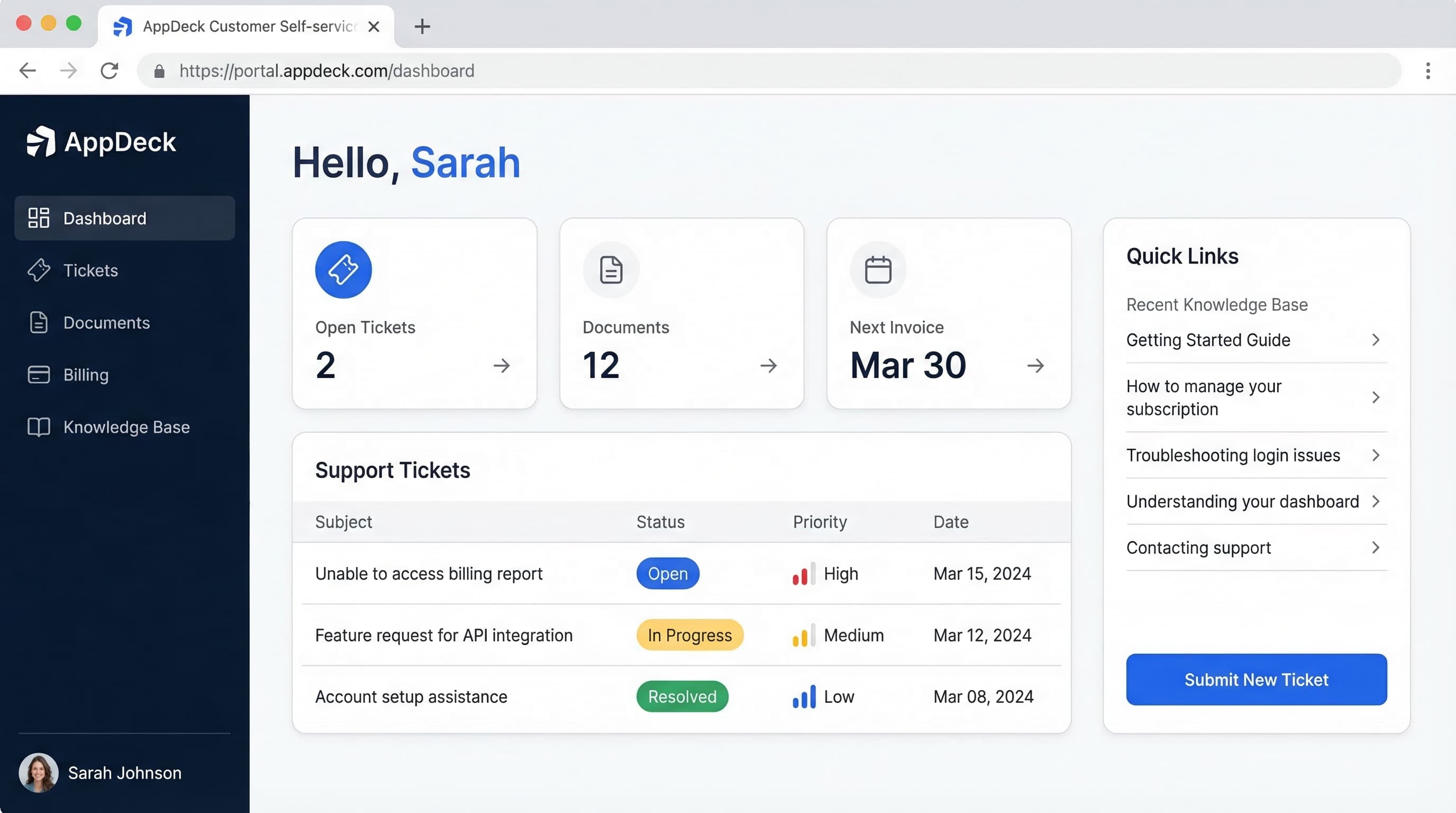
Example 1: B2B SaaS Account Hub
Company type: Mid-market B2B SaaS platform (project management or CRM category, 500-5,000 customers)
Key portal features:
- Subscription dashboard — current plan, usage metrics against limits, and renewal date prominently displayed
- Team management — add, remove, and manage user seats with role-based permissions
- Billing center — invoice history, payment method management, and plan upgrade/downgrade options
- Support integration — submit tickets, track open issues, and access a searchable knowledge base
- Product changelog — latest feature releases and updates, filterable by relevance
What makes it work: The portal opens to a personalized dashboard that shows three things immediately: your current plan usage (with a visual progress bar toward your limit), any open support tickets, and the next billing date. There's no generic welcome message. Every pixel is personalized to the logged-in account.
The team management section is particularly well-designed. Admins can see all users at a glance, with columns for name, role, last active date, and status. Adding a user is a single-step modal — enter email, select role, send invite. No multi-page forms. No unnecessary fields.
Design pattern: Dashboard-first with tabbed navigation. The left sidebar organizes sections (Account, Billing, Support, Team, Docs) while the main content area uses a card-based layout that adapts to screen size. Status indicators use green/yellow/red for at-a-glance health assessment.
Example 2: Developer Platform Portal
Company type: API-first SaaS company (payments, communications, or data infrastructure)
Key portal features:
- API usage dashboard — real-time request volume, error rates, and latency metrics with interactive charts
- API key management — generate, rotate, and revoke keys with environment labels (production, staging, sandbox)
- Documentation hub — interactive API reference with code samples in multiple languages, try-it-now console
- Webhook configuration — set up and test webhook endpoints with delivery logs and retry controls
- Billing by usage — granular usage breakdown by endpoint, with cost projections and spending alerts
What makes it work: Developer portals succeed or fail on one thing: can a developer go from signup to first successful API call in under 5 minutes? This portal nails it with a guided onboarding flow that creates a sandbox key, walks through a sample request, and confirms success — all without leaving the portal.
The API dashboard is the real differentiator. It shows request volume and error rates on a live-updating chart, with the ability to filter by endpoint, time range, and response code. When something breaks, developers see it here before their customers report it. The webhook logs are equally powerful — every delivery attempt is logged with the full request/response payload, making debugging a 30-second task instead of a 30-minute one.
Design pattern: Activity-centric with a persistent top navigation bar. The portal is organized around what developers do: Build (docs, API reference), Monitor (dashboard, logs), and Manage (keys, billing, settings). Dark theme option because developers spend hours in these portals and eye strain matters.
Example 3: SaaS Onboarding Portal
Company type: Enterprise SaaS with complex implementation (HR tech, ERP, or marketing automation)
Key portal features:
- Onboarding checklist — step-by-step implementation progress with percentage completion and assigned owners
- Resource library — implementation guides, best practices, video tutorials, and configuration templates
- Milestone tracker — key dates for go-live phases with status indicators and dependency mapping
- Stakeholder access — multiple users from the customer's team with role-specific views (admin, end user, executive sponsor)
- CSM communication — direct messaging with the assigned customer success manager, meeting scheduler, and shared notes
What makes it work: Enterprise implementations fail when customers lose visibility into progress. This portal solves that by making the onboarding journey visible and trackable. The checklist isn't just a to-do list — each step has an owner (customer-side or vendor-side), a due date, supporting documentation, and a status that updates automatically when tasks complete.
The executive sponsor view is a standout feature. While admins see granular task details, the executive sponsor sees a high-level progress dashboard: percentage complete, days until go-live, any blockers flagged red, and the next milestone date. This keeps executive sponsors engaged without overwhelming them with implementation details.
Design pattern: Progress-driven with a central timeline visualization. The onboarding checklist serves as the portal's spine, with everything else organized around it. A collapsible left sidebar provides access to resources and communication, while the main area focuses on the current phase of implementation.
Example 4: Multi-Product SaaS Hub
Company type: SaaS company with multiple product lines (e.g., a marketing suite with email, analytics, and automation products)
Key portal features:
- Product switcher — one-click navigation between different products with unified authentication
- Consolidated billing — single invoice across all products, with per-product cost breakdown
- Cross-product analytics — unified usage metrics that show how different products work together
- Centralized support — one ticket system that routes to the correct product team automatically
- Account-level settings — SSO configuration, security policies, and company-wide preferences that apply across all products
What makes it work: The challenge with multi-product companies is fragmentation. Customers shouldn't need separate logins, separate billing pages, or separate support queues for each product. This portal unifies everything under one roof.
The product switcher is the hero feature. It sits in the top navigation as a dropdown, showing each product with its icon, the customer's current plan for that product, and a quick-access link to each product's dashboard. Switching between products feels seamless — no re-authentication, no page reloads, just an instant context change.
Consolidated billing is the feature that finance teams love. One invoice, one payment method, one place to manage everything. The billing page breaks down costs by product, by month, and by user count, giving finance complete visibility without requiring them to aggregate multiple invoices.
Design pattern: Hub-and-spoke with a unified header. The portal serves as the hub, with each product accessible as a spoke. The header remains consistent across all products (logo, product switcher, notifications, user menu), while the content area adapts to the selected product. This creates a sense of cohesion across what might be very different product experiences.
E-Commerce Customer Portals (Examples 5-6)
E-commerce portals serve customers who want three things: order status, return management, and reorder convenience. Speed is everything. These customers are task-driven and impatient — they're not logging in to explore, they're logging in to do one thing and leave. The best e-commerce portals respect that intent and remove every unnecessary step between login and task completion.
Example 5: D2C Brand Account Center
Company type: Direct-to-consumer brand with subscription and one-time purchase options (beauty, food, wellness, or apparel)
Key portal features:
- Order tracking — real-time shipment tracking with carrier integration, expected delivery dates, and delivery photo confirmation
- Subscription management — pause, skip, swap products, change frequency, and update payment — all self-service
- Reorder with one click — past orders displayed as cards with a "Reorder" button that adds items to cart instantly
- Loyalty and rewards — points balance, tier status, available rewards, and history of earned/redeemed points
- Returns and exchanges — initiate returns with a prepaid label generated automatically, select exchange preferences
What makes it work: This portal understands that D2C customers have a recurring relationship with the brand. The subscription management panel is front and center, showing the next delivery date, the items included, and quick-action buttons: Skip, Swap, Add Items, Change Date. Every action that used to require a support email is now a single click.
The reorder feature is deceptively simple but highly effective. Past orders display as visual cards (product images, not just text) with quantities and a prominent reorder button. For a customer who buys the same products regularly, this turns a 5-minute browsing session into a 10-second transaction.
Design pattern: Task-card layout with a top-section status bar. The status bar shows the next subscription delivery date and current loyalty tier — the two things subscribers care about most. Below it, task cards (Track Orders, Manage Subscription, Reorder, Returns) are arranged in a 2x2 grid on desktop and stack vertically on mobile.
Example 6: B2B Wholesale Buyer Portal
Company type: Wholesale distributor or manufacturer with business customers placing recurring bulk orders
Key portal features:
- Custom pricing catalog — products displayed with the customer's negotiated pricing, volume discounts, and availability
- Order history with reorder — past orders filterable by date, product category, and order value, with bulk reorder functionality
- Invoice and payment management — outstanding invoices, payment history, credit terms, and the ability to pay invoices online
- Inventory availability — real-time stock levels for frequently ordered items, with back-in-stock notifications
- Account manager contact — direct line to their assigned account manager with chat, call scheduling, and shared order notes
What makes it work: B2B buyers don't browse. They know exactly what they need, and they need it fast. This portal opens directly to a quick-order pad — a search bar where buyers type a SKU or product name, see their contract price, enter a quantity, and add to cart. No product pages. No category navigation. Just search, quantity, order.
The invoice management section eliminates a massive source of accounts payable friction. Buyers see all outstanding invoices in a sortable table with due dates, amounts, and payment status. They can pay individual invoices or select multiples for batch payment. Download options include PDF and CSV for their own accounting systems.
Design pattern: Efficiency-first with a persistent quick-order bar. The portal is designed for speed over aesthetics. The quick-order bar sits at the top of every page. Below it, a tabbed interface organizes the portal into Orders, Invoices, Products, and Account sections. Table-heavy layouts with sort and filter controls cater to the data-oriented nature of B2B purchasing.
Healthcare Customer Portals (Examples 7-8)
Healthcare portals face unique constraints: regulatory compliance (HIPAA, GDPR), accessibility requirements, and a user base that spans every age group and technical ability level. A 25-year-old scheduling a telehealth visit and a 75-year-old checking lab results use the same portal. Simplicity isn't a nice-to-have — it's a safety requirement. Confused patients miss appointments, misunderstand results, and delay care.
Example 7: Patient Portal
Company type: Multi-location healthcare provider or hospital network
Key portal features:
- Appointment management — schedule, reschedule, and cancel appointments with provider availability calendar
- Medical records access — lab results, visit summaries, imaging reports, and medication lists in plain language
- Secure messaging — HIPAA-compliant messaging with care team, with average response time displayed
- Prescription management — view active prescriptions, request refills, and track pharmacy fulfillment
- Billing and insurance — view statements, make payments, see insurance claim status, and download EOBs
What makes it work: Patient portals fail when they're designed by IT departments instead of patients. This portal succeeds because it was designed around the three actions patients perform most: booking appointments, viewing test results, and messaging their doctor.
The lab results section is a standout. Instead of displaying raw lab values that mean nothing to most patients, results are presented with context: the value, the normal range, a plain-language explanation ("Your cholesterol is within the normal range"), and a trend chart showing how the value has changed over time. This transforms a confusing data dump into useful health information.
Accessibility is baked in, not bolted on. Font sizes are generous, contrast ratios exceed WCAG AAA standards, and every action can be completed with a keyboard. A "Simplified View" toggle reduces the interface to just three large buttons: Appointments, Messages, Records.
Design pattern: Action-oriented with a simplified default view. The portal opens to a dashboard showing upcoming appointments, any new results or messages (with notification badges), and a prominent "Schedule Appointment" button. The navigation uses both icons and text labels — critical for older users who may not recognize icon-only interfaces.
Example 8: Telehealth Platform Portal
Company type: Virtual care provider or telemedicine platform
Key portal features:
- Virtual visit launcher — one-click video consultation with device and connection pre-checks
- Symptom checker — guided questionnaire that routes to the appropriate provider specialty
- Visit history — past consultations with provider notes, diagnoses, and follow-up instructions
- Care plan tracker — active care plans with task checklists (take medication, schedule follow-up, complete exercises)
- Health data integration — sync with wearables and health apps for continuous monitoring data
What makes it work: The critical moment in a telehealth portal is the transition from "I need to see a doctor" to "I'm in a video call with a doctor." This portal compresses that journey to under 2 minutes. The homepage shows available providers with their next open slot, a "See a Doctor Now" button for urgent care, and a wait time estimate.
Before a video visit launches, the portal runs an automatic check: camera working, microphone detected, internet speed sufficient. If anything fails, it provides a clear fix instruction. This eliminates the number-one source of telehealth frustration — technical difficulties at the moment of the appointment.
The care plan tracker turns a one-time visit into ongoing engagement. After each consultation, the provider creates a care plan visible in the portal. Patients see daily or weekly tasks (take medication, log blood pressure, complete physical therapy exercises) with check-off functionality and progress visualization.
Design pattern: Urgency-driven with progressive disclosure. The default view is deliberately sparse: a large "Start Visit" button, upcoming appointments, and unread messages. Detailed features (health data, visit history, care plans) are accessible through a bottom navigation bar but don't clutter the primary interface. The design assumes users are visiting because they need help right now.
Financial Services Customer Portals (Examples 9-10)
Financial portals demand two things above all: security and clarity. Customers need to trust that their data is safe, and they need to understand their financial position without a finance degree. Multi-factor authentication, session timeouts, and encryption are table stakes — but they need to be implemented in a way that doesn't make logging in feel like passing through airport security. The best financial portals are secure without being burdensome.
Example 9: Wealth Management Client Portal
Company type: Registered investment advisor (RIA) or wealth management firm
Key portal features:
- Portfolio dashboard — total portfolio value, asset allocation breakdown, performance vs. benchmark, and gain/loss summary
- Account aggregation — consolidated view of all accounts (investment, retirement, banking) with a total net worth figure
- Document vault — tax documents, statements, financial plans, and signed agreements in a secure, searchable repository
- Advisor communication — secure messaging, meeting scheduler, and shared financial planning workspace
- Performance reporting — interactive reports with customizable date ranges, benchmark comparisons, and attribution analysis
What makes it work: Wealth management clients check their portal for one primary reason: "How is my money doing?" This portal answers that question in the first two seconds with a prominent total portfolio value, a gain/loss indicator (green up arrow or red down arrow), and a performance percentage — all above the fold.
The document vault is where this portal justifies its existence for the advisory firm. Instead of emailing sensitive financial documents, everything lives in a secure, encrypted repository. Clients can find their latest tax documents, review their financial plan, and access any signed agreements. Each document has a timestamp, a category tag, and a read receipt so advisors know when clients have reviewed important materials.
For advisory firms looking to build this type of experience, a customer portal platform with built-in document management and secure messaging eliminates months of custom development.
Design pattern: Dashboard-centric with a document layer. The portal opens to the portfolio dashboard, which shows the information clients care about most. A secondary navigation provides access to Documents, Reports, Messages, and Settings. The overall aesthetic is deliberately conservative — muted colors, clean typography, no unnecessary animations — because financial interfaces need to convey trust and stability.
Example 10: Insurance Policyholder Portal
Company type: Property and casualty or life insurance carrier
Key portal features:
- Policy overview — all active policies with coverage summaries, premium amounts, and renewal dates
- Claims filing and tracking — guided claims submission with photo upload, status timeline, and adjuster contact
- ID card access — digital insurance ID cards accessible offline, shareable via text or email
- Payment management — premium payments, autopay setup, payment history, and billing schedule
- Coverage comparison — side-by-side comparison of current coverage vs. recommended coverage with cost differences
What makes it work: Insurance portals have historically been terrible. Policyholders tolerate them because they have no alternative. This portal breaks the pattern by making the two most important moments — filing a claim and making a payment — genuinely simple.
The claims filing flow is the hero. Instead of a 15-field form, it uses a guided conversation format: What happened? When did it happen? Upload photos. Review and submit. Each step is one screen with one question. Progress is visible. The estimated processing time appears after submission, and the status tracker updates in real-time as the claim moves through adjudication.
Digital ID cards are a small feature with outsized impact. Customers access their insurance card from their phone instantly — no more digging through the glove compartment or waiting for a replacement card in the mail. The card is always current and can be saved to Apple Wallet or Google Pay for offline access.
Design pattern: Card-based with guided workflows. Each policy displays as a card with the essential details (policy type, coverage amount, next payment date, premium). Actions like "File a Claim" or "Make a Payment" are prominent buttons on each card. Complex workflows (claims, coverage changes) use a step-by-step wizard pattern that reduces cognitive load.
Professional Services Customer Portals (Examples 11-12)
Professional services firms — law, accounting, consulting, agencies — have a relationship-driven model where the portal supplements human interaction rather than replacing it. These portals succeed when they eliminate the administrative friction that eats into billable time: chasing documents, scheduling meetings, collecting approvals, and generating reports. The portal handles the logistics so the humans can focus on the expertise.
Example 11: Accounting Firm Client Portal
Company type: CPA firm or accounting practice serving small to mid-market businesses
Key portal features:
- Document exchange — secure upload and download of financial documents, tax returns, and statements with version control
- Engagement tracker — status of current engagements (tax prep, audit, advisory) with milestones and deadlines
- Signature requests — e-signature workflows for tax returns, engagement letters, and financial statements
- Invoice and payment — outstanding invoices, payment history, and online payment with credit card or ACH
- Tax deadline calendar — personalized calendar showing upcoming filing deadlines, estimated tax payment dates, and required document submission dates
What makes it work: Accounting firms live and die by document exchange. Every year, the same dance: firms request documents, clients email them piecemeal, things get lost, deadlines approach, and everyone panics. This portal replaces that chaos with a structured upload system.
The document request feature is the game-changer. The firm creates a checklist of required documents (W-2s, 1099s, mortgage interest statements, etc.) and the client sees a clear list with checkboxes. Upload a document, check it off. The firm sees progress in real-time and can send targeted reminders for missing items instead of a generic "please send your documents" email.
The engagement tracker keeps clients informed without requiring status update calls. Each engagement (annual tax return, quarterly review, etc.) shows its current phase, the next action required (and by whom), and the target completion date. Clients can see at a glance whether they're holding things up or waiting on the firm.
Design pattern: Checklist-driven with a document-centric layout. The portal homepage shows a "To-Do" section (documents to upload, signatures needed, invoices due) and a "Status" section (active engagements with progress bars). The document library uses a folder structure organized by tax year and engagement type, familiar to anyone who's used a file manager.
Example 12: Digital Agency Client Portal
Company type: Marketing, design, or development agency managing multiple client projects
Key portal features:
- Project dashboard — active projects with timeline, budget burn, and deliverable status at a glance
- Deliverable review — file sharing with annotation, commenting, and approval workflows for design and content
- Reporting and analytics — automated performance reports (SEO rankings, ad spend, campaign metrics) on a regular cadence
- Budget and billing — retainer balance, hours consumed vs. remaining, itemized invoices, and change order tracking
- Meeting notes and decisions — shared workspace for call notes, strategic decisions, and approved directions
What makes it work: Agency clients have one recurring anxiety: "What am I paying for, and is it working?" This portal answers both questions on the dashboard. Current projects show their status (on track, at risk, delayed), the budget consumed vs. remaining, and the most recent deliverable with its approval status.
The deliverable review workflow is where this portal earns its keep. Clients can view design mockups, website pages, or content drafts directly in the portal. They add comments by clicking on specific areas of a design or highlighting text in a document. The approval workflow is explicit — approve, request changes, or reject — with a comment trail that serves as a decision record. No more lost email feedback or conflicting Slack messages.
Automated reporting eliminates the busywork of manual report generation. The portal pulls data from connected platforms (Google Analytics, ad platforms, SEO tools) and generates visual reports on a weekly or monthly schedule. Clients see trends, not just snapshots, and can drill into any metric for more detail.
Design pattern: Project-centric with a communication layer. The sidebar lists active projects, and selecting a project reveals its full context: timeline, deliverables, budget, and communications. A notification bell highlights items needing client action (review a deliverable, approve a report, sign off on a change order). The design emphasizes visual content — thumbnails, previews, and inline annotations — because agency work is inherently visual.
Utilities and Telecom Customer Portals (Examples 13-14)
Utilities and telecom companies serve massive customer bases — often millions of accounts — where even small improvements in self-service rates translate to enormous cost savings. A 5% increase in portal adoption for a utility with 2 million customers means 100,000 fewer phone calls per billing cycle. These portals prioritize billing, usage visibility, and service management because those three categories account for over 80% of inbound customer contacts.
Example 13: Energy Utility Customer Portal
Company type: Electric or gas utility company serving residential and commercial customers
Key portal features:
- Usage dashboard — daily and monthly energy consumption with comparisons to prior periods and similar homes
- Bill management — view current and past bills, set up autopay, choose paperless billing, and understand bill line items
- Outage reporting — report outages, view outage maps, and receive estimated restoration time updates
- Energy efficiency — personalized recommendations for reducing energy consumption based on usage patterns
- Service requests — start/stop/transfer service, schedule meter readings, and manage account preferences
What makes it work: Utility customers rarely think about their utility company until something goes wrong: a high bill or a power outage. This portal is designed around those two moments.
The usage dashboard reframes energy consumption from an abstract number on a bill to a daily pattern the customer can understand and influence. An interactive chart shows daily usage with callouts for unusual spikes ("Your usage on Tuesday was 40% higher than usual — here's why that might be"). Comparisons to similar homes in the area add social context that motivates behavioral change.
The bill explainer feature transforms a confusing utility bill into something comprehensible. Each line item on the bill (generation charge, distribution charge, renewable energy surcharge) has a plain-language explanation accessible by clicking on it. Customers who understand their bill call support less and pay on time more.
Design pattern: Insight-driven with seasonal adaptation. The portal dashboard changes emphasis based on the season — energy usage tips and AC efficiency in summer, heating costs and weatherization in winter. The primary navigation is minimal: Usage, Billing, Outages, Account. A prominent alert banner at the top displays any active outage affecting the customer's address.
Example 14: Telecom Account Portal
Company type: Mobile carrier or broadband provider serving consumer and small business customers
Key portal features:
- Plan and usage summary — current plan details, data/voice/text usage against limits, and cycle reset date
- Device management — linked devices, upgrade eligibility, trade-in value estimator, and device protection status
- Family or multi-line management — individual line details within a shared account, per-line usage, and controls
- Bill and payment — current bill breakdown, payment options, autopay management, and spending alerts
- Network and service status — coverage checker, speed test integration, and real-time network status for the customer's area
What makes it work: Telecom portals serve a wider demographic than almost any other industry. A teenager checking data usage and a small business owner managing 20 lines use the same portal. This one handles both by opening to a personalized summary: your plan name, data used vs. available (with a clear visual gauge), days until cycle reset, and current bill amount.
The multi-line management feature is essential for family plans and small businesses. The account owner sees all lines in a card layout, each showing the user's name, phone number, usage summary, and per-line cost. Parental controls (data limits, content filters, usage schedules) are accessible from each line's card. For small businesses, the ability to assign cost centers to lines simplifies expense reporting.
The upgrade eligibility feature drives revenue while providing genuine value. Each device shows its upgrade status with a countdown ("Eligible in 47 days" or "Upgrade available now") and a trade-in value estimate. The path from "I'm eligible" to "I've ordered my new phone" is three screens: choose device, confirm trade-in, review order.
Design pattern: Usage-centric with a visual gauge system. Data usage dominates the dashboard as a circular gauge (like a speedometer) — instantly readable even at a glance. Secondary information (bill, devices, family lines) sits in a tab bar below the usage gauge. The mobile experience is given priority over desktop because the majority of sessions originate from the customer's phone.
Insurance Customer Portal (Example 15)
Insurance is one of the last industries to modernize its customer experience, and the gap between best-in-class and average portals is enormous. The best insurance portals turn the most stressful customer moments — filing a claim, understanding coverage, managing enrollment — into straightforward digital experiences.
Example 15: Group Benefits Administration Portal
Company type: Employee benefits broker or insurance administrator managing group health, dental, vision, and life policies for employer clients
Key portal features:
- Employee census management — add, remove, and update employees and dependents with life event processing
- Plan comparison tools — side-by-side benefit plan comparisons during open enrollment with cost modeling
- Enrollment tracking — real-time enrollment status across the employee population with completion percentages
- Claims dashboard — aggregate claims data, utilization trends, and cost analysis across all benefit lines
- Compliance center — required filings, ACA reporting status, COBRA administration, and deadline tracking
What makes it work: Benefits administration is one of the most complex portal use cases because it serves three distinct user types: HR administrators who manage the plan, employees who enroll and use benefits, and brokers who oversee multiple employer clients. This portal handles all three with role-based views that show each user type exactly what they need.
For HR administrators, the portal is a command center during open enrollment. A real-time enrollment tracker shows how many employees have completed enrollment, how many have started but not finished, and how many haven't started. Automated reminders go out to incomplete enrollees at configurable intervals. The compliance center surfaces approaching deadlines and required filings with enough lead time to prepare — no more scrambling before ACA reporting deadlines.
For employees, the experience is deliberately simplified. During open enrollment, they see their current plans, available alternatives with cost comparisons, and a guided enrollment wizard that walks them through each benefit line. Outside of enrollment, they access their digital ID cards, find in-network providers, and submit claims — the same three actions they'd call HR about.
Design pattern: Role-segmented with a calendar backbone. The portal experience changes dramatically based on user role. HR admins see dashboards, reports, and management tools. Employees see a streamlined self-service interface. Brokers see a multi-client overview with drill-down capability. A shared calendar component highlights key dates (open enrollment, renewal, compliance deadlines) relevant to each role.
Common Design Patterns Across All 15 Examples
Looking across these 15 examples, five design patterns appear consistently in portals with the highest adoption rates and lowest support ticket volumes. These aren't aesthetic preferences — they're functional patterns backed by measurable outcomes.
1. Task-First, Not Feature-First
Every successful portal organizes around customer tasks, not product features. The navigation doesn't mirror your internal org chart or your product architecture. It mirrors what customers are trying to accomplish.
"Pay My Bill" beats "Billing Module" every time. "Track My Order" beats "Order Management System." The language matters as much as the structure — use your customers' words, not your internal terminology.
2. Progressive Disclosure
The best portals show only what's needed at each moment. The dashboard is sparse and action-oriented. Details are available one click deeper. Advanced settings are two clicks away. This layered approach prevents information overload while still providing depth for power users.
Think of it like a newspaper: headline, summary, full article. Your portal dashboard is the headline. The detail page is the summary. The settings, history, and reports are the full article. Most customers never get past the headline — and that's exactly the point.
3. Status Visibility
From order tracking to claims processing to project milestones, customers want to know where things stand. Every portal in this list includes some form of status visualization — progress bars, stage trackers, or timeline views. Proactive status display is the single most effective feature for reducing support contacts.
The implementation matters too. A status of "In Progress" with no context isn't much better than no status at all. The best status displays include the current stage, when it entered that stage, who owns the next action, and what the expected timeline looks like. Amazon didn't revolutionize e-commerce with fast shipping alone — they revolutionized it by showing you exactly where your package was at every moment.
4. Consistent Action Patterns
Buttons look like buttons. Confirmation dialogs appear when needed. Success states are clear. Error messages explain what went wrong and how to fix it. These basics seem obvious, but inconsistent interaction patterns are the leading cause of portal abandonment.
The best portals maintain a consistent visual language for actions: primary actions (Submit, Pay, Approve) are one color. Secondary actions (Cancel, Go Back) are another. Destructive actions (Delete, Remove) are a third. Once a customer learns the pattern on one page, they can navigate every page confidently.
5. Mobile-Responsive by Default
None of these portals treat mobile as an afterthought. Mobile layouts aren't just shrunk-down desktop views — they're reorganized for thumb-friendly navigation, vertically stacked content, and touch-appropriate input controls. Key actions are placed in the bottom third of the screen where thumbs can reach them. Forms use native input types (date pickers, number pads) to reduce typing. And loading times are optimized for cellular connections, not just Wi-Fi.
Building Your Customer Portal
If these examples have you thinking about your own portal, here's a practical framework for going from inspiration to implementation. The companies behind these 15 examples didn't build everything at once. They started focused, measured results, and expanded based on what their customers actually used.
Start With Your Top 3 Support Tickets
Your support ticket data tells you exactly what your portal should do first. If 40% of tickets are "Where's my order?" — build order tracking. If 30% are password resets — implement self-service account recovery. If 20% are billing questions — build a bill explainer with payment history. Let your customers' actual behavior dictate your portal's feature priorities, not your product roadmap.
Pull a report of your last 1,000 support tickets. Categorize them. The top three categories are your portal's MVP features. Everything else is Phase 2.
Don't Build From Scratch
Unless you have a unique use case that no existing platform handles, building a customer portal from scratch is almost never the right call. The development time alone typically runs 6-12 months for a competent engineering team, and that's before you address security audits, accessibility compliance, mobile optimization, and the ongoing maintenance burden of authentication, permissions, and infrastructure.
Platforms like AppDeck's Customer Portal provide the foundation — secure document sharing, user management, branded interface, role-based access — so you can focus on the experience rather than the infrastructure. You get the security, compliance, and mobile responsiveness out of the box, and you redirect your engineering resources toward the customer-specific features that differentiate your portal.
For a detailed comparison of portal platforms, see our customer portal software comparison.
Design for Your Least Technical Customer
It's tempting to design for power users. They give the most feedback, they request the most features, and they're the most vocal in user research sessions. But power users will figure out almost any interface. The customers who determine your portal's adoption rate are the ones who struggle with technology.
Design for the customer who calls support because they can't find the login page. Use clear labels instead of icons alone. Provide confirmation messages after every action. Include a "Help" link on every page that opens contextual guidance, not a generic FAQ. If your least technical customer can complete the top three tasks without help, everyone else will find it effortless.
Measure Adoption, Not Just Deployment
Launching a portal isn't the finish line. Track these metrics from day one:
- Login rate — what percentage of customers have logged in at least once?
- Monthly active users — what percentage log in regularly?
- Task completion rate — what percentage of portal sessions end with a completed action?
- Support deflection — has ticket volume decreased since launch?
- Time to task — how long does it take to complete the most common action?
If login rates are below 30% after 90 days, you have an adoption problem that more features won't solve. Focus on onboarding, email campaigns that link directly to portal actions, and reducing friction in the first-time experience.
Iterate Based on Behavior, Not Opinions
Once your portal is live, analytics will tell you more than surveys ever will. Watch where users click, where they drop off, and which features go unused. Session recordings reveal friction points that customers won't articulate in feedback forms because they don't know what's wrong — they just know something felt hard.
Run a quarterly portal review. Pull the data on feature usage, task completion rates, and support ticket topics. If a feature has less than 10% usage after six months, remove it or redesign it. If a support topic keeps appearing despite a portal feature that should address it, the feature isn't working — not because it's missing, but because customers can't find it or don't trust it.
Frequently Asked Questions
What is a customer portal?
A customer portal is a secure, authenticated web area where existing customers log in to manage their account, find information, and complete transactional tasks without contacting support. Common functions include viewing order history, downloading invoices, tracking shipments, opening support tickets, accessing documentation, paying bills, and managing subscription settings. Customer portals differ from public help centers because they show data specific to the logged-in customer — their orders, their bill, their tickets — and differ from client portals because they're built for high-volume self-service rather than one-to-one project collaboration with a service provider.
What makes a customer portal successful versus one customers ignore?
Adoption is driven by three things: solving the top three reasons customers contact support, surfacing the most common action within one click of login, and making the portal faster than calling. The examples in this guide that hit 70%+ adoption rates focus on a narrow set of high-frequency tasks rather than offering 30 features. Portals fail when they're treated as marketing assets — pretty dashboards with widgets nobody uses — instead of being designed around real support ticket data. If your top three ticket categories aren't one-click actions in your portal, customers will keep calling.
How long does it take to build a customer portal?
Building from scratch typically takes 6-12 months with a competent engineering team, plus another 2-3 months for security audits, accessibility compliance, and mobile testing. Using a platform like Zendesk, Salesforce Experience Cloud, or AppDeck cuts that to 4-12 weeks for a focused MVP covering 3-5 core tasks. The bottleneck is rarely the technology — it's integrating with your existing systems (CRM, billing, ticketing, order management) and writing clear copy. Expect 30-50% of total project time to be content design, not engineering.
Who should invest in a customer portal first?
Companies with high recurring support volume around predictable, structured tasks see the biggest return: SaaS with 1,000+ active subscribers, e-commerce with repeat customers, financial services with billing and statement requests, healthcare practices managing appointments and records, and B2B companies with active accounts that need invoices and documentation. If 40%+ of your support tickets are "where's my X" or "send me my Y," you have a clear self-service opportunity. Companies with low ticket volume or highly bespoke services where every interaction is unique get less leverage from a portal.
When does a customer portal not make sense?
If you have fewer than 200 active customers, your support team handles fewer than 30 tickets a week, or your product is so high-touch that customers expect named human contact (concierge banking, enterprise consulting, luxury concierge), a portal can feel cold and underused. Some industries are also poor portal fits because of regulatory or behavioral reasons — for example, customers in highly relational B2B sales often refuse to use portals because the human relationship is the product. Run the math: if portal investment exceeds two years of projected support cost savings plus customer-experience gains, defer it.
Conclusion
Customer portals are not a "nice to have" anymore. They're a competitive requirement — and increasingly, a customer expectation. The 15 examples in this guide share a common thread: they're designed around what customers actually do, not what the company wants to showcase. They make self-service faster than calling support. They provide visibility without requiring customers to ask for it. And they're simple enough that every customer — not just the tech-savvy ones — can use them successfully.
The difference between a portal that drives 80% self-service adoption and one that sits at 15% comes down to empathy: understanding the three things your customers log in to do and making those three things effortless. Not twenty things. Not fifty features. Three tasks, done perfectly.
The companies behind the best examples in this guide didn't start with 15 features. They started with three. They measured what customers actually used. They removed what didn't work. They expanded what did. That cycle — build, measure, learn, iterate — is the only reliable path to a portal that customers choose to use instead of calling support.
Start with your support data. Identify the top three tasks. Build those first. Measure adoption. Iterate. A focused portal launched in 30 days beats a comprehensive one planned for 12 months.
If you're ready to build a customer portal that customers actually use, explore AppDeck's Customer Portal for branded, secure portals with built-in document management and self-service tools. For a broader view of portal strategy, visit the Customer Portal Guide.
Related reading:
- The Complete Customer Portal Guide — strategy, planning, and implementation
- 12 Client Portal Examples — real designs from agencies, law firms, and consultants
- Customer Portal Software Comparison 2026 — platform options and pricing
- Self-Service Portal Guide — designing for self-service adoption
- Client Portal vs. Customer Portal — understanding the differences

Founder & CEO, AppDeck
Serial entrepreneur with 20+ years building B2B software companies. Former executive managing 2,800+ employees across three continents. Vik reviews all AppDeck content for accuracy and practical relevance.
Share this article
Explore Related Solutions
Related Articles
Customer Portal Software Comparison 2026: 10 Best Platforms Reviewed
Compare the best customer portal software for 2026. Zendesk, Salesforce, Freshdesk, AppDeck, and 6 others reviewed. Features, pricing, and ratings.
How to Reduce Support Tickets by 40% with a Customer Portal
Proven strategies to reduce support ticket volume using self-service customer portals. Knowledge bases, account management, billing portals, and automation tactics.
Customer Self-Service Portal: Complete Guide for 2026
How to build a self-service portal that reduces support tickets by 40%. Covers knowledge bases, account management, ticketing, billing, and implementation best practices.